```
#### `HeaderBackButton` and `DrawerToggleButton` components now accept an `icon` prop
Previously, the `HeaderBackButton` and `DrawerToggleButton` components accepted `backImage` and `imageSource` props respectively. In order to support the new icons such as [Material Symbols](https://fonts.google.com/icons) and [SF Symbols](https://developer.apple.com/sf-symbols/), these props have been replaced with a new `icon` prop.
If you're using a custom back image with `imageSource`, you can update your code as follows:
```diff lang=js
-
+
```
And for `DrawerToggleButton`:
```diff lang=js
-
+
```
See [HeaderBackButton](elements.md#headerbackbutton) and [DrawerToggleButton](drawer-navigator.md#headerleft) for more details.
#### Some exports are removed from `@react-navigation/elements`
The `@react-navigation/elements` package has exported some components that were primarily intended for internal usage. These components have been removed from the public API:
- `Background`
Background color can instead be applied by using it from `useTheme`.
```diff lang=js
- import { Background } from '@react-navigation/elements';
+ import { useTheme } from '@react-navigation/native';
// ...
- {children}
+ const { colors } = useTheme();
+
+ {children}
```
- `Screen`
You can render the `Header` component directly instead.
- `SafeAreaProviderCompat`
You can use `SafeAreaProvider` from [`react-native-safe-area-context`](https://github.com/AppAndFlow/react-native-safe-area-context) directly instead.
- `MissingIcon`
You can copy the implementation from the [source code](https://github.com/react-navigation/react-navigation/blob/main/packages/elements/src/MissingIcon.tsx) if you need a placeholder icon.
- `Assets`
This was an array of assets to preload with `expo-asset`. However since the built-in icons now render [Material Symbols](https://fonts.google.com/icons) on Android and [SF Symbols](https://developer.apple.com/sf-symbols/) on iOS instead of images, this is no longer needed.
If you were using this, you can remove it from your code:
```diff lang=js
- import { Assets } from '@react-navigation/elements';
- import { Asset } from 'expo-asset';
-
- Asset.loadAsync(Assets);
```
Some of these exports are still available and exported at `@react-navigation/elements/internal`, so you can continue using them if you really need. However, since they are not part of the public API, they don't follow semver and may change without warning in future releases.
#### The `getDefaultHeaderHeight` utility now accepts an object instead of positional arguments
The `getDefaultHeaderHeight` utility from `@react-navigation/elements` now accepts an object with named properties instead of positional arguments to improve readability"
```diff lang=js
- getDefaultHeaderHeight(layout, false, statusBarHeight);
+ getDefaultHeaderHeight({
+ landscape: false,
+ modalPresentation: false,
+ topInset: statusBarHeight
+ });
```
See [Elements docs](elements.md#getdefaultheaderheight) for more details.
## New features
### Common hooks now accept name of the screen
The `useNavigation`, `useRoute`, and `useNavigationState` hooks can now optionally accept the name of the screen:
```js
const route = useRoute('Profile');
```
The name of the screen can be for the current screen or any of its parent screens. This makes it possible to get params and navigation state for a parent screen without needing to setup context to pass them down.
If the provided screen name does not exist in any of the parent screens, it will throw an error, so any mistakes are caught early.
When using static configuration, the types are automatically inferred based on the name of the screen.
It's still possible to use these hooks without passing the screen name, same as before, and it will return the navigation or route for the current screen.
See [`useNavigation`](use-navigation.md), [`useRoute`](use-route.md), and [`useNavigationState`](use-navigation-state.md) for more details.
### New entry can be added to history stack with `pushParams` action
The `pushParams` action updates the params and pushes a new entry to the history stack:
```js
navigation.pushParams({ filter: 'new' });
```
Unlike `setParams`, this does not merge the new params with the existing ones. Instead, it uses the new params object as-is.
The action works in all navigators, such as stack, tab, and drawer. This allows to add a new entry to the history stack without needing to push a new screen instance.
This can be useful in various scenario:
- A product listing page with filters, where changing filters should create a new history entry so that users can go back to previous filter states.
- A screen with a custom modal component, where the modal is not a separate screen in the navigator, but its state should be reflected in the URL and history.
See [`pushParams` docs](navigation-actions.md#pushparams) for more details.
### Themes now support `ColorValue` and CSS custom properties
Previously, theme colors only supported string values. In React Navigation 8, theme colors now support `PlatformColor`, `DynamicColorIOS` on native, and CSS custom properties on Web for more flexibility.
Example theme using `PlatformColor`:
```js
const MyTheme = {
...DefaultTheme,
colors: Platform.select({
ios: () => ({
primary: PlatformColor('systemRed'),
background: PlatformColor('systemGroupedBackground'),
card: PlatformColor('tertiarySystemBackground'),
text: PlatformColor('label'),
border: PlatformColor('separator'),
notification: PlatformColor('systemRed'),
}),
android: () => ({
primary: PlatformColor('@android:color/system_primary_light'),
background: PlatformColor(
'@android:color/system_surface_container_light'
),
card: PlatformColor('@android:color/system_background_light'),
text: PlatformColor('@android:color/system_on_surface_light'),
border: PlatformColor('@android:color/system_outline_variant_light'),
notification: PlatformColor('@android:color/system_error_light'),
}),
default: () => DefaultTheme.colors,
})(),
};
```
See [Themes](themes.md#using-platform-colors) for more details.
### Groups now support `linking` option in static configuration
The `linking` option can now be specified for groups in static configuration to define nested paths:
```js
const Stack = createStackNavigator({
groups: {
Settings: {
linking: { path: 'settings' },
screens: {
UserSettings: 'user',
AppSettings: 'app',
},
},
},
});
```
This lets you prefix the paths of the screens in the group with a common prefix, e.g. `settings/` for `settings/user` and `settings/app`.
See [Group](group.md) for more details.
### Deep linking to screens behind conditional screens is now supported
Previously, if a screen was conditionally rendered based on some state (e.g. authentication status), deep linking to that screen wouldn't work since the screen wouldn't exist in the navigator when the app was opened via a deep link.
In React Navigation 7, we added an experimental `UNSTABLE_routeNamesChangeBehavior` option to enable remembering such unhandled actions and re-attempting them when the list of route names changed after the conditions changed by setting the option to `lastUnhandled`.
In React Navigation 8, we have dropped the `UNSTABLE_` prefix and made it a stable API.
```js static2dynamic
const Stack = createNativeStackNavigator({
// highlight-start
routeNamesChangeBehavior: 'lastUnhandled',
// highlight-end
screens: {
Home: HomeScreen,
Profile: ProfileScreen,
},
});
```
### Navigators now accept a `router` prop
A router defines how the navigator updates its state based on navigation actions. Previously, custom routers could only be used by [creating a custom navigator](custom-navigators.md#extending-navigators).
We later added an experimental `UNSTABLE_router` prop to various navigators to customize the router without needing to create a custom navigator. In React Navigation 8, we have dropped the `UNSTABLE_` prefix and made it a stable API.
```js static2dynamic
const MyStack = createNativeStackNavigator({
// highlight-start
router: (original) => ({
getStateForAction(state, action) {
if (action.type === 'NAVIGATE') {
// Custom logic for NAVIGATE action
}
// Fallback to original behavior
return original.getStateForAction(state, action);
},
}),
// highlight-end
screens: {
Home: HomeScreen,
Profile: ProfileScreen,
},
});
```
See [`Navigator` docs](navigator.md#router) for more details.
### State persistence is simplified with the `persistor` prop
Previously, state persistence could be implemented with `initialState` and `onStateChange` props, however it required some boilerplates and handling edge cases.
The new `persistor` prop simplifies state persistence by reducing the boilerplate code needed to persist and restore state:
```js
export default function App() {
return (
);
}
```
```js
export default function App() {
return (
{/* ... */}
);
}
```
See [State persistence docs](state-persistence.md) for more details.
### `Header` from `@react-navigation/elements` has been reworked
The `Header` component from `@react-navigation/elements` has been reworked with various improvements:
- It uses the new liquid glass effect on iOS 26
- It supports `ColorValue` and CSS custom properties for colors
- It supports `headerBlurEffect` on Web (previously only supported on iOS in Native Stack Navigator)
- It no longer needs the layout of the screen to render correctly
To match the iOS 26 design, the back button title is no longer shown by default on iOS 26.
The `backImage` prop has been replaced with `backIcon` that accepts an icon object similar to `tabBarIcon` in Bottom Tab Navigator. It now supports using [Material Symbols](https://fonts.google.com/icons) on Android and [SF Symbols](https://developer.apple.com/sf-symbols/) on iOS.
See [Elements](elements.md) for more details.
### Material Symbols & SF Symbols are now supported for icons
Various navigators and components now support using [Material Symbols](https://fonts.google.com/icons) on Android and [SF Symbols](https://developer.apple.com/sf-symbols/) on iOS for icons.
For example,
- [`tabBarIcon`](bottom-tab-navigator.md#tabbaricon) option in Bottom Tab Navigator
- [`headerBackIcon`](native-stack-navigator.md#headerbackicon) option in Native Stack Navigator
- [`headerBackIcon`](stack-navigator.md#headerbackicon) option in Stack Navigator
- [`icon`](elements.md#headerbackbutton) prop in `HeaderBackButton` component
- [`icon`](drawer-navigator.md#headerleft) option in `DrawerToggleButton` component
Usage:
```js
tabBarIcon: Platform.select({
ios: {
type: 'sfSymbol',
name: 'house',
},
android: {
type: 'materialSymbol',
name: 'home',
},
}),
```
In addition, new `SFSymbol` and `MaterialSymbol` components are exported from `@react-navigation/native` to render these icons directly.
See [Icons](icons.md) for more details.
### `react-native-tab-view` now supports a `renderAdapter` prop for custom adapters
By default, `react-native-tab-view` uses [`react-native-pager-view`](https://github.com/callstack/react-native-pager-view) for rendering pages on Android and iOS. However, it may not be suitable for all use cases.
So it now supports a `renderAdapter` prop to provide a custom adapter for rendering pages. For example, you can use `ScrollViewAdapter` to use a `ScrollView` for rendering pages:
```js
import React from 'react';
import { TabView, ScrollViewAdapter } from 'react-native-tab-view';
export default function TabViewExample() {
const [index, setIndex] = React.useState(0);
return (
);
}
```
You can also create your own custom adapter by implementing the required interface. See the [`react-native-tab-view` docs](tab-view.md) for more information.
### New built-in themes base on Material Design are now available
The `@react-navigation/native` package now exports 2 new built-in themes based on Material Design:
- `MaterialLightTheme`
- `MaterialDarkTheme`
These themes use platform colors to provide dynamic colors that adapt to the user's wallpaper and theme preferences.
See [Themes](themes.md#built-in-themes) for more details.
### `useLogger` devtools now shows more information
Previously, the `useLogger` devtools only showed navigation actions. It now shows the following additional information:
- Deep link received by React Navigation
- Events emitted by navigators (e.g. `tabPress`)
This should help with debugging issues with more complex use cases.
See [Devtools docs](devtools.md#uselogger) for more details.
---
## Stack Navigator
Source: https://reactnavigation.org/docs/8.x/stack-navigator
Stack Navigator provides a way for your app to transition between screens where each new screen is placed on top of a stack.
By default the stack navigator is configured to have the familiar iOS and Android look & feel: new screens slide in from the right on iOS, use OS default animation on Android. But the [animations can be customized](#animation-related-options) to match your needs.
One thing to keep in mind is that while `@react-navigation/stack` is extremely customizable, it's implemented in JavaScript. While it runs animations and gestures using natively, the performance may not be as fast as a native implementation. This may not be an issue for a lot of apps, but if you're experiencing performance issues during navigation, consider using [`@react-navigation/native-stack`](native-stack-navigator.md) instead - which uses native navigation primitives.
## Installation
To use this navigator, ensure that you have [`@react-navigation/native` and its dependencies (follow this guide)](getting-started.md), then install [`@react-navigation/stack`](https://github.com/react-navigation/react-navigation/tree/main/packages/stack):
```bash npm2yarn
npm install @react-navigation/stack@next
```
The navigator depends on [`react-native-gesture-handler`](https://docs.swmansion.com/react-native-gesture-handler/) for gestures and optionally [`@react-native-masked-view/masked-view`](https://github.com/react-native-masked-view/masked-view) for [UIKit style animations for the header](#headerstyleinterpolator).
If you have a Expo managed project, in your project directory, run:
```bash
npx expo install react-native-gesture-handler @react-native-masked-view/masked-view
```
If you have a bare React Native project, in your project directory, run:
```bash npm2yarn
npm install react-native-gesture-handler @react-native-masked-view/masked-view
```
If you're on a Mac and developing for iOS, you also need to install [pods](https://cocoapods.org/) to complete the linking.
```bash
npx pod-install ios
```
## Usage
To use this navigator, import it from `@react-navigation/stack`:
```js name="Stack Navigator" snack static2dynamic
import * as React from 'react';
import { Text, View } from 'react-native';
import {
createStaticNavigation,
useNavigation,
} from '@react-navigation/native';
import { Button } from '@react-navigation/elements';
// codeblock-focus-start
import { createStackNavigator } from '@react-navigation/stack';
// codeblock-focus-end
function HomeScreen() {
const navigation = useNavigation('Home');
return (
Home Screen
);
}
function ProfileScreen() {
return (
Profile Screen
);
}
// codeblock-focus-start
const MyStack = createStackNavigator({
screens: {
Home: HomeScreen,
Profile: ProfileScreen,
},
});
// codeblock-focus-end
const Navigation = createStaticNavigation(MyStack);
export default function App() {
return ;
}
```
## API Definition
### Props
In addition to the [common props](navigator.md#configuration) shared by all navigators, the stack navigator accepts the following additional props:
#### `detachInactiveScreens`
Boolean used to indicate whether inactive screens should be detached from the view hierarchy to save memory. This enables integration with [react-native-screens](https://github.com/software-mansion/react-native-screens). Defaults to `true`.
If you need to disable this optimization for specific screens (e.g. you want to screen to stay in view even when unfocused) [`detachPreviousScreen`](#detachpreviousscreen) option.
### Options
The following [options](screen-options.md) can be used to configure the screens in the navigator. These can be specified under `screenOptions` prop of `Stack.Navigator` or `options` prop of `Stack.Screen`.
#### `title`
String that can be used as a fallback for `headerTitle`.
#### `cardShadowEnabled`
Use this prop to have visible shadows during transitions. Defaults to `true`.
#### `cardOverlayEnabled`
Use this prop to have a semi-transparent dark overlay visible under the card during transitions. Defaults to `true` on Android and `false` on iOS.
#### `cardOverlay`
Function which returns a React Element to display as the overlay for the card. Make sure to set `cardOverlayEnabled` to `true` when using this.
#### `cardStyle`
Style object for the card in stack. You can provide a custom background color to use instead of the default background here.
You can also specify `{ backgroundColor: 'transparent' }` to make the previous screen visible underneath (for transparent modals). This is useful to implement things like modal dialogs. You should also specify `presentation: 'modal'` in the options when using a transparent background so previous screens aren't detached and stay visible underneath.
On Web, the height of the screen isn't limited to the height of the viewport. This is by design to allow the browser's address bar to hide when scrolling. If this isn't desirable behavior, you can set `cardStyle` to `{ flex: 1 }` to force the screen to fill the viewport.
#### `presentation`
This is shortcut option which configures several options to configure the style for rendering and transitions:
- `card`: Use the default OS animations for iOS and Android screen transitions.
- `modal`: Use Modal animations. This changes a few things:
- Sets `headerMode` to `screen` for the screen unless specified otherwise.
- Changes the screen animation to match the platform behavior for modals.
- `transparentModal`: Similar to `modal`. This changes following things:
- Sets `headerMode` to `screen` for the screen unless specified otherwise.
- Sets background color of the screen to transparent, so previous screen is visible
- Adjusts the `detachPreviousScreen` option so that the previous screen stays rendered.
- Prevents the previous screen from animating from its last position.
- Changes the screen animation to a vertical slide animation.
See [Transparent modals](#transparent-modals) for more details on how to customize `transparentModal`.
#### `animationTypeForReplace`
The type of animation to use when this screen replaces another screen. It takes the following values:
- `push` - The animation of a new screen being pushed will be used
- `pop` - The animation of a screen being popped will be used
Defaults to `push`.
When `pop` is used, the `pop` animation is applied to the screen being replaced.
#### `gestureEnabled`
Whether you can use gestures to dismiss this screen. Defaults to `true` on iOS, `false` on Android.
Gestures are not supported on Web.
#### `gestureResponseDistance`
Number to override the distance of touch start from the edge of the screen to recognize gestures.
It'll configure either the horizontal or vertical distance based on the [`gestureDirection`](#gesturedirection) value.
The default values are:
- `50` - when `gestureDirection` is `horizontal` or `horizontal-inverted`
- `135` - when `gestureDirection` is `vertical` or `vertical-inverted`
This is not supported on Web.
#### `gestureVelocityImpact`
Number which determines the relevance of velocity for the gesture. Defaults to 0.3.
This is not supported on Web.
#### `gestureDirection`
Direction of the gestures. Refer the [Animations section](#animations) for details.
This is not supported on Web.
#### `transitionSpec`
Configuration object for the screen transition. Refer the [Animations section](#animations) for details.
#### `cardStyleInterpolator`
Interpolated styles for various parts of the card. Refer the [Animations section](#animations) for details.
#### `headerStyleInterpolator`
Interpolated styles for various parts of the header. Refer the [Animations section](#animations) for details.
#### `keyboardHandlingEnabled`
If `false`, the keyboard will NOT automatically dismiss when navigating to a new screen from this screen. Defaults to `true`.
#### `detachPreviousScreen`
Boolean used to indicate whether to detach the previous screen from the view hierarchy to save memory. Set it to `false` if you need the previous screen to be seen through the active screen. Only applicable if `detachInactiveScreens` isn't set to `false`.
This is automatically adjusted when using [`presentation`](#presentation) as `transparentModal` or `modal` to keep the required screens visible. Defaults to `true` in other cases.
#### `freezeOnBlur`
Boolean indicating whether to prevent inactive screens from re-rendering. Defaults to `false`.
Defaults to `true` when `enableFreeze()` from `react-native-screens` package is run at the top of the application.
Only supported on iOS and Android.
### Header related options
You can find the list of header related options [here](elements.md#header). These [options](screen-options.md) can be specified under `screenOptions` prop of `Stack.Navigator` or `options` prop of `Stack.Screen`. You don't have to be using `@react-navigation/elements` directly to use these options, they are just documented in that page.
In addition to those, the following options are also supported in stack:
#### `header`
Custom header to use instead of the default header.
This accepts a function that returns a React Element to display as a header. The function receives an object containing the following properties as the argument:
- `navigation` - The navigation object for the current screen.
- `route` - The route object for the current screen.
- `options` - The options for the current screen
- `layout` - Dimensions of the screen, contains `height` and `width` properties.
- `progress` Animated nodes representing the progress of the animation.
- `back` - Options for the back button, contains an object with a `title` property to use for back button label.
- `styleInterpolator` - Function which returns interpolated styles for various elements in the header.
Make sure to set `headerMode` to `screen` as well when using a custom header (see below for more details).
Example:
```js
import { getHeaderTitle } from '@react-navigation/elements';
// ..
header: ({ navigation, route, options, back }) => {
const title = getHeaderTitle(options, route.name);
return (
: undefined
}
style={options.headerStyle}
/>
);
};
```
To set a custom header for all the screens in the navigator, you can specify this option in the `screenOptions` prop of the navigator.
When using a custom header, there are 2 things to keep in mind:
##### Specify a `height` in `headerStyle` to avoid glitches
If your header's height differs from the default header height, then you might notice glitches due to measurement being async. Explicitly specifying the height will avoid such glitches.
Example:
```js
headerStyle: {
height: 80, // Specify the height of your custom header
};
```
Note that this style is not applied to the header by default since you control the styling of your custom header. If you also want to apply this style to your header, use `headerStyle` from the props.
##### Set `headerMode` to `float` for custom header animations
By default, there is one floating header which renders headers for multiple screens on iOS for non-modals. These headers include animations to smoothly switch to one another.
If you specify a custom header, React Navigation will change it to `screen` automatically so that the header animated along with the screen instead. This means that you don't have to implement animations to animate it separately.
But you might want to keep the floating header to have a different transition animation between headers. To do that, you'll need to specify `headerMode: 'float'` in the options, and then interpolate on the `progress.current` and `progress.next` props in your custom header. For example, following will cross-fade the header:
```js
const opacity = Animated.add(progress.current, progress.next || 0).interpolate({
inputRange: [0, 1, 2],
outputRange: [0, 1, 0],
});
return (
{/* Header content */}
);
```
#### `headerMode`
Specifies how the header should be rendered:
- `float` - The header is rendered above the screen and animates independently of the screen. This is default on iOS for non-modals.
- `screen` - The header is rendered as part of the screen and animates together with the screen. This is default on other platforms.
#### `headerShown`
Whether to show or hide the header for the screen. The header is shown by default. Setting this to `false` hides the header.
#### `headerBackAllowFontScaling`
Whether back button title font should scale to respect Text Size accessibility settings. Defaults to false.
#### `headerBackAccessibilityLabel`
Accessibility label for the header back button.
#### `headerBackIcon`
Icon to display in the header as the icon in the back button.
It supports the following types:
- `materialSymbol` (Android only)
```js
headerBackIcon: {
type: 'materialSymbol',
name: 'arrow_back',
}
```
See [Icons](icons.md#material-symbols) for more details.
- `sfSymbol` (iOS only)
```js
headerBackIcon: {
type: 'sfSymbol',
name: 'arrow.left',
}
```
See [Icons](icons.md#sf-symbols) for more details.
- `image`
```js
headerBackIcon: {
type: 'image',
source: require('./path/to/icon.png'),
}
```
In addition to the icon object, you can also provide a function which returns a React Element to display as the back icon. It receives `tintColor` in its argument object:
```js
headerBackIcon: ({ tintColor }) => (
),
```
Defaults to back icon image for the platform:
- A chevron on iOS
- An arrow on Android
#### `headerBackTitle`
Title string used by the back button on iOS. Defaults to the previous scene's title. Use `headerBackButtonDisplayMode` to customize the behavior.
#### `headerTruncatedBackTitle`
Title string used by the back button when `headerBackTitle` doesn't fit on the screen. `"Back"` by default.
#### `headerBackButtonDisplayMode`
How the back button displays icon and title.
Supported values:
- `default`: Displays one of the following depending on the available space: previous screen's title, generic title (e.g. 'Back') or no title (only icon).
- `generic`: Displays one of the following depending on the available space: generic title (e.g. 'Back') or no title (only icon).
- `minimal`: Always displays only the icon without a title.
Defaults to `default` on iOS, and `minimal` on Android.
#### `headerBackTitleStyle`
Style object for the back title.
#### `headerBackTestID`
Test ID for the back button for testing purposes.
### Events
The navigator can [emit events](navigation-events.md) on certain actions. Supported events are:
#### `transitionStart`
This event is fired when the transition animation starts for the current screen.
Event data:
- `e.data.closing` - Boolean indicating whether the screen is being opened or closed.
Example:
```js
React.useEffect(() => {
const unsubscribe = navigation.addListener('transitionStart', (e) => {
// Do something
});
return unsubscribe;
}, [navigation]);
```
#### `transitionEnd`
This event is fired when the transition animation ends for the current screen.
Event data:
- `e.data.closing` - Boolean indicating whether the screen was opened or closed.
Example:
```js
React.useEffect(() => {
const unsubscribe = navigation.addListener('transitionEnd', (e) => {
// Do something
});
return unsubscribe;
}, [navigation]);
```
#### `gestureStart`
This event is fired when the swipe gesture starts for the current screen.
Example:
```js
React.useEffect(() => {
const unsubscribe = navigation.addListener('gestureStart', (e) => {
// Do something
});
return unsubscribe;
}, [navigation]);
```
#### `gestureEnd`
This event is fired when the swipe gesture ends for the current screen. e.g. a screen was successfully dismissed.
Example:
```js
React.useEffect(() => {
const unsubscribe = navigation.addListener('gestureEnd', (e) => {
// Do something
});
return unsubscribe;
}, [navigation]);
```
#### `gestureCancel`
This event is fired when the swipe gesture is cancelled for the current screen. e.g. a screen wasn't dismissed by the gesture.
Example:
```js
React.useEffect(() => {
const unsubscribe = navigation.addListener('gestureCancel', (e) => {
// Do something
});
return unsubscribe;
}, [navigation]);
```
### Helpers
The stack navigator adds the following methods to the navigation object:
#### `replace`
Replaces the current screen with a new screen in the stack. The method accepts the following arguments:
- `name` - _string_ - Name of the route to push onto the stack.
- `params` - _object_ - Screen params to pass to the destination route.
```js
navigation.replace('Profile', { owner: 'Michaś' });
```
#### `push`
Pushes a new screen to the top of the stack and navigate to it. The method accepts the following arguments:
- `name` - _string_ - Name of the route to push onto the stack.
- `params` - _object_ - Screen params to pass to the destination route.
```js
navigation.push('Profile', { owner: 'Michaś' });
```
#### `pop`
Pops the current screen from the stack and navigates back to the previous screen. It takes one optional argument (`count`), which allows you to specify how many screens to pop back by.
```js
navigation.pop();
```
#### `popTo`
Navigates back to a previous screen in the stack by popping screens after it. The method accepts the following arguments:
- `name` - _string_ - Name of the route to navigate to.
- `params` - _object_ - Screen params to pass to the destination route.
- `options` - Options object containing the following properties:
- `merge` - _boolean_ - Whether params should be merged with the existing route params, or replace them (when navigating to an existing screen). Defaults to `false`.
If a matching screen is not found in the stack, this will pop the current screen and add a new screen with the specified name and params.
```js
navigation.popTo('Profile', { owner: 'Michaś' });
```
#### `popToTop`
Pops all of the screens in the stack except the first one and navigates to it.
```js
navigation.popToTop();
```
### Hooks
The stack navigator exports the following hooks:
#### `useCardAnimation`
This hook returns values related to the screen's animation. It contains the following properties:
- `current` - Values for the current screen:
- `progress` - Animated node representing the progress value of the current screen.
- `next` - Values for the screen after this one in the stack. This can be `undefined` in case the screen animating is the last one.
- `progress` - Animated node representing the progress value of the next screen.
- `closing` - Animated node representing whether the card is closing. `1` when closing, `0` if not.
- `swiping` - Animated node representing whether the card is being swiped. `1` when swiping, `0` if not.
- `inverted` - Animated node representing whether the card is inverted. `-1` when inverted, `1` if not.
- `index` - The index of the card in the stack.
- `layouts` - Layout measurements for various items we use for animation.
- `screen` - Layout of the whole screen. Contains `height` and `width` properties.
- `insets` - Layout of the safe area insets. Contains `top`, `right`, `bottom` and `left` properties.
See [Transparent modals](#transparent-modals) for an example of how to use this hook.
## Animations
You can specify the `animation` option to customize the transition animation for screens being pushed or popped.
Supported values for `animation` are:
- `default` - Default animation based on the platform and OS version.
- `fade` - Simple fade animation for dialogs.
- `fade_from_bottom` - Standard Android-style fade-in from the bottom for Android Oreo.
- `fade_from_right` - Standard Android-style fade-in from the right for Android 14.
- `reveal_from_bottom` - Standard Android-style reveal from the bottom for Android Pie.
- `scale_from_center` - Scale animation from the center.
- `slide_from_right` - Standard iOS-style slide in from the right.
- `slide_from_left` - Similar to `slide_from_right`, but the screen will slide in from the left.
- `slide_from_bottom` - Slide animation from the bottom for modals and bottom sheets.
- `none` - The screens are pushed or popped immediately without any animation.
By default, Android and iOS use the `default` animation and other platforms use `none`.
If you need more control over the animation, you can customize individual parts of the animation using the various animation-related options:
### Animation related options
Stack Navigator exposes various options to configure the transition animation when a screen is added or removed. These transition animations can be customized on a per-screen basis by specifying the options in the `options` prop for each screen.
- `gestureDirection` - The direction of swipe gestures:
- `horizontal` - The gesture to close the screen will start from the left, and from the right in RTL. For animations, screen will slide from the right with `SlideFromRightIOS`, and from the left in RTL.
- `horizontal-inverted` - The gesture to close the screen will start from the right, and from the left in RTL. For animations, screen will slide from the left with `SlideFromRightIOS`, and from the right in RTL as the direction is inverted.
- `vertical` - The gesture to close the screen will start from the top. For animations, screen will slide from the bottom.
- `vertical-inverted` - The gesture to close the screen will start from the bottom. For animations, screen will slide from the top.
You may want to specify a matching horizontal/vertical animation along with `gestureDirection` as well. For the animations included in the library, if you set `gestureDirection` to one of the inverted ones, it'll also flip the animation direction.
- `transitionSpec` - An object which specifies the animation type (`timing` or `spring`) and their options (such as `duration` for `timing`). It takes 2 properties:
- `open` - Configuration for the transition when adding a screen
- `close` - Configuration for the transition when removing a screen.
Each of the object should specify 2 properties:
- `animation` - The animation function to use for the animation. Supported values are `timing` and `spring`.
- `config` - The configuration object for the timing function. For `timing`, it can be `duration` and `easing`. For `spring`, it can be `stiffness`, `damping`, `mass`, `overshootClamping`, `restDisplacementThreshold` and `restSpeedThreshold`.
A config which uses spring animation looks like this:
```js
const config = {
animation: 'spring',
config: {
stiffness: 1000,
damping: 500,
mass: 3,
overshootClamping: true,
restDisplacementThreshold: 0.01,
restSpeedThreshold: 0.01,
},
};
```
We can pass this config in the `transitionSpec` option:
```js name="Custom Transition Config" snack static2dynamic
import * as React from 'react';
import { Text, View } from 'react-native';
import {
createStaticNavigation,
useNavigation,
} from '@react-navigation/native';
import { Button } from '@react-navigation/elements';
import { createStackNavigator } from '@react-navigation/stack';
function HomeScreen() {
const navigation = useNavigation('Home');
return (
Home Screen
);
}
function ProfileScreen() {
const navigation = useNavigation('Profile');
return (
Profile Screen
);
}
// codeblock-focus-start
const config = {
animation: 'spring',
config: {
stiffness: 1000,
damping: 500,
mass: 3,
overshootClamping: true,
restDisplacementThreshold: 0.01,
restSpeedThreshold: 0.01,
},
};
const MyStack = createStackNavigator({
screens: {
Home: HomeScreen,
Profile: {
screen: ProfileScreen,
options: {
transitionSpec: {
open: config,
close: config,
},
},
},
},
});
// codeblock-focus-end
const Navigation = createStaticNavigation(MyStack);
export default function App() {
return ;
}
```
- `cardStyleInterpolator` - This is a function which specifies interpolated styles for various parts of the card. This allows you to customize the transitions when navigating from screen to screen. It is expected to return at least empty object, possibly containing interpolated styles for container, the card itself, overlay and shadow. Supported properties are:
- `containerStyle` - Style for the container view wrapping the card.
- `cardStyle` - Style for the view representing the card.
- `overlayStyle` - Style for the view representing the semi-transparent overlay below
- `shadowStyle` - Style for the view representing the card shadow.
The function receives the following properties in its argument:
- `current` - Values for the current screen:
- `progress` - Animated node representing the progress value of the current screen.
- `next` - Values for the screen after this one in the stack. This can be `undefined` in case the screen animating is the last one.
- `progress` - Animated node representing the progress value of the next screen.
- `index` - The index of the card in the stack.
- `closing` - Animated node representing whether the card is closing. `1` when closing, `0` if not.
- `layouts` - Layout measurements for various items we use for animation.
- `screen` - Layout of the whole screen. Contains `height` and `width` properties.
> **Note that when a screen is not the last, it will use the next screen's transition config.** This is because many transitions involve an animation of the previous screen, and so these two transitions need to be kept together to prevent running two different kinds of transitions on the two screens (for example a slide and a modal). You can check the `next` parameter to find out if you want to animate out the previous screen. For more information about this parameter, see [Animation](stack-navigator.md#animations) section.
A config which just fades the screen looks like this:
```js
const forFade = ({ current }) => ({
cardStyle: {
opacity: current.progress,
},
});
```
We can pass this function in `cardStyleInterpolator` option:
```js name="Custom Card Style Interpolator" snack static2dynamic
import * as React from 'react';
import { Text, View } from 'react-native';
import {
createStaticNavigation,
useNavigation,
} from '@react-navigation/native';
import { Button } from '@react-navigation/elements';
import { createStackNavigator } from '@react-navigation/stack';
function HomeScreen() {
const navigation = useNavigation('Home');
return (
Home Screen
);
}
function ProfileScreen() {
const navigation = useNavigation('Profile');
return (
Profile Screen
);
}
// codeblock-focus-start
const forFade = ({ current }) => ({
cardStyle: {
opacity: current.progress,
},
});
const MyStack = createStackNavigator({
screens: {
Home: HomeScreen,
Profile: {
screen: ProfileScreen,
options: {
cardStyleInterpolator: forFade,
},
},
},
});
// codeblock-focus-end
const Navigation = createStaticNavigation(MyStack);
export default function App() {
return ;
}
```
The interpolator will be called for each screen. For example, say you have a 2 screens in the stack, A & B. B is the new screen coming into focus and A is the previous screen. The interpolator will be called for each screen:
- The interpolator is called for `B`: Here, the `current.progress` value represents the progress of the transition, which will start at `0` and end at `1`. There won't be a `next.progress` since `B` is the last screen.
- The interpolator is called for `A`: Here, the `current.progress` will stay at the value of `1` and won't change, since the current transition is running for `B`, not `A`. The `next.progress` value represents the progress of `B` and will start at `0` and end at `1`.
Say we want to animate both screens during the transition. The easiest way to do it would be to combine the progress value of current and next screens:
```js
const progress = Animated.add(
current.progress.interpolate({
inputRange: [0, 1],
outputRange: [0, 1],
extrapolate: 'clamp',
}),
next
? next.progress.interpolate({
inputRange: [0, 1],
outputRange: [0, 1],
extrapolate: 'clamp',
})
: 0
);
```
Here, the screen `A` will have both `current.progress` and `next.progress`, and since `current.progress` stays at `1` and `next.progress` is changing, combined, the progress will change from `1` to `2`. The screen `B` will only have `current.progress` which will change from `0` to `1`. So, we can apply different interpolations for `0-1` and `1-2` to animate focused screen and unfocused screen respectively.
A config which translates the previous screen slightly to the left, and translates the current screen from the right edge would look like this:
```js
const forSlide = ({ current, next, inverted, layouts: { screen } }) => {
const progress = Animated.add(
current.progress.interpolate({
inputRange: [0, 1],
outputRange: [0, 1],
extrapolate: 'clamp',
}),
next
? next.progress.interpolate({
inputRange: [0, 1],
outputRange: [0, 1],
extrapolate: 'clamp',
})
: 0
);
return {
cardStyle: {
transform: [
{
translateX: Animated.multiply(
progress.interpolate({
inputRange: [0, 1, 2],
outputRange: [
screen.width, // Focused, but offscreen in the beginning
0, // Fully focused
screen.width * -0.3, // Fully unfocused
],
extrapolate: 'clamp',
}),
inverted
),
},
],
},
};
};
```
- `headerStyleInterpolator` - This is a function which specifies interpolated styles for various parts of the header. It is expected to return at least empty object, possibly containing interpolated styles for left label and button, right button, title and background. Supported properties are:
- `leftLabelStyle` - Style for the label of the left button (back button label).
- `leftButtonStyle` - Style for the left button (usually the back button).
- `rightButtonStyle` - Style for the right button.
- `titleStyle` - Style for the header title text.
- `backgroundStyle` - Style for the header background.
The function receives the following properties in it's argument:
- `current` - Values for the current screen (the screen which owns this header).
- `progress` - Animated node representing the progress value of the current screen. `0` when screen should start coming into view, `0.5` when it's mid-way, `1` when it should be fully in view.
- `next` - Values for the screen after this one in the stack. This can be `undefined` in case the screen animating is the last one.
- `progress` - Animated node representing the progress value of the next screen.
- `layouts` - Layout measurements for various items we use for animation. Each layout object contain `height` and `width` properties.
- `screen` - Layout of the whole screen.
- `title` - Layout of the title element. Might be `undefined` when not rendering a title.
- `leftLabel` - Layout of the back button label. Might be `undefined` when not rendering a back button label.
A config that just fades the elements looks like this:
```js
const forFade = ({ current, next }) => {
const opacity = Animated.add(
current.progress,
next ? next.progress : 0
).interpolate({
inputRange: [0, 1, 2],
outputRange: [0, 1, 0],
});
return {
leftButtonStyle: { opacity },
rightButtonStyle: { opacity },
titleStyle: { opacity },
backgroundStyle: { opacity },
};
};
```
We can pass this function in `headerStyleInterpolator` option:
```js name="Custom Header Style Interpolator" snack static2dynamic
import * as React from 'react';
import { Text, View } from 'react-native';
import {
createStaticNavigation,
useNavigation,
} from '@react-navigation/native';
import { Button } from '@react-navigation/elements';
import { createStackNavigator } from '@react-navigation/stack';
function HomeScreen() {
const navigation = useNavigation('Home');
return (
Home Screen
);
}
function ProfileScreen() {
const navigation = useNavigation('Profile');
return (
Profile Screen
);
}
// codeblock-focus-start
const forFade = ({ current, next }) => {
const opacity = Animated.add(
current.progress,
next ? next.progress : 0
).interpolate({
inputRange: [0, 1, 2],
outputRange: [0, 1, 0],
});
return {
leftButtonStyle: { opacity },
rightButtonStyle: { opacity },
titleStyle: { opacity },
backgroundStyle: { opacity },
};
};
const MyStack = createStackNavigator({
screens: {
Home: HomeScreen,
Profile: {
screen: ProfileScreen,
options: {
headerStyleInterpolator: forFade,
},
},
},
});
// codeblock-focus-end
const Navigation = createStaticNavigation(MyStack);
export default function App() {
return ;
}
```
### Pre-made configs
With these options, it's possible to build custom transition animations for screens. We also export various configs from the library with ready-made animations which you can use:
#### `TransitionSpecs`
- `TransitionIOSSpec` - Exact values from UINavigationController's animation configuration.
- `FadeInFromBottomAndroidSpec` - Configuration for activity open animation from Android Nougat.
- `FadeOutToBottomAndroidSpec` - Configuration for activity close animation from Android Nougat.
- `RevealFromBottomAndroidSpec` - Approximate configuration for activity open animation from Android Pie.
Example:
```js
import { TransitionSpecs } from '@react-navigation/stack';
// ...
;
```
#### `CardStyleInterpolators`
- `forHorizontalIOS` - Standard iOS-style slide in from the right.
- `forVerticalIOS` - Standard iOS-style slide in from the bottom (used for modals).
- `forModalPresentationIOS` - Standard iOS-style modal animation in iOS 13.
- `forFadeFromBottomAndroid` - Standard Android-style fade in from the bottom for Android Oreo.
- `forRevealFromBottomAndroid` - Standard Android-style reveal from the bottom for Android Pie.
Example configuration for Android Oreo style vertical screen fade animation:
```js name="Card Style Interpolators" snack static2dynamic
import * as React from 'react';
import { Text, View } from 'react-native';
import {
createStaticNavigation,
useNavigation,
} from '@react-navigation/native';
import { Button } from '@react-navigation/elements';
// codeblock-focus-start
import {
createStackNavigator,
CardStyleInterpolators,
} from '@react-navigation/stack';
// codeblock-focus-end
function HomeScreen() {
const navigation = useNavigation('Home');
return (
Home Screen
);
}
function ProfileScreen() {
const navigation = useNavigation('Profile');
return (
Profile Screen
);
}
// codeblock-focus-start
const MyStack = createStackNavigator({
screens: {
Home: HomeScreen,
Profile: {
screen: ProfileScreen,
options: {
title: 'Profile',
cardStyleInterpolator: CardStyleInterpolators.forFadeFromBottomAndroid,
},
},
},
});
// codeblock-focus-end
const Navigation = createStaticNavigation(MyStack);
export default function App() {
return ;
}
```
#### `HeaderStyleInterpolators`
- `forUIKit` - Standard UIKit style animation for the header where the title fades into the back button label.
- `forFade` - Simple fade animation for the header elements.
- `forStatic` - Simple translate animation to translate the header along with the sliding screen.
Example configuration for default iOS animation for header elements where the title fades into the back button:
```js name="Header Style Interpolators" snack static2dynamic
import * as React from 'react';
import { Text, View } from 'react-native';
import {
createStaticNavigation,
useNavigation,
} from '@react-navigation/native';
import { Button } from '@react-navigation/elements';
// codeblock-focus-start
import {
createStackNavigator,
HeaderStyleInterpolators,
} from '@react-navigation/stack';
// codeblock-focus-end
function HomeScreen() {
const navigation = useNavigation('Home');
return (
Home Screen
);
}
function ProfileScreen() {
const navigation = useNavigation('Profile');
return (
Profile Screen
);
}
// codeblock-focus-start
const MyStack = createStackNavigator({
screens: {
Home: HomeScreen,
Profile: {
screen: ProfileScreen,
options: {
title: 'Profile',
headerStyleInterpolator: HeaderStyleInterpolators.forUIKit,
},
},
},
});
// codeblock-focus-end
const Navigation = createStaticNavigation(MyStack);
export default function App() {
return ;
}
```
:::warning
Always define your animation configuration at the top-level of the file to ensure that the references don't change across re-renders. This is important for smooth and reliable transition animations.
:::
#### `TransitionPresets`
We export various transition presets which bundle various set of these options together to match certain native animations. A transition preset is an object containing few animation related screen options exported under `TransitionPresets`. Currently the following presets are available:
- `SlideFromRightIOS` - Standard iOS navigation transition.
- `ModalSlideFromBottomIOS` - Standard iOS navigation transition for modals.
- `ModalPresentationIOS` - Standard iOS modal presentation style (introduced in iOS 13).
- `FadeFromBottomAndroid` - Standard Android navigation transition when opening or closing an Activity on Android < 9 (Oreo).
- `RevealFromBottomAndroid` - Standard Android navigation transition when opening or closing an Activity on Android 9 (Pie).
- `ScaleFromCenterAndroid` - Standard Android navigation transition when opening or closing an Activity on Android >= 10.
- `DefaultTransition` - Default navigation transition for the current platform.
- `ModalTransition` - Default modal transition for the current platform.
You can spread these presets in `options` to customize the animation for a screen:
```js name="Transition Presets - Modal Slide" snack static2dynamic
import * as React from 'react';
import { Text, View } from 'react-native';
import {
createStaticNavigation,
useNavigation,
} from '@react-navigation/native';
import { Button } from '@react-navigation/elements';
// codeblock-focus-start
import {
createStackNavigator,
TransitionPresets,
} from '@react-navigation/stack';
// codeblock-focus-end
function HomeScreen() {
const navigation = useNavigation('Home');
return (
Home Screen
);
}
function ProfileScreen() {
const navigation = useNavigation('Profile');
return (
Profile Screen
);
}
// codeblock-focus-start
const MyStack = createStackNavigator({
screens: {
Home: HomeScreen,
Profile: {
screen: ProfileScreen,
options: {
title: 'Profile',
...TransitionPresets.ModalSlideFromBottomIOS,
},
},
},
});
// codeblock-focus-end
const Navigation = createStaticNavigation(MyStack);
export default function App() {
return ;
}
```
If you want to customize the transition animations for all of the screens in the navigator, you can specify it in `screenOptions` prop for the navigator.
Example configuration for iOS modal presentation style:
```js name="Transition Presets - Modal Presentation" snack static2dynamic
import * as React from 'react';
import { Text, View } from 'react-native';
import {
createStaticNavigation,
useNavigation,
} from '@react-navigation/native';
import { Button } from '@react-navigation/elements';
// codeblock-focus-start
import {
createStackNavigator,
TransitionPresets,
} from '@react-navigation/stack';
// codeblock-focus-end
function HomeScreen() {
const navigation = useNavigation('Home');
return (
Home Screen
);
}
function ProfileScreen() {
const navigation = useNavigation('Profile');
return (
Profile Screen
);
}
// codeblock-focus-start
const MyStack = createStackNavigator({
initialRouteName: 'Home',
screenOptions: {
headerShown: false,
...TransitionPresets.ModalPresentationIOS,
},
screens: {
Home: HomeScreen,
Profile: ProfileScreen,
},
});
// codeblock-focus-end
const Navigation = createStaticNavigation(MyStack);
export default function App() {
return ;
}
```
### Transparent modals
A transparent modal is like a modal dialog which overlays the screen. The previous screen still stays visible underneath. To get a transparent modal screen, you can specify `presentation: 'transparentModal'` in the screen's options.
Example:
```js
```
Now, when you navigate to the `Modal` screen, it'll have a transparent background and the `Home` screen will be visible underneath.
In addition to `presentation`, you might want to optionally specify few more things to get a modal dialog like behavior:
- Disable the header with `headerShown: false`
- Enable the overlay with `cardOverlayEnabled: true` (you can't tap the overlay to close the screen this way, see below for alternatives)
If you want to further customize how the dialog animates, or want to close the screen when tapping the overlay etc., you can use the `useCardAnimation` hook to customize elements inside your screen.
Example:
```js
import { Animated, View, Text, Pressable, StyleSheet } from 'react-native';
import { useTheme, useNavigation } from '@react-navigation/native';
import { useCardAnimation } from '@react-navigation/stack';
import { Button } from '@react-navigation/elements';
function ModalScreen() {
const navigation = useNavigation('Modal');
const { colors } = useTheme();
const { current } = useCardAnimation();
return (
Mise en place is a French term that literally means “put in place.” It
also refers to a way cooks in professional kitchens and restaurants
set up their work stations—first by gathering all ingredients for a
recipes, partially preparing them (like measuring out and chopping),
and setting them all near each other. Setting up mise en place before
cooking is another top tip for home cooks, as it seriously helps with
organization. It’ll pretty much guarantee you never forget to add an
ingredient and save you time from running back and forth from the
pantry ten times.
);
}
```
Here we animate the scale of the dialog, and also add an overlay to close the dialog.
---
## Native Stack Navigator
Source: https://reactnavigation.org/docs/8.x/native-stack-navigator
Native Stack Navigator provides a way for your app to transition between screens where each new screen is placed on top of a stack.
This navigator uses the native APIs `UINavigationController` on iOS and `Fragment` on Android so that navigation built with `createNativeStackNavigator` will behave exactly the same and have the same performance characteristics as apps built natively on top of those APIs. It also offers basic Web support using [`react-native-web`](https://github.com/necolas/react-native-web).
One thing to keep in mind is that while `@react-navigation/native-stack` offers native performance and exposes native features such as large title on iOS etc., it may not be as customizable as [`@react-navigation/stack`](stack-navigator.md) depending on your needs. So if you need more customization than what's possible in this navigator, consider using `@react-navigation/stack` instead - which is a more customizable JavaScript based implementation.
## Installation
To use this navigator, ensure that you have [`@react-navigation/native` and its dependencies (follow this guide)](getting-started.md), then install [`@react-navigation/native-stack`](https://github.com/react-navigation/react-navigation/tree/main/packages/native-stack):
```bash npm2yarn
npm install @react-navigation/native-stack@next
```
## Usage
To use this navigator, import it from `@react-navigation/native-stack`:
```js name="Native Stack Navigator" snack static2dynamic
import * as React from 'react';
import { Text, View } from 'react-native';
import {
createStaticNavigation,
useNavigation,
} from '@react-navigation/native';
import { Button } from '@react-navigation/elements';
// codeblock-focus-start
import { createNativeStackNavigator } from '@react-navigation/native-stack';
// codeblock-focus-end
function HomeScreen() {
const navigation = useNavigation('Home');
return (
Home Screen
);
}
function ProfileScreen() {
return (
Profile Screen
);
}
// codeblock-focus-start
const MyStack = createNativeStackNavigator({
screens: {
Home: HomeScreen,
Profile: ProfileScreen,
},
});
// codeblock-focus-end
const Navigation = createStaticNavigation(MyStack);
export default function App() {
return ;
}
```
:::info
If you encounter any bugs while using `createNativeStackNavigator`, please open issues on [`react-native-screens`](https://github.com/software-mansion/react-native-screens) rather than the `react-navigation` repository!
:::
## API Definition
### Props
The native stack navigator accepts the [common props](navigator.md#configuration) shared by all navigators.
### Options
The following [options](screen-options.md) can be used to configure the screens in the navigator:
#### `title`
String that can be used as a fallback for `headerTitle`.
#### `statusBarAnimation`
Sets the status bar animation (similar to the `StatusBar` component). Defaults to `fade` on iOS and `none` on Android.
Supported values:
- `"fade"`
- `"none"`
- `"slide"`
On Android, setting either `fade` or `slide` will set the transition of status bar color. On iOS, this option applies to the appereance animation of the status bar.
Requires setting `View controller-based status bar appearance -> YES` (or removing the config) in your `Info.plist` file.
Only supported on Android and iOS.
#### `statusBarHidden`
Whether the status bar should be hidden on this screen.
Requires setting `View controller-based status bar appearance -> YES` (or removing the config) in your `Info.plist` file.
Only supported on Android and iOS.
#### `statusBarStyle`
Sets the status bar color (similar to the `StatusBar` component).
Supported values:
- `"auto"` (iOS only)
- `"inverted"` (iOS only)
- `"dark"`
- `"light"`
Defaults to `auto` on iOS and `light` on Android.
Requires setting `View controller-based status bar appearance -> YES` (or removing the config) in your `Info.plist` file.
Only supported on Android and iOS.
#### `statusBarBackgroundColor`
:::warning
This option is deprecated and will be removed in a future release (for apps targeting Android SDK 35 or above edge-to-edge mode is enabled by default
and it is expected that the edge-to-edge will be enforced in future SDKs, see [here](https://developer.android.com/about/versions/15/behavior-changes-15#ux) for more information).
:::
Sets the background color of the status bar (similar to the `StatusBar` component).
Only supported on Android.
#### `statusBarTranslucent`
:::warning
This option is deprecated and will be removed in a future release (for apps targeting Android SDK 35 or above edge-to-edge mode is enabled by default
and it is expected that the edge-to-edge will be enforced in future SDKs, see [here](https://developer.android.com/about/versions/15/behavior-changes-15#ux) for more information).
:::
Sets the translucency of the status bar (similar to the `StatusBar` component). Defaults to `false`.
Only supported on Android.
#### `contentStyle`
Style object for the scene content.
#### `animationMatchesGesture`
Whether the gesture to dismiss should use animation provided to `animation` prop. Defaults to `false`.
Doesn't affect the behavior of screens presented modally.
Only supported on iOS.
#### `fullScreenGestureEnabled`
Whether the gesture to dismiss should work on the whole screen. Using gesture to dismiss with this option results in the same transition animation as `simple_push`. This behavior can be changed by setting `customAnimationOnGesture` prop. Achieving the default iOS animation isn't possible due to platform limitations. Defaults to `false`.
Doesn't affect the behavior of screens presented modally.
Only supported on iOS.
#### `fullScreenGestureShadowEnabled`
Whether the full screen dismiss gesture has shadow under view during transition. Defaults to `true`.
This does not affect the behavior of transitions that don't use gestures enabled by `fullScreenGestureEnabled` prop.
#### `gestureEnabled`
Whether you can use gestures to dismiss this screen. Defaults to `true`. Only supported on iOS.
#### `animationTypeForReplace`
The type of animation to use when this screen replaces another screen. Defaults to `push`.
Supported values:
- `push`: the new screen will perform push animation.
- `pop`: the new screen will perform pop animation.
#### `animation`
How the screen should animate when pushed or popped.
Only supported on Android and iOS.
Supported values:
- `default`: use the platform default animation
- `fade`: fade screen in or out
- `fade_from_bottom`: fade the new screen from bottom
- `flip`: flip the screen, requires `presentation: "modal"` (iOS only)
- `simple_push`: default animation, but without shadow and native header transition (iOS only, uses default animation on Android)
- `slide_from_bottom`: slide in the new screen from bottom
- `slide_from_right`: slide in the new screen from right (Android only, uses default animation on iOS)
- `slide_from_left`: slide in the new screen from left (Android only, uses default animation on iOS)
- `none`: don't animate the screen
#### `presentation`
How should the screen be presented.
Only supported on Android and iOS.
Supported values:
- `card`: the new screen will be pushed onto a stack, which means the default animation will be slide from the side on iOS, the animation on Android will vary depending on the OS version and theme.
- `modal`: the new screen will be presented modally. this also allows for a nested stack to be rendered inside the screen.
- `transparentModal`: the new screen will be presented modally, but in addition, the previous screen will stay so that the content below can still be seen if the screen has translucent background.
- `containedModal`: will use "UIModalPresentationCurrentContext" modal style on iOS and will fallback to "modal" on Android.
- `containedTransparentModal`: will use "UIModalPresentationOverCurrentContext" modal style on iOS and will fallback to "transparentModal" on Android.
- `fullScreenModal`: will use "UIModalPresentationFullScreen" modal style on iOS and will fallback to "modal" on Android. A screen using this presentation style can't be dismissed by gesture.
- `formSheet`: will use "BottomSheetBehavior" on Android and "UIModalPresentationFormSheet" modal style on iOS.
##### Using Form Sheet
To use Form Sheet for your screen, add `presentation: 'formSheet'` to the `options`.
```js name="Form Sheet" snack static2dynamic
import * as React from 'react';
import { Text, View } from 'react-native';
import {
createStaticNavigation,
useNavigation,
} from '@react-navigation/native';
import { Button } from '@react-navigation/elements';
// codeblock-focus-start
import { createNativeStackNavigator } from '@react-navigation/native-stack';
// codeblock-focus-end
function HomeScreen() {
const navigation = useNavigation('Home');
return (
Home Screen
);
}
function ProfileScreen() {
const navigation = useNavigation('Profile');
return (
Profile Screen
Lorem ipsum dolor sit amet, consectetur adipiscing elit. Etiam accumsan
euismod enim, quis porta ligula egestas sed. Maecenas vitae consequat
odio, at dignissim lorem. Ut euismod eros ac mi ultricies, vel pharetra
tortor commodo. Interdum et malesuada fames ac ante ipsum primis in
faucibus. Nullam at urna in metus iaculis aliquam at sed quam. In
ullamcorper, ex ut facilisis commodo, urna diam posuere urna, at
condimentum mi orci ac ipsum. In hac habitasse platea dictumst. Donec
congue pharetra ipsum in finibus. Nulla blandit finibus turpis, non
vulputate elit viverra a. Curabitur in laoreet nisl.
);
}
// codeblock-focus-start
const MyStack = createNativeStackNavigator({
screens: {
Home: {
screen: HomeScreen,
},
Profile: {
screen: ProfileScreen,
options: {
presentation: 'formSheet',
headerShown: false,
sheetAllowedDetents: 'fitToContents',
},
},
},
});
// codeblock-focus-end
const Navigation = createStaticNavigation(MyStack);
export default function App() {
return ;
}
```
:::warning
Due to technical issues in platform component integration with `react-native`, `presentation: 'formSheet'` has limited support for `flex: 1`.
On Android, using `flex: 1` on a top-level content container passed to a `formSheet` with `showAllowedDetents: 'fitToContents'` causes the sheet to not display at all, leaving only the dimmed background visible. This is because it is the sheet, not the parent who is source of the size. Setting fixed values for `sheetAllowedDetents`, e.g. `[0.4, 0.9]`, works correctly (content is aligned for the highest detent).
On iOS, `flex: 1` with `showAllowedDetents: 'fitToContents'` works properly but setting a fixed value for `showAllowedDetents` causes the screen to not respect the `flex: 1` style - the height of the container does not fill the `formSheet` fully, but rather inherits intrinsic size of its contents. This tradeoff is _currently_ necessary to prevent ["sheet flickering" problem on iOS](https://github.com/software-mansion/react-native-screens/issues/1722).
If you don't use `flex: 1` but the content's height is less than max screen height, the rest of the sheet might become translucent or use the default theme background color (you can see this happening on the screenshots in the descrption of [this PR](https://github.com/software-mansion/react-native-screens/pull/2462)). To match the sheet to the background of your content, set `backgroundColor` in the `contentStyle` prop of the given screen.
On Android, there are also some problems with getting nested ScrollViews to work properly. The solution is to set `nestedScrollEnabled` on the `ScrollView`, but this does not work if the content's height is less than the `ScrollView`'s height. Please see [this PR](https://github.com/facebook/react-native/pull/44099) for details and suggested [workaround](https://github.com/facebook/react-native/pull/44099#issuecomment-2058469661).
On Android, nested stack and `headerShown` prop are not currently supported for screens with `presentation: 'formSheet'`.
:::
#### `sheetAllowedDetents`
:::note
Works only when `presentation` is set to `formSheet`.
:::
Describes heights where a sheet can rest.
Supported values:
- `fitToContents` - intents to set the sheet height to the height of its contents.
- Array of fractions, e.g. `[0.25, 0.5, 0.75]`:
- Heights should be described as fraction (a number from `[0, 1]` interval) of screen height / maximum detent height.
- The array **must** be sorted in ascending order. This invariant is verified only in developement mode, where violation results in error.
- iOS accepts any number of detents, while **Android is limited to three** - any surplus values, beside first three are ignored.
Defaults to `[1.0]`.
Only supported on Android and iOS.
#### `sheetElevation`
:::note
Works only when `presentation` is set to `formSheet`.
:::
Integer value describing elevation of the sheet, impacting shadow on the top edge of the sheet.
Not dynamic - changing it after the component is rendered won't have an effect.
Defaults to `24`.
Only supported on Android.
#### `sheetExpandsWhenScrolledToEdge`
:::note
Works only when `presentation` is set to `formSheet`.
:::
Whether the sheet should expand to larger detent when scrolling.
Defaults to `true`.
Only supported on iOS.
:::warning
Please note that for this interaction to work, the ScrollView must be "first-subview-chain" descendant of the Screen component. This restriction is due to platform requirements.
:::
#### `sheetCornerRadius`
:::note
Works only when `presentation` is set to `formSheet`.
:::
The corner radius that the sheet will try to render with.
If set to non-negative value it will try to render sheet with provided radius, else it will apply system default.
If left unset, system default is used.
Only supported on Android and iOS.
#### `sheetInitialDetentIndex`
:::note
Works only when `presentation` is set to `formSheet`.
:::
**Index** of the detent the sheet should expand to after being opened.
If the specified index is out of bounds of `sheetAllowedDetents` array, in dev environment more errors will be thrown, in production the value will be reset to default value.
Additionaly there is `last` value available, when set the sheet will expand initially to last (largest) detent.
Defaults to `0` - which represents first detent in the detents array.
Only supported on Android and iOS.
#### `sheetGrabberVisible`
:::note
Works only when `presentation` is set to `formSheet`.
:::
Boolean indicating whether the sheet shows a grabber at the top.
Defaults to `false`.
Only supported on iOS.
#### `sheetLargestUndimmedDetentIndex`
:::note
Works only when `presentation` is set to `formSheet`.
:::
The largest sheet detent for which a view underneath won't be dimmed.
This prop can be set to an number, which indicates index of detent in `sheetAllowedDetents` array for which there won't be a dimming view beneath the sheet.
Additionaly there are following options available:
- `none` - there will be dimming view for all detents levels,
- `last` - there won't be a dimming view for any detent level.
:::warning
On iOS, the native implementation might resize the the sheet w/o explicitly changing the detent level, e.g. in case of keyboard appearance.
In case after such resize the sheet exceeds height for which in regular scenario a dimming view would be applied - it will be applied, even if the detent has not effectively been changed.
:::
Defaults to `none`, indicating that the dimming view should be always present.
Only supported on Android and iOS.
#### `sheetShouldOverflowTopInset`
:::note
Works only when `presentation` is set to `formSheet`.
:::
Boolean indicating whether the sheet content should be rendered behind the **status bar** or **display cutouts**.
When set to `true`, the sheet will extend to the physical edges of the stack, allowing content to be visible behind the status bar or display cutouts. Detent ratios in `sheetAllowedDetents` will be measured relative to the **full stack height**.
When set to `false`, the sheet's layout will be constrained by the inset from the top and the detent ratios will then be measured relative to the **adjusted height** (excluding the top inset). This means that `sheetAllowedDetents` will result in different sheet heights depending on this prop.
Defaults to `false`.
Only supported on Android.
#### `sheetResizeAnimationEnabled`
:::note
Works only when `presentation` is set to `formSheet`.
:::
Boolean indicating whether the default native animation should be used when the sheet's content size changes (specifically when using `fitToContents`).
When set to `true`, the sheet uses internal logic to synchronize size updates and translation animations during entry, exit, or content updates. This ensures a smooth transition for standard, static content mounting/unmounting.
When set to `false`, the internal animation and translation logic is ignored. This allows the sheet to adjust its size dynamically based on the current dimensions of the content provided by the developer, allowing implementing **custom resizing animations**.
Defaults to `true`.
Only supported on Android.
#### `orientation`
The display orientation to use for the screen.
Supported values:
- `default` - resolves to "all" without "portrait_down" on iOS. On Android, this lets the system decide the best orientation.
- `all`: all orientations are permitted.
- `portrait`: portrait orientations are permitted.
- `portrait_up`: right-side portrait orientation is permitted.
- `portrait_down`: upside-down portrait orientation is permitted.
- `landscape`: landscape orientations are permitted.
- `landscape_left`: landscape-left orientation is permitted.
- `landscape_right`: landscape-right orientation is permitted.
Only supported on Android and iOS.
#### `autoHideHomeIndicator`
Boolean indicating whether the home indicator should prefer to stay hidden. Defaults to `false`.
Only supported on iOS.
#### `gestureDirection`
Sets the direction in which you should swipe to dismiss the screen.
Supported values:
- `vertical` – dismiss screen vertically
- `horizontal` – dismiss screen horizontally (default)
When using `vertical` option, options `fullScreenGestureEnabled: true`, `customAnimationOnGesture: true` and `animation: 'slide_from_bottom'` are set by default.
Only supported on iOS.
#### `animationDuration`
Changes the duration (in milliseconds) of `slide_from_bottom`, `fade_from_bottom`, `fade` and `simple_push` transitions on iOS. Defaults to `500`.
The duration is not customizable for:
- Screens with `default` and `flip` animations
- Screens with `presentation` set to `modal`, `formSheet`, `pageSheet` (regardless of animation)
Only supported on iOS.
#### `navigationBarColor`
:::warning
This option is deprecated and will be removed in a future release (for apps targeting Android SDK 35 or above edge-to-edge mode is enabled by default
and it is expected that the edge-to-edge will be enforced in future SDKs, see [here](https://developer.android.com/about/versions/15/behavior-changes-15#ux) for more information).
:::
Sets the navigation bar color. Defaults to initial status bar color.
Only supported on Android.
#### `navigationBarHidden`
Boolean indicating whether the navigation bar should be hidden. Defaults to `false`.
Only supported on Android.
#### `freezeOnBlur`
Boolean indicating whether to prevent inactive screens from re-rendering. Defaults to `false`.
Defaults to `true` when `enableFreeze()` from `react-native-screens` package is run at the top of the application.
Only supported on iOS and Android.
#### `scrollEdgeEffects`
Configures the scroll edge effect for the _content ScrollView_ (the ScrollView that is present in first descendants chain of the Screen).
Depending on values set, it will blur the scrolling content below certain UI elements (e.g. header items, search bar) for the specified edge of the ScrollView.
When set in nested containers, i.e. Native Stack inside Native Bottom Tabs, or the other way around, the ScrollView will use only the innermost one's config.
Edge effects can be configured for each edge separately. The following values are currently supported:
- `automatic` - the automatic scroll edge effect style,
- `hard` - a scroll edge effect with a hard cutoff and dividing line,
- `soft` - a soft-edged scroll edge effect,
- `hidden` - no scroll edge effect.
Defaults to `automatic` for each edge.
:::note
Using both `blurEffect` and `scrollEdgeEffects` (>= iOS 26) simultaneously may cause overlapping effects.
:::
Only supported on iOS, starting from iOS 26.
### Header related options
The navigator supports following options to configure the header:
#### `headerBackButtonMenuEnabled`
Boolean indicating whether to show the menu on longPress of iOS >= 14 back button. Defaults to `true`.
Only supported on iOS.
 #### `headerBackVisible`
Whether the back button is visible in the header. You can use it to show a back button alongside `headerLeft` if you have specified it.
This will have no effect on the first screen in the stack.
#### `headerBackTitle`
Title string used by the back button on iOS. Defaults to the previous scene's title, "Back" or arrow icon depending on the available space. See `headerBackButtonDisplayMode` to read about limitations and customize the behavior.
Use `headerBackButtonDisplayMode: "minimal"` to hide it.
Only supported on iOS.
#### `headerBackVisible`
Whether the back button is visible in the header. You can use it to show a back button alongside `headerLeft` if you have specified it.
This will have no effect on the first screen in the stack.
#### `headerBackTitle`
Title string used by the back button on iOS. Defaults to the previous scene's title, "Back" or arrow icon depending on the available space. See `headerBackButtonDisplayMode` to read about limitations and customize the behavior.
Use `headerBackButtonDisplayMode: "minimal"` to hide it.
Only supported on iOS.
 #### `headerBackButtonDisplayMode`
How the back button displays icon and title.
Supported values:
- "default" - Displays one of the following depending on the available space: previous screen's title, generic title (e.g. 'Back') or no title (only icon).
- "generic" – Displays one of the following depending on the available space: generic title (e.g. 'Back') or no title (only icon).
- "minimal" – Always displays only the icon without a title.
The space-aware behavior is disabled when:
- The iOS version is 13 or lower
- Custom font family or size is set (e.g. with `headerBackTitleStyle`)
- Back button menu is disabled (e.g. with `headerBackButtonMenuEnabled`)
In such cases, a static title and icon are always displayed.
Only supported on iOS.
#### `headerBackTitleStyle`
Style object for header back title. Supported properties:
- `fontFamily`
- `fontSize`
Only supported on iOS.
#### `headerBackButtonDisplayMode`
How the back button displays icon and title.
Supported values:
- "default" - Displays one of the following depending on the available space: previous screen's title, generic title (e.g. 'Back') or no title (only icon).
- "generic" – Displays one of the following depending on the available space: generic title (e.g. 'Back') or no title (only icon).
- "minimal" – Always displays only the icon without a title.
The space-aware behavior is disabled when:
- The iOS version is 13 or lower
- Custom font family or size is set (e.g. with `headerBackTitleStyle`)
- Back button menu is disabled (e.g. with `headerBackButtonMenuEnabled`)
In such cases, a static title and icon are always displayed.
Only supported on iOS.
#### `headerBackTitleStyle`
Style object for header back title. Supported properties:
- `fontFamily`
- `fontSize`
Only supported on iOS.
 Example:
```js
headerBackTitleStyle: {
fontSize: 14,
fontFamily: 'Georgia',
},
```
#### `headerBackIcon`
Icon to display in the header as the icon in the back button.
It supports the following types:
- `materialSymbol` (Android only)
```js
headerBackIcon: {
type: 'materialSymbol',
name: 'arrow_back',
}
```
See [Icons](icons.md#material-symbols) for more details.
- `sfSymbol` (iOS only)
```js
headerBackIcon: {
type: 'sfSymbol',
name: 'arrow.left',
}
```
See [Icons](icons.md#sf-symbols) for more details.
This is only supported when using [`Header`](elements.md#header) from `@react-navigation/elements` as the header component. The native header doesn't support SF Symbols.
- `image`
```js
headerBackIcon: {
type: 'image',
source: require('./path/to/icon.png'),
}
```
Defaults to back icon image for the platform:
- A chevron on iOS
- An arrow on Android
#### `headerLargeStyle`
Style of the header when a large title is shown. The large title is shown if `headerLargeTitleEnabled` is `true` and the edge of any scrollable content reaches the matching edge of the header.
Supported properties:
- backgroundColor
Only supported on iOS.
#### `headerLargeTitleEnabled`
Whether to enable header with large title which collapses to regular header on scroll.
Defaults to `false`.
For large title to collapse on scroll, the content of the screen should be wrapped in a scrollable view such as `ScrollView` or `FlatList`. If the scrollable area doesn't fill the screen, the large title won't collapse on scroll. You also need to specify `contentInsetAdjustmentBehavior="automatic"` in your `ScrollView`, `FlatList` etc.
Only supported on iOS.
#### `headerLargeTitleShadowVisible`
Whether drop shadow of header is visible when a large title is shown.
#### `headerLargeTitleStyle`
Style object for large title in header. Supported properties:
- `fontFamily`
- `fontSize`
- `fontWeight`
- `color`
Only supported on iOS.
Example:
```js
headerBackTitleStyle: {
fontSize: 14,
fontFamily: 'Georgia',
},
```
#### `headerBackIcon`
Icon to display in the header as the icon in the back button.
It supports the following types:
- `materialSymbol` (Android only)
```js
headerBackIcon: {
type: 'materialSymbol',
name: 'arrow_back',
}
```
See [Icons](icons.md#material-symbols) for more details.
- `sfSymbol` (iOS only)
```js
headerBackIcon: {
type: 'sfSymbol',
name: 'arrow.left',
}
```
See [Icons](icons.md#sf-symbols) for more details.
This is only supported when using [`Header`](elements.md#header) from `@react-navigation/elements` as the header component. The native header doesn't support SF Symbols.
- `image`
```js
headerBackIcon: {
type: 'image',
source: require('./path/to/icon.png'),
}
```
Defaults to back icon image for the platform:
- A chevron on iOS
- An arrow on Android
#### `headerLargeStyle`
Style of the header when a large title is shown. The large title is shown if `headerLargeTitleEnabled` is `true` and the edge of any scrollable content reaches the matching edge of the header.
Supported properties:
- backgroundColor
Only supported on iOS.
#### `headerLargeTitleEnabled`
Whether to enable header with large title which collapses to regular header on scroll.
Defaults to `false`.
For large title to collapse on scroll, the content of the screen should be wrapped in a scrollable view such as `ScrollView` or `FlatList`. If the scrollable area doesn't fill the screen, the large title won't collapse on scroll. You also need to specify `contentInsetAdjustmentBehavior="automatic"` in your `ScrollView`, `FlatList` etc.
Only supported on iOS.
#### `headerLargeTitleShadowVisible`
Whether drop shadow of header is visible when a large title is shown.
#### `headerLargeTitleStyle`
Style object for large title in header. Supported properties:
- `fontFamily`
- `fontSize`
- `fontWeight`
- `color`
Only supported on iOS.
 Example:
```js
headerLargeTitleStyle: {
fontFamily: 'Georgia',
fontSize: 22,
fontWeight: '500',
color: 'blue',
},
```
#### `headerStyle`
Style object for header. Supported properties:
- `backgroundColor`
#### `headerShadowVisible`
Whether to hide the elevation shadow (Android) or the bottom border (iOS) on the header.
Android:
Example:
```js
headerLargeTitleStyle: {
fontFamily: 'Georgia',
fontSize: 22,
fontWeight: '500',
color: 'blue',
},
```
#### `headerStyle`
Style object for header. Supported properties:
- `backgroundColor`
#### `headerShadowVisible`
Whether to hide the elevation shadow (Android) or the bottom border (iOS) on the header.
Android:
 iOS:
iOS:
 #### `headerTransparent`
Boolean indicating whether the navigation bar is translucent.
Defaults to `false`. Setting this to `true` makes the header absolutely positioned - so that the header floats over the screen so that it overlaps the content underneath, and changes the background color to `transparent` unless specified in `headerStyle`.
This is useful if you want to render a semi-transparent header or a blurred background.
Note that if you don't want your content to appear under the header, you need to manually add a top margin to your content. React Navigation won't do it automatically.
To get the height of the header, you can use [`HeaderHeightContext`](elements.md#headerheightcontext) with [React's Context API](https://react.dev/reference/react/useContext#contextconsumer) or [`useHeaderHeight`](elements.md#useheaderheight).
#### `headerBlurEffect`
Blur effect for the translucent header. The `headerTransparent` option needs to be set to `true` for this to work.
Supported values:
- `extraLight`
- `light`
#### `headerTransparent`
Boolean indicating whether the navigation bar is translucent.
Defaults to `false`. Setting this to `true` makes the header absolutely positioned - so that the header floats over the screen so that it overlaps the content underneath, and changes the background color to `transparent` unless specified in `headerStyle`.
This is useful if you want to render a semi-transparent header or a blurred background.
Note that if you don't want your content to appear under the header, you need to manually add a top margin to your content. React Navigation won't do it automatically.
To get the height of the header, you can use [`HeaderHeightContext`](elements.md#headerheightcontext) with [React's Context API](https://react.dev/reference/react/useContext#contextconsumer) or [`useHeaderHeight`](elements.md#useheaderheight).
#### `headerBlurEffect`
Blur effect for the translucent header. The `headerTransparent` option needs to be set to `true` for this to work.
Supported values:
- `extraLight`
- `light`
 - `dark`
 - `regular`
 - `prominent`
 - `systemUltraThinMaterial`
- `systemThinMaterial`
- `systemUltraThinMaterial`
- `systemThinMaterial`
 - `systemMaterial`
 - `systemThickMaterial`
 - `systemChromeMaterial`
 - `systemUltraThinMaterialLight`
 - `systemThinMaterialLight`
 - `systemMaterialLight`
 - `systemThickMaterialLight`
 - `systemChromeMaterialLight`
 - `systemUltraThinMaterialDark`
 - `systemThinMaterialDark`
 - `systemMaterialDark`
 - `systemThickMaterialDark`
 - `systemChromeMaterialDark`
 :::note
Using both [`headerBlurEffect`](#headerblureffect) and `scrollEdgeEffects` (>= iOS 26) simultaneously may cause overlapping effects.
:::
Only supported on iOS.
#### `headerBackground`
Function which returns a React Element to render as the background of the header. This is useful for using backgrounds such as an image or a gradient.
:::note
Using both [`headerBlurEffect`](#headerblureffect) and `scrollEdgeEffects` (>= iOS 26) simultaneously may cause overlapping effects.
:::
Only supported on iOS.
#### `headerBackground`
Function which returns a React Element to render as the background of the header. This is useful for using backgrounds such as an image or a gradient.
 Example:
```js
headerBackground: () => (
),
```
#### `headerTintColor`
Tint color for the header. Changes the color of back button and title.
Example:
```js
headerBackground: () => (
),
```
#### `headerTintColor`
Tint color for the header. Changes the color of back button and title.
 #### `headerLeft`
Function which returns a React Element to display on the left side of the header. This replaces the back button. See `headerBackVisible` to show the back button along side left element. It receives the following properties in the arguments:
- `tintColor` - The tint color to apply. Defaults to the [theme](themes.md)'s primary color.
- `canGoBack` - Boolean indicating whether there is a screen to go back to.
- `label` - Label text for the button. Usually the title of the previous screen.
- `href` - The `href` to use for the anchor tag on web
#### `headerLeft`
Function which returns a React Element to display on the left side of the header. This replaces the back button. See `headerBackVisible` to show the back button along side left element. It receives the following properties in the arguments:
- `tintColor` - The tint color to apply. Defaults to the [theme](themes.md)'s primary color.
- `canGoBack` - Boolean indicating whether there is a screen to go back to.
- `label` - Label text for the button. Usually the title of the previous screen.
- `href` - The `href` to use for the anchor tag on web
 Example:
```js
headerLeft: () => (
),
headerBackVisible: true,
headerBackTitle: 'Back',
```
#### `headerLeftBackgroundVisible`
Whether the liquid glass background is visible for the item.
Only supported on iOS 26.0 and later. Older versions of iOS and other platforms never show the background.
Defaults to `true`.
#### `unstable_headerLeftItems`
:::warning
This option is experimental and may change in a minor release.
:::
Function which returns an array of items to display as on the left side of the header. This will override `headerLeft` if both are specified. It receives the following properties in the arguments:
- `tintColor` - The tint color to apply. Defaults to the [theme](themes.md)'s primary color.
- `canGoBack` - Boolean indicating whether there is a screen to go back to.
Example:
```js
unstable_headerLeftItems: () => [
{
type: 'button',
title: 'Edit',
onPress: () => {
// Do something
},
},
],
```
See [Header items](#header-items) for more information.
Only supported on iOS.
#### `headerRight`
Function which returns a React Element to display on the right side of the header. It receives the following properties in the arguments:
- `tintColor` - The tint color to apply. Defaults to the [theme](themes.md)'s primary color.
- `canGoBack` - Boolean indicating whether there is a screen to go back to.
Example:
```js
headerLeft: () => (
),
headerBackVisible: true,
headerBackTitle: 'Back',
```
#### `headerLeftBackgroundVisible`
Whether the liquid glass background is visible for the item.
Only supported on iOS 26.0 and later. Older versions of iOS and other platforms never show the background.
Defaults to `true`.
#### `unstable_headerLeftItems`
:::warning
This option is experimental and may change in a minor release.
:::
Function which returns an array of items to display as on the left side of the header. This will override `headerLeft` if both are specified. It receives the following properties in the arguments:
- `tintColor` - The tint color to apply. Defaults to the [theme](themes.md)'s primary color.
- `canGoBack` - Boolean indicating whether there is a screen to go back to.
Example:
```js
unstable_headerLeftItems: () => [
{
type: 'button',
title: 'Edit',
onPress: () => {
// Do something
},
},
],
```
See [Header items](#header-items) for more information.
Only supported on iOS.
#### `headerRight`
Function which returns a React Element to display on the right side of the header. It receives the following properties in the arguments:
- `tintColor` - The tint color to apply. Defaults to the [theme](themes.md)'s primary color.
- `canGoBack` - Boolean indicating whether there is a screen to go back to.
 Example:
```js
headerRight: () => ;
```
#### `headerRightBackgroundVisible`
Whether the liquid glass background is visible for the item.
Only supported on iOS 26.0 and later. Older versions of iOS and other platforms never show the background.\
Defaults to `true`.
#### `unstable_headerRightItems`
:::warning
This option is experimental and may change in a minor release.
:::
Function which returns an array of items to display as on the right side of the header. This will override `headerRight` if both are specified. It receives the following properties in the arguments:
- `tintColor` - The tint color to apply. Defaults to the [theme](themes.md)'s primary color.
- `canGoBack` - Boolean indicating whether there is a screen to go back to.
Example:
```js
unstable_headerRightItems: () => [
{
type: 'button',
title: 'Edit',
onPress: () => {
// Do something
},
},
],
```
See [Header items](#header-items) for more information.
Only supported on iOS.
#### `headerTitle`
String or a function that returns a React Element to be used by the header. Defaults to `title` or name of the screen.
When a function is passed, it receives `tintColor` and`children` in the options object as an argument. The title string is passed in `children`.
Note that if you render a custom element by passing a function, animations for the title won't work.
#### `headerTitleAlign`
How to align the header title. Possible values:
- `left`
Example:
```js
headerRight: () => ;
```
#### `headerRightBackgroundVisible`
Whether the liquid glass background is visible for the item.
Only supported on iOS 26.0 and later. Older versions of iOS and other platforms never show the background.\
Defaults to `true`.
#### `unstable_headerRightItems`
:::warning
This option is experimental and may change in a minor release.
:::
Function which returns an array of items to display as on the right side of the header. This will override `headerRight` if both are specified. It receives the following properties in the arguments:
- `tintColor` - The tint color to apply. Defaults to the [theme](themes.md)'s primary color.
- `canGoBack` - Boolean indicating whether there is a screen to go back to.
Example:
```js
unstable_headerRightItems: () => [
{
type: 'button',
title: 'Edit',
onPress: () => {
// Do something
},
},
],
```
See [Header items](#header-items) for more information.
Only supported on iOS.
#### `headerTitle`
String or a function that returns a React Element to be used by the header. Defaults to `title` or name of the screen.
When a function is passed, it receives `tintColor` and`children` in the options object as an argument. The title string is passed in `children`.
Note that if you render a custom element by passing a function, animations for the title won't work.
#### `headerTitleAlign`
How to align the header title. Possible values:
- `left`
 - `center`
 Defaults to `left` on platforms other than iOS.
Not supported on iOS. It's always `center` on iOS and cannot be changed.
#### `headerTitleStyle`
Style object for header title. Supported properties:
- `fontFamily`
- `fontSize`
- `fontWeight`
- `color`
Defaults to `left` on platforms other than iOS.
Not supported on iOS. It's always `center` on iOS and cannot be changed.
#### `headerTitleStyle`
Style object for header title. Supported properties:
- `fontFamily`
- `fontSize`
- `fontWeight`
- `color`
 Example:
```js
headerTitleStyle: {
color: 'blue',
fontSize: 22,
fontFamily: 'Georgia',
fontWeight: 300,
},
```
#### `headerSearchBarOptions`
Options to render a native search bar. Search bars are rarely static so normally it is controlled by passing an object to `headerSearchBarOptions` navigation option in the component's body.
On iOS, you also need to specify `contentInsetAdjustmentBehavior="automatic"` in your `ScrollView`, `FlatList` etc. If you don't have a `ScrollView`, specify `headerTransparent: false`.
Example:
```js
React.useLayoutEffect(() => {
navigation.setOptions({
headerSearchBarOptions: {
// search bar options
},
});
}, [navigation]);
```
Supported properties are:
##### `ref`
Ref to manipulate the search input imperatively. It contains the following methods:
- `focus` - focuses the search bar
- `blur` - removes focus from the search bar
- `setText` - sets the search bar's content to given value
- `clearText` - removes any text present in the search bar input field
- `cancelSearch` - cancel the search and close the search bar
- `toggleCancelButton` - depending on passed boolean value, hides or shows cancel button (only supported on iOS)
##### `autoCapitalize`
Controls whether the text is automatically auto-capitalized as it is entered by the user.
Possible values:
- `systemDefault`
- `none`
- `words`
- `sentences`
- `characters`
Defaults to `systemDefault` which is the same as `sentences` on iOS and `none` on Android.
##### `autoFocus`
Whether to automatically focus search bar when it's shown. Defaults to `false`.
Only supported on Android.
##### `barTintColor`
The search field background color. By default bar tint color is translucent.
Only supported on iOS.
Example:
```js
headerTitleStyle: {
color: 'blue',
fontSize: 22,
fontFamily: 'Georgia',
fontWeight: 300,
},
```
#### `headerSearchBarOptions`
Options to render a native search bar. Search bars are rarely static so normally it is controlled by passing an object to `headerSearchBarOptions` navigation option in the component's body.
On iOS, you also need to specify `contentInsetAdjustmentBehavior="automatic"` in your `ScrollView`, `FlatList` etc. If you don't have a `ScrollView`, specify `headerTransparent: false`.
Example:
```js
React.useLayoutEffect(() => {
navigation.setOptions({
headerSearchBarOptions: {
// search bar options
},
});
}, [navigation]);
```
Supported properties are:
##### `ref`
Ref to manipulate the search input imperatively. It contains the following methods:
- `focus` - focuses the search bar
- `blur` - removes focus from the search bar
- `setText` - sets the search bar's content to given value
- `clearText` - removes any text present in the search bar input field
- `cancelSearch` - cancel the search and close the search bar
- `toggleCancelButton` - depending on passed boolean value, hides or shows cancel button (only supported on iOS)
##### `autoCapitalize`
Controls whether the text is automatically auto-capitalized as it is entered by the user.
Possible values:
- `systemDefault`
- `none`
- `words`
- `sentences`
- `characters`
Defaults to `systemDefault` which is the same as `sentences` on iOS and `none` on Android.
##### `autoFocus`
Whether to automatically focus search bar when it's shown. Defaults to `false`.
Only supported on Android.
##### `barTintColor`
The search field background color. By default bar tint color is translucent.
Only supported on iOS.
 ##### `tintColor`
The color for the cursor caret and cancel button text.
Only supported on iOS.
##### `tintColor`
The color for the cursor caret and cancel button text.
Only supported on iOS.
 ##### `cancelButtonText`
The text to be used instead of default `Cancel` button text.
Only supported on iOS. **Deprecated** starting from iOS 26.
##### `disableBackButtonOverride`
Whether the back button should close search bar's text input or not. Defaults to `false`.
Only supported on Android.
##### `hideNavigationBar`
Boolean indicating whether to hide the navigation bar during searching.
If left unset, system default is used.
Only supported on iOS.
##### `hideWhenScrolling`
Boolean indicating whether to hide the search bar when scrolling. Defaults to `true`.
Only supported on iOS.
##### `inputType`
The type of the input. Defaults to `"text"`.
Supported values:
- `"text"`
- `"phone"`
- `"number"`
- `"email"`
Only supported on Android.
##### `obscureBackground`
Boolean indicating whether to obscure the underlying content with semi-transparent overlay.
If left unset, system default is used.
Only supported on iOS.
##### `placement`
Controls preferred placement of the search bar. Defaults to `automatic`.
Supported values:
- `automatic`
- `stacked`
- `inline` (**deprecated** starting from iOS 26, it is mapped to `integrated`)
- `integrated` (available starting from iOS 26, on prior versions it is mapped to `inline`)
- `integratedButton` (available starting from iOS 26, on prior versions it is mapped to `inline`)
- `integratedCentered` (available starting from iOS 26, on prior versions it is mapped to `inline`)
Only supported on iOS.
##### `allowToolbarIntegration`
Boolean indicating whether the system can place the search bar among other toolbar items on iPhone.
Set this prop to `false` to prevent the search bar from appearing in the toolbar when `placement` is `automatic`, `integrated`, `integratedButton` or `integratedCentered`.
Defaults to `true`. If `placement` is set to `stacked`, the value of this prop will be overridden with `false`.
Only supported on iOS, starting from iOS 26.
##### `placeholder`
Text displayed when search field is empty.
##### `textColor`
The color of the text in the search field.
##### `cancelButtonText`
The text to be used instead of default `Cancel` button text.
Only supported on iOS. **Deprecated** starting from iOS 26.
##### `disableBackButtonOverride`
Whether the back button should close search bar's text input or not. Defaults to `false`.
Only supported on Android.
##### `hideNavigationBar`
Boolean indicating whether to hide the navigation bar during searching.
If left unset, system default is used.
Only supported on iOS.
##### `hideWhenScrolling`
Boolean indicating whether to hide the search bar when scrolling. Defaults to `true`.
Only supported on iOS.
##### `inputType`
The type of the input. Defaults to `"text"`.
Supported values:
- `"text"`
- `"phone"`
- `"number"`
- `"email"`
Only supported on Android.
##### `obscureBackground`
Boolean indicating whether to obscure the underlying content with semi-transparent overlay.
If left unset, system default is used.
Only supported on iOS.
##### `placement`
Controls preferred placement of the search bar. Defaults to `automatic`.
Supported values:
- `automatic`
- `stacked`
- `inline` (**deprecated** starting from iOS 26, it is mapped to `integrated`)
- `integrated` (available starting from iOS 26, on prior versions it is mapped to `inline`)
- `integratedButton` (available starting from iOS 26, on prior versions it is mapped to `inline`)
- `integratedCentered` (available starting from iOS 26, on prior versions it is mapped to `inline`)
Only supported on iOS.
##### `allowToolbarIntegration`
Boolean indicating whether the system can place the search bar among other toolbar items on iPhone.
Set this prop to `false` to prevent the search bar from appearing in the toolbar when `placement` is `automatic`, `integrated`, `integratedButton` or `integratedCentered`.
Defaults to `true`. If `placement` is set to `stacked`, the value of this prop will be overridden with `false`.
Only supported on iOS, starting from iOS 26.
##### `placeholder`
Text displayed when search field is empty.
##### `textColor`
The color of the text in the search field.
 ##### `hintTextColor`
The color of the hint text in the search field.
Only supported on Android.
##### `hintTextColor`
The color of the hint text in the search field.
Only supported on Android.
 ##### `headerIconColor`
The color of the search and close icons shown in the header
Only supported on Android.
##### `headerIconColor`
The color of the search and close icons shown in the header
Only supported on Android.
 ##### `shouldShowHintSearchIcon`
Whether to show the search hint icon when search bar is focused. Defaults to `true`.
Only supported on Android.
##### `onBlur`
A callback that gets called when search bar has lost focus.
##### `onCancelButtonPress`
A callback that gets called when the cancel button is pressed.
##### `onSearchButtonPress`
A callback that gets called when the search button is pressed.
```js
const [search, setSearch] = React.useState('');
React.useLayoutEffect(() => {
navigation.setOptions({
headerSearchBarOptions: {
onSearchButtonPress: (event) => setSearch(event?.nativeEvent?.text),
},
});
}, [navigation]);
```
##### `onChange`
A callback that gets called when the text changes. It receives en event containing the current text value of the search bar.
Example:
```js
const [search, setSearch] = React.useState('');
React.useLayoutEffect(() => {
navigation.setOptions({
headerSearchBarOptions: {
onChange: (event) => setSearch(event.nativeEvent.text),
},
});
}, [navigation]);
```
#### `headerShown`
Whether to show the header. The header is shown by default. Setting this to `false` hides the header.
#### `header`
Custom header to use instead of the default header.
This accepts a function that returns a React Element to display as a header. The function receives an object containing the following properties as the argument:
- `navigation` - The navigation object for the current screen.
- `route` - The route object for the current screen.
- `options` - The options for the current screen
- `back` - Options for the back button, contains an object with a `title` property to use for back button label.
Example:
```js
import { getHeaderTitle } from '@react-navigation/elements';
// ..
header: ({ navigation, route, options, back }) => {
const title = getHeaderTitle(options, route.name);
return (
: undefined
}
style={options.headerStyle}
/>
);
};
```
To set a custom header for all the screens in the navigator, you can specify this option in the `screenOptions` prop of the navigator.
Note that if you specify a custom header, the native functionality such as large title, search bar etc. won't work.
### Events
The navigator can [emit events](navigation-events.md) on certain actions. Supported events are:
#### `transitionStart`
This event is fired when the transition animation starts for the current screen.
Event data:
- `e.data.closing` - Boolean indicating whether the screen is being opened or closed.
Example:
```js
React.useEffect(() => {
const unsubscribe = navigation.addListener('transitionStart', (e) => {
// Do something
});
return unsubscribe;
}, [navigation]);
```
#### `transitionEnd`
This event is fired when the transition animation ends for the current screen.
Event data:
- `e.data.closing` - Boolean indicating whether the screen was opened or closed.
Example:
```js
React.useEffect(() => {
const unsubscribe = navigation.addListener('transitionEnd', (e) => {
// Do something
});
return unsubscribe;
}, [navigation]);
```
#### `gestureCancel`
This event is fired when the swipe back gesture is canceled. Only supported on iOS.
Example:
```js
React.useEffect(() => {
const unsubscribe = navigation.addListener('gestureCancel', (e) => {
// Do something
});
return unsubscribe;
}, [navigation]);
```
#### `sheetDetentChange`
This event is fired when the screen has [`presentation`](#presentation) set to `formSheet` and the sheet detent changes.
Event data:
- `e.data.index` - Index of the current detent in the `sheetAllowedDetents` array.
- `e.data.stable` - Boolean indicating whether the sheet is being dragged or settling. Only supported on Android. On iOS, this is always `true`.
Example:
```js
React.useEffect(() => {
const unsubscribe = navigation.addListener('sheetDetentChange', (e) => {
// Do something
});
return unsubscribe;
}, [navigation]);
```
### Helpers
The native stack navigator adds the following methods to the navigation object:
#### `replace`
Replaces the current screen with a new screen in the stack. The method accepts the following arguments:
- `name` - _string_ - Name of the route to push onto the stack.
- `params` - _object_ - Screen params to pass to the destination route.
```js
navigation.replace('Profile', { owner: 'Michaś' });
```
#### `push`
Pushes a new screen to the top of the stack and navigate to it. The method accepts the following arguments:
- `name` - _string_ - Name of the route to push onto the stack.
- `params` - _object_ - Screen params to pass to the destination route.
```js
navigation.push('Profile', { owner: 'Michaś' });
```
#### `pop`
Pops the current screen from the stack and navigates back to the previous screen. It takes one optional argument (`count`), which allows you to specify how many screens to pop back by.
```js
navigation.pop();
```
#### `popTo`
Navigates back to a previous screen in the stack by popping screens after it. The method accepts the following arguments:
- `name` - _string_ - Name of the route to navigate to.
- `params` - _object_ - Screen params to pass to the destination route.
- `options` - Options object containing the following properties:
- `merge` - _boolean_ - Whether params should be merged with the existing route params, or replace them (when navigating to an existing screen). Defaults to `false`.
If a matching screen is not found in the stack, this will pop the current screen and add a new screen with the specified name and params.
```js
navigation.popTo('Profile', { owner: 'Michaś' });
```
#### `popToTop`
Pops all of the screens in the stack except the first one and navigates to it.
```js
navigation.popToTop();
```
### Hooks
The native stack navigator exports the following hooks:
#### `useAnimatedHeaderHeight`
The hook returns an animated value representing the height of the header. This is similar to [`useHeaderHeight`](elements.md#useheaderheight) but returns an animated value that changed as the header height changes, e.g. when expanding or collapsing large title or search bar on iOS.
It can be used to animated content along with header height changes.
```js
import { Animated } from 'react-native';
import { useAnimatedHeaderHeight } from '@react-navigation/native-stack';
const MyView = () => {
const headerHeight = useAnimatedHeaderHeight();
return (
);
};
```
## Header items
The [`unstable_headerLeftItems`](#unstable_headerleftitems) and [`unstable_headerRightItems`](#unstable_headerrightitems) options allow you to add header items to the left and right side of the header respectively. This items can show native buttons, menus or custom React elements.
On iOS 26+, the header right items can also be collapsed into an overflow menu by the system when there is not enough space to show all items. Note that custom elements (with `type: 'custom'`) won't be collapsed into the overflow menu.
##### `shouldShowHintSearchIcon`
Whether to show the search hint icon when search bar is focused. Defaults to `true`.
Only supported on Android.
##### `onBlur`
A callback that gets called when search bar has lost focus.
##### `onCancelButtonPress`
A callback that gets called when the cancel button is pressed.
##### `onSearchButtonPress`
A callback that gets called when the search button is pressed.
```js
const [search, setSearch] = React.useState('');
React.useLayoutEffect(() => {
navigation.setOptions({
headerSearchBarOptions: {
onSearchButtonPress: (event) => setSearch(event?.nativeEvent?.text),
},
});
}, [navigation]);
```
##### `onChange`
A callback that gets called when the text changes. It receives en event containing the current text value of the search bar.
Example:
```js
const [search, setSearch] = React.useState('');
React.useLayoutEffect(() => {
navigation.setOptions({
headerSearchBarOptions: {
onChange: (event) => setSearch(event.nativeEvent.text),
},
});
}, [navigation]);
```
#### `headerShown`
Whether to show the header. The header is shown by default. Setting this to `false` hides the header.
#### `header`
Custom header to use instead of the default header.
This accepts a function that returns a React Element to display as a header. The function receives an object containing the following properties as the argument:
- `navigation` - The navigation object for the current screen.
- `route` - The route object for the current screen.
- `options` - The options for the current screen
- `back` - Options for the back button, contains an object with a `title` property to use for back button label.
Example:
```js
import { getHeaderTitle } from '@react-navigation/elements';
// ..
header: ({ navigation, route, options, back }) => {
const title = getHeaderTitle(options, route.name);
return (
: undefined
}
style={options.headerStyle}
/>
);
};
```
To set a custom header for all the screens in the navigator, you can specify this option in the `screenOptions` prop of the navigator.
Note that if you specify a custom header, the native functionality such as large title, search bar etc. won't work.
### Events
The navigator can [emit events](navigation-events.md) on certain actions. Supported events are:
#### `transitionStart`
This event is fired when the transition animation starts for the current screen.
Event data:
- `e.data.closing` - Boolean indicating whether the screen is being opened or closed.
Example:
```js
React.useEffect(() => {
const unsubscribe = navigation.addListener('transitionStart', (e) => {
// Do something
});
return unsubscribe;
}, [navigation]);
```
#### `transitionEnd`
This event is fired when the transition animation ends for the current screen.
Event data:
- `e.data.closing` - Boolean indicating whether the screen was opened or closed.
Example:
```js
React.useEffect(() => {
const unsubscribe = navigation.addListener('transitionEnd', (e) => {
// Do something
});
return unsubscribe;
}, [navigation]);
```
#### `gestureCancel`
This event is fired when the swipe back gesture is canceled. Only supported on iOS.
Example:
```js
React.useEffect(() => {
const unsubscribe = navigation.addListener('gestureCancel', (e) => {
// Do something
});
return unsubscribe;
}, [navigation]);
```
#### `sheetDetentChange`
This event is fired when the screen has [`presentation`](#presentation) set to `formSheet` and the sheet detent changes.
Event data:
- `e.data.index` - Index of the current detent in the `sheetAllowedDetents` array.
- `e.data.stable` - Boolean indicating whether the sheet is being dragged or settling. Only supported on Android. On iOS, this is always `true`.
Example:
```js
React.useEffect(() => {
const unsubscribe = navigation.addListener('sheetDetentChange', (e) => {
// Do something
});
return unsubscribe;
}, [navigation]);
```
### Helpers
The native stack navigator adds the following methods to the navigation object:
#### `replace`
Replaces the current screen with a new screen in the stack. The method accepts the following arguments:
- `name` - _string_ - Name of the route to push onto the stack.
- `params` - _object_ - Screen params to pass to the destination route.
```js
navigation.replace('Profile', { owner: 'Michaś' });
```
#### `push`
Pushes a new screen to the top of the stack and navigate to it. The method accepts the following arguments:
- `name` - _string_ - Name of the route to push onto the stack.
- `params` - _object_ - Screen params to pass to the destination route.
```js
navigation.push('Profile', { owner: 'Michaś' });
```
#### `pop`
Pops the current screen from the stack and navigates back to the previous screen. It takes one optional argument (`count`), which allows you to specify how many screens to pop back by.
```js
navigation.pop();
```
#### `popTo`
Navigates back to a previous screen in the stack by popping screens after it. The method accepts the following arguments:
- `name` - _string_ - Name of the route to navigate to.
- `params` - _object_ - Screen params to pass to the destination route.
- `options` - Options object containing the following properties:
- `merge` - _boolean_ - Whether params should be merged with the existing route params, or replace them (when navigating to an existing screen). Defaults to `false`.
If a matching screen is not found in the stack, this will pop the current screen and add a new screen with the specified name and params.
```js
navigation.popTo('Profile', { owner: 'Michaś' });
```
#### `popToTop`
Pops all of the screens in the stack except the first one and navigates to it.
```js
navigation.popToTop();
```
### Hooks
The native stack navigator exports the following hooks:
#### `useAnimatedHeaderHeight`
The hook returns an animated value representing the height of the header. This is similar to [`useHeaderHeight`](elements.md#useheaderheight) but returns an animated value that changed as the header height changes, e.g. when expanding or collapsing large title or search bar on iOS.
It can be used to animated content along with header height changes.
```js
import { Animated } from 'react-native';
import { useAnimatedHeaderHeight } from '@react-navigation/native-stack';
const MyView = () => {
const headerHeight = useAnimatedHeaderHeight();
return (
);
};
```
## Header items
The [`unstable_headerLeftItems`](#unstable_headerleftitems) and [`unstable_headerRightItems`](#unstable_headerrightitems) options allow you to add header items to the left and right side of the header respectively. This items can show native buttons, menus or custom React elements.
On iOS 26+, the header right items can also be collapsed into an overflow menu by the system when there is not enough space to show all items. Note that custom elements (with `type: 'custom'`) won't be collapsed into the overflow menu.
 There are 3 categories of items that can be displayed in the header:
### Action
A regular button that performs an action when pressed, or shows a menu.
Common properties:
- `type`: Must be `button` or `menu`.
- `label`: Label of the item. The label is not shown if `icon` is specified. However, it is used by screen readers, or if the header items get collapsed due to lack of space.
- `labelStyle`: Style object for the label. Supported properties:
- `fontFamily`
- `fontSize`
- `fontWeight`
- `color`
- `icon`: Optional icon to show instead of the label.
The icon can be an image:
```js
{
type: 'image',
source: require('./path/to/image.png'),
tinted: true, // Whether to apply tint color to the icon. Defaults to true.
}
```
Or a [SF Symbols](https://developer.apple.com/sf-symbols/) name:
```js
{
type: 'sfSymbol',
name: 'heart',
}
```
- `variant`: Visual variant of the button. Supported values:
- `plain` (default)
- `done`
- `prominent` (iOS 26+)
- `tintColor`: Tint color to apply to the item.
- `disabled`: Whether the item is disabled.
- `width`: Width of the item.
- `hidesSharedBackground` (iOS 26+): Whether the background this item may share with other items in the bar should be hidden. Setting this to `true` hides the liquid glass background.
- `sharesBackground` (iOS 26+): Whether this item can share a background with other items. Defaults to `true`.
- `identifier` (iOS 26+) - An identifier used to match items across transitions.
- `badge` (iOS 26+): An optional badge to display alongside the item. Supported properties:
- `value`: The value to display in the badge. It can be a string or a number.
- `style`: Style object for the badge. Supported properties:
- `fontFamily`
- `fontSize`
- `fontWeight`
- `color`
- `backgroundColor`
- `accessibilityLabel`: Accessibility label for the item.
- `accessibilityHint`: Accessibility hint for the item.
Supported properties when `type` is `button`:
- `onPress`: Function to call when the button is pressed.
- `selected`: Whether the button is in a selected state.
Example:
```js
unstable_headerRightItems: () => [
{
type: 'button',
label: 'Edit',
icon: {
type: 'sfSymbol',
name: 'pencil',
},
onPress: () => {
// Do something
},
},
],
```
Supported properties when `type` is `menu`:
- `changesSelectionAsPrimaryAction`: Whether the menu is a selection menu. Tapping an item in a selection menu will add a checkmark to the selected item. Defaults to `false`.
- `menu`: An object containing the menu items. It contains the following properties:
- `title`: Optional title to show on top of the menu.
- `multiselectable`: Whether multiple items in the menu can be selected (i.e. in "on" state). Defaults to `false`.
- `layout`: How the menu items are displayed. Supported values:
- `default` (default): menu items are displayed normally.
- `palette`: menu items are displayed in a horizontal row.
- `items`: An array of menu items. A menu item can be either an `action` or a `submenu`.
- `action`: An object with the following properties:
- `type`: Must be `action`.
- `label`: Label of the menu item.
- `description`: The secondary text displayed alongside the label of the menu item.
- `icon`: Optional icon to show alongside the label. The icon can be a [SF Symbols](https://developer.apple.com/sf-symbols/) name:
```js
{
type: 'sfSymbol',
name: 'trash',
}
```
- `onPress`: Function to call when the menu item is pressed.
- `state`: Optional state of the menu item. Supported values:
- `on`
- `off`
- `mixed`
- `disabled`: Whether the menu item is disabled.
- `destructive`: Whether the menu item is styled as destructive.
- `hidden`: Whether the menu item is hidden.
- `keepsMenuPresented`: Whether to keep the menu open after selecting this item. Defaults to `false`.
- `discoverabilityLabel`: An elaborated title that explains the purpose of the action. On iOS, the system displays this title in the discoverability heads-up display (HUD). If this is not set, the HUD displays the label property.
- `submenu`: An object with the following properties:
- `type`: Must be `submenu`.
- `label`: Label of the submenu item.
- `icon`: Optional icon to show alongside the label. The icon can be a [SF Symbols](https://developer.apple.com/sf-symbols/) name:
```js
{
type: 'sfSymbol',
name: 'pencil',
}
```
- `inline`: Whether the menu is displayed inline with the parent menu. By default, submenus are displayed after expanding the parent menu item. Inline menus are displayed as part of the parent menu as a section. Defaults to `false`.
- `layout`: How the submenu items are displayed. Supported values:
- `default` (default): menu items are displayed normally.
- `palette`: menu items are displayed in a horizontal row.
- `destructive`: Whether the submenu is styled as destructive.
- `multiselectable`: Whether multiple items in the submenu can be selected (i.e. in "on" state). Defaults to `false`.
- `items`: An array of menu items (can be either `action` or `submenu`).
Example:
```js
unstable_headerRightItems: () => [
{
type: 'menu',
label: 'Options',
icon: {
type: 'sfSymbol',
name: 'ellipsis',
},
menu: {
title: 'Options',
items: [
{
type: 'action',
label: 'Edit',
icon: {
type: 'sfSymbol',
name: 'pencil',
},
onPress: () => {
// Do something
},
},
{
type: 'submenu',
label: 'More',
items: [
{
type: 'action',
label: 'Delete',
destructive: true,
onPress: () => {
// Do something
},
},
],
},
],
},
},
],
```
### Spacing
An item to add spacing between other items in the header.
Supported properties:
- `type`: Must be `spacing`.
- `spacing`: Amount of spacing to add.
```js
unstable_headerRightItems: () => [
{
type: 'button',
label: 'Edit',
onPress: () => {
// Do something
},
},
{
type: 'spacing',
spacing: 10,
},
{
type: 'button',
label: 'Delete',
onPress: () => {
// Do something
},
},
],
```
### Custom
A custom item to display any React Element in the header.
Supported properties:
- `type`: Must be `custom`.
- `element`: A React Element to display as the item.
- `hidesSharedBackground`: Whether the background this item may share with other items in the bar should be hidden. Setting this to `true` hides the liquid glass background on iOS 26+.
Example:
```js
unstable_headerRightItems: () => [
{
type: 'custom',
element: ,
},
],
```
The advantage of using this over [`headerLeft`](#headerleft) or [`headerRight`](#headerright) options is that it supports features like shared background on iOS 26+.
---
## Bottom Tabs Navigator
Source: https://reactnavigation.org/docs/8.x/bottom-tab-navigator
Bottom Tab Navigator displays a set of screens with a tab bar to switch between them.
## Installation
To use this navigator, ensure that you have [`@react-navigation/native` and its dependencies (follow this guide)](getting-started.md), then install [`@react-navigation/bottom-tabs`](https://github.com/react-navigation/react-navigation/tree/main/packages/bottom-tabs):
```bash npm2yarn
npm install @react-navigation/bottom-tabs@next
```
## Usage
To use this navigator, import it from `@react-navigation/bottom-tabs`:
```js name="Bottom Tab Navigator" snack static2dynamic
import * as React from 'react';
import { Text, View } from 'react-native';
import {
createStaticNavigation,
useNavigation,
} from '@react-navigation/native';
import { Button } from '@react-navigation/elements';
// codeblock-focus-start
import { createBottomTabNavigator } from '@react-navigation/bottom-tabs';
// codeblock-focus-end
function HomeScreen() {
const navigation = useNavigation('Home');
return (
Home Screen
);
}
function ProfileScreen() {
const navigation = useNavigation('Profile');
return (
Profile Screen
);
}
// codeblock-focus-start
const MyTabs = createBottomTabNavigator({
screens: {
Home: HomeScreen,
Profile: ProfileScreen,
},
});
// codeblock-focus-end
const Navigation = createStaticNavigation(MyTabs);
export default function App() {
return ;
}
```
## Highlights
There are 3 categories of items that can be displayed in the header:
### Action
A regular button that performs an action when pressed, or shows a menu.
Common properties:
- `type`: Must be `button` or `menu`.
- `label`: Label of the item. The label is not shown if `icon` is specified. However, it is used by screen readers, or if the header items get collapsed due to lack of space.
- `labelStyle`: Style object for the label. Supported properties:
- `fontFamily`
- `fontSize`
- `fontWeight`
- `color`
- `icon`: Optional icon to show instead of the label.
The icon can be an image:
```js
{
type: 'image',
source: require('./path/to/image.png'),
tinted: true, // Whether to apply tint color to the icon. Defaults to true.
}
```
Or a [SF Symbols](https://developer.apple.com/sf-symbols/) name:
```js
{
type: 'sfSymbol',
name: 'heart',
}
```
- `variant`: Visual variant of the button. Supported values:
- `plain` (default)
- `done`
- `prominent` (iOS 26+)
- `tintColor`: Tint color to apply to the item.
- `disabled`: Whether the item is disabled.
- `width`: Width of the item.
- `hidesSharedBackground` (iOS 26+): Whether the background this item may share with other items in the bar should be hidden. Setting this to `true` hides the liquid glass background.
- `sharesBackground` (iOS 26+): Whether this item can share a background with other items. Defaults to `true`.
- `identifier` (iOS 26+) - An identifier used to match items across transitions.
- `badge` (iOS 26+): An optional badge to display alongside the item. Supported properties:
- `value`: The value to display in the badge. It can be a string or a number.
- `style`: Style object for the badge. Supported properties:
- `fontFamily`
- `fontSize`
- `fontWeight`
- `color`
- `backgroundColor`
- `accessibilityLabel`: Accessibility label for the item.
- `accessibilityHint`: Accessibility hint for the item.
Supported properties when `type` is `button`:
- `onPress`: Function to call when the button is pressed.
- `selected`: Whether the button is in a selected state.
Example:
```js
unstable_headerRightItems: () => [
{
type: 'button',
label: 'Edit',
icon: {
type: 'sfSymbol',
name: 'pencil',
},
onPress: () => {
// Do something
},
},
],
```
Supported properties when `type` is `menu`:
- `changesSelectionAsPrimaryAction`: Whether the menu is a selection menu. Tapping an item in a selection menu will add a checkmark to the selected item. Defaults to `false`.
- `menu`: An object containing the menu items. It contains the following properties:
- `title`: Optional title to show on top of the menu.
- `multiselectable`: Whether multiple items in the menu can be selected (i.e. in "on" state). Defaults to `false`.
- `layout`: How the menu items are displayed. Supported values:
- `default` (default): menu items are displayed normally.
- `palette`: menu items are displayed in a horizontal row.
- `items`: An array of menu items. A menu item can be either an `action` or a `submenu`.
- `action`: An object with the following properties:
- `type`: Must be `action`.
- `label`: Label of the menu item.
- `description`: The secondary text displayed alongside the label of the menu item.
- `icon`: Optional icon to show alongside the label. The icon can be a [SF Symbols](https://developer.apple.com/sf-symbols/) name:
```js
{
type: 'sfSymbol',
name: 'trash',
}
```
- `onPress`: Function to call when the menu item is pressed.
- `state`: Optional state of the menu item. Supported values:
- `on`
- `off`
- `mixed`
- `disabled`: Whether the menu item is disabled.
- `destructive`: Whether the menu item is styled as destructive.
- `hidden`: Whether the menu item is hidden.
- `keepsMenuPresented`: Whether to keep the menu open after selecting this item. Defaults to `false`.
- `discoverabilityLabel`: An elaborated title that explains the purpose of the action. On iOS, the system displays this title in the discoverability heads-up display (HUD). If this is not set, the HUD displays the label property.
- `submenu`: An object with the following properties:
- `type`: Must be `submenu`.
- `label`: Label of the submenu item.
- `icon`: Optional icon to show alongside the label. The icon can be a [SF Symbols](https://developer.apple.com/sf-symbols/) name:
```js
{
type: 'sfSymbol',
name: 'pencil',
}
```
- `inline`: Whether the menu is displayed inline with the parent menu. By default, submenus are displayed after expanding the parent menu item. Inline menus are displayed as part of the parent menu as a section. Defaults to `false`.
- `layout`: How the submenu items are displayed. Supported values:
- `default` (default): menu items are displayed normally.
- `palette`: menu items are displayed in a horizontal row.
- `destructive`: Whether the submenu is styled as destructive.
- `multiselectable`: Whether multiple items in the submenu can be selected (i.e. in "on" state). Defaults to `false`.
- `items`: An array of menu items (can be either `action` or `submenu`).
Example:
```js
unstable_headerRightItems: () => [
{
type: 'menu',
label: 'Options',
icon: {
type: 'sfSymbol',
name: 'ellipsis',
},
menu: {
title: 'Options',
items: [
{
type: 'action',
label: 'Edit',
icon: {
type: 'sfSymbol',
name: 'pencil',
},
onPress: () => {
// Do something
},
},
{
type: 'submenu',
label: 'More',
items: [
{
type: 'action',
label: 'Delete',
destructive: true,
onPress: () => {
// Do something
},
},
],
},
],
},
},
],
```
### Spacing
An item to add spacing between other items in the header.
Supported properties:
- `type`: Must be `spacing`.
- `spacing`: Amount of spacing to add.
```js
unstable_headerRightItems: () => [
{
type: 'button',
label: 'Edit',
onPress: () => {
// Do something
},
},
{
type: 'spacing',
spacing: 10,
},
{
type: 'button',
label: 'Delete',
onPress: () => {
// Do something
},
},
],
```
### Custom
A custom item to display any React Element in the header.
Supported properties:
- `type`: Must be `custom`.
- `element`: A React Element to display as the item.
- `hidesSharedBackground`: Whether the background this item may share with other items in the bar should be hidden. Setting this to `true` hides the liquid glass background on iOS 26+.
Example:
```js
unstable_headerRightItems: () => [
{
type: 'custom',
element: ,
},
],
```
The advantage of using this over [`headerLeft`](#headerleft) or [`headerRight`](#headerright) options is that it supports features like shared background on iOS 26+.
---
## Bottom Tabs Navigator
Source: https://reactnavigation.org/docs/8.x/bottom-tab-navigator
Bottom Tab Navigator displays a set of screens with a tab bar to switch between them.
## Installation
To use this navigator, ensure that you have [`@react-navigation/native` and its dependencies (follow this guide)](getting-started.md), then install [`@react-navigation/bottom-tabs`](https://github.com/react-navigation/react-navigation/tree/main/packages/bottom-tabs):
```bash npm2yarn
npm install @react-navigation/bottom-tabs@next
```
## Usage
To use this navigator, import it from `@react-navigation/bottom-tabs`:
```js name="Bottom Tab Navigator" snack static2dynamic
import * as React from 'react';
import { Text, View } from 'react-native';
import {
createStaticNavigation,
useNavigation,
} from '@react-navigation/native';
import { Button } from '@react-navigation/elements';
// codeblock-focus-start
import { createBottomTabNavigator } from '@react-navigation/bottom-tabs';
// codeblock-focus-end
function HomeScreen() {
const navigation = useNavigation('Home');
return (
Home Screen
);
}
function ProfileScreen() {
const navigation = useNavigation('Profile');
return (
Profile Screen
);
}
// codeblock-focus-start
const MyTabs = createBottomTabNavigator({
screens: {
Home: HomeScreen,
Profile: ProfileScreen,
},
});
// codeblock-focus-end
const Navigation = createStaticNavigation(MyTabs);
export default function App() {
return ;
}
```
## Highlights
-
[Search tab on iOS 26+](#search-tab-on-ios-26)
-
[Bottom accessory](#bottomaccessory)
-
[Minimize on scroll](#tabbarminimizebehavior)
## Native vs Custom implementation
The navigator provides 2 implementations that can be specified using the [`implementation`](#implementation) prop, `native` and `custom`. Many customization options are exclusive to one of the implementations. Make sure to check the documentation of each option to see which implementation it supports.
A custom [`tabBar`](#tabbar) can be provided with either implementation. However, you'll need to handle most of the options in your custom tab bar.
### `native`
Uses native primitives for rendering content - `UITabBarController` on iOS and `BottomNavigationView` on Android. This allows matching the native design such as liquid glass effect on iOS 26, native tab switch animations etc.
This is the default implementation on Android and iOS, and does not support other platforms.
### `custom`
Uses a JavaScript-based implementation for rendering content.
This is the default implementation on other platforms such as web, macOS and Windows, and supports all platforms.
## Notes
- Liquid Glass effect on iOS 26+ requires your app to be built with Xcode 26 or above.
- On Android, at most 5 tabs are supported with the `native` implementation. This is a limitation of the underlying native component.
## API Definition
### Props
In addition to the [common props](navigator.md#configuration) shared by all navigators, the bottom tab navigator accepts the following additional props:
#### `implementation`
The implementation to use for rendering the tab bar. Possible values:
- `native` - Uses native primitives for rendering content
- `custom` - Uses a JavaScript-based implementation for rendering content
See [Native vs Custom implementation](#native-vs-custom-implementation) for more details.
```js
createBottomTabNavigator({
implementation: 'custom',
// ...
});
```
```js
{/* ... */}
```
#### `backBehavior`
This controls what happens when `goBack` is called in the navigator. This includes pressing the device's back button or back gesture on Android.
It supports the following values:
- `firstRoute` - return to the first screen defined in the navigator (default)
- `initialRoute` - return to initial screen passed in `initialRouteName` prop, if not passed, defaults to the first screen
- `order` - return to screen defined before the focused screen
- `history` - return to last visited screen in the navigator; if the same screen is visited multiple times, the older entries are dropped from the history
- `fullHistory` - return to last visited screen in the navigator; doesn't drop duplicate entries unlike `history` - this behavior is useful to match how web pages work
- `none` - do not handle back button
#### `detachInactiveScreens`
Boolean used to indicate whether inactive screens should be detached from the view hierarchy to save memory. This enables integration with [react-native-screens](https://github.com/software-mansion/react-native-screens). Defaults to `true`.
Only supported with `custom` implementation.
#### `tabBar`
Function that returns a React element to display as the tab bar.
The function receives an object containing the following properties as the argument:
- `state` - The state object for the tab navigator.
- `descriptors` - The descriptors object containing options for the tab navigator.
- `navigation` - The navigation object for the tab navigator.
The `state.routes` array contains all the routes defined in the navigator. Each route's options can be accessed using `descriptors[route.key].options`.
Example:
```js name="Custom tab bar" snack static2dynamic
import * as React from 'react';
import {
createStaticNavigation,
NavigationContainer,
} from '@react-navigation/native';
// codeblock-focus-start
import { View, Platform } from 'react-native';
import { useLinkBuilder, useTheme } from '@react-navigation/native';
import { Text, PlatformPressable } from '@react-navigation/elements';
import { createBottomTabNavigator } from '@react-navigation/bottom-tabs';
function MyTabBar({ state, descriptors, navigation }) {
const { colors } = useTheme();
const { buildHref } = useLinkBuilder();
return (
{state.routes.map((route, index) => {
const { options } = descriptors[route.key];
const label =
options.tabBarLabel !== undefined
? options.tabBarLabel
: options.title !== undefined
? options.title
: route.name;
const isFocused = state.index === index;
const onPress = () => {
const event = navigation.emit({
type: 'tabPress',
target: route.key,
canPreventDefault: true,
});
if (!isFocused && !event.defaultPrevented) {
navigation.navigate(route.name, route.params);
}
};
const onLongPress = () => {
navigation.emit({
type: 'tabLongPress',
target: route.key,
});
};
return (
{label}
);
})}
);
}
// codeblock-focus-end
function HomeScreen() {
return (
Home Screen
);
}
function ProfileScreen() {
return (
Profile Screen
);
}
// codeblock-focus-start
const MyTabs = createBottomTabNavigator({
// highlight-next-line
tabBar: (props) => ,
screens: {
Home: HomeScreen,
Profile: ProfileScreen,
},
});
// codeblock-focus-end
const Navigation = createStaticNavigation(MyTabs);
export default function App() {
return ;
}
```
This example will render a basic tab bar with labels.
Note that you **cannot** use the `useNavigation` hook inside the `tabBar` since `useNavigation` is only available inside screens. You get a `navigation` prop for your `tabBar` which you can use instead:
```js
function MyTabBar({ navigation }) {
return (
);
}
```
### Options
The following [options](screen-options.md) can be used to configure the screens in the navigator. These can be specified under `screenOptions` prop of `Tab.Navigator` or `options` prop of `Tab.Screen`.
#### `title`
Generic title that can be used as a fallback for `headerTitle` and `tabBarLabel`.
#### `tabBarLabel`
Title string of a tab displayed in the tab bar. When undefined, scene `title` is used. To hide, see [`tabBarLabelVisibilityMode`](#tabbarlabelvisibilitymode).
Overrides the label provided by [`tabBarSystemItem`](#tabbarsystemitem) on iOS.
#### `tabBarSystemItem`
Uses iOS built-in tab bar items with standard iOS styling and localized titles. Supported values:
- `bookmarks`
- `contacts`
- `downloads`
- `favorites`
- `featured`
- `history`
- `more`
- `mostRecent`
- `mostViewed`
- `recents`
- `search`
- `topRated`
Only supported on iOS with `native` implementation.
The [`tabBarIcon`](#tabbaricon) and [`tabBarLabel`](#tabbarlabel) options will override the icon and label from the system item. If you want to keep the system behavior on iOS, but need to provide icon and label for other platforms, use `Platform.OS` or `Platform.select` to conditionally set `undefined` for `tabBarIcon` and `tabBarLabel` on iOS.
##### Search tab on iOS 26+
The `tabBarSystemItem` option has special styling and behavior when set to `search` on iOS 26+.
Additionally, when the `search` tab is selected, the tab bar transforms into a search field if:
- The screen has a nested [native stack navigator](native-stack-navigator.md)
- The focused screen in the nested native stack has [`headerSearchBarOptions`](native-stack-navigator.md#headersearchbaroptions)
This won't work if `headerSearchBarOptions` is set on the tab screen itself.
Example:
```js name="Search Tab on iOS 26" snack static2dynamic
import * as React from 'react';
import { View, Text, FlatList } from 'react-native';
import { createStaticNavigation } from '@react-navigation/native';
import { createBottomTabNavigator } from '@react-navigation/bottom-tabs';
import { createNativeStackNavigator } from '@react-navigation/native-stack';
const DATA = [
'Apple',
'Banana',
'Cherry',
'Durian',
'Elderberry',
'Fig',
'Grape',
];
function HomeScreen() {
return (
Home Screen
);
}
function FruitsListScreen() {
const [searchText, setSearchText] = React.useState('');
const filteredData = DATA.filter((item) =>
item.toLowerCase().includes(searchText.toLowerCase())
);
const navigation = useNavigation('FruitsList');
React.useEffect(() => {
navigation.setOptions({
headerSearchBarOptions: {
placeholder: 'Search fruits',
onChange: (e) => {
setSearchText(e.nativeEvent.text);
},
},
});
}, [navigation]);
return (
item}
renderItem={({ item }) => (
{item}
)}
/>
);
}
// codeblock-focus-start
const SearchStack = createNativeStackNavigator({
screens: {
FruitsList: {
screen: FruitsListScreen,
options: {
title: 'Search',
// highlight-start
headerSearchBarOptions: {
placeholder: 'Search fruits',
},
// highlight-end
},
},
},
});
const HomeTabs = createBottomTabNavigator({
screens: {
Home: {
screen: HomeScreen,
options: {
tabBarIcon: Platform.select({
ios: {
type: 'sfSymbol',
name: 'house',
},
android: {
type: 'materialSymbol',
name: 'home',
},
}),
},
},
Search: {
// highlight-next-line
screen: SearchStack,
options: {
// highlight-next-line
tabBarSystemItem: 'search',
},
},
},
});
// codeblock-focus-end
const Navigation = createStaticNavigation(HomeTabs);
export default function App() {
return ;
}
```
#### `tabBarLabelVisibilityMode`
The label visibility mode for the tab bar items. Supported values:
- `auto` - decided based on platform and implementation (default)
- `labeled` - labels are always shown
- `unlabeled` - labels are never shown
- `selected` - labels shown only for selected tab (only supported on Android with `native` implementation)
Supported on all platforms with `custom` implementation. Only supported on Android with `native` implementation.
#### `tabBarLabelPosition`
Whether the label is shown below the icon or beside the icon.
By default, the position is chosen automatically based on device width.
Only supported with `custom` implementation.
- `below-icon`: the label is shown below the icon (typical for iPhones)
 - `beside-icon` the label is shown next to the icon (typical for iPad)
 #### `tabBarAllowFontScaling`
Whether label font should scale to respect Text Size accessibility settings. Defaults to `true`.
Only supported with `custom` implementation.
#### `tabBarLabelStyle`
Style object for the tab label. Supported properties:
- `fontFamily`
- `fontSize`
- `fontWeight`
- `fontStyle`
#### `tabBarAllowFontScaling`
Whether label font should scale to respect Text Size accessibility settings. Defaults to `true`.
Only supported with `custom` implementation.
#### `tabBarLabelStyle`
Style object for the tab label. Supported properties:
- `fontFamily`
- `fontSize`
- `fontWeight`
- `fontStyle`
 Example:
```js
tabBarLabelStyle: {
fontSize: 16,
fontFamily: 'Georgia',
fontWeight: 300,
},
```
#### `tabBarIcon`
Icon object to display or a function that given `{ focused: boolean, color: string, size: number }` returns an icon to display in the tab bar. It can be one of the following:
- An icon object with both `native` and `custom` implementations
- A React element with `custom` implementation only
It overrides the icon provided by [`tabBarSystemItem`](#tabbarsystemitem) on iOS.
The icon object can be one of the following types:
- Local image - Supported on all platforms
```js
tabBarIcon: {
type: 'image',
source: require('./path/to/icon.png'),
}
```
It's necessary to provide icons for multiple screen densities (1x, 2x, 3x), e.g.: `icon.png`, `icon@2x.png`, `icon@3x.png` etc. as icons are not scaled automatically on iOS for the `native` implementation.
A `tinted` property can be used to control whether the icon should be tinted with the active/inactive color:
```js
tabBarIcon: {
type: 'image',
source: require('./path/to/icon.png'),
tinted: false,
}
```
Set `tinted` to `false` if the image has its own colors that you want to preserve.
The image is tinted by default. Overriding is only supported on iOS for the `native` implementation, all platforms for the `custom` implementation.
- [SF Symbols](https://developer.apple.com/sf-symbols/) name - Supported on iOS
```js
tabBarIcon: {
type: 'sfSymbol',
name: 'heart',
}
```
See [Icons](icons.md#sf-symbols) for more details.
- [Material Symbols](https://fonts.google.com/icons) name - Supported on Android
```js
tabBarIcon: {
type: 'materialSymbol',
name: 'favorite',
}
```
It also supports the following optional properties:
- `variant` - Supported values: `outlined`, `rounded`, `sharp`
- `weight` - Supported values: `100`, `200`, `300`, `400`, `500`, `600`, `700`
See [Icons](icons.md#material-symbols) for more details.
- Resource name - [Drawable resource](https://developer.android.com/guide/topics/resources/drawable-resource) on Android, [xcasset](https://developer.apple.com/documentation/xcode/adding-images-to-your-xcode-project) on iOS.
```js
tabBarIcon: {
type: 'resource',
name: 'sunny',
}
```
To render different icons for active and inactive states, you can use a function:
```js
tabBarIcon: ({ focused }) => {
return {
type: 'sfSymbol',
name: focused ? 'heart.fill' : 'heart',
};
},
```
This not supported on Android with `native` implementation, the icon specified for inactive state will be used for both active and inactive states.
To provide different icons for different platforms, you can use [`Platform.select`](https://reactnative.dev/docs/platform-specific-code):
```js
tabBarIcon: Platform.select({
ios: {
type: 'sfSymbol',
name: 'heart',
},
android: {
type: 'materialSymbol',
name: 'favorite',
},
default: {
type: 'image',
source: require('./path/to/icon.png'),
},
});
```
#### `tabBarIconStyle`
Style object for the tab icon.
Only supported with `custom` implementation.
#### `tabBarBadge`
Text to show in a badge on the tab icon. Accepts a `string` or a `number`.
Example:
```js
tabBarLabelStyle: {
fontSize: 16,
fontFamily: 'Georgia',
fontWeight: 300,
},
```
#### `tabBarIcon`
Icon object to display or a function that given `{ focused: boolean, color: string, size: number }` returns an icon to display in the tab bar. It can be one of the following:
- An icon object with both `native` and `custom` implementations
- A React element with `custom` implementation only
It overrides the icon provided by [`tabBarSystemItem`](#tabbarsystemitem) on iOS.
The icon object can be one of the following types:
- Local image - Supported on all platforms
```js
tabBarIcon: {
type: 'image',
source: require('./path/to/icon.png'),
}
```
It's necessary to provide icons for multiple screen densities (1x, 2x, 3x), e.g.: `icon.png`, `icon@2x.png`, `icon@3x.png` etc. as icons are not scaled automatically on iOS for the `native` implementation.
A `tinted` property can be used to control whether the icon should be tinted with the active/inactive color:
```js
tabBarIcon: {
type: 'image',
source: require('./path/to/icon.png'),
tinted: false,
}
```
Set `tinted` to `false` if the image has its own colors that you want to preserve.
The image is tinted by default. Overriding is only supported on iOS for the `native` implementation, all platforms for the `custom` implementation.
- [SF Symbols](https://developer.apple.com/sf-symbols/) name - Supported on iOS
```js
tabBarIcon: {
type: 'sfSymbol',
name: 'heart',
}
```
See [Icons](icons.md#sf-symbols) for more details.
- [Material Symbols](https://fonts.google.com/icons) name - Supported on Android
```js
tabBarIcon: {
type: 'materialSymbol',
name: 'favorite',
}
```
It also supports the following optional properties:
- `variant` - Supported values: `outlined`, `rounded`, `sharp`
- `weight` - Supported values: `100`, `200`, `300`, `400`, `500`, `600`, `700`
See [Icons](icons.md#material-symbols) for more details.
- Resource name - [Drawable resource](https://developer.android.com/guide/topics/resources/drawable-resource) on Android, [xcasset](https://developer.apple.com/documentation/xcode/adding-images-to-your-xcode-project) on iOS.
```js
tabBarIcon: {
type: 'resource',
name: 'sunny',
}
```
To render different icons for active and inactive states, you can use a function:
```js
tabBarIcon: ({ focused }) => {
return {
type: 'sfSymbol',
name: focused ? 'heart.fill' : 'heart',
};
},
```
This not supported on Android with `native` implementation, the icon specified for inactive state will be used for both active and inactive states.
To provide different icons for different platforms, you can use [`Platform.select`](https://reactnative.dev/docs/platform-specific-code):
```js
tabBarIcon: Platform.select({
ios: {
type: 'sfSymbol',
name: 'heart',
},
android: {
type: 'materialSymbol',
name: 'favorite',
},
default: {
type: 'image',
source: require('./path/to/icon.png'),
},
});
```
#### `tabBarIconStyle`
Style object for the tab icon.
Only supported with `custom` implementation.
#### `tabBarBadge`
Text to show in a badge on the tab icon. Accepts a `string` or a `number`.
 #### `tabBarBadgeStyle`
Style for the badge on the tab icon. Supported properties:
- `backgroundColor`
- `color`
Supported on all platforms with `custom` implementation. Only supported with `native` implementation on Android.
#### `tabBarBadgeStyle`
Style for the badge on the tab icon. Supported properties:
- `backgroundColor`
- `color`
Supported on all platforms with `custom` implementation. Only supported with `native` implementation on Android.
 Example:
```js
tabBarBadgeStyle: {
color: 'black',
backgroundColor: 'yellow',
},
```
#### `tabBarAccessibilityLabel`
Accessibility label for the tab button. This is read by the screen reader when the user taps the tab. It's recommended to set this if you don't have a label for the tab.
Only supported with `custom` implementation.
#### `tabBarButton`
Function which returns a React element to render as the tab bar button. It wraps the icon and label. Renders [`PlatformPressable`](elements.md#platformpressable) by default.
Only supported with `custom` implementation.
You can specify a custom implementation here:
```js
tabBarButton: (props) => ;
```
#### `tabBarButtonTestID`
ID to locate this tab button in tests.
Only supported with `custom` implementation.
#### `tabBarActiveTintColor`
Color for the icon and label in the active tab.
Example:
```js
tabBarBadgeStyle: {
color: 'black',
backgroundColor: 'yellow',
},
```
#### `tabBarAccessibilityLabel`
Accessibility label for the tab button. This is read by the screen reader when the user taps the tab. It's recommended to set this if you don't have a label for the tab.
Only supported with `custom` implementation.
#### `tabBarButton`
Function which returns a React element to render as the tab bar button. It wraps the icon and label. Renders [`PlatformPressable`](elements.md#platformpressable) by default.
Only supported with `custom` implementation.
You can specify a custom implementation here:
```js
tabBarButton: (props) => ;
```
#### `tabBarButtonTestID`
ID to locate this tab button in tests.
Only supported with `custom` implementation.
#### `tabBarActiveTintColor`
Color for the icon and label in the active tab.
 #### `tabBarInactiveTintColor`
Color for the icon and label in the inactive tabs.
#### `tabBarInactiveTintColor`
Color for the icon and label in the inactive tabs.
 #### `tabBarActiveIndicatorColor`
Background color of the active indicator.
Only supported with `native` implementation on Android.
#### `tabBarActiveIndicatorEnabled`
Whether the active indicator should be used. Defaults to `true`.
Only supported with `native` implementation on Android.
#### `tabBarRippleColor`
Color of the ripple effect when pressing a tab.
Only supported with `native` implementation on Android.
#### `tabBarActiveBackgroundColor`
Background color for the active tab.
Only supported with `custom` implementation.
#### `tabBarInactiveBackgroundColor`
Background color for the inactive tabs.
Only supported with `custom` implementation.
#### `tabBarHideOnKeyboard`
Whether the tab bar is hidden when the keyboard opens. Defaults to `false`.
Only supported with `custom` implementation.
#### `tabBarVisibilityAnimationConfig`
Animation config for showing and hiding the tab bar when the keyboard is shown/hidden.
Only supported with `custom` implementation.
Example:
```js
tabBarVisibilityAnimationConfig: {
show: {
animation: 'timing',
config: {
duration: 200,
},
},
hide: {
animation: 'timing',
config: {
duration: 100,
},
},
},
```
#### `tabBarItemStyle`
Style object for the tab item container.
Only supported with `custom` implementation.
#### `tabBarStyle`
Style object for the tab bar. You can configure styles such as background color here.
With `custom` implementation, this accepts any style properties. With `native` implementation, only `backgroundColor` and `shadowColor` (iOS 18 and below) are supported.
To show your screen under the tab bar, you can set the `position` style to absolute (only with `custom` implementation):
```js
```
You also might need to add a bottom margin to your content if you have an absolutely positioned tab bar. React Navigation won't do it automatically. See [`useBottomTabBarHeight`](#usebottomtabbarheight) for more details.
#### `tabBarBackground`
Function which returns a React Element to use as background for the tab bar. You could render an image, a gradient, blur view etc.
Only supported with `custom` implementation.
Example:
```js
import { BlurView } from 'expo-blur';
// ...
(
),
}}
>
```
When using `BlurView`, make sure to set `position: 'absolute'` in `tabBarStyle` as well. You'd also need to use [`useBottomTabBarHeight`](#usebottomtabbarheight) to add bottom padding to your content.
#### `tabBarActiveIndicatorColor`
Background color of the active indicator.
Only supported with `native` implementation on Android.
#### `tabBarActiveIndicatorEnabled`
Whether the active indicator should be used. Defaults to `true`.
Only supported with `native` implementation on Android.
#### `tabBarRippleColor`
Color of the ripple effect when pressing a tab.
Only supported with `native` implementation on Android.
#### `tabBarActiveBackgroundColor`
Background color for the active tab.
Only supported with `custom` implementation.
#### `tabBarInactiveBackgroundColor`
Background color for the inactive tabs.
Only supported with `custom` implementation.
#### `tabBarHideOnKeyboard`
Whether the tab bar is hidden when the keyboard opens. Defaults to `false`.
Only supported with `custom` implementation.
#### `tabBarVisibilityAnimationConfig`
Animation config for showing and hiding the tab bar when the keyboard is shown/hidden.
Only supported with `custom` implementation.
Example:
```js
tabBarVisibilityAnimationConfig: {
show: {
animation: 'timing',
config: {
duration: 200,
},
},
hide: {
animation: 'timing',
config: {
duration: 100,
},
},
},
```
#### `tabBarItemStyle`
Style object for the tab item container.
Only supported with `custom` implementation.
#### `tabBarStyle`
Style object for the tab bar. You can configure styles such as background color here.
With `custom` implementation, this accepts any style properties. With `native` implementation, only `backgroundColor` and `shadowColor` (iOS 18 and below) are supported.
To show your screen under the tab bar, you can set the `position` style to absolute (only with `custom` implementation):
```js
```
You also might need to add a bottom margin to your content if you have an absolutely positioned tab bar. React Navigation won't do it automatically. See [`useBottomTabBarHeight`](#usebottomtabbarheight) for more details.
#### `tabBarBackground`
Function which returns a React Element to use as background for the tab bar. You could render an image, a gradient, blur view etc.
Only supported with `custom` implementation.
Example:
```js
import { BlurView } from 'expo-blur';
// ...
(
),
}}
>
```
When using `BlurView`, make sure to set `position: 'absolute'` in `tabBarStyle` as well. You'd also need to use [`useBottomTabBarHeight`](#usebottomtabbarheight) to add bottom padding to your content.
 #### `tabBarPosition`
Position of the tab bar. Available values are:
- `bottom` (Default)
- `top`
- `left`
- `right`
Only supported with `custom` implementation, or if a custom `tabBar` is provided with the [`tabBar`](#tabbar) prop.
When the tab bar is positioned on the `left` or `right`, it is styled as a sidebar. This can be useful when you want to show a sidebar on larger screens and a bottom tab bar on smaller screens:
```js
const Tabs = createBottomTabNavigator({
screenOptions: {
tabBarPosition: isLargeScreen ? 'left' : 'bottom',
},
// ...
});
```
```js
```
#### `tabBarPosition`
Position of the tab bar. Available values are:
- `bottom` (Default)
- `top`
- `left`
- `right`
Only supported with `custom` implementation, or if a custom `tabBar` is provided with the [`tabBar`](#tabbar) prop.
When the tab bar is positioned on the `left` or `right`, it is styled as a sidebar. This can be useful when you want to show a sidebar on larger screens and a bottom tab bar on smaller screens:
```js
const Tabs = createBottomTabNavigator({
screenOptions: {
tabBarPosition: isLargeScreen ? 'left' : 'bottom',
},
// ...
});
```
```js
```
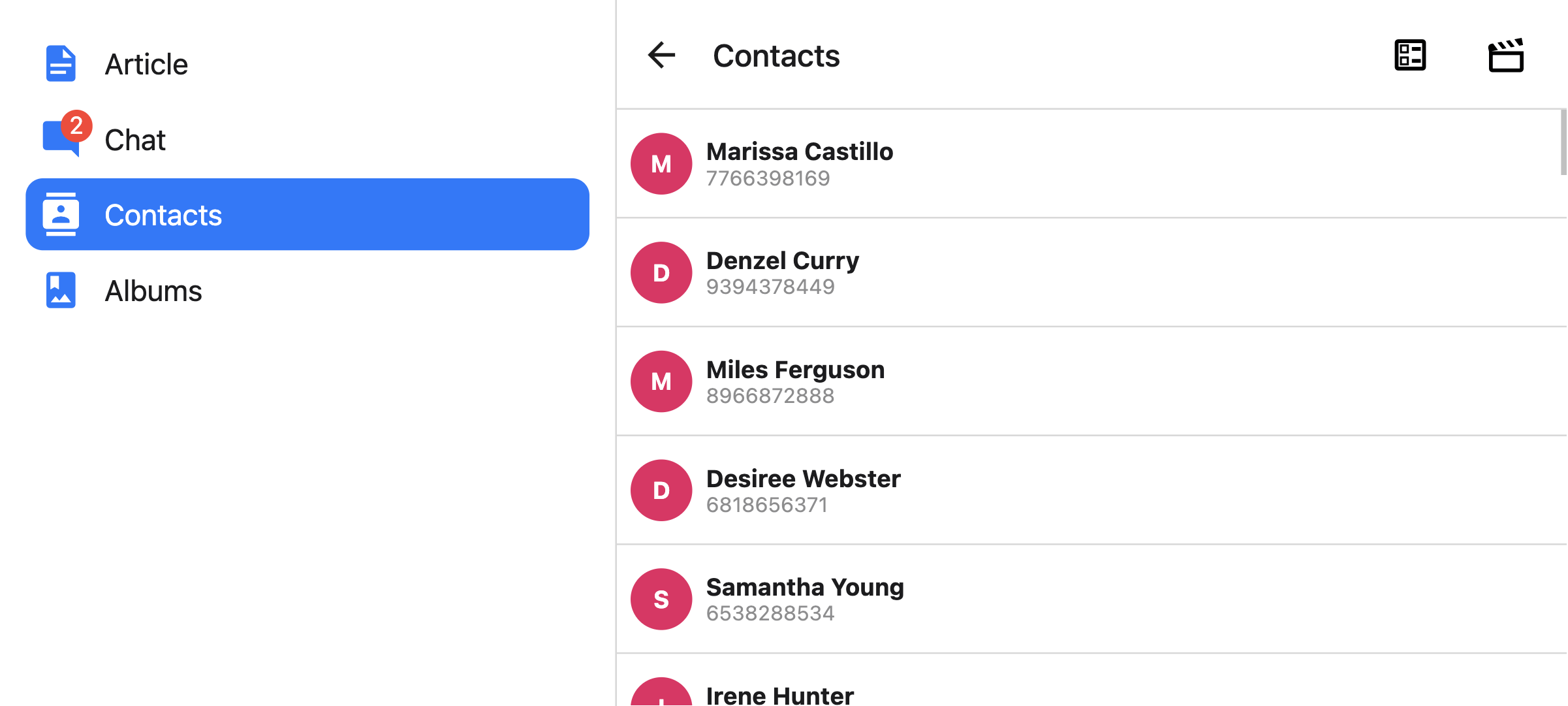 You can also render a compact sidebar by placing the label below the icon. This is only supported when the [`tabBarVariant`](#tabbarvariant) is set to `material`:
```js
const Tabs = createBottomTabNavigator({
screenOptions: {
tabBarPosition: isLargeScreen ? 'left' : 'bottom',
tabBarVariant: isLargeScreen ? 'material' : 'uikit',
tabBarLabelPosition: 'below-icon',
},
// ...
});
```
```js
```
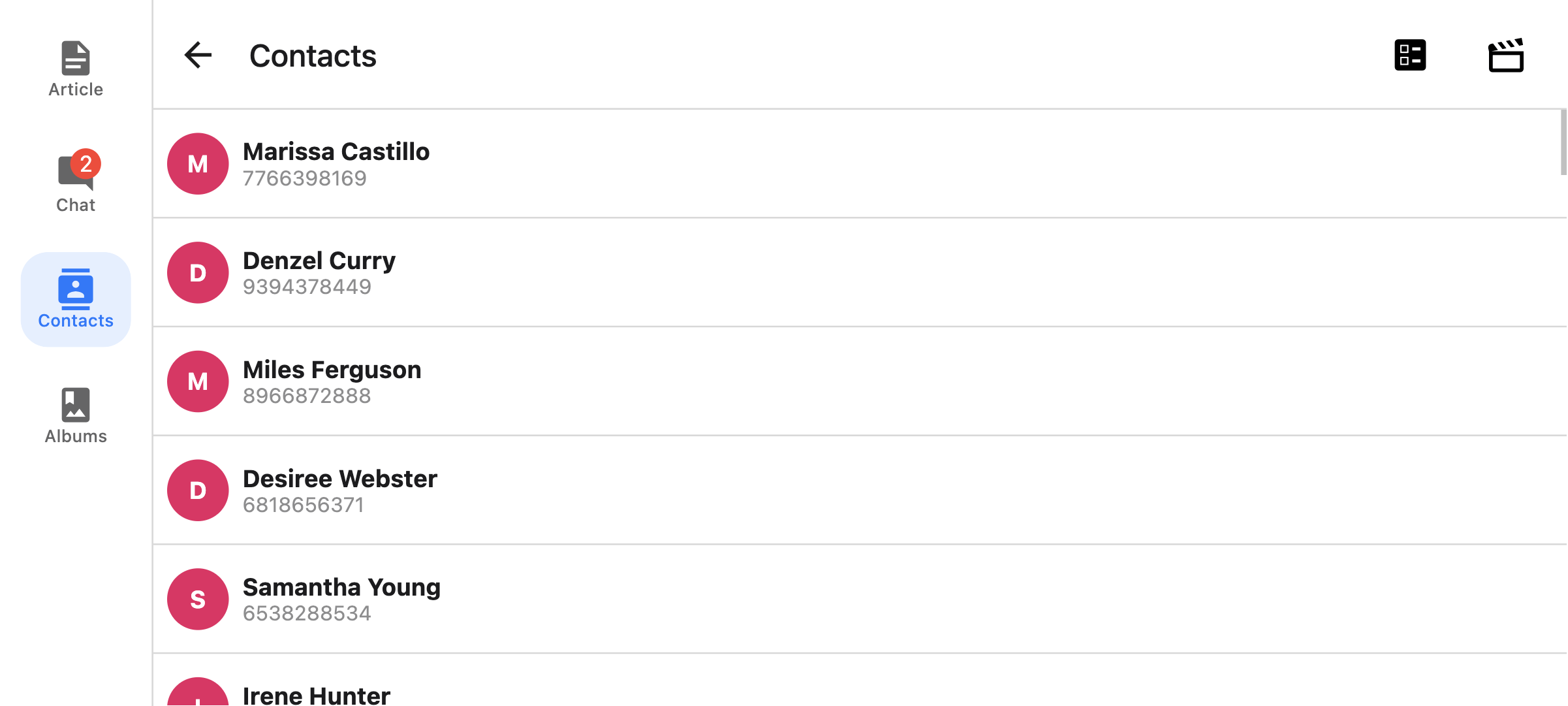
#### `tabBarVariant`
Variant of the tab bar. Available values are:
- `uikit` (Default) - The tab bar will be styled according to the iOS UIKit guidelines.
- `material` - The tab bar will be styled according to the Material Design guidelines.
Only supported with `custom` implementation.
The `material` variant is currently only supported when the [`tabBarPosition`](#tabbarposition) is set to `left` or `right`.
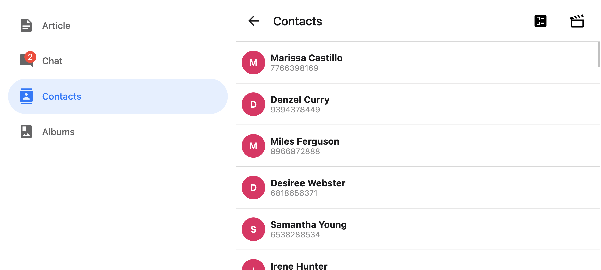
#### `tabBarBlurEffect`
Blur effect applied to the tab bar on iOS 18 and lower when tab screen is selected.
Supported values:
- `none` - no blur effect
- `systemDefault` - default blur effect applied by the system
- `extraLight`
- `light`
- `dark`
- `regular`
- `prominent`
- `systemUltraThinMaterial`
- `systemThinMaterial`
- `systemMaterial`
- `systemThickMaterial`
- `systemChromeMaterial`
- `systemUltraThinMaterialLight`
- `systemThinMaterialLight`
- `systemMaterialLight`
- `systemThickMaterialLight`
- `systemChromeMaterialLight`
- `systemUltraThinMaterialDark`
- `systemThinMaterialDark`
- `systemMaterialDark`
- `systemThickMaterialDark`
- `systemChromeMaterialDark`
Defaults to `systemDefault`.
Only supported with `native` implementation on iOS 18 and below.
#### `tabBarControllerMode`
The display mode for the tab bar. Supported values:
- `auto` - the system sets the display mode based on the tab's content
- `tabBar` - the system displays the content only as a tab bar
- `tabSidebar` - the tab bar is displayed as a sidebar
Supported on all platforms with `custom` implementation. By default:
- `tabBar` is positioned at the bottom
- `tabSidebar` is positioned on the left (LTR) or right (RTL)
The [`tabBarPosition`](#tabbarposition) option can be used to override this in `custom` implementation or for custom [`tabBar`](#tabbar).
Supported on iOS 18 and above with `native` implementation. Not supported on tvOS.
#### `tabBarMinimizeBehavior`
The minimize behavior for the tab bar. Supported values:
- `auto` - resolves to the system default minimize behavior
- `never` - the tab bar does not minimize
- `onScrollDown` - the tab bar minimizes when scrolling down and expands when scrolling back up
- `onScrollUp` - the tab bar minimizes when scrolling up and expands when scrolling back down
Only supported with `native` implementation on iOS 26 and above.
#### `bottomAccessory`
Function that returns a React element to display as an accessory view. The function receives an options object with a `placement` parameter that can be one of the following values:
- `regular` - at bottom of the screen, above the tab bar if tab bar is at the bottom
- `inline` - inline with the collapsed bottom tab bar (e.g., when minimized based on [`tabBarMinimizeBehavior`](#tabbarminimizebehavior))
Example:
```js
bottomAccessory: ({ placement }) => {
return (
Placement: {placement}
);
};
```
Only supported with `native` implementation on iOS 26 and above.
On Android, iOS 18 and below, nothing is rendered. You can either use the [`screenLayout`](navigator.md#screen-layout) or [`layout`](screen.md) props, or render content inside your screen component directly as a fallback.
:::note
The content is rendered twice for both placements, but only one is visible at a time based on the tab bar state. Any shared state should be stored outside of the component to keep both versions in sync.
:::
#### `scrollEdgeEffects`
Configures the scroll edge effect for the _content ScrollView_ (the ScrollView that is present in first descendants chain of the Screen).
Depending on values set, it will blur the scrolling content below certain UI elements (e.g. header items, search bar) for the specified edge of the ScrollView.
When set in nested containers, i.e. Native Stack inside Native Bottom Tabs, or the other way around, the ScrollView will use only the innermost one's config.
Edge effects can be configured for each edge separately. The following values are currently supported:
- `automatic` - the automatic scroll edge effect style,
- `hard` - a scroll edge effect with a hard cutoff and dividing line,
- `soft` - a soft-edged scroll edge effect,
- `hidden` - no scroll edge effect.
Defaults to `automatic` for each edge.
Only supported with `native` implementation on iOS 26 and above.
#### `lazy`
Whether this screen should render only after the first time it's accessed. Defaults to `true`. Set it to `false` if you want to render the screen on the initial render of the navigator.
#### `popToTopOnBlur`
Boolean indicating whether any nested stack should be popped to the top of the stack when navigating away from this tab. Defaults to `false`.
It only works when there is a stack navigator (e.g. [stack navigator](stack-navigator.md) or [native stack navigator](native-stack-navigator.md)) nested under the tab navigator.
#### `sceneStyle`
Style object for the component wrapping the screen content.
### Header related options
The navigator does not show a header by default. It renders a native stack header if `headerShown` is set to `true` in the screen options explicitly, or if a custom header is provided with the `header` option.
You can find the list of header related options [here](elements.md#header). These [options](screen-options.md) can be specified under `screenOptions` prop of `Tab.Navigator` or `options` prop of `Tab.Screen`. You don't have to be using `@react-navigation/elements` directly to use these options, they are just documented in that page.
In addition to those, the following options are also supported in bottom tabs:
#### `header`
Custom header to use instead of the default header.
This accepts a function that returns a React Element to display as a header. The function receives an object containing the following properties as the argument:
- `navigation` - The navigation object for the current screen.
- `route` - The route object for the current screen.
- `options` - The options for the current screen
Example:
```js
import { getHeaderTitle } from '@react-navigation/elements';
// ..
header: ({ navigation, route, options }) => {
const title = getHeaderTitle(options, route.name);
return ;
};
```
To set a custom header for all the screens in the navigator, you can specify this option in the `screenOptions` prop of the navigator.
##### Specify a `height` in `headerStyle`
If your custom header's height differs from the default header height, then you might notice glitches due to measurement being async. Explicitly specifying the height will avoid such glitches.
Example:
```js
headerStyle: {
height: 80, // Specify the height of your custom header
};
```
Note that this style is not applied to the header by default since you control the styling of your custom header. If you also want to apply this style to your header, use `options.headerStyle` from the props.
#### `headerShown`
Whether to show or hide the header for the screen. The header is not shown by default unless a custom header is provided with the `header` option.
### Events
The navigator can [emit events](navigation-events.md) on certain actions. Supported events are:
#### `tabPress`
This event is fired when the user presses the tab button for the current screen in the tab bar. By default a tab press does several things:
- If the tab is not focused, tab press will focus that tab
- If the tab is already focused:
- If the screen for the tab renders a scroll view, you can use [`useScrollToTop`](use-scroll-to-top.md) to scroll it to top
- If the screen for the tab renders a stack navigator, a `popToTop` action is performed on the stack
To prevent the default behavior, you can call `event.preventDefault`.
:::note
Calling `event.preventDefault` is only supported with the `custom` implementation. The default behavior cannot be prevented with the `native` implementation.
:::
```js name="Tab Press Event" snack static2dynamic
import * as React from 'react';
import { Alert, Text, View } from 'react-native';
import {
createStaticNavigation,
useNavigation,
} from '@react-navigation/native';
import { createBottomTabNavigator } from '@react-navigation/bottom-tabs';
function HomeScreen() {
const navigation = useNavigation('Home');
// codeblock-focus-start
React.useEffect(() => {
const unsubscribe = navigation.addListener('tabPress', (e) => {
// Prevent default behavior
e.preventDefault();
// Do something manually
// ...
});
return unsubscribe;
}, [navigation]);
// codeblock-focus-end
return (
Home Screen
Tab press event is prevented
);
}
function SettingsScreen() {
return (
Settings Screen
);
}
const MyTabs = createBottomTabNavigator({
screens: {
Home: HomeScreen,
Settings: SettingsScreen,
},
});
const Navigation = createStaticNavigation(MyTabs);
export default function App() {
return ;
}
```
If you have a custom tab bar, make sure to emit this event.
:::note
By default, tabs are rendered lazily. So if you add a listener inside a screen component, it won't receive the event until the screen is focused for the first time. If you need to listen to this event before the screen is focused, you can specify the [listener in the screen config](navigation-events.md#listeners-prop-on-screen) instead.
:::
#### `tabLongPress`
This event is fired when the user presses the tab button for the current screen in the tab bar for an extended period. If you have a custom tab bar, make sure to emit this event.
Only supported with the `custom` implementation.
Example:
```js
React.useEffect(() => {
const unsubscribe = navigation.addListener('tabLongPress', (e) => {
// Do something
});
return unsubscribe;
}, [navigation]);
```
#### `transitionStart`
This event is fired when a transition animation starts when switching tabs.
Example:
```js
React.useEffect(() => {
const unsubscribe = navigation.addListener('transitionStart', (e) => {
// Do something
});
return unsubscribe;
}, [navigation]);
```
#### `transitionEnd`
This event is fired when a transition animation ends when switching tabs.
Example:
```js
React.useEffect(() => {
const unsubscribe = navigation.addListener('transitionEnd', (e) => {
// Do something
});
return unsubscribe;
}, [navigation]);
```
### Helpers
The tab navigator adds the following methods to the navigation object:
#### `jumpTo`
Navigates to an existing screen in the tab navigator. The method accepts following arguments:
- `name` - _string_ - Name of the route to jump to.
- `params` - _object_ - Screen params to use for the destination route.
```js name="Tab Navigator - jumpTo" snack static2dynamic
import * as React from 'react';
import { Text, View } from 'react-native';
import {
createStaticNavigation,
useNavigation,
} from '@react-navigation/native';
import { Button } from '@react-navigation/elements';
import { createBottomTabNavigator } from '@react-navigation/bottom-tabs';
function HomeScreen() {
const navigation = useNavigation('Home');
return (
Home Screen
);
}
function ProfileScreen({ route }) {
return (
Profile Screen
{route.params?.owner && (
Owner: {route.params.owner}
)}
);
}
const MyTabs = createBottomTabNavigator({
screens: {
Home: HomeScreen,
Profile: ProfileScreen,
},
});
const Navigation = createStaticNavigation(MyTabs);
export default function App() {
return ;
}
```
### Hooks
The bottom tab navigator exports the following hooks:
#### `useBottomTabBarHeight`
This hook returns the height of the bottom tab bar. By default, the screen content doesn't go under the tab bar. However, if you want to make the tab bar absolutely positioned and have the content go under it (e.g. to show a blur effect), it's necessary to adjust the content to take the tab bar height into account.
Example:
```js
import { useBottomTabBarHeight } from '@react-navigation/bottom-tabs';
function MyComponent() {
const tabBarHeight = useBottomTabBarHeight();
return (
{/* Content */}
);
}
```
Alternatively, you can use the `BottomTabBarHeightContext` directly if you are using a class component or need it in a reusable component that can be used outside the bottom tab navigator:
```js
import { BottomTabBarHeightContext } from '@react-navigation/bottom-tabs';
// ...
{tabBarHeight => (
/* render something */
)}
```
## Animations
By default, switching between tabs doesn't have any animation. You can specify the `animation` option to customize the transition animation.
:::note
Customizing animations are only supported with the `custom` implementation.
:::
Supported values for `animation` are:
- `fade` - Cross-fade animation for the screen transition where the new screen fades in and the old screen fades out.
- `shift` - Shifting animation for the screen transition where the screens slightly shift to left/right.
- `none` - The screen transition doesn't have any animation. This is the default value.
```js name="Bottom Tabs animation" snack static2dynamic
import * as React from 'react';
import { View, Text, Easing } from 'react-native';
import { createStaticNavigation } from '@react-navigation/native';
import { createBottomTabNavigator } from '@react-navigation/bottom-tabs';
function HomeScreen() {
return (
Home!
);
}
function ProfileScreen() {
return (
Profile!
);
}
// codeblock-focus-start
const RootTabs = createBottomTabNavigator({
screenOptions: {
// highlight-start
animation: 'fade',
// highlight-end
},
screens: {
Home: HomeScreen,
Profile: ProfileScreen,
},
});
// codeblock-focus-end
const Navigation = createStaticNavigation(RootTabs);
export default function App() {
return ;
}
```
If you need more control over the animation, you can customize individual parts of the animation using the various animation-related options:
### Animation related options
Bottom Tab Navigator exposes various options to configure the transition animation when switching tabs. These transition animations can be customized on a per-screen basis by specifying the options in the `options` for each screen, or for all screens in the tab navigator by specifying them in the `screenOptions`.
- `transitionSpec` - An object that specifies the animation type (`timing` or `spring`) and its options (such as `duration` for `timing`). It contains 2 properties:
- `animation` - The animation function to use for the animation. Supported values are `timing` and `spring`.
- `config` - The configuration object for the timing function. For `timing`, it can be `duration` and `easing`. For `spring`, it can be `stiffness`, `damping`, `mass`, `overshootClamping`, `restDisplacementThreshold` and `restSpeedThreshold`.
A config that uses a timing animation looks like this:
```js
const config = {
animation: 'timing',
config: {
duration: 150,
easing: Easing.inOut(Easing.ease),
},
};
```
We can pass this config in the `transitionSpec` option:
```js
{
Profile: {
screen: Profile,
options: {
// highlight-start
transitionSpec: {
animation: 'timing',
config: {
duration: 150,
easing: Easing.inOut(Easing.ease),
},
},
// highlight-end
},
},
}
```
```js
```
- `sceneStyleInterpolator` - This is a function that specifies interpolated styles for various parts of the scene. It currently supports style for the view containing the screen:
- `sceneStyle` - Style for the container view wrapping the screen content.
The function receives the following properties in its argument:
- `current` - Animation values for the current screen:
- `progress` - Animated node representing the progress value of the current screen.
A config that fades the screen looks like this:
```js
const forFade = ({ current }) => ({
sceneStyle: {
opacity: current.progress.interpolate({
inputRange: [-1, 0, 1],
outputRange: [0, 1, 0],
}),
},
});
```
The value of `current.progress` is as follows:
- -1 if the index is lower than the active tab,
- 0 if they're active,
- 1 if the index is higher than the active tab
We can pass this function in `sceneStyleInterpolator` option:
```js
{
Profile: {
screen: Profile,
options: {
// highlight-start
sceneStyleInterpolator: ({ current }) => ({
sceneStyle: {
opacity: current.progress.interpolate({
inputRange: [-1, 0, 1],
outputRange: [0, 1, 0],
}),
},
}),
// highlight-end
},
},
}
```
```js
({
sceneStyle: {
opacity: current.progress.interpolate({
inputRange: [-1, 0, 1],
outputRange: [0, 1, 0],
}),
},
}),
// highlight-end
}}
/>
```
Putting these together, you can customize the transition animation for a screen:
Putting these together, you can customize the transition animation for a screen:
```js name="Bottom Tabs custom animation" snack static2dynamic
import * as React from 'react';
import { View, Text, Easing } from 'react-native';
import { createStaticNavigation } from '@react-navigation/native';
import { createBottomTabNavigator } from '@react-navigation/bottom-tabs';
function HomeScreen() {
return (
Home!
);
}
function ProfileScreen() {
return (
Profile!
);
}
// codeblock-focus-start
const RootTabs = createBottomTabNavigator({
screenOptions: {
transitionSpec: {
animation: 'timing',
config: {
duration: 150,
easing: Easing.inOut(Easing.ease),
},
},
sceneStyleInterpolator: ({ current }) => ({
sceneStyle: {
opacity: current.progress.interpolate({
inputRange: [-1, 0, 1],
outputRange: [0, 1, 0],
}),
},
}),
},
screens: {
Home: HomeScreen,
Profile: ProfileScreen,
},
});
// codeblock-focus-end
const Navigation = createStaticNavigation(RootTabs);
export default function App() {
return ;
}
```
### Pre-made configs
We also export various configs from the library with ready-made configs that you can use to customize the animations:
#### `TransitionSpecs`
- `FadeSpec` - Configuration for a cross-fade animation between screens.
- `ShiftSpec` - Configuration for a shifting animation between screens.
Example:
```js
import { TransitionSpecs } from '@react-navigation/bottom-tabs';
// ...
{
Profile: {
screen: Profile,
options: {
// highlight-start
transitionSpec: TransitionSpecs.CrossFadeSpec,
// highlight-end
},
},
}
```
```js
import { TransitionSpecs } from '@react-navigation/bottom-tabs';
// ...
;
```
#### `SceneStyleInterpolators`
- `forFade` - Cross-fade animation for the screen transition where the new screen fades in and the old screen fades out.
- `forShift` - Shifting animation for the screen transition where the screens slightly shift to left/right.
Example:
```js
import { SceneStyleInterpolators } from '@react-navigation/bottom-tabs';
// ...
{
Profile: {
screen: Profile,
options: {
// highlight-start
sceneStyleInterpolator: SceneStyleInterpolators.forFade,
// highlight-end
},
},
}
```
```js
import { SceneStyleInterpolators } from '@react-navigation/bottom-tabs';
// ...
;
```
#### `TransitionPresets`
We export transition presets that bundle various sets of these options together. A transition preset is an object containing a few animation-related screen options exported under `TransitionPresets`. Currently the following presets are available:
- `FadeTransition` - Cross-fade animation for the screen transition where the new screen fades in and the old screen fades out.
- `ShiftTransition` - Shifting animation for the screen transition where the screens slightly shift to left/right.
You can spread these presets in `options` to customize the animation for a screen:
Example:
```js
import { TransitionPresets } from '@react-navigation/bottom-tabs';
// ...
{
Profile: {
screen: Profile,
options: {
// highlight-start
...TransitionPresets.FadeTransition,
// highlight-end
},
},
}
```
```js
import { TransitionPresets } from '@react-navigation/bottom-tabs';
// ...
;
```
---
## Drawer Navigator
Source: https://reactnavigation.org/docs/8.x/drawer-navigator
Drawer Navigator renders a navigation drawer on the side of the screen which can be opened and closed via gestures.
This wraps [`react-native-drawer-layout`](drawer-layout.md). If you want to use the drawer without React Navigation integration, use the library directly instead.
## Installation
To use this navigator, ensure that you have [`@react-navigation/native` and its dependencies (follow this guide)](getting-started.md), then install [`@react-navigation/drawer`](https://github.com/react-navigation/react-navigation/tree/main/packages/drawer):
```bash npm2yarn
npm install @react-navigation/drawer@next
```
The navigator depends on [`react-native-gesture-handler`](https://docs.swmansion.com/react-native-gesture-handler/) for gestures and [`react-native-reanimated`](https://docs.swmansion.com/react-native-reanimated/) for animations.
If you have a Expo managed project, in your project directory, run:
```bash
npx expo install react-native-gesture-handler react-native-reanimated react-native-worklets
```
If you have a bare React Native project, in your project directory, run:
```bash npm2yarn
npm install react-native-gesture-handler react-native-reanimated react-native-worklets
```
After installation, configure the Reanimated Babel Plugin in your project following the [installation guide](https://docs.swmansion.com/react-native-reanimated/docs/fundamentals/getting-started).
If you're on a Mac and developing for iOS, you also need to install [pods](https://cocoapods.org/) to complete the linking.
```bash
npx pod-install ios
```
## Usage
To use this navigator, import it from `@react-navigation/drawer`:
```js name="Drawer Navigator" snack static2dynamic
import * as React from 'react';
import { Text, View } from 'react-native';
import {
createStaticNavigation,
useNavigation,
} from '@react-navigation/native';
import { Button } from '@react-navigation/elements';
// codeblock-focus-start
import { createDrawerNavigator } from '@react-navigation/drawer';
// codeblock-focus-end
function HomeScreen() {
const navigation = useNavigation('Home');
return (
Home Screen
);
}
function ProfileScreen() {
const navigation = useNavigation('Profile');
return (
Profile Screen
);
}
// codeblock-focus-start
const MyDrawer = createDrawerNavigator({
screens: {
Home: HomeScreen,
Profile: ProfileScreen,
},
});
// codeblock-focus-end
const Navigation = createStaticNavigation(MyDrawer);
export default function App() {
return ;
}
```
## API Definition
### Props
In addition to the [common props](navigator.md#configuration) shared by all navigators, the drawer navigator component accepts the following additional props:
#### `backBehavior`
This controls what happens when `goBack` is called in the navigator. This includes pressing the device's back button or back gesture on Android.
It supports the following values:
- `firstRoute` - return to the first screen defined in the navigator (default)
- `initialRoute` - return to initial screen passed in `initialRouteName` prop, if not passed, defaults to the first screen
- `order` - return to screen defined before the focused screen
- `history` - return to last visited screen in the navigator; if the same screen is visited multiple times, the older entries are dropped from the history
- `fullHistory` - return to last visited screen in the navigator; doesn't drop duplicate entries unlike `history` - this behavior is useful to match how web pages work
- `none` - do not handle back button
#### `defaultStatus`
The default status of the drawer - whether the drawer should stay `open` or `closed` by default.
When this is set to `open`, the drawer will be open from the initial render. It can be closed normally using gestures or programmatically. However, when going back, the drawer will re-open if it was closed. This is essentially the opposite of the default behavior of the drawer where it starts `closed`, and the back button closes an open drawer.
#### `detachInactiveScreens`
Boolean used to indicate whether inactive screens should be detached from the view hierarchy to save memory. This enables integration with [react-native-screens](https://github.com/software-mansion/react-native-screens). Defaults to `true`.
#### `drawerContent`
Function that returns React element to render as the content of the drawer, for example, navigation items
The content component receives the following props by default:
- `state` - The [navigation state](navigation-state.md) of the navigator.
- `navigation` - The navigation object for the navigator.
- `descriptors` - An descriptor object containing options for the drawer screens. The options can be accessed at `descriptors[route.key].options`.
##### Providing a custom `drawerContent`
The default component for the drawer is scrollable and only contains links for the routes in the RouteConfig. You can easily override the default component to add a header, footer, or other content to the drawer. The default content component is exported as `DrawerContent`. It renders a `DrawerItemList` component inside a `ScrollView`.
By default, the drawer is scrollable and supports devices with notches. If you customize the content, you can use `DrawerContentScrollView` to handle this automatically:
```js
import {
DrawerContentScrollView,
DrawerItemList,
} from '@react-navigation/drawer';
function CustomDrawerContent(props) {
return (
);
}
```
To add additional items in the drawer, you can use the `DrawerItem` component:
```js name="Custom Drawer Content" snack static2dynamic
import * as React from 'react';
import { Text, View, Linking } from 'react-native';
import { createStaticNavigation } from '@react-navigation/native';
import {
createDrawerNavigator,
DrawerContentScrollView,
DrawerItemList,
DrawerItem,
} from '@react-navigation/drawer';
function HomeScreen() {
return (
Home Screen
);
}
function SettingsScreen() {
return (
Settings Screen
);
}
// codeblock-focus-start
function CustomDrawerContent(props) {
return (
Linking.openURL('https://mywebsite.com/help')}
/>
);
}
// codeblock-focus-end
const MyDrawer = createDrawerNavigator({
drawerContent: (props) => ,
screens: {
Home: HomeScreen,
Settings: SettingsScreen,
},
});
const Navigation = createStaticNavigation(MyDrawer);
export default function App() {
return ;
}
```
The `DrawerItem` component accepts the following props:
- `label` (required): The label text of the item. Can be string, or a function returning a react element. e.g. `({ focused, color }) => {focused ? 'Focused text' : 'Unfocused text'}`.
- `icon`: Icon to display for the item. Accepts a function returning a react element. e.g. `({ focused, color, size }) => `.
- `focused`: Boolean indicating whether to highlight the drawer item as active.
- `onPress` (required): Function to execute on press.
- `activeTintColor`: Color for the icon and label when the item is active.
- `inactiveTintColor`: Color for the icon and label when the item is inactive.
- `activeBackgroundColor`: Background color for item when it's active.
- `inactiveBackgroundColor`: Background color for item when it's inactive.
- `labelStyle`: Style object for the label `Text`.
- `style`: Style object for the wrapper `View`.
Note that you **cannot** use the `useNavigation` hook inside the `drawerContent` since `useNavigation` is only available inside screens. You get a `navigation` prop for your `drawerContent` which you can use instead:
```js
function CustomDrawerContent({ navigation }) {
return (
);
}
```
To use the custom component, we need to pass it in the `drawerContent` prop:
```js
}>
{/* screens */}
```
### Options
The following [options](screen-options.md) can be used to configure the screens in the navigator. These can be specified under `screenOptions` prop of `Drawer.Navigator` or `options` prop of `Drawer.Screen`.
#### `title`
A generic title that can be used as a fallback for `headerTitle` and `drawerLabel`.
#### `lazy`
Whether this screen should render the first time it's accessed. Defaults to `true`. Set it to `false` if you want to render the screen on initial render.
#### `drawerLabel`
String or a function that given `{ focused: boolean, color: string }` returns a React.Node, to display in drawer sidebar. When undefined, scene `title` is used.
#### `drawerIcon`
Function, that given `{ focused: boolean, color: string, size: number }` returns a React.Node to display in drawer sidebar.
#### `drawerActiveTintColor`
Color for the icon and label in the active item in the drawer.
You can also render a compact sidebar by placing the label below the icon. This is only supported when the [`tabBarVariant`](#tabbarvariant) is set to `material`:
```js
const Tabs = createBottomTabNavigator({
screenOptions: {
tabBarPosition: isLargeScreen ? 'left' : 'bottom',
tabBarVariant: isLargeScreen ? 'material' : 'uikit',
tabBarLabelPosition: 'below-icon',
},
// ...
});
```
```js
```

#### `tabBarVariant`
Variant of the tab bar. Available values are:
- `uikit` (Default) - The tab bar will be styled according to the iOS UIKit guidelines.
- `material` - The tab bar will be styled according to the Material Design guidelines.
Only supported with `custom` implementation.
The `material` variant is currently only supported when the [`tabBarPosition`](#tabbarposition) is set to `left` or `right`.

#### `tabBarBlurEffect`
Blur effect applied to the tab bar on iOS 18 and lower when tab screen is selected.
Supported values:
- `none` - no blur effect
- `systemDefault` - default blur effect applied by the system
- `extraLight`
- `light`
- `dark`
- `regular`
- `prominent`
- `systemUltraThinMaterial`
- `systemThinMaterial`
- `systemMaterial`
- `systemThickMaterial`
- `systemChromeMaterial`
- `systemUltraThinMaterialLight`
- `systemThinMaterialLight`
- `systemMaterialLight`
- `systemThickMaterialLight`
- `systemChromeMaterialLight`
- `systemUltraThinMaterialDark`
- `systemThinMaterialDark`
- `systemMaterialDark`
- `systemThickMaterialDark`
- `systemChromeMaterialDark`
Defaults to `systemDefault`.
Only supported with `native` implementation on iOS 18 and below.
#### `tabBarControllerMode`
The display mode for the tab bar. Supported values:
- `auto` - the system sets the display mode based on the tab's content
- `tabBar` - the system displays the content only as a tab bar
- `tabSidebar` - the tab bar is displayed as a sidebar
Supported on all platforms with `custom` implementation. By default:
- `tabBar` is positioned at the bottom
- `tabSidebar` is positioned on the left (LTR) or right (RTL)
The [`tabBarPosition`](#tabbarposition) option can be used to override this in `custom` implementation or for custom [`tabBar`](#tabbar).
Supported on iOS 18 and above with `native` implementation. Not supported on tvOS.
#### `tabBarMinimizeBehavior`
The minimize behavior for the tab bar. Supported values:
- `auto` - resolves to the system default minimize behavior
- `never` - the tab bar does not minimize
- `onScrollDown` - the tab bar minimizes when scrolling down and expands when scrolling back up
- `onScrollUp` - the tab bar minimizes when scrolling up and expands when scrolling back down
Only supported with `native` implementation on iOS 26 and above.
#### `bottomAccessory`
Function that returns a React element to display as an accessory view. The function receives an options object with a `placement` parameter that can be one of the following values:
- `regular` - at bottom of the screen, above the tab bar if tab bar is at the bottom
- `inline` - inline with the collapsed bottom tab bar (e.g., when minimized based on [`tabBarMinimizeBehavior`](#tabbarminimizebehavior))
Example:
```js
bottomAccessory: ({ placement }) => {
return (
Placement: {placement}
);
};
```
Only supported with `native` implementation on iOS 26 and above.
On Android, iOS 18 and below, nothing is rendered. You can either use the [`screenLayout`](navigator.md#screen-layout) or [`layout`](screen.md) props, or render content inside your screen component directly as a fallback.
:::note
The content is rendered twice for both placements, but only one is visible at a time based on the tab bar state. Any shared state should be stored outside of the component to keep both versions in sync.
:::
#### `scrollEdgeEffects`
Configures the scroll edge effect for the _content ScrollView_ (the ScrollView that is present in first descendants chain of the Screen).
Depending on values set, it will blur the scrolling content below certain UI elements (e.g. header items, search bar) for the specified edge of the ScrollView.
When set in nested containers, i.e. Native Stack inside Native Bottom Tabs, or the other way around, the ScrollView will use only the innermost one's config.
Edge effects can be configured for each edge separately. The following values are currently supported:
- `automatic` - the automatic scroll edge effect style,
- `hard` - a scroll edge effect with a hard cutoff and dividing line,
- `soft` - a soft-edged scroll edge effect,
- `hidden` - no scroll edge effect.
Defaults to `automatic` for each edge.
Only supported with `native` implementation on iOS 26 and above.
#### `lazy`
Whether this screen should render only after the first time it's accessed. Defaults to `true`. Set it to `false` if you want to render the screen on the initial render of the navigator.
#### `popToTopOnBlur`
Boolean indicating whether any nested stack should be popped to the top of the stack when navigating away from this tab. Defaults to `false`.
It only works when there is a stack navigator (e.g. [stack navigator](stack-navigator.md) or [native stack navigator](native-stack-navigator.md)) nested under the tab navigator.
#### `sceneStyle`
Style object for the component wrapping the screen content.
### Header related options
The navigator does not show a header by default. It renders a native stack header if `headerShown` is set to `true` in the screen options explicitly, or if a custom header is provided with the `header` option.
You can find the list of header related options [here](elements.md#header). These [options](screen-options.md) can be specified under `screenOptions` prop of `Tab.Navigator` or `options` prop of `Tab.Screen`. You don't have to be using `@react-navigation/elements` directly to use these options, they are just documented in that page.
In addition to those, the following options are also supported in bottom tabs:
#### `header`
Custom header to use instead of the default header.
This accepts a function that returns a React Element to display as a header. The function receives an object containing the following properties as the argument:
- `navigation` - The navigation object for the current screen.
- `route` - The route object for the current screen.
- `options` - The options for the current screen
Example:
```js
import { getHeaderTitle } from '@react-navigation/elements';
// ..
header: ({ navigation, route, options }) => {
const title = getHeaderTitle(options, route.name);
return ;
};
```
To set a custom header for all the screens in the navigator, you can specify this option in the `screenOptions` prop of the navigator.
##### Specify a `height` in `headerStyle`
If your custom header's height differs from the default header height, then you might notice glitches due to measurement being async. Explicitly specifying the height will avoid such glitches.
Example:
```js
headerStyle: {
height: 80, // Specify the height of your custom header
};
```
Note that this style is not applied to the header by default since you control the styling of your custom header. If you also want to apply this style to your header, use `options.headerStyle` from the props.
#### `headerShown`
Whether to show or hide the header for the screen. The header is not shown by default unless a custom header is provided with the `header` option.
### Events
The navigator can [emit events](navigation-events.md) on certain actions. Supported events are:
#### `tabPress`
This event is fired when the user presses the tab button for the current screen in the tab bar. By default a tab press does several things:
- If the tab is not focused, tab press will focus that tab
- If the tab is already focused:
- If the screen for the tab renders a scroll view, you can use [`useScrollToTop`](use-scroll-to-top.md) to scroll it to top
- If the screen for the tab renders a stack navigator, a `popToTop` action is performed on the stack
To prevent the default behavior, you can call `event.preventDefault`.
:::note
Calling `event.preventDefault` is only supported with the `custom` implementation. The default behavior cannot be prevented with the `native` implementation.
:::
```js name="Tab Press Event" snack static2dynamic
import * as React from 'react';
import { Alert, Text, View } from 'react-native';
import {
createStaticNavigation,
useNavigation,
} from '@react-navigation/native';
import { createBottomTabNavigator } from '@react-navigation/bottom-tabs';
function HomeScreen() {
const navigation = useNavigation('Home');
// codeblock-focus-start
React.useEffect(() => {
const unsubscribe = navigation.addListener('tabPress', (e) => {
// Prevent default behavior
e.preventDefault();
// Do something manually
// ...
});
return unsubscribe;
}, [navigation]);
// codeblock-focus-end
return (
Home Screen
Tab press event is prevented
);
}
function SettingsScreen() {
return (
Settings Screen
);
}
const MyTabs = createBottomTabNavigator({
screens: {
Home: HomeScreen,
Settings: SettingsScreen,
},
});
const Navigation = createStaticNavigation(MyTabs);
export default function App() {
return ;
}
```
If you have a custom tab bar, make sure to emit this event.
:::note
By default, tabs are rendered lazily. So if you add a listener inside a screen component, it won't receive the event until the screen is focused for the first time. If you need to listen to this event before the screen is focused, you can specify the [listener in the screen config](navigation-events.md#listeners-prop-on-screen) instead.
:::
#### `tabLongPress`
This event is fired when the user presses the tab button for the current screen in the tab bar for an extended period. If you have a custom tab bar, make sure to emit this event.
Only supported with the `custom` implementation.
Example:
```js
React.useEffect(() => {
const unsubscribe = navigation.addListener('tabLongPress', (e) => {
// Do something
});
return unsubscribe;
}, [navigation]);
```
#### `transitionStart`
This event is fired when a transition animation starts when switching tabs.
Example:
```js
React.useEffect(() => {
const unsubscribe = navigation.addListener('transitionStart', (e) => {
// Do something
});
return unsubscribe;
}, [navigation]);
```
#### `transitionEnd`
This event is fired when a transition animation ends when switching tabs.
Example:
```js
React.useEffect(() => {
const unsubscribe = navigation.addListener('transitionEnd', (e) => {
// Do something
});
return unsubscribe;
}, [navigation]);
```
### Helpers
The tab navigator adds the following methods to the navigation object:
#### `jumpTo`
Navigates to an existing screen in the tab navigator. The method accepts following arguments:
- `name` - _string_ - Name of the route to jump to.
- `params` - _object_ - Screen params to use for the destination route.
```js name="Tab Navigator - jumpTo" snack static2dynamic
import * as React from 'react';
import { Text, View } from 'react-native';
import {
createStaticNavigation,
useNavigation,
} from '@react-navigation/native';
import { Button } from '@react-navigation/elements';
import { createBottomTabNavigator } from '@react-navigation/bottom-tabs';
function HomeScreen() {
const navigation = useNavigation('Home');
return (
Home Screen
);
}
function ProfileScreen({ route }) {
return (
Profile Screen
{route.params?.owner && (
Owner: {route.params.owner}
)}
);
}
const MyTabs = createBottomTabNavigator({
screens: {
Home: HomeScreen,
Profile: ProfileScreen,
},
});
const Navigation = createStaticNavigation(MyTabs);
export default function App() {
return ;
}
```
### Hooks
The bottom tab navigator exports the following hooks:
#### `useBottomTabBarHeight`
This hook returns the height of the bottom tab bar. By default, the screen content doesn't go under the tab bar. However, if you want to make the tab bar absolutely positioned and have the content go under it (e.g. to show a blur effect), it's necessary to adjust the content to take the tab bar height into account.
Example:
```js
import { useBottomTabBarHeight } from '@react-navigation/bottom-tabs';
function MyComponent() {
const tabBarHeight = useBottomTabBarHeight();
return (
{/* Content */}
);
}
```
Alternatively, you can use the `BottomTabBarHeightContext` directly if you are using a class component or need it in a reusable component that can be used outside the bottom tab navigator:
```js
import { BottomTabBarHeightContext } from '@react-navigation/bottom-tabs';
// ...
{tabBarHeight => (
/* render something */
)}
```
## Animations
By default, switching between tabs doesn't have any animation. You can specify the `animation` option to customize the transition animation.
:::note
Customizing animations are only supported with the `custom` implementation.
:::
Supported values for `animation` are:
- `fade` - Cross-fade animation for the screen transition where the new screen fades in and the old screen fades out.
- `shift` - Shifting animation for the screen transition where the screens slightly shift to left/right.
- `none` - The screen transition doesn't have any animation. This is the default value.
```js name="Bottom Tabs animation" snack static2dynamic
import * as React from 'react';
import { View, Text, Easing } from 'react-native';
import { createStaticNavigation } from '@react-navigation/native';
import { createBottomTabNavigator } from '@react-navigation/bottom-tabs';
function HomeScreen() {
return (
Home!
);
}
function ProfileScreen() {
return (
Profile!
);
}
// codeblock-focus-start
const RootTabs = createBottomTabNavigator({
screenOptions: {
// highlight-start
animation: 'fade',
// highlight-end
},
screens: {
Home: HomeScreen,
Profile: ProfileScreen,
},
});
// codeblock-focus-end
const Navigation = createStaticNavigation(RootTabs);
export default function App() {
return ;
}
```
If you need more control over the animation, you can customize individual parts of the animation using the various animation-related options:
### Animation related options
Bottom Tab Navigator exposes various options to configure the transition animation when switching tabs. These transition animations can be customized on a per-screen basis by specifying the options in the `options` for each screen, or for all screens in the tab navigator by specifying them in the `screenOptions`.
- `transitionSpec` - An object that specifies the animation type (`timing` or `spring`) and its options (such as `duration` for `timing`). It contains 2 properties:
- `animation` - The animation function to use for the animation. Supported values are `timing` and `spring`.
- `config` - The configuration object for the timing function. For `timing`, it can be `duration` and `easing`. For `spring`, it can be `stiffness`, `damping`, `mass`, `overshootClamping`, `restDisplacementThreshold` and `restSpeedThreshold`.
A config that uses a timing animation looks like this:
```js
const config = {
animation: 'timing',
config: {
duration: 150,
easing: Easing.inOut(Easing.ease),
},
};
```
We can pass this config in the `transitionSpec` option:
```js
{
Profile: {
screen: Profile,
options: {
// highlight-start
transitionSpec: {
animation: 'timing',
config: {
duration: 150,
easing: Easing.inOut(Easing.ease),
},
},
// highlight-end
},
},
}
```
```js
```
- `sceneStyleInterpolator` - This is a function that specifies interpolated styles for various parts of the scene. It currently supports style for the view containing the screen:
- `sceneStyle` - Style for the container view wrapping the screen content.
The function receives the following properties in its argument:
- `current` - Animation values for the current screen:
- `progress` - Animated node representing the progress value of the current screen.
A config that fades the screen looks like this:
```js
const forFade = ({ current }) => ({
sceneStyle: {
opacity: current.progress.interpolate({
inputRange: [-1, 0, 1],
outputRange: [0, 1, 0],
}),
},
});
```
The value of `current.progress` is as follows:
- -1 if the index is lower than the active tab,
- 0 if they're active,
- 1 if the index is higher than the active tab
We can pass this function in `sceneStyleInterpolator` option:
```js
{
Profile: {
screen: Profile,
options: {
// highlight-start
sceneStyleInterpolator: ({ current }) => ({
sceneStyle: {
opacity: current.progress.interpolate({
inputRange: [-1, 0, 1],
outputRange: [0, 1, 0],
}),
},
}),
// highlight-end
},
},
}
```
```js
({
sceneStyle: {
opacity: current.progress.interpolate({
inputRange: [-1, 0, 1],
outputRange: [0, 1, 0],
}),
},
}),
// highlight-end
}}
/>
```
Putting these together, you can customize the transition animation for a screen:
Putting these together, you can customize the transition animation for a screen:
```js name="Bottom Tabs custom animation" snack static2dynamic
import * as React from 'react';
import { View, Text, Easing } from 'react-native';
import { createStaticNavigation } from '@react-navigation/native';
import { createBottomTabNavigator } from '@react-navigation/bottom-tabs';
function HomeScreen() {
return (
Home!
);
}
function ProfileScreen() {
return (
Profile!
);
}
// codeblock-focus-start
const RootTabs = createBottomTabNavigator({
screenOptions: {
transitionSpec: {
animation: 'timing',
config: {
duration: 150,
easing: Easing.inOut(Easing.ease),
},
},
sceneStyleInterpolator: ({ current }) => ({
sceneStyle: {
opacity: current.progress.interpolate({
inputRange: [-1, 0, 1],
outputRange: [0, 1, 0],
}),
},
}),
},
screens: {
Home: HomeScreen,
Profile: ProfileScreen,
},
});
// codeblock-focus-end
const Navigation = createStaticNavigation(RootTabs);
export default function App() {
return ;
}
```
### Pre-made configs
We also export various configs from the library with ready-made configs that you can use to customize the animations:
#### `TransitionSpecs`
- `FadeSpec` - Configuration for a cross-fade animation between screens.
- `ShiftSpec` - Configuration for a shifting animation between screens.
Example:
```js
import { TransitionSpecs } from '@react-navigation/bottom-tabs';
// ...
{
Profile: {
screen: Profile,
options: {
// highlight-start
transitionSpec: TransitionSpecs.CrossFadeSpec,
// highlight-end
},
},
}
```
```js
import { TransitionSpecs } from '@react-navigation/bottom-tabs';
// ...
;
```
#### `SceneStyleInterpolators`
- `forFade` - Cross-fade animation for the screen transition where the new screen fades in and the old screen fades out.
- `forShift` - Shifting animation for the screen transition where the screens slightly shift to left/right.
Example:
```js
import { SceneStyleInterpolators } from '@react-navigation/bottom-tabs';
// ...
{
Profile: {
screen: Profile,
options: {
// highlight-start
sceneStyleInterpolator: SceneStyleInterpolators.forFade,
// highlight-end
},
},
}
```
```js
import { SceneStyleInterpolators } from '@react-navigation/bottom-tabs';
// ...
;
```
#### `TransitionPresets`
We export transition presets that bundle various sets of these options together. A transition preset is an object containing a few animation-related screen options exported under `TransitionPresets`. Currently the following presets are available:
- `FadeTransition` - Cross-fade animation for the screen transition where the new screen fades in and the old screen fades out.
- `ShiftTransition` - Shifting animation for the screen transition where the screens slightly shift to left/right.
You can spread these presets in `options` to customize the animation for a screen:
Example:
```js
import { TransitionPresets } from '@react-navigation/bottom-tabs';
// ...
{
Profile: {
screen: Profile,
options: {
// highlight-start
...TransitionPresets.FadeTransition,
// highlight-end
},
},
}
```
```js
import { TransitionPresets } from '@react-navigation/bottom-tabs';
// ...
;
```
---
## Drawer Navigator
Source: https://reactnavigation.org/docs/8.x/drawer-navigator
Drawer Navigator renders a navigation drawer on the side of the screen which can be opened and closed via gestures.
This wraps [`react-native-drawer-layout`](drawer-layout.md). If you want to use the drawer without React Navigation integration, use the library directly instead.
## Installation
To use this navigator, ensure that you have [`@react-navigation/native` and its dependencies (follow this guide)](getting-started.md), then install [`@react-navigation/drawer`](https://github.com/react-navigation/react-navigation/tree/main/packages/drawer):
```bash npm2yarn
npm install @react-navigation/drawer@next
```
The navigator depends on [`react-native-gesture-handler`](https://docs.swmansion.com/react-native-gesture-handler/) for gestures and [`react-native-reanimated`](https://docs.swmansion.com/react-native-reanimated/) for animations.
If you have a Expo managed project, in your project directory, run:
```bash
npx expo install react-native-gesture-handler react-native-reanimated react-native-worklets
```
If you have a bare React Native project, in your project directory, run:
```bash npm2yarn
npm install react-native-gesture-handler react-native-reanimated react-native-worklets
```
After installation, configure the Reanimated Babel Plugin in your project following the [installation guide](https://docs.swmansion.com/react-native-reanimated/docs/fundamentals/getting-started).
If you're on a Mac and developing for iOS, you also need to install [pods](https://cocoapods.org/) to complete the linking.
```bash
npx pod-install ios
```
## Usage
To use this navigator, import it from `@react-navigation/drawer`:
```js name="Drawer Navigator" snack static2dynamic
import * as React from 'react';
import { Text, View } from 'react-native';
import {
createStaticNavigation,
useNavigation,
} from '@react-navigation/native';
import { Button } from '@react-navigation/elements';
// codeblock-focus-start
import { createDrawerNavigator } from '@react-navigation/drawer';
// codeblock-focus-end
function HomeScreen() {
const navigation = useNavigation('Home');
return (
Home Screen
);
}
function ProfileScreen() {
const navigation = useNavigation('Profile');
return (
Profile Screen
);
}
// codeblock-focus-start
const MyDrawer = createDrawerNavigator({
screens: {
Home: HomeScreen,
Profile: ProfileScreen,
},
});
// codeblock-focus-end
const Navigation = createStaticNavigation(MyDrawer);
export default function App() {
return ;
}
```
## API Definition
### Props
In addition to the [common props](navigator.md#configuration) shared by all navigators, the drawer navigator component accepts the following additional props:
#### `backBehavior`
This controls what happens when `goBack` is called in the navigator. This includes pressing the device's back button or back gesture on Android.
It supports the following values:
- `firstRoute` - return to the first screen defined in the navigator (default)
- `initialRoute` - return to initial screen passed in `initialRouteName` prop, if not passed, defaults to the first screen
- `order` - return to screen defined before the focused screen
- `history` - return to last visited screen in the navigator; if the same screen is visited multiple times, the older entries are dropped from the history
- `fullHistory` - return to last visited screen in the navigator; doesn't drop duplicate entries unlike `history` - this behavior is useful to match how web pages work
- `none` - do not handle back button
#### `defaultStatus`
The default status of the drawer - whether the drawer should stay `open` or `closed` by default.
When this is set to `open`, the drawer will be open from the initial render. It can be closed normally using gestures or programmatically. However, when going back, the drawer will re-open if it was closed. This is essentially the opposite of the default behavior of the drawer where it starts `closed`, and the back button closes an open drawer.
#### `detachInactiveScreens`
Boolean used to indicate whether inactive screens should be detached from the view hierarchy to save memory. This enables integration with [react-native-screens](https://github.com/software-mansion/react-native-screens). Defaults to `true`.
#### `drawerContent`
Function that returns React element to render as the content of the drawer, for example, navigation items
The content component receives the following props by default:
- `state` - The [navigation state](navigation-state.md) of the navigator.
- `navigation` - The navigation object for the navigator.
- `descriptors` - An descriptor object containing options for the drawer screens. The options can be accessed at `descriptors[route.key].options`.
##### Providing a custom `drawerContent`
The default component for the drawer is scrollable and only contains links for the routes in the RouteConfig. You can easily override the default component to add a header, footer, or other content to the drawer. The default content component is exported as `DrawerContent`. It renders a `DrawerItemList` component inside a `ScrollView`.
By default, the drawer is scrollable and supports devices with notches. If you customize the content, you can use `DrawerContentScrollView` to handle this automatically:
```js
import {
DrawerContentScrollView,
DrawerItemList,
} from '@react-navigation/drawer';
function CustomDrawerContent(props) {
return (
);
}
```
To add additional items in the drawer, you can use the `DrawerItem` component:
```js name="Custom Drawer Content" snack static2dynamic
import * as React from 'react';
import { Text, View, Linking } from 'react-native';
import { createStaticNavigation } from '@react-navigation/native';
import {
createDrawerNavigator,
DrawerContentScrollView,
DrawerItemList,
DrawerItem,
} from '@react-navigation/drawer';
function HomeScreen() {
return (
Home Screen
);
}
function SettingsScreen() {
return (
Settings Screen
);
}
// codeblock-focus-start
function CustomDrawerContent(props) {
return (
Linking.openURL('https://mywebsite.com/help')}
/>
);
}
// codeblock-focus-end
const MyDrawer = createDrawerNavigator({
drawerContent: (props) => ,
screens: {
Home: HomeScreen,
Settings: SettingsScreen,
},
});
const Navigation = createStaticNavigation(MyDrawer);
export default function App() {
return ;
}
```
The `DrawerItem` component accepts the following props:
- `label` (required): The label text of the item. Can be string, or a function returning a react element. e.g. `({ focused, color }) => {focused ? 'Focused text' : 'Unfocused text'}`.
- `icon`: Icon to display for the item. Accepts a function returning a react element. e.g. `({ focused, color, size }) => `.
- `focused`: Boolean indicating whether to highlight the drawer item as active.
- `onPress` (required): Function to execute on press.
- `activeTintColor`: Color for the icon and label when the item is active.
- `inactiveTintColor`: Color for the icon and label when the item is inactive.
- `activeBackgroundColor`: Background color for item when it's active.
- `inactiveBackgroundColor`: Background color for item when it's inactive.
- `labelStyle`: Style object for the label `Text`.
- `style`: Style object for the wrapper `View`.
Note that you **cannot** use the `useNavigation` hook inside the `drawerContent` since `useNavigation` is only available inside screens. You get a `navigation` prop for your `drawerContent` which you can use instead:
```js
function CustomDrawerContent({ navigation }) {
return (
);
}
```
To use the custom component, we need to pass it in the `drawerContent` prop:
```js
}>
{/* screens */}
```
### Options
The following [options](screen-options.md) can be used to configure the screens in the navigator. These can be specified under `screenOptions` prop of `Drawer.Navigator` or `options` prop of `Drawer.Screen`.
#### `title`
A generic title that can be used as a fallback for `headerTitle` and `drawerLabel`.
#### `lazy`
Whether this screen should render the first time it's accessed. Defaults to `true`. Set it to `false` if you want to render the screen on initial render.
#### `drawerLabel`
String or a function that given `{ focused: boolean, color: string }` returns a React.Node, to display in drawer sidebar. When undefined, scene `title` is used.
#### `drawerIcon`
Function, that given `{ focused: boolean, color: string, size: number }` returns a React.Node to display in drawer sidebar.
#### `drawerActiveTintColor`
Color for the icon and label in the active item in the drawer.
 ```js
drawerActiveTintColor: 'green',
```
#### `drawerActiveBackgroundColor`
Background color for the active item in the drawer.
```js
drawerActiveTintColor: 'green',
```
#### `drawerActiveBackgroundColor`
Background color for the active item in the drawer.
 ```js
screenOptions={{
drawerActiveTintColor: 'white',
drawerActiveBackgroundColor: '#003CB3',
drawerLabelStyle: {
color: 'white',
},
}}
```
#### `drawerInactiveTintColor`
Color for the icon and label in the inactive items in the drawer.
#### `drawerInactiveBackgroundColor`
Background color for the inactive items in the drawer.
#### `drawerItemStyle`
Style object for the single item, which can contain an icon and/or a label.
```js
screenOptions={{
drawerActiveTintColor: 'white',
drawerActiveBackgroundColor: '#003CB3',
drawerLabelStyle: {
color: 'white',
},
}}
```
#### `drawerInactiveTintColor`
Color for the icon and label in the inactive items in the drawer.
#### `drawerInactiveBackgroundColor`
Background color for the inactive items in the drawer.
#### `drawerItemStyle`
Style object for the single item, which can contain an icon and/or a label.
 Example:
```js
drawerItemStyle: {
backgroundColor: '#9dd3c8',
borderColor: 'black',
borderWidth: 2,
opacity: 0.6,
},
```
#### `drawerLabelStyle`
Style object to apply to the `Text` style inside content section which renders a label.
Example:
```js
drawerItemStyle: {
backgroundColor: '#9dd3c8',
borderColor: 'black',
borderWidth: 2,
opacity: 0.6,
},
```
#### `drawerLabelStyle`
Style object to apply to the `Text` style inside content section which renders a label.
 Example:
```js
drawerLabelStyle: {
color: 'black',
fontSize: 20,
fontFamily: 'Georgia',
},
```
#### `drawerContentContainerStyle`
Style object for the content section inside the `ScrollView`.
#### `drawerContentStyle`
Style object for the wrapper view.
#### `drawerStyle`
Style object for the drawer component. You can pass a custom background color for a drawer or a custom width here.
Example:
```js
drawerLabelStyle: {
color: 'black',
fontSize: 20,
fontFamily: 'Georgia',
},
```
#### `drawerContentContainerStyle`
Style object for the content section inside the `ScrollView`.
#### `drawerContentStyle`
Style object for the wrapper view.
#### `drawerStyle`
Style object for the drawer component. You can pass a custom background color for a drawer or a custom width here.
 ```js
{/* screens */}
```
#### `drawerPosition`
Options are `left` or `right`. Defaults to `left` for LTR languages and `right` for RTL languages.
#### `drawerType`
Type of the drawer. It determines how the drawer looks and animates.
- `front`: Traditional drawer which covers the screen with an overlay behind it.
- `back`: The drawer is revealed behind the screen on swipe.
- `slide`: Both the screen and the drawer slide on swipe to reveal the drawer.
- `permanent`: A permanent drawer is shown as a sidebar. Useful for having always visible drawer on larger screens.
Defaults to `slide` on iOS and `front` on other platforms.
You can conditionally specify the `drawerType` to show a permanent drawer on bigger screens and a traditional drawer drawer on small screens:
```js
import { useWindowDimensions } from 'react-native';
import { createDrawerNavigator } from '@react-navigation/drawer';
const Drawer = createDrawerNavigator();
function MyDrawer() {
const dimensions = useWindowDimensions();
return (
= 768 ? 'permanent' : 'front',
}}
>
{/* Screens */}
);
}
```
You can also specify other props such as `drawerStyle` based on screen size to customize the behavior. For example, you can combine it with `defaultStatus="open"` to achieve a master-detail layout:
```js
import { useWindowDimensions } from 'react-native';
import { createDrawerNavigator } from '@react-navigation/drawer';
const Drawer = createDrawerNavigator();
function MyDrawer() {
const dimensions = useWindowDimensions();
const isLargeScreen = dimensions.width >= 768;
return (
{/* Screens */}
);
}
```
#### `drawerHideStatusBarOnOpen`
When set to `true`, Drawer will hide the OS status bar whenever the drawer is pulled or when it's in an "open" state.
#### `drawerStatusBarAnimation`
Animation of the statusbar when hiding it. use in combination with `drawerHideStatusBarOnOpen`.
This is only supported on iOS. Defaults to `slide`.
Supported values:
- `slide`
- `fade`
- `none`
#### `overlayStyle`
Style for the overlay on top of the content view when drawer gets open. You can use this to customize the overlay color, opacity, and other properties:
```js
overlayStyle: {
backgroundColor: 'rgba(0, 0, 0, 0.5)',
}
```
#### `sceneStyle`
Style object for the component wrapping the screen content.
#### `configureGestureHandler`
Callback to configure the underlying [gesture from `react-native-gesture-handler`](https://docs.swmansion.com/react-native-gesture-handler/docs/gestures/gesture). It receives the `gesture` object as an argument:
```js
configureGestureHandler: ({ gesture }) => {
return gesture.enableTrackpadTwoFingerGesture(false);
},
```
This is not supported on Web.
#### `swipeEnabled`
Whether you can use swipe gestures to open or close the drawer. Defaults to `true`.
Swipe gesture is not supported on Web.
#### `swipeEdgeWidth`
Allows for defining how far from the edge of the content view the swipe gesture should activate.
This is not supported on Web.
#### `swipeMinDistance`
Minimum swipe distance threshold that should activate opening the drawer.
#### `keyboardDismissMode`
Whether the keyboard should be dismissed when the swipe gesture begins. Defaults to `'on-drag'`. Set to `'none'` to disable keyboard handling.
#### `freezeOnBlur`
Boolean indicating whether to prevent inactive screens from re-rendering. Defaults to `false`.
Defaults to `true` when `enableFreeze()` from `react-native-screens` package is run at the top of the application.
Only supported on iOS and Android.
#### `popToTopOnBlur`
Boolean indicating whether any nested stack should be popped to the top of the stack when navigating away from this drawer screen. Defaults to `false`.
It only works when there is a stack navigator (e.g. [stack navigator](stack-navigator.md) or [native stack navigator](native-stack-navigator.md)) nested under the drawer navigator.
### Header related options
You can find the list of header related options [here](elements.md#header). These [options](screen-options.md) can be specified under `screenOptions` prop of `Drawer.Navigator` or `options` prop of `Drawer.Screen`. You don't have to be using `@react-navigation/elements` directly to use these options, they are just documented in that page.
In addition to those, the following options are also supported in drawer:
#### `header`
Custom header to use instead of the default header.
This accepts a function that returns a React Element to display as a header. The function receives an object containing the following properties as the argument:
- `navigation` - The navigation object for the current screen.
- `route` - The route object for the current screen.
- `options` - The options for the current screen
Example:
```js
import { getHeaderTitle } from '@react-navigation/elements';
// ..
header: ({ navigation, route, options }) => {
const title = getHeaderTitle(options, route.name);
return ;
};
```
To set a custom header for all the screens in the navigator, you can specify this option in the `screenOptions` prop of the navigator.
##### Specify a `height` in `headerStyle`
If your custom header's height differs from the default header height, then you might notice glitches due to measurement being async. Explicitly specifying the height will avoid such glitches.
Example:
```js
headerStyle: {
height: 80, // Specify the height of your custom header
};
```
Note that this style is not applied to the header by default since you control the styling of your custom header. If you also want to apply this style to your header, use `options.headerStyle` from the props.
#### `headerShown`
Whether to show or hide the header for the screen. The header is shown by default. Setting this to `false` hides the header.
#### `headerLeft`
Custom element to display on the left side of the header. By default, renders a menu icon with the `DrawerToggleButton` component:
```js
import { DrawerToggleButton } from '@react-navigation/drawer';
// ...
headerLeft: (props) => ;
```
To customize the icon, you can use the `icon` prop of `DrawerToggleButton` component. It can be a function that returns a React Element or an icon object:
```js
import { DrawerToggleButton } from '@react-navigation/drawer';
// ...
headerLeft: (props) => (
(
)}
/>
);
```
See [Icons](icons.md) documentation on how to use [SF Symbols](icons.md#sf-symbols) and [Material Symbols](icons.md#material-symbols).
### Events
The navigator can [emit events](navigation-events.md) on certain actions. Supported events are:
#### `drawerItemPress`
This event is fired when the user presses the button for the screen in the drawer. By default a drawer item press does several things:
- If the screen is not focused, drawer item press will focus that screen
- If the screen is already focused, then it'll close the drawer
To prevent the default behavior, you can call `event.preventDefault`:
```js
React.useEffect(() => {
const unsubscribe = navigation.addListener('drawerItemPress', (e) => {
// Prevent default behavior
e.preventDefault();
// Do something manually
// ...
});
return unsubscribe;
}, [navigation]);
```
If you have custom drawer content, make sure to emit this event.
### Helpers
The drawer navigator adds the following methods to the navigation object:
#### `openDrawer`
Opens the drawer pane.
```js name="Drawer Helper Methods" snack static2dynamic
import * as React from 'react';
import { Text, View } from 'react-native';
import {
createStaticNavigation,
useNavigation,
} from '@react-navigation/native';
import { Button } from '@react-navigation/elements';
import { createDrawerNavigator } from '@react-navigation/drawer';
function HomeScreen() {
const navigation = useNavigation('Home');
return (
Home Screen
);
}
function SettingsScreen() {
return (
Settings Screen
);
}
const MyDrawer = createDrawerNavigator({
screens: {
Home: HomeScreen,
Settings: SettingsScreen,
},
});
const Navigation = createStaticNavigation(MyDrawer);
export default function App() {
return ;
}
```
#### `closeDrawer`
Closes the drawer pane.
```js
navigation.closeDrawer();
```
#### `toggleDrawer`
Opens the drawer pane if closed, closes the drawer pane if opened.
```js
navigation.toggleDrawer();
```
#### `jumpTo`
Navigates to an existing screen in the drawer navigator. The method accepts the following arguments:
- `name` - _string_ - Name of the route to jump to.
- `params` - _object_ - Screen params to pass to the destination route.
```js name="Drawer Navigator - jumpTo" snack static2dynamic
import * as React from 'react';
import { Text, View } from 'react-native';
import {
createStaticNavigation,
useNavigation,
} from '@react-navigation/native';
import { Button } from '@react-navigation/elements';
import { createDrawerNavigator } from '@react-navigation/drawer';
function HomeScreen() {
const navigation = useNavigation('Home');
return (
Home Screen
);
}
function ProfileScreen({ route }) {
return (
Profile Screen
{route.params?.owner && (
Owner: {route.params.owner}
)}
);
}
const MyDrawer = createDrawerNavigator({
screens: {
Home: HomeScreen,
Profile: ProfileScreen,
},
});
const Navigation = createStaticNavigation(MyDrawer);
export default function App() {
return ;
}
```
### Hooks
The drawer navigator exports the following hooks:
#### `useDrawerProgress`
This hook returns the progress of the drawer. It is available in the screen components rendered by the drawer navigator as well as in the [custom drawer content](#drawercontent).
The `progress` object is a `SharedValue` that represents the animated position of the drawer (`0` is closed; `1` is open). It can be used to animate elements based on the animation of the drawer with [Reanimated](https://docs.swmansion.com/react-native-reanimated/):
```js name="Drawer animation progress" snack static2dynamic
import * as React from 'react';
import { Text, View } from 'react-native';
import { createStaticNavigation } from '@react-navigation/native';
import { Button } from '@react-navigation/elements';
// codeblock-focus-start
import {
createDrawerNavigator,
useDrawerProgress,
} from '@react-navigation/drawer';
import Animated, { useAnimatedStyle } from 'react-native-reanimated';
function HomeScreen() {
// highlight-next-line
const progress = useDrawerProgress();
const animatedStyle = useAnimatedStyle(() => ({
transform: [{ translateX: progress.value * -100 }],
}));
return (
);
}
// codeblock-focus-end
const MyDrawer = createDrawerNavigator({
screens: {
Home: HomeScreen,
},
});
const Navigation = createStaticNavigation(MyDrawer);
export default function App() {
return ;
}
```
If you are using class components, you can use the `DrawerProgressContext` to get the progress value.
:::warning
The `useDrawerProgress` hook (or `DrawerProgressContext`) will return a mock value on Web since Reanimated is not used on Web. The mock value can only represent the open state of the drawer (`0` when closed, `1` when open), and not the progress of the drawer.
:::
#### `useDrawerStatus`
You can check if the drawer is open by using the `useDrawerStatus` hook.
```js
import { useDrawerStatus } from '@react-navigation/drawer';
// ...
const isDrawerOpen = useDrawerStatus() === 'open';
```
If you can't use the hook, you can also use the `getDrawerStatusFromState` helper:
```js
import { getDrawerStatusFromState } from '@react-navigation/drawer';
// ...
const isDrawerOpen = getDrawerStatusFromState(navigation.getState()) === 'open';
```
For class components, you can listen to the `state` event to check if the drawer was opened or closed:
```js
class Profile extends React.Component {
componentDidMount() {
this._unsubscribe = navigation.addListener('state', () => {
const isDrawerOpen =
getDrawerStatusFromState(navigation.getState()) === 'open';
// do something
});
}
componentWillUnmount() {
this._unsubscribe();
}
render() {
// Content of the component
}
}
```
## Nesting drawer navigators inside others
If a drawer navigator is nested inside of another navigator that provides some UI, for example, a tab navigator or stack navigator, then the drawer will be rendered below the UI from those navigators. The drawer will appear below the tab bar and below the header of the stack. You will need to make the drawer navigator the parent of any navigator where the drawer should be rendered on top of its UI.
---
## Material Top Tabs Navigator
Source: https://reactnavigation.org/docs/8.x/material-top-tab-navigator
A material-design themed tab bar on the top of the screen that lets you switch between different routes by tapping the tabs or swiping horizontally. Transitions are animated by default. Screen components for each route are mounted immediately.
This wraps [`react-native-tab-view`](tab-view.md). If you want to use the tab view without React Navigation integration, use the library directly instead.
## Installation
To use this navigator, ensure that you have [`@react-navigation/native` and its dependencies (follow this guide)](getting-started.md), then install [`@react-navigation/material-top-tabs`](https://github.com/react-navigation/react-navigation/tree/main/packages/material-top-tabs):
```bash npm2yarn
npm install @react-navigation/material-top-tabs@next
```
The navigator depends on [`react-native-pager-view`](https://github.com/callstack/react-native-pager-view) for rendering the pages.
If you have a Expo managed project, in your project directory, run:
```bash
npx expo install react-native-pager-view
```
If you have a bare React Native project, in your project directory, run:
```bash npm2yarn
npm install react-native-pager-view
```
If you're on a Mac and developing for iOS, you also need to install [pods](https://cocoapods.org/) to complete the linking.
```bash
npx pod-install ios
```
## Usage
To use this navigator, import it from `@react-navigation/material-top-tabs`:
```js name="Material Top Tab Navigator" snack static2dynamic
import * as React from 'react';
import { Text, View } from 'react-native';
import {
createStaticNavigation,
useNavigation,
} from '@react-navigation/native';
import { Button } from '@react-navigation/elements';
// codeblock-focus-start
import { createMaterialTopTabNavigator } from '@react-navigation/material-top-tabs';
// codeblock-focus-end
function HomeScreen() {
const navigation = useNavigation('Home');
return (
Home Screen
);
}
function ProfileScreen() {
const navigation = useNavigation('Profile');
return (
Profile Screen
);
}
// codeblock-focus-start
const MyTabs = createMaterialTopTabNavigator({
screens: {
Home: HomeScreen,
Profile: ProfileScreen,
},
});
// codeblock-focus-end
const Navigation = createStaticNavigation(MyTabs);
export default function App() {
return ;
}
```
## API Definition
### Props
In addition to the [common props](navigator.md#configuration) shared by all navigators, the material top tabs navigator component accepts the following additional props:
#### `backBehavior`
This controls what happens when `goBack` is called in the navigator. This includes pressing the device's back button or back gesture on Android.
It supports the following values:
- `firstRoute` - return to the first screen defined in the navigator (default)
- `initialRoute` - return to initial screen passed in `initialRouteName` prop, if not passed, defaults to the first screen
- `order` - return to screen defined before the focused screen
- `history` - return to last visited screen in the navigator; if the same screen is visited multiple times, the older entries are dropped from the history
- `none` - do not handle back button
#### `tabBarPosition`
Position of the tab bar in the tab view. Possible values are `'top'` and `'bottom'`. Defaults to `'top'`.
#### `keyboardDismissMode`
String indicating whether the keyboard gets dismissed in response to a drag gesture. Possible values are:
- `'auto'` (default): the keyboard is dismissed when the index changes.
- `'on-drag'`: the keyboard is dismissed when a drag begins.
- `'none'`: drags do not dismiss the keyboard.
##### `overScrollMode`
Used to override default value of pager's overScroll mode.
Possible values:
- `'auto'` (default): Allow a user to over-scroll this view only if the content is large enough to meaningfully scroll.
- `'always'`: Always allow a user to over-scroll this view.
- `'never'`: Never allow a user to over-scroll this view.
Only supported on Android.
#### `initialLayout`
Object containing the initial height and width of the screens. Passing this will improve the initial rendering performance. For most apps, this is a good default:
```js
{
width: Dimensions.get('window').width;
}
```
#### `style`
Style to apply to the tab view container.
#### `tabBar`
Function that returns a React element to display as the tab bar.
Example:
```js name="Custom Tab Bar" snack static2dynamic
import * as React from 'react';
import { Animated, View, Platform, Text } from 'react-native';
import {
createStaticNavigation,
useLinkBuilder,
useTheme,
} from '@react-navigation/native';
import { PlatformPressable } from '@react-navigation/elements';
import { createMaterialTopTabNavigator } from '@react-navigation/material-top-tabs';
function HomeScreen() {
return (
Home Screen
);
}
function SettingsScreen() {
return (
Settings Screen
);
}
// codeblock-focus-start
function MyTabBar({ state, descriptors, navigation, position }) {
const { colors } = useTheme();
const { buildHref } = useLinkBuilder();
return (
{state.routes.map((route, index) => {
const { options } = descriptors[route.key];
const label =
options.tabBarLabel !== undefined
? options.tabBarLabel
: options.title !== undefined
? options.title
: route.name;
const isFocused = state.index === index;
const onPress = () => {
const event = navigation.emit({
type: 'tabPress',
target: route.key,
canPreventDefault: true,
});
if (!isFocused && !event.defaultPrevented) {
navigation.navigate(route.name, route.params);
}
};
const onLongPress = () => {
navigation.emit({
type: 'tabLongPress',
target: route.key,
});
};
const inputRange = state.routes.map((_, i) => i);
const opacity = position.interpolate({
inputRange,
outputRange: inputRange.map((i) => (i === index ? 1 : 0.5)),
});
return (
{label}
);
})}
);
}
const MyTabs = createMaterialTopTabNavigator({
tabBar: (props) => ,
screens: {
Home: HomeScreen,
Settings: SettingsScreen,
},
});
// codeblock-focus-end
const Navigation = createStaticNavigation(MyTabs);
export default function App() {
return ;
}
```
This example will render a basic tab bar with labels.
Note that you **cannot** use the `useNavigation` hook inside the `tabBar` since `useNavigation` is only available inside screens. You get a `navigation` prop for your `tabBar` which you can use instead:
```js
function MyTabBar({ navigation }) {
return (
);
}
```
### Options
The following [options](screen-options.md) can be used to configure the screens in the navigator:
Example:
```js name="Tab Navigator Options" snack static2dynamic
import * as React from 'react';
import { Text, View } from 'react-native';
import { createStaticNavigation } from '@react-navigation/native';
import { createMaterialTopTabNavigator } from '@react-navigation/material-top-tabs';
function HomeScreen() {
return (
Home Screen
);
}
function SettingsScreen() {
return (
Settings Screen
);
}
function ProfileScreen() {
return (
Profile Screen
);
}
// codeblock-focus-start
const MyTabs = createMaterialTopTabNavigator({
// highlight-start
screenOptions: {
tabBarLabelStyle: { fontSize: 12 },
tabBarItemStyle: { width: 100 },
tabBarStyle: { backgroundColor: 'powderblue' },
},
// highlight-end
screens: {
Home: HomeScreen,
Settings: SettingsScreen,
Profile: ProfileScreen,
},
});
// codeblock-focus-end
const Navigation = createStaticNavigation(MyTabs);
export default function App() {
return ;
}
```
#### `title`
Generic title that can be used as a fallback for `headerTitle` and `tabBarLabel`.
#### `tabBarLabel`
Title string of a tab displayed in the tab bar or a function that given `{ focused: boolean, color: string }` returns a React.Node, to display in tab bar. When undefined, scene `title` is used. To hide, see [`tabBarShowLabel`](#tabbarshowlabel) option.
#### `tabBarAccessibilityLabel`
Accessibility label for the tab button. This is read by the screen reader when the user taps the tab. It's recommended to set this if you don't have a label for the tab.
#### `tabBarAllowFontScaling`
Whether label font should scale to respect Text Size accessibility settings.
#### `tabBarShowLabel`
Whether the tab label should be visible. Defaults to `true`.
#### `tabBarIcon`
Function that given `{ focused: boolean, color: string }` returns a React.Node, to display in the tab bar.
#### `tabBarShowIcon`
Whether the tab icon should be visible. Defaults to `false`.
#### `tabBarBadge`
Function that returns a React element to use as a badge for the tab.
#### `tabBarIndicator`
Function that returns a React element as the tab bar indicator.
#### `tabBarIndicatorStyle`
Style object for the tab bar indicator.
#### `tabBarIndicatorContainerStyle`
Style object for the view containing the tab bar indicator.
#### `tabBarButtonTestID`
ID to locate this tab button in tests.
#### `tabBarActiveTintColor`
Color for the icon and label in the active tab.
#### `tabBarInactiveTintColor`
Color for the icon and label in the inactive tabs.
#### `tabBarPressColor`
Color for material ripple (Android >= 5.0 only).
#### `tabBarPressOpacity`
Opacity for pressed tab (iOS and Android < 5.0 only).
#### `tabBarBounces`
Boolean indicating whether the tab bar bounces when overscrolling.
#### `tabBarScrollEnabled`
Boolean indicating whether to make the tab bar scrollable.
If you set this to `true`, you should also specify a width in `tabBarItemStyle` to improve the performance of initial render.
#### `tabBarLabelStyle`
Style object for the tab label.
#### `tabBarItemStyle`
Style object for the individual tab items.
#### `tabBarContentContainerStyle`
Style object for the view containing the tab items.
#### `tabBarStyle`
Style object for the tab bar.
#### `swipeEnabled`
Boolean indicating whether to enable swipe gestures. Swipe gestures are enabled by default. Passing `false` will disable swipe gestures, but the user can still switch tabs by pressing the tab bar.
#### `lazy`
Whether this screen should be lazily rendered. When this is set to `true`, the screen will be rendered as it comes into the viewport. By default all screens are rendered to provide a smoother swipe experience. But you might want to defer the rendering of screens out of the viewport until the user sees them. To enable lazy rendering for this screen, set `lazy` to `true`.
When you enable `lazy`, the lazy loaded screens will usually take some time to render when they come into the viewport. You can use the `lazyPlaceholder` prop to customize what the user sees during this short period.
#### `lazyPreloadDistance`
When `lazy` is enabled, you can specify how many adjacent screens should be preloaded in advance with this prop. This value defaults to `0` which means lazy pages are loaded as they come into the viewport.
#### `lazyPlaceholder`
Function that returns a React element to render if this screen hasn't been rendered yet. The `lazy` option also needs to be enabled for this to work.
This view is usually only shown for a split second. Keep it lightweight.
By default, this renders `null`.
#### `sceneStyle`
Style to apply to the view wrapping each screen. You can pass this to override some default styles such as overflow clipping.
### Events
The navigator can [emit events](navigation-events.md) on certain actions. Supported events are:
#### `tabPress`
This event is fired when the user presses the tab button for the current screen in the tab bar. By default a tab press does several things:
- If the tab is not focused, tab press will focus that tab
- If the tab is already focused:
- If the screen for the tab renders a scroll view, you can use [`useScrollToTop`](use-scroll-to-top.md) to scroll it to top
- If the screen for the tab renders a stack navigator, a `popToTop` action is performed on the stack
To prevent the default behavior, you can call `event.preventDefault`:
```js name="Tab Press Event" snack static2dynamic
import * as React from 'react';
import { Text, View } from 'react-native';
import {
createStaticNavigation,
useNavigation,
} from '@react-navigation/native';
import { createMaterialTopTabNavigator } from '@react-navigation/material-top-tabs';
function HomeScreen() {
const navigation = useNavigation('Home');
// codeblock-focus-start
React.useEffect(() => {
const unsubscribe = navigation.addListener('tabPress', (e) => {
// Prevent default behavior
e.preventDefault();
// Do something manually
// ...
});
return unsubscribe;
}, [navigation]);
// codeblock-focus-end
return (
Home Screen
Tab press event is prevented
);
}
function SettingsScreen() {
return (
Settings Screen
);
}
const MyTabs = createMaterialTopTabNavigator({
screens: {
Home: HomeScreen,
Settings: SettingsScreen,
},
});
const Navigation = createStaticNavigation(MyTabs);
export default function App() {
return ;
}
```
If you have a custom tab bar, make sure to emit this event.
:::note
By default, tabs are rendered lazily. So if you add a listener inside a screen component, it won't receive the event until the screen is focused for the first time. If you need to listen to this event before the screen is focused, you can specify the [listener in the screen config](navigation-events.md#listeners-prop-on-screen) instead.
:::
#### `tabLongPress`
This event is fired when the user presses the tab button for the current screen in the tab bar for an extended period.
Example:
```js
React.useEffect(() => {
const unsubscribe = navigation.addListener('tabLongPress', (e) => {
// Do something
});
return unsubscribe;
}, [navigation]);
```
### Helpers
The tab navigator adds the following methods to the navigation object:
#### `jumpTo`
Navigates to an existing screen in the tab navigator. The method accepts following arguments:
- `name` - _string_ - Name of the route to jump to.
- `params` - _object_ - Screen params to pass to the destination route.
```js name="Tab Navigator - jumpTo" snack static2dynamic
import * as React from 'react';
import { Text, View } from 'react-native';
import {
createStaticNavigation,
useNavigation,
} from '@react-navigation/native';
import { Button } from '@react-navigation/elements';
import { createMaterialTopTabNavigator } from '@react-navigation/material-top-tabs';
function HomeScreen() {
const navigation = useNavigation('Home');
return (
Home Screen
);
}
function ProfileScreen({ route }) {
return (
Profile Screen
{route.params?.name && (
Name: {route.params.name}
)}
);
}
const MyTabs = createMaterialTopTabNavigator({
screens: {
Home: HomeScreen,
Profile: ProfileScreen,
},
});
const Navigation = createStaticNavigation(MyTabs);
export default function App() {
return ;
}
```
### Hooks
The material top tab navigator exports the following hooks:
#### `useTabAnimation`
This hook returns an object containing an animated value that represents the current position of the tabs. This can be used to animate elements based on the swipe position of the tabs, such as the tab indicator:
```js
import { Animated } from 'react-native';
import { useTabAnimation } from '@react-navigation/material-top-tabs';
function MyView() {
const { position } = useTabAnimation();
return (
);
}
```
---
## Developer tools
Source: https://reactnavigation.org/docs/8.x/devtools
import Tabs from '@theme/Tabs';
import TabItem from '@theme/TabItem';
Developer tools to make debugging easier when using React Navigation.
To use the developer tools, install [`@react-navigation/devtools`](https://github.com/react-navigation/react-navigation/tree/master/packages/devtools):
```bash npm2yarn
npm install @react-navigation/devtools@next
```
Hooks from this package only work during development and are disabled in production. You don't need to do anything special to remove them from the production build.
## API Definition
The package exposes the following APIs:
### `useLogger`
This hook provides a logger for React Navigation. It logs the navigation state and actions to the console.
**Usage:**
To use the hook, import it and pass a `ref` to the `NavigationContainer` as its argument:
```js
import * as React from 'react';
import {
createStaticNavigation,
useNavigationContainerRef,
} from '@react-navigation/native';
import { useLogger } from '@react-navigation/devtools';
/* content */
export default function App() {
const navigationRef = useNavigationContainerRef();
useLogger(navigationRef);
return ;
}
```
```js
import * as React from 'react';
import {
NavigationContainer,
useNavigationContainerRef,
} from '@react-navigation/native';
import { useLogger } from '@react-navigation/devtools';
export default function App() {
const navigationRef = useNavigationContainerRef();
useLogger(navigationRef);
return (
{/* ... */}
);
}
```
### `useReduxDevToolsExtension`
This hook provides integration with [Redux DevTools Extension](https://github.com/reduxjs/redux-devtools). It also works with [`React Native Debugger app`](https://github.com/jhen0409/react-native-debugger) which includes this extension.
**Usage:**
To use the hook, import it and pass a `ref` to the `NavigationContainer` as its argument:
```js
import * as React from 'react';
import {
createStaticNavigation,
useNavigationContainerRef,
} from '@react-navigation/native';
import { useReduxDevToolsExtension } from '@react-navigation/devtools';
/* content */
export default function App() {
const navigationRef = useNavigationContainerRef();
useReduxDevToolsExtension(navigationRef);
return ;
}
```
```js
import * as React from 'react';
import {
NavigationContainer,
useNavigationContainerRef,
} from '@react-navigation/native';
import { useReduxDevToolsExtension } from '@react-navigation/devtools';
export default function App() {
const navigationRef = useNavigationContainerRef();
useReduxDevToolsExtension(navigationRef);
return (
{/* ... */}
);
}
```
Now, you'll be able to see logs from React Navigation in Redux DevTools Extension, e.g. when you're debugging your app with React Native Debugger app.
---
## Elements Library
Source: https://reactnavigation.org/docs/8.x/elements
import Tabs from '@theme/Tabs';
import TabItem from '@theme/TabItem';
A component library containing the UI elements and helpers used in React Navigation. It can be useful if you're building your own navigator, or want to reuse a default functionality in your app.
## Installation
To use this package, ensure that you have [`@react-navigation/native` and its dependencies (follow this guide)](getting-started.md), then install [`@react-navigation/elements`](https://github.com/react-navigation/react-navigation/tree/main/packages/elements):
```bash npm2yarn
npm install @react-navigation/elements@next
```
## Components
### `Header`
A component that can be used as a header. This is used by all the navigators by default.
Usage:
```js name="React Navigation Elements Header" snack
import * as React from 'react';
import { SafeAreaProviderCompat } from '@react-navigation/elements';
import { NavigationContainer } from '@react-navigation/native';
// codeblock-focus-start
import { Header } from '@react-navigation/elements';
function MyHeader() {
return ;
}
// codeblock-focus-end
export default function App() {
return (
);
}
```
To use the header in a navigator, you can use the `header` option in the screen options:
```js name="Header with Native Stack" snack
import * as React from 'react';
import { Text, View, Button } from 'react-native';
import { createStaticNavigation } from '@react-navigation/native';
import { createNativeStackNavigator } from '@react-navigation/native-stack';
// codeblock-focus-start
import { Header, getHeaderTitle } from '@react-navigation/elements';
// codeblock-focus-end
function HomeScreen() {
return (
Home Screen
);
}
// codeblock-focus-start
const MyStack = createNativeStackNavigator({
screenOptions: {
header: ({ options, route, back }) => (
),
},
screens: {
Home: HomeScreen,
},
});
// codeblock-focus-end
const Navigation = createStaticNavigation(MyStack);
export default function App() {
return ;
}
```
```js name="Header with Native Stack" snack
import * as React from 'react';
import { Text, View, Button } from 'react-native';
import { NavigationContainer } from '@react-navigation/native';
import { createNativeStackNavigator } from '@react-navigation/native-stack';
// codeblock-focus-start
import { Header, getHeaderTitle } from '@react-navigation/elements';
const Stack = createNativeStackNavigator();
function MyStack() {
return (
(
),
}}
>
);
}
// codeblock-focus-end
function HomeScreen() {
return (
Home Screen
);
}
export default function App() {
return (
);
}
```
:::note
This doesn't replicate the behavior of the header in stack and native stack navigators as the stack navigator also includes animations, and the native stack navigator header is provided by the native platform.
:::
It accepts the following props:
#### `headerTitle`
String or a function that returns a React Element to be used by the header. Defaults to scene `title`.
When a function is specified, it receives an object containing following properties:
- `allowFontScaling`: Whether it scale to respect Text Size accessibility settings.
- `tintColor`: Text color of the header title.
- `style`: Style object for the `Text` component.
- `children`: The title string (from `title` in `options`).
```js
const RootStack = createNativeStackNavigator({
screens: {
Home: {
screen: HomeScreen,
options: {
headerTitle: ({ allowFontScaling, tintColor, style, children }) => (
{children}
),
},
},
},
});
```
```js
(
{children}
),
}}
/>
```
#### `headerTitleAlign`
How to align the header title. Possible values:
- `left`
- `center`
Defaults to `center` on iOS and `left` on Android.
#### `headerTitleAllowFontScaling`
Whether header title font should scale to respect Text Size accessibility settings. Defaults to `false`.
#### `headerLeft`
Function which returns a React Element to display on the left side of the header.
It receives an object containing following properties:
- `tintColor`: The color of the icon and label.
- `pressColor`: The color of the material ripple (Android >= 5.0 only).
- `pressOpacity`: The opacity of the button when it's pressed (Android < 5.0, and iOS).
- `displayMode`: How the element displays icon and title. Defaults to `default` on iOS and `minimal` on Android. Possible values:
- `default`: Displays one of the following depending on the available space: previous screen's title, generic title (e.g. 'Back') or no title (only icon).
- `generic`: Displays one of the following depending on the available space: generic title (e.g. 'Back') or no title (only icon). iOS >= 14 only, falls back to "default" on older iOS versions.
- `minimal`: Always displays only the icon without a title.
- `href`: The URL to open when the button is pressed on the Web.
You can use it to implement your custom left button, for example:
```js
const RootStack = createNativeStackNavigator({
screens: {
Home: {
screen: HomeScreen,
options: {
headerLeft: (props) => (
{
// Do something
}}>
)
}
}
}
})
```
```js
(
{
// Do something
}}
/>
),
}}
/>
```
#### `headerRight`
Function which returns a React Element to display on the right side of the header.
It receives an object containing following properties:
- `tintColor`: The color of the icon and label.
- `pressColor`: The color of the material ripple (Android >= 5.0 only).
- `pressOpacity`: The opacity of the button when it's pressed (Android < 5.0, and iOS).
```js
const RootStack = createNativeStackNavigator({
screens: {
Home: {
screen: HomeScreen,
options: {
headerLeft: (props) => (
{
// Do something
}}>
)
}
}
}
})
```
```js
(
{
// Do something
}}
/>
),
}}
/>
```
#### `headerSearchBarOptions`
Options for the search bar in the header. When this is specified, the header will contain a button to show a search input.
It can contain the following properties:
- `ref`: Ref to manipulate the search input imperatively. It contains the following methods:
- `focus` - focuses the search bar
- `blur` - removes focus from the search bar
- `setText` - sets the search bar's content to given value
- `clearText` - removes any text present in the search bar input field
- `cancelSearch` - cancel the search and close the search bar
- `autoCapitalize`: The auto-capitalization behavior. Possible values: `none`, `words`, `sentences`, `characters`.
- `autoFocus`: Automatically focus search input on mount.
- `cancelButtonText`: Text to be used instead of default `Cancel` button text (iOS only).
- `inputType`: Type of the input. Possible values: `text`, `phone`, `number`, `email`.
- `onBlur`: Callback that gets called when search input has lost focus.
- `onChange`: Callback that gets called when the text changes.
- `onClose`: Callback that gets called when search input is closed.
- `onFocus`: Callback that gets called when search input has received focus.
- `placeholder`: Text displayed when search input is empty.
```js
React.useLayoutEffect(() => {
navigation.setOptions({
headerSearchBarOptions: {
placeholder: 'Search',
onChange: (event) => {
const text = event.nativeEvent.text;
// Do something
},
},
});
}, [navigation]);
```
#### `headerShadowVisible`
Whether to hide the elevation shadow (Android) or the bottom border (iOS) on the header.
This is a short-hand for the following styles:
```js
{
elevation: 0,
shadowOpacity: 0,
borderBottomWidth: 0,
}
```
If any of the above styles are specified in `headerStyle` along with `headerShadowVisible: false`, then the styles in `headerStyle` will take precedence.
#### `headerStyle`
Style object for the header. You can specify a custom background color here, for example:
```js
{
backgroundColor: 'tomato',
}
```
Note that `headerStyle` won't take effect if you are also using [`headerBackground`](#headerbackground). In that case, you should style the element returned from `headerBackground` instead.
#### `headerTitleStyle`
Style object for the title component
#### `headerLeftBackgroundVisible`
Whether the liquid glass background is visible for the item.
Only supported on iOS 26.0 and later. Older versions of iOS and other platforms never show the background.
Defaults to `true`.
#### `headerLeftContainerStyle`
Customize the style for the container of the `headerLeft` component, for example to add padding.
#### `headerRightBackgroundVisible`
Whether the liquid glass background is visible for the item.
Only supported on iOS 26.0 and later. Older versions of iOS and other platforms never show the background.\
Defaults to `true`.
#### `headerRightContainerStyle`
Customize the style for the container of the `headerRight` component, for example to add padding.
#### `headerTitleContainerStyle`
Customize the style for the container of the `headerTitle` component, for example to add padding.
By default, `headerTitleContainerStyle` is with an absolute position style and offsets both `left` and `right`. This may lead to white space or overlap between `headerLeft` and `headerTitle` if a customized `headerLeft` is used. It can be solved by adjusting `left` and `right` style in `headerTitleContainerStyle` and `marginHorizontal` in `headerTitleStyle`.
#### `headerBackgroundContainerStyle`
Style object for the container of the `headerBackground` element.
#### `headerTintColor`
Tint color for the header
#### `headerPressColor`
Color for material ripple (Android >= 5.0 only)
#### `headerPressOpacity`
Press opacity for the buttons in header (Android < 5.0, and iOS)
#### `headerTransparent`
Defaults to `false`. If `true`, the header will not have a background unless you explicitly provide it with `headerBackground`. The header will also float over the screen so that it overlaps the content underneath.
This is useful if you want to render a semi-transparent header or a blurred background.
Note that if you don't want your content to appear under the header, you need to manually add a top margin to your content. React Navigation won't do it automatically.
To get the height of the header, you can use [`HeaderHeightContext`](#headerheightcontext) with [React's Context API](https://react.dev/reference/react/useContext#contextconsumer) or [`useHeaderHeight`](#useheaderheight).
#### `headerBackground`
Function which returns a React Element to render as the background of the header. This is useful for using backgrounds such as an image or a gradient.
For example, you can use this with `headerTransparent` to render a blur view to create a translucent header.
```js name="Header blur" snack dependencies=expo-blur
import * as React from 'react';
import { View, StyleSheet } from 'react-native';
import {
createStaticNavigation,
useNavigation,
} from '@react-navigation/native';
import { createStackNavigator } from '@react-navigation/stack';
import { Button } from '@react-navigation/elements';
import { BlurView } from 'expo-blur';
function HomeScreen() {
const navigation = useNavigation('Home');
return (
);
}
function ProfileScreen() {
const navigation = useNavigation('Profile');
return (
);
}
// codeblock-focus-start
const Stack = createStackNavigator({
initialRouteName: 'Home',
screens: {
Home: {
screen: HomeScreen,
options: {
headerTransparent: true,
headerBackground: () => (
),
},
},
Profile: ProfileScreen,
},
});
// codeblock-focus-end
const Navigation = createStaticNavigation(Stack);
function App() {
return ;
}
export default App;
```
```js name="Header blur" snack dependencies=expo-blur
import * as React from 'react';
import { View, StyleSheet } from 'react-native';
import { NavigationContainer, useNavigation } from '@react-navigation/native';
import { createStackNavigator } from '@react-navigation/stack';
import { Button } from '@react-navigation/elements';
// codeblock-focus-start
import { BlurView } from 'expo-blur';
// codeblock-focus-end
function HomeScreen() {
const navigation = useNavigation('Home');
return (
);
}
function ProfileScreen() {
const navigation = useNavigation('Profile');
return (
);
}
const Stack = createStackNavigator();
function App() {
return (
// codeblock-focus-start
(
),
}}
/>
// codeblock-focus-end
);
}
export default App;
```
#### `headerStatusBarHeight`
Extra padding to add at the top of header to account for translucent status bar. By default, it uses the top value from the safe area insets of the device. Pass 0 or a custom value to disable the default behavior, and customize the height.
### `HeaderBackground`
A component containing the styles used in the background of the header, such as the background color and shadow. It's the default for [`headerBackground`](#headerbackground). It accepts the same props as a [`View`](https://reactnative.dev/docs/view).
Usage:
```js
```
### `HeaderTitle`
A component used to show the title text in header. It's the default for [`headerTitle`](#headertitle). It accepts the same props as a [`Text`](https://reactnative.dev/docs/Text).
The color of title defaults to the [theme text color](themes.md). You can override it by passing a `tintColor` prop.
Usage:
```js
Hello
```
### `HeaderButton`
A component used to show a button in header. It can be used for both left and right buttons. It accepts the following props:
- `onPress` - Callback to call when the button is pressed.
- `href` - The `href` to use for the anchor tag on web.
- `disabled` - Boolean which controls whether the button is disabled.
- `accessibilityLabel` - Accessibility label for the button for screen readers.
- `testID` - ID to locate this button in tests.
- `tintColor` - Tint color for the header button.
- `pressColor` - Color for material ripple (Android >= 5.0 only).
- `pressOpacity` - Opacity when the button is pressed if material ripple isn't supported by the platform.
- `style` - Style object for the button.
- `children` - Content to render for the button. Usually the icon.
Usage:
```js
console.log('button pressed')}
>
```
### `HeaderBackButton`
A component used to show the back button header. It's the default for [`headerLeft`](#headerleft) in the [stack navigator](stack-navigator.md). It accepts the following props:
- `disabled` - Boolean which controls Whether the button is disabled.
- `onPress` - Callback to call when the button is pressed.
- `pressColor` - Color for material ripple (Android >= 5.0 only).
- `backIcon` - Icon to display custom icon in header's back button. See [Custom back icon](#custom-back-icon) section for more details.
- `tintColor` - Tint color for the header.
- `label` - Label text for the button. Usually the title of the previous screen. By default, this is only shown on iOS.
- `truncatedLabel` - Label text to show when there isn't enough space for the full label.
- `displayMode`: How the back button displays icon and title. Defaults to `default` on iOS and `minimal` on Android. Possible values:
- `default`: Displays one of the following depending on the available space: previous screen's title, generic title (e.g. 'Back') or no title (only icon).
- `generic`: Displays one of the following depending on the available space: generic title (e.g. 'Back') or no title (only icon). iOS >= 14 only, falls back to "default" on older iOS versions.
- `minimal`: Always displays only the icon without a title.
- `labelStyle` - Style object for the label.
- `allowFontScaling` - Whether label font should scale to respect Text Size accessibility settings.
- `onLabelLayout` - Callback to trigger when the size of the label changes.
- `screenLayout` - Layout of the screen.
- `titleLayout` - Layout of the title element in the header.
- `canGoBack` - Boolean to indicate whether it's possible to navigate back in stack.
- `accessibilityLabel` - Accessibility label for the button for screen readers.
- `testID` - ID to locate this button in tests.
- `style` - Style object for the button.
Usage:
```js
console.log('back pressed')} />
```
#### Custom back icon
The `backIcon` prop accepts an icon object for SF Symbols on iOS, Material Symbols on Android and image source on all platforms:
```js
console.log('back pressed')}
/>
```
See [Icons](icons.md) for more details.
It can also be a function that returns a React Element to render any component:
```js
(
)}
onPress={() => console.log('back pressed')}
/>
```
### `MissingIcon`
A component that renders a missing icon symbol. It can be used as a fallback for icons to show that there's a missing icon. It accepts the following props:
- `color` - Color of the icon.
- `size` - Size of the icon.
- `style` - Additional styles for the icon.
### `PlatformPressable`
A component which provides an abstraction on top of [`Pressable`](https://reactnative.dev/docs/Pressable) to handle platform differences. In addition to `Pressable`'s props, it accepts following additional props:
- `pressColor` - Color of material ripple on Android when it's pressed
- `pressOpacity` - Opacity when it's pressed if material ripple isn't supported by the platform
### `Button`
A component that renders a button. In addition to [`PlatformPressable`](#platformpressable)'s props, it accepts following additional props:
- `variant` - Variant of the button. Possible values are:
- `tinted` (default)
- `plain`
- `filled`
- `color` - Color of the button. Defaults to the [theme](themes.md)'s primary color.
- `children` - Content to render inside the button.
In addition, the button integrates with React Navigation and accepts the same props as [`useLinkProps`](use-link-props.md#options) hook.
It can be used to navigate between screens by specifying a screen name and params:
```js
```
Or as a regular button:
```js
```
### `Label`
The `Label` component is used to render small text. It is used in [Bottom Tab Navigator](bottom-tab-navigator.md) to render the label for each tab.
In addition to the standard [`Text`](https://reactnative.dev/docs/text) props, it accepts the following props:
- `tintColor` - Color of the label. Defaults to the [theme](themes.md)'s text color.
Usage:
```jsx
```
### `Badge`
A component that renders a badge, typically used to show a count or status indicator on tab icons.
It accepts the following props:
- `visible` - Whether the badge is visible.
- `children` - Content of the badge (string or number).
- `size` - Size of the badge. Defaults to `18`.
- `style` - Style object for the badge.
Usage:
```jsx
5
```
### `Text`
A themed text component that automatically applies the theme's text color and font styles.
It accepts the same props as React Native's [`Text`](https://reactnative.dev/docs/text) component.
Usage:
```jsx
Hello World
```
## Utilities
### `SafeAreaProviderCompat`
A wrapper over the `SafeAreaProvider` component from [`react-native-safe-area-context](https://github.com/th3rdwave/react-native-safe-area-context) which includes initial values.
Usage:
```js
{/* Your components */}
```
### `HeaderBackContext`
React context that can be used to get the back title of the parent screen.
```js
import { HeaderBackContext } from '@react-navigation/elements';
// ...
{(headerBack) => {
if (headerBack) {
const backTitle = headerBack.title;
/* render something */
}
/* render something */
}}
;
```
### `HeaderShownContext`
React context that can be used to check if a header is visible in a parent screen.
```js
import { HeaderShownContext } from '@react-navigation/elements';
// ...
{(headerShown) => {
/* render something */
}}
;
```
### `HeaderHeightContext`
React context that can be used to get the height of the nearest visible header in a parent screen.
```js
import { HeaderHeightContext } from '@react-navigation/elements';
// ...
{(headerHeight) => {
/* render something */
}}
;
```
### `useHeaderHeight`
Hook that returns the height of the nearest visible header in the parent screen.
```js
import { useHeaderHeight } from '@react-navigation/elements';
// ...
const headerHeight = useHeaderHeight();
```
### `useFrameSize`
Hook that returns the size of the frame of the parent navigator. It accepts a selector function which receives the frame dimensions and returns a value:
```js
import { useFrameSize } from '@react-navigation/elements';
// ...
const isLandscape = useFrameSize((frame) => frame.width > frame.height);
```
The selector ensures that the component only re-renders when we need to.
### `getDefaultHeaderHeight`
Helper that returns the default header height. It takes an object with the following properties:
- `landscape` - Whether the device is in landscape orientation.
- `modalPresentation` - Whether the screen is presented as a modal.
- `topInset` - The height of the top inset (status bar height).
```js
import { getDefaultHeaderHeight } from '@react-navigation/elements';
// ...
const headerHeight = getDefaultHeaderHeight({
landscape: false,
modalPresentation: false,
topInset: statusBarHeight,
});
```
### `getHeaderTitle`
Helper that returns the title text to use in header. It takes the following parameters:
- `options` - The options object of the screen.
- `fallback` - Fallback title string if no title was found in options.
### `getLabel`
Helper that returns the label text to use. It takes the following parameters:
- `options` - An object with optional `label` and `title` properties.
- `fallback` - Fallback label string if no label or title was found in options.
```js
import { getLabel } from '@react-navigation/elements';
// ...
const label = getLabel(options, route.name);
```
### `getDefaultSidebarWidth`
Helper that returns the default sidebar width based on the screen dimensions. It follows Material Design 3 guidelines for navigation drawer specs.
It takes an object with the following property:
- `width` - The width of the screen.
```js
import { getDefaultSidebarWidth } from '@react-navigation/elements';
// ...
const sidebarWidth = getDefaultSidebarWidth({ width: screenWidth });
```
---
## React Native Tab View
Source: https://reactnavigation.org/docs/8.x/tab-view
React Native Tab View is a cross-platform Tab View component for React Native implemented using [`react-native-pager-view`](https://github.com/callstack/react-native-viewpager) on Android & iOS, and [PanResponder](https://reactnative.dev/docs/panresponder) on Web, macOS, and Windows.
It follows material design guidelines by default, but you can also use your own custom tab bar or position the tab bar at the bottom.
This package doesn't integrate with React Navigation. If you want to integrate the tab view with React Navigation's navigation system, e.g. want to show screens in the tab bar and be able to navigate between them using `navigation.navigate` etc, use [Material Top Tab Navigator](material-top-tab-navigator.md) instead.
## Installation
To use this package, open a Terminal in the project root and run:
```bash npm2yarn
npm install react-native-tab-view@next
```
The library depends on [`react-native-pager-view`](https://github.com/callstack/react-native-pager-view) for rendering the pages.
If you have a Expo managed project, in your project directory, run:
```bash
npx expo install react-native-pager-view
```
If you have a bare React Native project, in your project directory, run:
```bash npm2yarn
npm install react-native-pager-view
```
If you're on a Mac and developing for iOS, you also need to install [pods](https://cocoapods.org/) to complete the linking.
```bash
npx pod-install ios
```
## Quick start
```js name="React Native Tab View" snack
// codeblock-focus-start
import * as React from 'react';
import { View, useWindowDimensions } from 'react-native';
import { TabView, SceneMap } from 'react-native-tab-view';
// codeblock-focus-end
const FirstRoute = () => (
);
const SecondRoute = () => (
);
// codeblock-focus-start
const renderScene = SceneMap({
first: FirstRoute,
second: SecondRoute,
});
const routes = [
{ key: 'first', title: 'First' },
{ key: 'second', title: 'Second' },
];
export default function TabViewExample() {
const layout = useWindowDimensions();
const [index, setIndex] = React.useState(0);
return (
);
}
// codeblock-focus-end
```
## More examples on Snack
- [Custom Tab Bar](https://snack.expo.io/@satya164/react-native-tab-view-custom-tabbar)
- [Lazy Load](https://snack.expo.io/@satya164/react-native-tab-view-lazy-load)
## API reference
The package exports a `TabView` component which is the one you'd use to render the tab view, and a `TabBar` component which is the default tab bar implementation.
### `TabView`
Container component responsible for rendering and managing tabs. Follows material design styles by default.
Basic usage look like this:
```js
```
#### TabView Props
##### `navigationState` (`required`)
State for the tab view. The state should contain the following properties:
- `index`: a number representing the index of the active route in the `routes` array
- `routes`: an array containing a list of route objects used for rendering the tabs
Each route object should contain the following properties:
- `key`: a unique key to identify the route (required)
- `title`: title for the route to display in the tab bar
- `icon`: icon for the route to display in the tab bar
- `accessibilityLabel`: accessibility label for the tab button
- `testID`: test id for the tab button
Example:
```js
{
index: 1,
routes: [
{ key: 'music', title: 'Music' },
{ key: 'albums', title: 'Albums' },
{ key: 'recents', title: 'Recents' },
{ key: 'purchased', title: 'Purchased' },
]
}
```
`TabView` is a controlled component, which means the `index` needs to be updated via the `onIndexChange` callback.
##### `onIndexChange` (`required`)
Callback which is called on tab change, receives the index of the new tab as argument.
The navigation state needs to be updated when it's called, otherwise the change is dropped.
##### `renderScene` (`required`)
Callback which returns a react element to render as the page for the tab. Receives an object containing the route as the argument:
```js
const renderScene = ({ route, jumpTo }) => {
switch (route.key) {
case 'music':
return ;
case 'albums':
return ;
}
};
```
You need to make sure that your individual routes implement a `shouldComponentUpdate` to improve the performance. To make it easier to specify the components, you can use the `SceneMap` helper.
`SceneMap` takes an object with the mapping of `route.key` to React components and returns a function to use with `renderScene` prop.
```js
import { SceneMap } from 'react-native-tab-view';
...
const renderScene = SceneMap({
music: MusicRoute,
albums: AlbumsRoute,
});
```
Specifying the components this way is easier and takes care of implementing a `shouldComponentUpdate` method.
Each scene receives the following props:
- `route`: the current route rendered by the component
- `jumpTo`: method to jump to other tabs, takes a `route.key` as it's argument
- `position`: animated node which represents the current position
The `jumpTo` method can be used to navigate to other tabs programmatically:
```js
props.jumpTo('albums');
```
All the scenes rendered with `SceneMap` are optimized using `React.PureComponent` and don't re-render when parent's props or states change. If you need more control over how your scenes update (e.g. - triggering a re-render even if the `navigationState` didn't change), use `renderScene` directly instead of using `SceneMap`.
:::warning
**Do not** pass inline functions to `SceneMap`, for example, don't do the following:
```js
SceneMap({
first: () => ,
second: SecondRoute,
});
```
:::
Always define your components elsewhere in the top level of the file. If you pass inline functions, it'll re-create the component every render, which will cause the entire route to unmount and remount every change. It's very bad for performance and will also cause any local state to be lost.
If you need to pass additional props, use a custom `renderScene` function:
```js
const renderScene = ({ route }) => {
switch (route.key) {
case 'first':
return ;
case 'second':
return ;
default:
return null;
}
};
```
##### `renderTabBar`
Callback which returns a custom React Element to use as the tab bar:
```js
import { TabBar } from 'react-native-tab-view';
...
}
...
/>
```
If this is not specified, the default tab bar is rendered. You pass this props to customize the default tab bar, provide your own tab bar, or disable the tab bar completely.
```js
null}
...
/>
```
##### `tabBarPosition`
Position of the tab bar in the tab view. Possible values are `'top'` and `'bottom'`. Defaults to `'top'`.
##### `lazy`
Function which takes an object with the current route and returns a boolean to indicate whether to lazily render the scenes.
By default all scenes are rendered to provide a smoother swipe experience. But you might want to defer the rendering of unfocused scenes until the user sees them. To enable lazy rendering for a particular scene, return `true` from `lazy` for that `route`:
```js
route.name === 'Albums'}
...
/>
```
When you enable lazy rendering for a screen, it will usually take some time to render when it comes into focus. You can use the `renderLazyPlaceholder` prop to customize what the user sees during this short period.
You can also pass a boolean to enable lazy for all of the scenes:
```js
```
##### `lazyPreloadDistance`
When `lazy` is enabled, you can specify how many adjacent routes should be preloaded with this prop. This value defaults to `0` which means lazy pages are loaded as they come into the viewport.
##### `renderLazyPlaceholder`
Callback which returns a custom React Element to render for routes that haven't been rendered yet. Receives an object containing the route as the argument. The `lazy` prop also needs to be enabled.
This view is usually only shown for a split second. Keep it lightweight.
By default, this renders `null`.
##### `keyboardDismissMode`
String indicating whether the keyboard gets dismissed in response to a drag gesture. Possible values are:
- `'auto'` (default): the keyboard is dismissed when the index changes.
- `'on-drag'`: the keyboard is dismissed when a drag begins.
- `'none'`: drags do not dismiss the keyboard.
##### `overScrollMode`
Used to override default value of pager's overScroll mode.
Possible values:
- `'auto'` (default): Allow a user to over-scroll this view only if the content is large enough to meaningfully scroll.
- `'always'`: Always allow a user to over-scroll this view.
- `'never'`: Never allow a user to over-scroll this view.
Only supported on Android.
##### `swipeEnabled`
Boolean indicating whether to enable swipe gestures. Swipe gestures are enabled by default. Passing `false` will disable swipe gestures, but the user can still switch tabs by pressing the tab bar.
##### `renderAdapter`
A function that returns a custom adapter for rendering pages. By default, `react-native-tab-view` uses [`react-native-pager-view`](https://github.com/callstack/react-native-pager-view) for rendering pages on Android and iOS. However, it may not be suitable for all use cases.
You can use built-in adapters or create your own custom adapter. For example, you can use `ScrollViewAdapter` to use a `ScrollView` for rendering pages:
```js
import React from 'react';
import { TabView, ScrollViewAdapter } from 'react-native-tab-view';
export default function TabViewExample() {
const [index, setIndex] = React.useState(0);
return (
);
}
```
The following built-in adapters are available:
- `PagerViewAdapter`: Uses [`react-native-pager-view`](https://github.com/callstack/react-native-pager-view) for rendering pages (default on Android & iOS).
- `PanResponderAdapter`: Uses [`PanResponder`](https://reactnative.dev/docs/panresponder) for handling gestures (default on Web and other platforms).
- `ScrollViewAdapter`: Uses [`ScrollView`](https://reactnative.dev/docs/scrollview) for rendering pages.
You can also create your own custom adapter by implementing the required interface:
```ts
function MyAdapter({ navigationState, children }: AdapterProps) {
const { index, routes } = navigationState;
// Animated.Value containing the current position (index + offset)
// This should be updated as the user swipes between pages
const [position] = useState(() => new Animated.Value(index));
const subscribe = useCallback(
(callback: (event: { type: 'enter'; index: number }) => void) => {
// Subscribe to `enter` events and call the callback when the page comes into view
// This is used to render lazy loaded pages only when they come into view
},
[]
);
const jumpTo = useCallback((key: string) => {
// Function to jump to a specific page by key of the route
}, []);
return children({
position,
subscribe,
jumpTo,
render: (children) => {
// Render the pages based on the `children` array
// The `children` array contains react elements for each route in the routes array
},
});
}
```
Check out the [source code of the built-in adapters](https://github.com/react-navigation/react-navigation/tree/main/packages/react-native-tab-view/src) for reference.
#### `animationEnabled`
Enables animation when changing tab. By default it's true.
##### `onSwipeStart`
Callback which is called when the swipe gesture starts, i.e. the user touches the screen and moves it.
##### `onSwipeEnd`
Callback which is called when the swipe gesture ends, i.e. the user lifts their finger from the screen after the swipe gesture.
##### `initialLayout`
Object containing the initial height and width of the screens. Passing this will improve the initial rendering performance. For most apps, this is a good default:
```js
```
##### `pagerStyle`
Style to apply to the pager view wrapping all the scenes.
##### `style`
Style to apply to the tab view container.
### `TabBar`
Material design themed tab bar. To customize the tab bar, you'd need to use the `renderTabBar` prop of `TabView` to render the `TabBar` and pass additional props.
For example, to customize the indicator color and the tab bar background color, you can pass `indicatorStyle` and `style` props to the `TabBar` respectively:
```js
const renderTabBar = props => (
);
//...
return (
);
```
#### TabBar Props
##### `renderTabBarItem`
Function which takes a `TabBarItemProps` object and returns a custom React Element to be used as a tab button.
##### `renderIndicator`
Function which takes an object with the current route and returns a custom React Element to be used as a tab indicator.
##### `onTabPress`
Function to execute on tab press. It receives the scene for the pressed tab, useful for things like scroll to top.
By default, tab press also switches the tab. To prevent this behavior, you can call `preventDefault`:
```js
{
if (route.key === 'home') {
preventDefault();
// Do something else
}
}}
...
/>
```
##### `onTabLongPress`
Function to execute on tab long press, use for things like showing a menu with more options
##### `activeColor`
Custom color for icon and label in the active tab.
##### `inactiveColor`
Custom color for icon and label in the inactive tab.
##### `pressColor`
Color for material ripple (Android >= 5.0 only).
##### `pressOpacity`
Opacity for pressed tab (iOS and Android < 5.0 only).
##### `scrollEnabled`
Boolean indicating whether to make the tab bar scrollable.
If you set `scrollEnabled` to `true`, you should also specify a `width` in `tabStyle` to improve the initial render.
##### `bounces`
Boolean indicating whether the tab bar bounces when scrolling.
##### `tabStyle`
Style to apply to the individual tab items in the tab bar.
By default, all tab items take up the same pre-calculated width based on the width of the container. If you want them to take their original width, you can specify `width: 'auto'` in `tabStyle`.
##### `indicatorStyle`
Style to apply to the active indicator.
##### `indicatorContainerStyle`
Style to apply to the container view for the indicator.
##### `contentContainerStyle`
Style to apply to the inner container for tabs.
##### `style` (`TabBar`)
Style to apply to the tab bar container.
##### `gap`
Spacing between the tab items.
##### `testID` (`TabBar`)
Test ID for the tab bar. Can be used for scrolling the tab bar in tests
#### Options
Options describe how each tab should be configured. There are 2 ways to specify options:
- `commonOptions`: Options that apply to all tabs.
- `options`: Options that apply to specific tabs. It has the route key as the key and the object with options.
Example:
```js
(
),
}}
options={{
albums: {
labelText: 'Albums',
},
profile: {
labelText: 'Profile',
},
}}
/>
```
The following options are available:
##### `accessibilityLabel`
Accessibility label for the tab button. Uses `route.accessibilityLabel` by default if specified, otherwise uses the route title.
##### `accessible`
Whether to mark the tab as `accessible`. Defaults to `true`.
##### `testID`
Test ID for the tab button. Uses `route.testID` by default.
##### `labelText`
Label text for the tab button. Uses `route.title` by default.
##### `labelAllowFontScaling`
Whether label font should scale to respect Text Size accessibility settings. Defaults to `true`.
##### `href`
URL to use for the anchor tag for the tab button on the Web.
##### `label`
A function that returns a custom React Element to be used as a label. The function receives an object with the following properties:
- `route` - The route object for the tab.
- `labelText` - The label text for the tab specified in the `labelText` option or the `route title`.
- `focused` - Whether the label is for the focused state.
- `color` - The color of the label.
- `allowFontScaling` - Whether label font should scale to respect Text Size accessibility settings.
- `style` - The style object for the label.
```js
label: ({ route, labelText, focused, color }) => (
{labelText ?? route.name}
);
```
##### `labelStyle`
Style to apply to the tab item label.
##### `icon`
A function that returns a custom React Element to be used as an icon. The function receives an object with the following properties:
- `route` - The route object for the tab.
- `focused` - Whether the icon is for the focused state.
- `color` - The color of the icon.
- `size` - The size of the icon.
```js
icon: ({ route, focused, color }) => (
);
```
##### `badge`
A function that returns a custom React Element to be used as a badge. The function receives an object with the following properties:
- `route` - The route object for the tab.
```js
badge: ({ route }) => (
);
```
##### `sceneStyle`
Style to apply to the view wrapping each screen. You can pass this to override some default styles such as overflow clipping.
## Optimization Tips
### Avoid unnecessary re-renders
The `renderScene` function is called every time the index changes. If your `renderScene` function is expensive, it's good idea move each route to a separate component if they don't depend on the index, and use `shouldComponentUpdate` or `React.memo` in your route components to prevent unnecessary re-renders.
For example, instead of:
```js
const renderScene = ({ route }) => {
switch (route.key) {
case 'home':
return (
);
default:
return null;
}
};
```
Do the following:
```js
const renderScene = ({ route }) => {
switch (route.key) {
case 'home':
return ;
default:
return null;
}
};
```
Where `` is a `PureComponent` if you're using class components:
```js
export default class HomeComponent extends React.PureComponent {
render() {
return (
);
}
}
```
Or, wrapped in `React.memo` if you're using function components:
```js
function HomeComponent() {
return (
);
}
export default React.memo(HomeComponent);
```
### Avoid one frame delay
We need to measure the width of the container and hence need to wait before rendering some elements on the screen. If you know the initial width upfront, you can pass it in and we won't need to wait for measuring it. Most of the time, it's just the window width.
For example, pass the following `initialLayout` to `TabView`:
```js
const initialLayout = {
height: 0,
width: Dimensions.get('window').width,
};
```
The tab view will still react to changes in the dimension and adjust accordingly to accommodate things like orientation change.
### Optimize large number of routes
If you've a large number of routes, especially images, it can slow the animation down a lot. You can instead render a limited number of routes.
For example, do the following to render only 2 routes on each side:
```js
const renderScene = ({ route }) => {
if (Math.abs(index - routes.indexOf(route)) > 2) {
return ;
}
return ;
};
```
### Avoid rendering TabView inside ScrollView
Nesting the `TabView` inside a vertical `ScrollView` will disable the optimizations in the `FlatList` components rendered inside the `TabView`. So avoid doing it if possible.
### Use `lazy` and `renderLazyPlaceholder` props to render routes as needed
The `lazy` option is disabled by default to provide a smoother tab switching experience, but you can enable it and provide a placeholder component for a better lazy loading experience. Enabling `lazy` can improve initial load performance by rendering routes only when they come into view. Refer the [prop reference](#lazy) for more details.
---
## React Native Drawer Layout
Source: https://reactnavigation.org/docs/8.x/drawer-layout
A cross-platform Drawer component for React Native implemented using [`react-native-gesture-handler`](https://docs.swmansion.com/react-native-gesture-handler/) and [`react-native-reanimated`](https://docs.swmansion.com/react-native-reanimated/) on native platforms and CSS transitions on Web.
This package doesn't integrate with React Navigation. If you want to integrate the drawer layout with React Navigation's navigation system, e.g. want to show screens in the drawer and be able to navigate between them using `navigation.navigate` etc, use [Drawer Navigator](drawer-navigator.md) instead.
## Installation
To use this package, open a Terminal in the project root and run:
```bash npm2yarn
npm install react-native-drawer-layout@next
```
The library depends on [`react-native-gesture-handler`](https://docs.swmansion.com/react-native-gesture-handler/) for gestures and [`react-native-reanimated`](https://docs.swmansion.com/react-native-reanimated/) for animations.
If you have a Expo managed project, in your project directory, run:
```bash
npx expo install react-native-gesture-handler react-native-reanimated react-native-worklets
```
If you have a bare React Native project, in your project directory, run:
```bash npm2yarn
npm install react-native-gesture-handler react-native-reanimated react-native-worklets
```
After installation, configure the Reanimated Babel Plugin in your project following the [installation guide](https://docs.swmansion.com/react-native-reanimated/docs/fundamentals/getting-started).
If you're on a Mac and developing for iOS, you also need to install [pods](https://cocoapods.org/) to complete the linking.
```bash
npx pod-install ios
```
## Quick start
```js
import * as React from 'react';
import { Text } from 'react-native';
import { Drawer } from 'react-native-drawer-layout';
import { Button } from '@react-navigation/elements';
export default function DrawerExample() {
const [open, setOpen] = React.useState(false);
return (
setOpen(true)}
onClose={() => setOpen(false)}
renderDrawerContent={() => {
return Drawer content;
}}
>
);
}
```
## API reference
The package exports a `Drawer` component which is the one you'd use to render the drawer.
### `Drawer`
Component is responsible for rendering a drawer sidebar with animations and gestures.
#### Drawer Props
##### `open`
Whether the drawer is open or not.
##### `onOpen`
Callback which is called when the drawer is opened.
##### `onClose`
Callback which is called when the drawer is closed.
##### `renderDrawerContent`
Callback which returns a react element to render as the content of the drawer.
##### `layout`
Object containing the layout of the container. Defaults to the dimensions of the application's window.
##### `drawerPosition`
Position of the drawer on the screen. Defaults to `right` in RTL mode, otherwise `left`.
##### `drawerType`
Type of the drawer. It determines how the drawer looks and animates.
- `front`: Traditional drawer which covers the screen with a overlay behind it.
- `back`: The drawer is revealed behind the screen on swipe.
- `slide`: Both the screen and the drawer slide on swipe to reveal the drawer.
- `permanent`: A permanent drawer is shown as a sidebar.
Defaults to `front`.
##### `drawerStyle`
Style object for the drawer. You can pass a custom background color for drawer or a custom width for the drawer.
##### `overlayStyle`
Style object for the overlay.
##### `hideStatusBarOnOpen`
Whether to hide the status bar when the drawer is open. Defaults to `false`.
##### `keyboardDismissMode`
Whether to dismiss the keyboard when the drawer is open. Supported values are:
- `none`: The keyboard will not be dismissed when the drawer is open.
- `on-drag`: The keyboard will be dismissed when the drawer is opened by a swipe gesture.
Defaults to `on-drag`.
##### `statusBarAnimation`
Animation to use when the status bar is hidden. Supported values are:
- `slide`: The status bar will slide out of view.
- `fade`: The status bar will fade out of view.
- `none`: The status bar will not animate.
Use it in combination with `hideStatusBarOnOpen`.
##### `swipeEnabled`
Whether to enable swipe gestures to open the drawer. Defaults to `true`.
Swipe gestures are only supported on iOS and Android.
##### `swipeEdgeWidth`
How far from the edge of the screen the swipe gesture should activate. Defaults to `32`.
This is only supported on iOS and Android.
##### `swipeMinDistance`
Minimum swipe distance that should activate opening the drawer. Defaults to `60`.
This is only supported on iOS and Android.
##### `swipeMinVelocity`
Minimum swipe velocity that should activate opening the drawer. Defaults to `500`.
This is only supported on iOS and Android.
#### `configureGestureHandler`
Callback to configure the underlying [gesture from `react-native-gesture-handler`](https://docs.swmansion.com/react-native-gesture-handler/docs/gestures/gesture). It receives the `gesture` object as an argument:
```js
configureGestureHandler={({ gesture }) => {
return gesture.enableTrackpadTwoFingerGesture(false);
}}
```
##### `children`
Content that the drawer should wrap.
### `useDrawerProgress`
The `useDrawerProgress` hook returns a Reanimated `SharedValue` which represents the progress of the drawer. It can be used to animate the content of the screen.
Example with modern implementation:
```js
import { Animated } from 'react-native-reanimated';
import { useDrawerProgress } from 'react-native-drawer-layout';
// ...
function MyComponent() {
const progress = useDrawerProgress();
const animatedStyle = useAnimatedStyle(() => {
return {
transform: [
{
translateX: interpolate(progress, [0, 1], [-100, 0]),
},
],
};
});
return {/* ... */};
}
```
If you are using class components, you can use the `DrawerProgressContext` to get the progress value.
```js
import { DrawerProgressContext } from 'react-native-drawer-layout';
// ...
class MyComponent extends React.Component {
static contextType = DrawerProgressContext;
render() {
const progress = this.context;
// ...
}
}
```
:::warning
The `useDrawerProgress` hook (or `DrawerProgressContext`) will return a mock value on Web since Reanimated is not used on Web. The mock value can only represent the open state of the drawer (`0` when closed, `1` when open), and not the progress of the drawer.
:::
---
## Static configuration
Source: https://reactnavigation.org/docs/8.x/static-configuration
The bulk of the static configuration is done using the `createXNavigator` functions, e.g. [`createNativeStackNavigator`](native-stack-navigator.md), [`createBottomTabNavigator`](bottom-tab-navigator.md), [`createDrawerNavigator`](drawer-navigator.md) etc. We'll refer to these functions as `createXNavigator` in the rest of this guide.
## `createXNavigator`
The `createXNavigator` functions take one argument, which is an object with the following properties:
- Same props as the navigator component, e.g. `id`, `initialRouteName`, `screenOptions` etc. See [Navigator](navigator.md) as well as the docs for each navigator for more details on the props they accept.
- `screens` - an object containing configuration for each screen in the navigator.
- `groups` - an optional object containing groups of screens (equivalent to [`Group`](group.md) in the dynamic API).
For example:
```js
const RootStack = createNativeStackNavigator({
initialRouteName: 'Home',
screenOptions: {
headerTintColor: 'white',
headerStyle: {
backgroundColor: 'tomato',
},
},
screens: {
Home: HomeScreen,
Profile: ProfileScreen,
},
});
```
### `screens`
The `screens` object can contain key value pairs where the key is the name of the screen and the value can be several things:
- A component to render:
```js
const RootStack = createNativeStackNavigator({
screens: {
Home: HomeScreen,
},
});
```
- A navigator configured using `createXNavigator` for nested navigators:
```js
const HomeTabs = createBottomTabNavigator({
screens: {
Groups: GroupsScreen,
Chats: ChatsScreen,
},
});
const RootStack = createNativeStackNavigator({
screens: {
Home: HomeTabs,
},
});
```
- An object containing configuration for the screen. This configuration contains the various properties:
```js
const RootStack = createNativeStackNavigator({
screens: {
Home: {
screen: HomeScreen,
linking: {
path: 'home',
},
},
},
});
```
See [Screen configuration](#screen-configuration) for more details.
### `groups`
The `groups` object can contain key-value pairs where the key is the name of the group and the value is the group configuration.
The configuration object for a screen accepts the [properties described in the Group page](group.md). In addition, the following properties are available when using static configuration:
- `if` - this can be used to conditionally render the group and works the same as the [`if` property in the screen configuration](#if).
- `screens` - an object containing configuration for each screen in the group. The configuration is the same as the [`screens` object in the navigator configuration](#screens).
Example:
```js
const RootStack = createNativeStackNavigator({
screens: {
Home: HomeScreen,
Profile: ProfileScreen,
},
groups: {
Guest: {
if: useIsGuest,
screenOptions: {
headerShown: false,
},
screens: {
// ...
},
},
User: {
if: useIsUser,
screens: {
// ...
},
},
},
});
```
### Screen configuration
The configuration object for a screen accepts the [properties described in the Screen page](screen.md). In addition, the following properties are available when using static configuration:
#### `createXScreen`
Each navigator exports a helper function to create screen configurations with proper TypeScript types. These helpers enable type inference for the params in the configuration.
Example usage:
```js
import {
createNativeStackNavigator,
createNativeStackScreen,
} from '@react-navigation/native-stack';
const Stack = createNativeStackNavigator({
screens: {
Profile: createNativeStackScreen({
screen: ProfileScreen,
options: ({ route }) => {
const userId = route.params.userId;
return {
title: `${userId}'s profile`,
};
},
}),
},
});
```
Each navigator exports its own helper function:
- `createNativeStackScreen` from `@react-navigation/native-stack`
- `createStackScreen` from `@react-navigation/stack`
- `createBottomTabScreen` from `@react-navigation/bottom-tabs`
- `createDrawerScreen` from `@react-navigation/drawer`
- `createMaterialTopTabScreen` from `@react-navigation/material-top-tabs`
#### `linking`
[Linking configuration](configuring-links.md) for the screen. It can be either a string for a path or an object with the linking configuration:
```js
const RootStack = createNativeStackNavigator({
screens: {
Profile: {
screen: ProfileScreen,
linking: {
path: 'u/:userId',
parse: {
userId: (id) => id.replace(/^@/, ''),
},
stringify: {
userId: (id) => `@${id}`,
},
},
},
Chat: {
screen: ChatScreen,
linking: 'chat/:chatId',
},
},
});
```
The `linking` object supports the same configuration options described in [Configuring links](configuring-links.md) such as `parse`, `stringify` and `exact`.
To make deep links work on native apps, you also need to [configure your app](deep-linking.md) and pass `prefixes` to the navigation component returned by [`createStaticNavigation`](static-configuration.md#createstaticnavigation):
```js
const Navigation = createStaticNavigation(RootStack);
const linking = {
prefixes: ['https://example.com', 'example://'],
};
function App() {
return ;
}
```
#### `if`
Callback to determine whether the screen should be rendered or not. It doesn't receive any arguments. This can be useful for conditional rendering of screens, e.g. - if you want to render a different screen for logged in users.
You can use a custom hook to use custom logic to determine the return value:
```js
const useIsLoggedIn = () => {
const { isLoggedIn } = React.useContext(AuthContext);
return isLoggedIn;
};
const RootStack = createNativeStackNavigator({
screens: {
Home: {
screen: HomeScreen,
if: useIsLoggedIn,
},
},
});
```
The above example will only render the `HomeScreen` if the user is logged in.
For more details, see [Authentication flow](auth-flow.md?config=static).
## `createStaticNavigation`
The `createStaticNavigation` function takes the static config returned by `createXNavigator` functions and returns a React component to render:
```js
const Navigation = createStaticNavigation(RootStack);
function App() {
return ;
}
```
This component is a wrapper around the `NavigationContainer` component and accepts the [same props and ref as the `NavigationContainer`](navigation-container.md) component. It is intended to be rendered once at the root of your app similar to how you'd use `NavigationContainer` component.
### Differences in the `linking` prop
Similar to `NavigationContainer`, the component returned by `createStaticNavigation` also accepts a [`linking`](navigation-container.md#linking) prop. However, there are some key differences:
1. It's not possible to pass a full `config` object to the `linking` prop. It can only accept [`path`](configuring-links.md#apps-under-subpaths) and an [`initialRouteName` for the root navigator](configuring-links.md#rendering-an-initial-route).
2. The linking config is collected from the [`linking`](#linking) properties specified in the screen configuration.
3. It's possible to pass `enabled: 'auto'` to automatically generate paths for all leaf screens:
```js
const Navigation = createStaticNavigation(RootStack);
const linking = {
enabled: 'auto',
prefixes: ['https://example.com', 'example://'],
};
function App() {
return ;
}
```
See [How does automatic path generation work](configuring-links.md#how-does-automatic-path-generation-work) for more details.
By default, linking is enabled in static configuration with automatic path generation. It needs to be explicitly disabled by passing `enabled: false` to the `linking` prop if you don't want linking support.
## `createComponentForStaticNavigation`
The `createComponentForStaticNavigation` function takes the static config returned by `createXNavigator` functions and returns a React component to render. The second argument is a name for the component that'd be used in React DevTools:
```js
const RootStackNavigator = createComponentForStaticNavigation(
RootStack,
'RootNavigator'
);
```
The returned component doesn't take any props. All of the configuration is inferred from the static config. It's essentially the same as defining a component using the dynamic API.
This looks similar to `createStaticNavigation` however they are very different. When using static configuration, you'd never use this function directly. The only time you'd use this is if you're migrating away from static configuration and want to reuse existing code you wrote instead of rewriting it to the dynamic API. See [Combining static and dynamic APIs](combine-static-with-dynamic.md) for more details.
## `createPathConfigForStaticNavigation`
The `createPathConfigForStaticNavigation` function takes the static config returned by `createXNavigator` functions and returns a path config object that can be used within the linking config.
```js
const config = {
screens: {
Home: {
screens: createPathConfigForStaticNavigation(HomeTabs),
},
},
};
```
Similar to `createComponentForStaticNavigation`, this is intended to be used when migrating away from static configuration. See [Combining static and dynamic APIs](combine-static-with-dynamic.md) for more details.
---
## NavigationContainer
Source: https://reactnavigation.org/docs/8.x/navigation-container
import Tabs from '@theme/Tabs';
import TabItem from '@theme/TabItem';
The `NavigationContainer` is responsible for managing your app's navigation state and linking your top-level navigator to the app environment.
The container takes care of platform specific integration and provides various useful functionality:
1. Deep link integration with the [`linking`](#linking) prop.
2. Notify state changes for [screen tracking](screen-tracking.md), [state persistence](state-persistence.md) etc.
3. Handle system back button on Android by using the [`BackHandler`](https://reactnative.dev/docs/backhandler) API from React Native.
Usage:
When using the static API, the component returned by [`createStaticNavigation`](static-configuration.md#createstaticnavigation) is equivalent to the `NavigationContainer` component.
```js
import { createStaticNavigation } from '@react-navigation/native';
import { createNativeStackNavigator } from '@react-navigation/native-stack';
const Stack = createNativeStackNavigator({
screens: {
/* ... */
},
});
const Navigation = createStaticNavigation(Stack);
export default function App() {
return ;
}
```
```js
import { NavigationContainer } from '@react-navigation/native';
import { createNativeStackNavigator } from '@react-navigation/native-stack';
const Stack = createNativeStackNavigator();
export default function App() {
return (
{/* ... */}
);
}
```
## Ref
It's possible to pass a [`ref`](https://react.dev/learn/referencing-values-with-refs) to the container to get access to various helper methods, for example, dispatch navigation actions. This should be used in rare cases when you don't have access to the [`navigation` object](navigation-object.md), such as a Redux middleware.
Example:
```js name="Using refs" snack
import * as React from 'react';
import { View, Text } from 'react-native';
import { Button } from '@react-navigation/elements';
// codeblock-focus-start
import {
createStaticNavigation,
useNavigationContainerRef,
} from '@react-navigation/native';
// codeblock-focus-end
import { createStackNavigator } from '@react-navigation/stack';
const Stack = createStackNavigator({
initialRouteName: 'Empty',
screens: {
Empty: () => ,
Home: HomeScreen,
},
});
function HomeScreen() {
return (
Home Screen
);
}
const Navigation = createStaticNavigation(Stack);
// codeblock-focus-start
export default function App() {
// highlight-next-line
const navigationRef = useNavigationContainerRef(); // You can also use a regular ref with `React.useRef()`
return (
);
}
// codeblock-focus-end
```
```js name="Using refs" snack
import * as React from 'react';
import { View, Text } from 'react-native';
import { Button } from '@react-navigation/elements';
// codeblock-focus-start
import {
NavigationContainer,
useNavigationContainerRef,
} from '@react-navigation/native';
// codeblock-focus-end
import { createStackNavigator } from '@react-navigation/stack';
const Stack = createStackNavigator();
function HomeScreen() {
return (
Home Screen
);
}
// codeblock-focus-start
export default function App() {
// highlight-next-line
const navigationRef = useNavigationContainerRef(); // You can also use a regular ref with `React.useRef()`
return (
} />
);
}
// codeblock-focus-end
```
If you're using a regular ref object, keep in mind that the ref may be initially `null` in some situations (such as when linking is enabled). To make sure that the ref is initialized, you can use the [`onReady`](#onready) callback to get notified when the navigation container finishes mounting.
Check how to setup `ref` with TypeScript [here](typescript.md#annotating-ref-on-navigationcontainer).
See the [Navigating without the navigation prop](navigating-without-navigation-prop.md) guide for more details.
### Methods on the ref
The ref object includes all of the common navigation methods such as `navigate`, `goBack` etc. See [docs for `CommonActions`](navigation-actions.md) for more details.
Example:
```js
navigationRef.navigate(name, params);
```
All of these methods will act as if they were called inside the currently focused screen. It's important note that there must be a navigator rendered to handle these actions.
In addition to these methods, the ref object also includes the following special methods:
#### `isReady`
The `isReady` method returns a `boolean` indicating whether the navigation tree is ready. The navigation tree is ready when the `NavigationContainer` contains at least one navigator and all of the navigators have finished mounting.
This can be used to determine whether it's safe to dispatch navigation actions without getting an error. See [handling initialization](navigating-without-navigation-prop.md#handling-initialization) for more details.
#### `resetRoot`
The `resetRoot` method lets you reset the state of the navigation tree to the specified state object:
```js
navigationRef.resetRoot({
index: 0,
routes: [{ name: 'Profile' }],
});
```
Unlike the `reset` method, this acts on the root navigator instead of navigator of the currently focused screen.
#### `getRootState`
The `getRootState` method returns a [navigation state](navigation-state.md) object containing the navigation states for all navigators in the navigation tree:
```js
const state = navigationRef.getRootState();
```
Note that the returned `state` object will be `undefined` if there are no navigators currently rendered.
#### `getCurrentRoute`
The `getCurrentRoute` method returns the route object for the currently focused screen in the whole navigation tree:
```js
const route = navigationRef.getCurrentRoute();
```
Note that the returned `route` object will be `undefined` if there are no navigators currently rendered.
#### `getCurrentOptions`
The `getCurrentOptions` method returns the options for the currently focused screen in the whole navigation tree:
```js
const options = navigationRef.getCurrentOptions();
```
Note that the returned `options` object will be `undefined` if there are no navigators currently rendered.
#### `addListener`
The `addListener` method lets you listen to the following events:
##### `ready`
The event is triggered when the navigation tree is ready. This is useful for cases where you want to wait until the navigation tree is mounted:
```js
const unsubscribe = navigationRef.addListener('ready', () => {
// Get the initial state of the navigation tree
console.log(navigationRef.getRootState());
});
```
This is analogous to the [`onReady`](#onready) method.
##### `state`
The event is triggered whenever the [navigation state](navigation-state.md) changes in any navigator in the navigation tree:
```js
const unsubscribe = navigationRef.addListener('state', (e) => {
// You can get the raw navigation state (partial state object of the root navigator)
console.log(e.data.state);
// Or get the full state object with `getRootState()`
console.log(navigationRef.getRootState());
});
```
This is analogous to the [`onStateChange`](#onstatechange) method. The only difference is that the `e.data.state` object might contain partial state object unlike the `state` argument in `onStateChange` which will always contain the full state object.
##### `options`
The event is triggered whenever the options change for the currently focused screen in the navigation tree:
```js
const unsubscribe = navigationRef.addListener('options', (e) => {
// You can get the new options for the currently focused screen
console.log(e.data.options);
});
```
## Props
### `initialState`
Prop that accepts initial state for the navigator. This can be useful for cases such as deep linking, state persistence etc.
Example:
```js
```
```js
{/* ... */}
```
See [Navigation state reference](navigation-state.md) for more details on the structure of the state object.
Providing a custom initial state object will override the initial state object obtained via linking configuration or from browser's URL. If you're providing an initial state object, make sure that you don't pass it on web and that there's no deep link to handle.
Example:
```js
const initialUrl = await Linking.getInitialURL();
if (Platform.OS !== 'web' && initialUrl == null) {
// Only restore state if there's no deep link and we're not on web
}
```
See [state persistence guide](state-persistence.md) for more details on how to persist and restore state.
### `onStateChange`
:::warning
Consider the navigator's state object to be internal and subject to change in a minor release. Avoid using properties from the [navigation state](navigation-state.md) state object except `index` and `routes`, unless you really need it. If there is some functionality you cannot achieve without relying on the structure of the state object, please open an issue.
:::
Function that gets called every time [navigation state](navigation-state.md) changes. It receives the new navigation state as the argument.
You can use it to track the focused screen, persist the navigation state etc.
Example:
```js
console.log('New state is', state)}
/>
```
```js
console.log('New state is', state)}
>
{/* ... */}
```
### `onReady`
Function which is called after the navigation container and all its children finish mounting for the first time. You can use it for:
- Making sure that the `ref` is usable. See [docs regarding initialization of the ref](navigating-without-navigation-prop.md#handling-initialization) for more details.
- Hiding your native splash screen
Example:
```js
console.log('Navigation container is ready')}
/>
```
```js
console.log('Navigation container is ready')}
>
{/* ... */}
```
This callback won't fire if there are no navigators rendered inside the container.
The current status can be obtained with the [`isReady`](#isready) method on the ref.
### `onUnhandledAction`
Function which is called when a navigation action is not handled by any of the navigators.
By default, React Navigation will show a development-only error message when an action is not handled. You can override the default behavior by providing a custom function.
Example:
```js
console.error('Unhandled action', action)}
/>
```
```js
console.error('Unhandled action', action)}
>
{/* ... */}
```
### `linking`
Configuration for linking integration used for deep linking, URL support in browsers etc.
Example:
```js
import { createStaticNavigation } from '@react-navigation/native';
import { createNativeStackNavigator } from '@react-navigation/native-stack';
const RootStack = createNativeStackNavigator({
screens: {
Home: {
screen: Home,
linking: {
path: 'feed/:sort',
},
},
},
});
const Navigation = createStaticNavigation(RootStack);
function App() {
const linking = {
prefixes: ['https://example.com', 'example://'],
};
return (
Loading...}
/>
);
}
```
```js
import { NavigationContainer } from '@react-navigation/native';
function App() {
const linking = {
prefixes: ['https://example.com', 'example://'],
config: {
screens: {
Home: 'feed/:sort',
},
},
};
return (
Loading...}
>
{/* content */}
);
}
```
See [configuring links guide](configuring-links.md) for more details on how to configure deep links and URL integration.
#### Options
##### `linking.prefixes`
URL prefixes to handle. You can provide multiple prefixes to support custom schemes as well as [universal links](https://developer.apple.com/ios/universal-links/).
Only URLs matching these prefixes will be handled. The prefix will be stripped from the URL before parsing.
Example:
```js
Loading...}
/>
```
```js
{/* content */}
```
This is only supported on iOS and Android.
##### `linking.config`
Config to fine-tune how to parse the path.
When using dynamic API, the config object should represent the structure of the navigators in the app.
See the [configuring links guide](configuring-links.md) for more details on how to configure deep links and URL integration.
##### `linking.enabled`
Optional boolean to enable or disable the linking integration. Defaults to `true` if the `linking` prop is specified.
When using the static API, it's possible to pass `'auto'` to automatically generate the config based on the navigator's structure. See the [configuring links guide](configuring-links.md) for more details.
##### `linking.getInitialURL`
By default, linking integrates with React Native's `Linking` API and uses `Linking.getInitialURL()` to provide built-in support for deep linking. However, you might also want to handle links from other sources, such as [Branch](https://help.branch.io/developers-hub/docs/react-native), or push notifications using [Firebase](https://rnfirebase.io/messaging/notifications) etc.
You can provide a custom `getInitialURL` function where you can return the link which we should use as the initial URL. The `getInitialURL` function should return a `string` if there's a URL to handle, otherwise `undefined`.
For example, you could do something like following to handle both deep linking and [Firebase notifications](https://rnfirebase.io/messaging/notifications):
```js
import messaging from '@react-native-firebase/messaging';
;
```
```js
import messaging from '@react-native-firebase/messaging';
{/* content */}
;
```
This option is not available on Web.
##### `linking.subscribe`
Similar to [`getInitialURL`](#linkinggetinitialurl), you can provide a custom `subscribe` function to handle any incoming links instead of the default deep link handling. The `subscribe` function will receive a listener as the argument and you can call it with a URL string whenever there's a new URL to handle. It should return a cleanup function where you can unsubscribe from any event listeners that you have setup.
For example, you could do something like following to handle both deep linking and [Firebase notifications](https://rnfirebase.io/messaging/notifications):
```js
import messaging from '@react-native-firebase/messaging';
listener(url);
// Listen to incoming links from deep linking
const subscription = Linking.addEventListener('url', onReceiveURL);
// Listen to firebase push notifications
const unsubscribeNotification = messaging().onNotificationOpenedApp(
(message) => {
const url = message.data?.url;
if (url) {
// Any custom logic to check whether the URL needs to be handled
//...
// Call the listener to let React Navigation handle the URL
listener(url);
}
}
);
return () => {
// Clean up the event listeners
subscription.remove();
unsubscribeNotification();
};
},
// highlight-end
}}
/>
```
```js
import messaging from '@react-native-firebase/messaging';
listener(url);
// Listen to incoming links from deep linking
const subscription = Linking.addEventListener('url', onReceiveURL);
// Listen to firebase push notifications
const unsubscribeNotification = messaging().onNotificationOpenedApp(
(message) => {
const url = message.data?.url;
if (url) {
// Any custom logic to check whether the URL needs to be handled
//...
// Call the listener to let React Navigation handle the URL
listener(url);
}
}
);
return () => {
// Clean up the event listeners
subscription.remove();
unsubscribeNotification();
};
},
// highlight-end
}}
>
{/* content */}
;
```
This option is not available on Web.
##### `linking.getStateFromPath`
React Navigation handles deep links and [URLs on Web](web-support.md) by parsing the path to a [navigation state](navigation-state.md) object based on the [linking config](#linkingconfig). You can optionally override the way the parsing happens by providing your own `getStateFromPath` function.
Example:
```js
```
```js
{/* content */}
```
##### `linking.getPathFromState`
On Web, React Navigation automatically updates the [URL in the browser's address bar](web-support.md) to match the current navigation state by serializing the state to a path based on the [linking config](#linkingconfig). You can optionally override the way the serialization happens by providing your own `getPathFromState` function.
If you provide a custom [`getStateFromPath`](#linkinggetstatefrompath), you should also provide a custom `getPathFromState` to ensure that the parsing and serialization are consistent with each other for Web support to work correctly.
Example:
```js
```
```js
{/* content */}
```
##### `linking.getActionFromState`
The state parsed with [`getStateFromPath`](#linkinggetstatefrompath) is used as the initial state of the navigator. But for subsequent deep links and URLs, the state is converted to a navigation action. Typically it is a [`navigate`](navigation-actions.md#navigate) action.
You can provide a custom `getActionFromState` function to customize how the state is converted to an action.
Example:
```js
```
```js
{/* content */}
```
### `fallback`
React Element to use as a fallback while we resolve deep links. Defaults to `null`.
```js
Loading...}
/>
```
```js
Loading...}
>
{/* content */}
```
If you have a native splash screen, please use [`onReady`](#onready) instead of `fallback` prop.
### `documentTitle`
By default, React Navigation automatically updates the document title on Web to match the `title` option of the focused screen. You can disable it or customize it using this prop. It accepts a configuration object with the following options:
#### `documentTitle.enabled`
Whether document title handling should be enabled. Defaults to `true`.
#### `documentTitle.formatter`
Custom formatter to use if you want to customize the title text. Defaults to:
```js
(options, route) => options?.title ?? route?.name;
```
Example:
```js
`${options?.title ?? route?.name} - My Cool App`,
}}
// highlight-end
/>
```
```js
`${options?.title ?? route?.name} - My Cool App`,
}}
// highlight-end
>
{/* content */}
```
### `theme`
Custom theme to use for the navigation components such as the header, tab bar etc. See [theming guide](themes.md) for more details and usage guide.
### `direction`
The direction of the text configured in the app. Defaults to `'rtl'` when `I18nManager.getConstants().isRTL` returns `true`, otherwise `'ltr'`.
Supported values:
- `'ltr'`: Left-to-right text direction for languages like English, French etc.
- `'rtl'`: Right-to-left text direction for languages like Arabic, Hebrew etc.
Example:
```js
```
```js
{/* content */}
```
This is used in various navigators to adjust the content according to the text direction, for example, the drawer in the [drawer navigator](drawer-navigator.md) is positioned on the right side in RTL languages.
This prop informs React Navigation about the text direction in the app, it doesn't change the text direction by itself. If you intend to support RTL languages, it's important to set this prop to the correct value that's configured in the app. If it doesn't match the actual text direction, the layout might be incorrect.
On the Web, it may also be necessary to set the `dir` attribute on the root element of the app to ensure that the text direction is correct:
```html
```
The `direction` will be available to use in your own components via the `useLocale` hook:
```js
import { useLocale } from '@react-navigation/native';
function MyComponent() {
const { direction } = useLocale();
// Use the direction
}
```
### `persistor`
An object containing functions to persist and restore the [navigation state](navigation-state.md).
The `persistor` object should contain two functions:
- `persist` - Function that receives the navigation state as an argument and should save it to storage.
- `restore` - Function that returns the previously saved state from storage, or `undefined` if there's no saved state.
These function can be both synchronous or asynchronous. If a promise is returned from the `restore` function, make sure to provide a [`fallback`](navigation-container.md#fallback).
See [state persistence guide](state-persistence.md) for example usage.
## Independent navigation containers
:::warning
This is an advanced use case. Don't use this unless you are 100% sure that you need it.
:::
In most apps, there will be only a single `NavigationContainer`. Nesting multiple `NavigationContainer`s will throw an error. However, in rare cases, it may be useful to have multiple independent navigation trees, e.g. including a mini-app inside a larger app.
You can wrap the nested `NavigationContainer` with the `NavigationIndependentTree` component to make it independent from the parent navigation tree:
```js
import {
createStaticNavigation,
NavigationIndependentTree,
} from '@react-navigation/native';
/* content */
const Navigation = createStaticNavigation(RootStack);
function NestedApp() {
return (
// highlight-start
// highlight-end
);
}
```
```js
import {
NavigationContainer,
NavigationIndependentTree,
} from '@react-navigation/native';
function NestedApp() {
return (
// highlight-start
{/* content */}
// highlight-end
);
}
```
Doing this disconnects any children navigators from the parent container and doesn't allow navigation between them.
Avoid using this if you need to integrate with third-party components such as modals or bottom sheets. Consider using a [custom navigator](custom-navigators.md) instead.
---
## ServerContainer
Source: https://reactnavigation.org/docs/8.x/server-container
The `ServerContainer` component provides utilities to render your app on server with the correct [navigation state](navigation-state.md).
Example:
```js
// Ref which will be populated with the screen options
const ref = React.createRef();
// Location object containing the `pathname` and `search` fields of the current URL
const location = { pathname: '/profile', search: '?user=jane' };
// Get rendered HTML
const html = ReactDOMServer.renderToString(
);
// Then you can access the options for the current screen in the ref
const options = ref.current.getCurrentOptions(); // { title: 'My Profile' }
```
The `ServerContainer` component should wrap your entire app during server rendering. Note that you still need a `NavigationContainer` in your app, `ServerContainer` doesn't replace it.'
See the [`server rendering guide`](server-rendering.md) for a detailed guide and examples.
## Ref
If you attach a `ref` to the container, you can get the options for the current screen after rendering the app. The `ref` will contain a method called `getCurrentOptions` which will return an object with options for the focused screen in the navigation tree:
```js
const options = ref.current.getCurrentOptions();
```
Then you can access the options for the screen from this object and put it in the HTML:
```jsx
{options.title}
```
Note that the `options` object can be undefined if you are not rendering a navigator on the initial render.
## Props
### `location`
Location object containing the location to use for server rendered output. You can pass the `pathname` and `search` properties matching the `location` object in the browsers:
```js
```
Normally, you'd construct this object based on the incoming request.
Basic example with Koa (don't use as is in production):
```js
app.use(async (ctx) => {
const html = ReactDOMServer.renderToString(
);
ctx.body = html;
});
```
---
## Navigator
Source: https://reactnavigation.org/docs/8.x/navigator
import Tabs from '@theme/Tabs';
import TabItem from '@theme/TabItem';
A navigator is responsible for managing and rendering a set of screens. It can be created using the `createXNavigator` functions, e.g. [`createStackNavigator`](stack-navigator.md), [`createNativeStackNavigator`](native-stack-navigator.md), [`createBottomTabNavigator`](bottom-tab-navigator.md), [`createMaterialTopTabNavigator`](material-top-tab-navigator.md), [`createDrawerNavigator`](drawer-navigator.md) etc.:
```js
const MyStack = createNativeStackNavigator({
screens: {
Home: HomeScreen,
Profile: ProfileScreen,
},
});
```
```js
const Stack = createNativeStackNavigator();
function MyStack() {
return (
);
}
```
In addition to the built-in navigators, it's also possible to build your custom navigators or use third-party navigators. See [custom navigators](custom-navigators.md) for more details.
## Configuration
Different navigators accept different configuration options. You can find the list of options for each navigator in their respective documentation.
There is a set of common configurations that are shared across all navigators:
### Initial route name
The name of the route to render on the first load of the navigator.
```js
const MyStack = createNativeStackNavigator({
// highlight-next-line
initialRouteName: 'Home',
screens: {
Home: HomeScreen,
Profile: ProfileScreen,
},
});
```
```js
const Stack = createNativeStackNavigator();
function MyStack() {
return (
);
}
```
### Layout
A layout is a wrapper around the navigator. It can be useful for augmenting the navigators with additional UI with a wrapper.
The difference from adding a wrapper around the navigator manually is that the code in a layout callback has access to the navigator's state, options etc.
It takes a function that returns a React element:
```js
const MyStack = createNativeStackNavigator({
// highlight-start
layout: ({ children, state, descriptors, navigation }) => (
{children}
),
// highlight-end
screens: {
Home: HomeScreen,
Profile: ProfileScreen,
},
});
```
```js
const Stack = createNativeStackNavigator();
function MyStack() {
return (
(
{children}
)}
// highlight-end
>
);
}
```
### Screen options
Default options to use for all the screens in the navigator. It accepts either an object or a function returning an object:
```js
const MyStack = createNativeStackNavigator({
// highlight-start
screenOptions: {
headerShown: false,
},
// highlight-end
screens: {
Home: HomeScreen,
Profile: ProfileScreen,
},
});
```
```js
const Stack = createNativeStackNavigator();
function MyStack() {
return (
);
}
```
See [Options for screens](screen-options.md) for more details and examples.
### Screen listeners
Event listeners can be used to subscribe to various events emitted for the screen. See [`screenListeners` prop on the navigator](navigation-events.md#screenlisteners-prop-on-the-navigator) for more details.
### Screen layout
A screen layout is a wrapper around each screen in the navigator. It makes it easier to provide things such as an error boundary and suspense fallback for all screens in the navigator, or wrap each screen with additional UI.
It takes a function that returns a React element:
```js
const MyStack = createNativeStackNavigator({
// highlight-start
screenLayout: ({ children }) => (
Loading…
}
>
{children}
),
// highlight-end
screens: {
Home: HomeScreen,
Profile: ProfileScreen,
},
});
```
```js
const Stack = createNativeStackNavigator();
function MyStack() {
return (
(
Loading…
}
>
{children}
)}
// highlight-end
>
);
}
```
### Router
Routers can be customized with the `router` prop on navigator to override how navigation actions are handled.
It takes a function that receives the original router and returns an object with overrides:
```js
const MyStack = createNativeStackNavigator({
// highlight-start
router: (original) => ({
getStateForAction(state, action) {
if (action.type === 'SOME_ACTION') {
// Custom logic
}
// Fallback to original behavior
return original.getStateForAction(state, action);
},
}),
// highlight-end
screens: {
Home: HomeScreen,
Profile: ProfileScreen,
},
});
```
```js
const Stack = createNativeStackNavigator();
function MyStack() {
return (
({
getStateForAction(state, action) {
if (action.type === 'SOME_ACTION') {
// Custom logic
}
// Fallback to original behavior
return original.getStateForAction(state, action);
},
})}
// highlight-end
>
);
}
```
The function passed to `router` **must be a pure function and cannot reference outside dynamic variables**.
The overrides object is shallow merged with the original router. So you don't need to specify all properties of the router, only the ones you want to override.
See [custom routers](custom-routers.md) for more details on routers.
### Route names change behavior
:::warning
This API is experimental and may change in a minor release.
:::
When the list of available routes in a navigator changes dynamically, e.g. based on conditional rendering, looping over data from an API etc., the navigator needs to update the [navigation state](navigation-state.md) according to the new list of routes.
By default, it works as follows:
- Any routes not present in the new available list of routes are removed from the navigation state
- If the currently focused route is still present in the new available list of routes, it remains focused.
- If the currently focused route has been removed, but the navigation state has other routes that are present in the new available list, the first route in from the list of rendered routes becomes focused.
- If none of the routes in the navigation state are present in the new available list of routes, one of the following things can happen based on the `routeNamesChangeBehavior` prop:
- `'firstMatch'` - The first route defined in the new list of routes becomes focused. This is the default behavior based on [`getStateForRouteNamesChange`](custom-routers.md) in the router.
- `'lastUnhandled'` - The last state that was unhandled due to conditional rendering is restored.
Example cases where state might have been unhandled:
- Opened a deep link to a screen, but a login screen was shown.
- Navigated to a screen containing a navigator, but a different screen was shown.
- Reset the navigator to a state with different routes not matching the available list of routes.
In these cases, specifying `'lastUnhandled'` will reuse the unhandled state if present. If there's no unhandled state, it will fallback to `'firstMatch'` behavior.
Caveats:
- Direct navigation is only handled for `NAVIGATE` actions.
- Unhandled state is restored only if the current state becomes invalid, i.e. it doesn't contain any currently defined screens.
Example usage:
```js
const RootStack = createNativeStackNavigator({
// highlight-next-line
routeNamesChangeBehavior: 'lastUnhandled',
screens: {
Home: {
if: useIsSignedIn,
screen: HomeScreen,
},
SignIn: {
if: useIsSignedOut,
screen: SignInScreen,
options: {
title: 'Sign in',
},
},
},
});
```
```js
{isSignedIn ? (
) : (
)}
```
The most common use case for this is to [show the correct screen based on authentication based on deep link](auth-flow.md#handling-deep-links-after-auth).
---
## Group
Source: https://reactnavigation.org/docs/8.x/group
import Tabs from '@theme/Tabs';
import TabItem from '@theme/TabItem';
A group contains several [screens](screen.md) inside a navigator for organizational purposes. They can also be used to apply the same options such as header styles to a group of screens, or to define a common layout etc.
Groups can be defined using the `groups` property in the navigator configuration:
```js name="Stack groups" snack
import * as React from 'react';
import { View, Text } from 'react-native';
import { Button } from '@react-navigation/elements';
import { createNativeStackNavigator } from '@react-navigation/native-stack';
import {
createStaticNavigation,
useNavigation,
} from '@react-navigation/native';
function HomeScreen() {
const navigation = useNavigation('Home');
return (
Home Screen
);
}
function EmptyScreen() {
return ;
}
// codeblock-focus-start
const MyStack = createNativeStackNavigator({
groups: {
App: {
screenOptions: {
headerStyle: {
backgroundColor: '#FFB6C1',
},
},
screens: {
Home: HomeScreen,
Profile: EmptyScreen,
},
},
Modal: {
screenOptions: {
presentation: 'modal',
},
screens: {
Search: EmptyScreen,
Share: EmptyScreen,
},
},
},
});
// codeblock-focus-end
const Navigation = createStaticNavigation(Stack);
export default function App() {
return ;
}
```
The keys of the `groups` object (e.g. `Guest`, `User`) are used as the [`navigationKey`](#navigation-key) for the group. You can use any string as the key.
A `Group` component is returned from a `createXNavigator` function. After creating the navigator, it can be used as children of the `Navigator` component:
```js name="Stack groups" snack
import * as React from 'react';
import { View, Text } from 'react-native';
import { Button } from '@react-navigation/elements';
import { createNativeStackNavigator } from '@react-navigation/native-stack';
import { NavigationContainer, useNavigation } from '@react-navigation/native';
const Stack = createNativeStackNavigator();
function HomeScreen() {
const navigation = useNavigation('Home');
return (
Home Screen
);
}
function EmptyScreen() {
return ;
}
export default function App() {
return (
// codeblock-focus-start
// codeblock-focus-end
);
}
```
It's also possible to nest `Group` components inside other `Group` components.
## Configuration
### Screen options
Options to configure how the screens inside the group get presented in the navigator. It accepts either an object or a function returning an object:
```js
const MyStack = createNativeStackNavigator({
groups: {
Modal: {
// highlight-start
screenOptions: {
presentation: 'modal',
},
// highlight-end
screens: {
/* screens */
},
},
},
});
```
```jsx
{/* screens */}
```
When you pass a function, it'll receive the [`route`](route-object.md) and [`navigation`](navigation-object.md):
```js
const MyStack = createNativeStackNavigator({
groups: {
Modal: {
// highlight-start
screenOptions: ({ route, navigation }) => ({
title: route.params.title,
}),
// highlight-end
screens: {
/* screens */
},
},
},
});
```
```jsx
({
title: route.params.title,
})}
// highlight-end
>
{/* screens */}
```
These options are merged with the `options` specified in the individual screens, and the screen's options will take precedence over the group's options.
See [Options for screens](screen-options.md) for more details and examples.
### Screen layout
A screen layout is a wrapper around each screen in the group. It makes it easier to provide things such as an error boundary and suspense fallback for all screens in the group, or wrap each screen with additional UI.
It takes a function that returns a React element:
```js
const MyStack = createNativeStackNavigator({
groups: {
Modal: {
// highlight-start
screenLayout: ({ children }) => (
Loading…
}
>
{children}
),
// highlight-end
screens: {
/* screens */
},
},
},
});
```
```jsx
(
Loading…
}
>
{children}
)}
// highlight-end
>
{/* screens */}
```
### Navigation key
Optional key for a group of screens. If the key changes, all existing screens in this group will be removed (if used in a stack navigator) or reset (if used in a tab or drawer navigator):
The name of the group is used as the `navigationKey`:
```js
const MyStack = createNativeStackNavigator({
groups: {
// highlight-next-line
User: {
screens: {
/* screens */
},
},
// highlight-next-line
Guest: {
screens: {
/* screens */
},
},
},
});
```
This means if a screen is defined in 2 groups and the groups use the [`if`](static-configuration.md#if) property, the screen will remount if the condition changes resulting in one group being removed and the other group being used.
```jsx
{/* screens */}
```
This is similar to the [`navigationKey`](screen.md#navigation-key) prop for screens, but applies to a group of screens.
---
## Screen
Source: https://reactnavigation.org/docs/8.x/screen
import Tabs from '@theme/Tabs';
import TabItem from '@theme/TabItem';
A screen represents routes in a navigator. A screen's configuration contains the component for the route, options, event listeners, etc.
Screens can be defined under the `screens` key in the navigator configuration:
```js
const MyStack = createNativeStackNavigator({
screens: {
Home: HomeScreen,
Profile: ProfileScreen,
},
});
```
A `Screen` component is returned from a `createXNavigator` function. After creating the navigator, it can be used as children of the `Navigator` component:
```js
const Stack = createNativeStackNavigator();
function MyStack() {
return (
);
}
```
You need to provide at least a name and a component to render for each screen.
## Configuration
### Name
The name to use for the screen.
The key in the `screens` object is used as the name:
```js
const Stack = createNativeStackNavigator({
screens: {
// highlight-next-line
Profile: {
screen: ProfileScreen,
},
},
});
```
It can be passed in the `name` prop to the `Screen` component:
```jsx
```
This name is used to navigate to the screen:
```js
navigation.navigate('Profile');
```
It is also used for the `name` property in the [`route`](route-object.md).
While it is supported, we recommend avoiding spaces or special characters in screen names and keeping them simple.
### Options
Options are used to configure how the screen gets presented in the navigator. It accepts either an object or a function returning an object:
```js
const Stack = createNativeStackNavigator({
screens: {
Profile: {
screen: ProfileScreen,
// highlight-start
options: {
title: 'Awesome app',
},
// highlight-end
},
},
});
```
```jsx
```
When you pass a function, it'll receive the [`route`](route-object.md), [`navigation`](navigation-object.md) and [`theme`](themes.md) as arguments:
```js
const Stack = createNativeStackNavigator({
screens: {
Profile: {
screen: ProfileScreen,
// highlight-start
options: ({ route, navigation, theme }) => ({
title: route.params.userId,
}),
// highlight-end
},
},
});
```
```jsx
({
title: route.params.userId,
})}
// highlight-end
/>
```
See [Options for screens](screen-options.md) for more details and examples.
### Initial params
Initial params are used as the default params for the screen. If a screen is used as `initialRouteName`, it'll contain the params from `initialParams`. If you navigate to a new screen, the params passed are shallow merged with the initial params.
```js
const Stack = createNativeStackNavigator({
screens: {
Details: {
screen: DetailsScreen,
// highlight-next-line
initialParams: { itemId: 42 },
},
},
});
```
```jsx
```
### ID
A screen can have an ID to identify it uniquely. This is useful when you want to ensure that the screen with the same ID doesn't appear multiple times in the stack.
This can be done by specifying the `getId` callback. It receives an object with the route params:
```js
const Stack = createStackNavigator({
screens: {
Profile: {
screen: ProfileScreen,
// highlight-next-line
getId: ({ params }) => params.userId,
},
},
});
```
```jsx
params.userId}
/>
```
In the above example, `params.userId` is used as an ID for the `Profile` screen with `getId`. This changes how the navigation works to ensure that the screen with the same ID appears only once in the stack.
Let's say you have a stack with the history `Home > Profile (userId: bob) > Settings`, consider following scenarios:
- You call `navigate(Profile, { userId: 'bob' })`:
The resulting screens will be `Home > Settings > Profile (userId: bob)` since the existing `Profile` screen matches the ID.
- You call `navigate(Profile, { userId: 'alice' })`:
The resulting screens will be `Home > Profile (userId: bob) > Settings > Profile (userId: alice)` since it'll add a new `Profile` screen as no matching screen was found.
If `getId` is specified in a tab or drawer navigator, the screen will remount if the ID changes.
:::warning
If you're using [`@react-navigation/native-stack`](native-stack-navigator.md), it doesn't work correctly with the `getId` callback. So it's recommended to avoid using it in that case.
:::
### Component
Each screen must specify a component to render for that route.
It can be passed under the `screen` property in the screen configuration:
```js
const Stack = createNativeStackNavigator({
screens: {
Profile: {
// highlight-next-line
screen: ProfileScreen,
},
},
});
```
#### `component`
It can be passed in the `component` prop to the `Screen` component:
```jsx
```
#### `getComponent`
It's also possible to pass a function in the `getComponent` prop to lazily evaluate the component:
```jsx
require('./ProfileScreen').default}
/>
```
You can use this approach instead of the `component` prop if you want the `ProfileScreen` module to be lazily evaluated when needed. This is especially useful when using [ram bundles](https://reactnative.dev/docs/ram-bundles-inline-requires) to improve initial load.
#### `children`
Another way is to pass a render callback to return React Element to use for the screen:
```jsx
// highlight-next-line
{(props) => }
```
You can use this approach instead of the `component` prop if you need to pass additional props. Though we recommend using [React context](https://react.dev/reference/react/useContext) for passing data instead.
:::warning
By default, React Navigation applies optimizations to screen components to prevent unnecessary renders. Using a render callback removes those optimizations. So if you use a render callback, you'll need to ensure that you use [`React.memo`](https://react.dev/reference/react/memo) or [`React.PureComponent`](https://react.dev/reference/react/PureComponent) for your screen components to avoid performance issues.
:::
### Layout
A layout is a wrapper around the screen. It makes it easier to provide things such as an error boundary and suspense fallback for a screen, or wrap the screen with additional UI.
It takes a function that returns a React element:
```js
const Stack = createNativeStackNavigator({
screens: {
Profile: {
screen: ProfileScreen,
// highlight-start
layout: ({ children }) => (
Loading…
}
>
{children}
),
// highlight-end
},
},
});
```
```jsx
(
Loading…
}
>
{children}
)}
// highlight-end
/>
```
To specify a layout for all multiple screens, you can use `screenLayout` in a [group](group.md#screen-layout) or [navigator](navigator.md#screen-layout).
### Navigation key
A navigation key is an optional key for this screen. This doesn't need to be unique. If the key changes, existing screens with this name will be removed (if used in a stack navigator) or reset (if used in a tab or drawer navigator).
This can be useful when we have some screens that we want to be removed or reset when the condition changes:
```js
const Stack = createNativeStackNavigator({
screens: {
Profile: {
screen: ProfileScreen,
// highlight-next-line
navigationKey: 'user',
},
},
});
```
For the static API, we recommend using the [`groups`](group.md#navigation-key) instead of the `navigationKey` for each screen as you can dynamically add or remove groups with the [`if`](static-configuration.md#if) property.
```jsx
```
### Event listeners
Event listeners can be used to subscribe to various events emitted for the screen. See [`listeners` prop on `Screen`](navigation-events.md#listeners-prop-on-screen) for more details.
---
## Options for screens
Source: https://reactnavigation.org/docs/8.x/screen-options
import Tabs from '@theme/Tabs';
import TabItem from '@theme/TabItem';
Each screen can configure various aspects about how it gets presented in the navigator that renders it by specifying certain options, for example, the header title in stack navigator, tab bar icon in bottom tab navigator etc. Different navigators support different set of options.
In the [configuring the header bar](headers.md) section of the fundamentals documentation we explain the basics of how this works. Also see the [screen options resolution guide](screen-options-resolution.md) to get an idea of how they work when there are multiple navigators.
See [our docs](typescript.md#annotating-options-and-screenoptions) to learn more about how to use TypeScript with `screenOptions` and `options`.
There are 3 ways of specifying options for screens:
## `options` prop on `Screen`
You can pass a prop named `options` to the `Screen` component to configure a screen, where you can specify an object with different options for that screen:
```js name="Screen title option" snack static2dynamic
import * as React from 'react';
import { View, Text } from 'react-native';
import { Button } from '@react-navigation/elements';
import {
createStaticNavigation,
useNavigation,
} from '@react-navigation/native';
import { createNativeStackNavigator } from '@react-navigation/native-stack';
function HomeScreen() {
const navigation = useNavigation('Home');
return (
Home Screen
);
}
function ProfileScreen() {
const navigation = useNavigation('Profile');
return (
Profile Screen
);
}
// codeblock-focus-start
const RootStack = createNativeStackNavigator({
screens: {
Home: createNativeStackScreen({
screen: HomeScreen,
options: {
title: 'Awesome app',
},
}),
Profile: createNativeStackScreen({
screen: ProfileScreen,
options: {
title: 'My profile',
},
}),
},
});
const Navigation = createStaticNavigation(RootStack);
export default function App() {
return ;
}
// codeblock-focus-end
```
You can also pass a function to `options`. The function will receive the [`navigation` object](navigation-object.md) and the [`route` object](route-object.md) for that screen, as well as the [`theme` object](themes.md). This can be useful if you want to perform navigation in your options:
```js static2dynamic
const RootStack = createNativeStackNavigator({
screens: {
Home: createNativeStackScreen({
screen: HomeScreen,
options: ({ navigation }) => ({
title: 'Awesome app',
headerLeft: () => {
navigation.toggleDrawer()} />;
},
}),
}),
},
});
```
## `screenOptions` prop on `Group`
You can pass a prop named `screenOptions` to the `Group` component to configure screens inside the group, where you can specify an object with different options. The options specified in `screenOptions` apply to all of the screens in the group.
Example:
```js name="Screen options for group" snack
import * as React from 'react';
import { View, Text } from 'react-native';
import { Button } from '@react-navigation/elements';
import {
useNavigation,
createStaticNavigation,
} from '@react-navigation/native';
import {
createNativeStackNavigator,
createNativeStackScreen,
} from '@react-navigation/native-stack';
// codeblock-focus-start
const RootStack = createNativeStackNavigator({
groups: {
App: {
screenOptions: {
headerStyle: {
backgroundColor: '#FFB6C1',
},
},
screens: {
Home: ScreenWithButton('Home', 'Profile'),
Profile: ScreenWithButton('Profile', 'Settings'),
},
},
Modal: {
screenOptions: {
presentation: 'modal',
},
screens: {
Settings: ScreenWithButton('Settings', 'Share'),
Share: ScreenWithButton('Share'),
},
},
},
});
// codeblock-focus-end
function ScreenWithButton(screenName, navigateTo) {
return function () {
const navigation = useNavigation(screenName);
return (
{screenName} Screen
{navigateTo && (
)}
);
};
}
const Navigation = createStaticNavigation(RootStack);
export default function App() {
return ;
}
```
```js name="Screen options for group" snack
import * as React from 'react';
import { View, Text } from 'react-native';
import { Button } from '@react-navigation/elements';
import { NavigationContainer, useNavigation } from '@react-navigation/native';
import { createNativeStackNavigator } from '@react-navigation/native-stack';
const Stack = createNativeStackNavigator();
function ScreenWithButton(screenName, navigateTo) {
return function () {
const navigation = useNavigation(screenName);
return (
{screenName} Screen
{navigateTo && (
)}
);
};
}
const HomeScreen = ScreenWithButton('Home', 'Profile');
const ProfileScreen = ScreenWithButton('Profile', 'Settings');
const SettingsScreen = ScreenWithButton('Settings', 'Share');
const ShareScreen = ScreenWithButton('Share');
export default function App() {
return (
// codeblock-focus-start
// codeblock-focus-end
);
}
```
Similar to `options`, you can also pass a function to `screenOptions`. The function will receive the [`navigation` object](navigation-object.md) and the [`route` object](route-object.md) for each screen. This can be useful if you want to configure options for all the screens in one place based on the route:
```js
const Stack = createNativeStackNavigator({
screens: {
Home: createNativeStackScreen({
screen: HomeScreen,
}),
Profile: createNativeStackScreen({
screen: ProfileScreen,
}),
},
groups: {
Modal: {
screenOptions: {
presentation: 'modal',
headerLeft: () => ,
},
screens: {
Settings: createNativeStackScreen({
screen: Settings,
}),
Share: createNativeStackScreen({
screen: Share,
}),
},
},
},
});
```
```js
({
presentation: 'modal',
headerLeft: () => ,
})}
>
```
## `screenOptions` prop on the navigator
You can pass a prop named `screenOptions` to the navigator component, where you can specify an object with different options. The options specified in `screenOptions` apply to all of the screens in the navigator. So this is a good place to specify options that you want to configure for the whole navigator.
Example:
```js static2dynamic
const RootStack = createNativeStackNavigator({
screenOptions: {
headerStyle: {
backgroundColor: 'papayawhip',
},
},
screens: {
Home: createNativeStackScreen({
screen: HomeScreen,
}),
Profile: createNativeStackScreen({
screen: ProfileScreen,
}),
},
});
```
Similar to `options`, you can also pass a function to `screenOptions`. The function will receive the [`navigation` object](navigation-object.md) and the [`route` object](route-object.md) for each screen. This can be useful if you want to configure options for all the screens in one place based on the route:
```js name="Screen options for tab navigator" snack static2dynamic
import * as React from 'react';
import { View } from 'react-native';
import { createStaticNavigation } from '@react-navigation/native';
import {
createBottomTabNavigator,
createBottomTabScreen,
} from '@react-navigation/bottom-tabs';
// codeblock-focus-start
const MyTabs = createBottomTabNavigator({
screenOptions: ({ route }) => {
const title = route.name === 'Home' ? 'Welcome' : `${route.name} screen`;
return {
headerTitle: title,
};
},
screens: {
Home: createBottomTabScreen({
screen: EmptyScreen,
}),
Profile: createBottomTabScreen({
screen: EmptyScreen,
}),
},
});
// codeblock-focus-end
function EmptyScreen() {
return ;
}
const Navigation = createStaticNavigation(MyTabs);
export default function App() {
return ;
}
```
## `navigation.setOptions` method
The `navigation` object has a `setOptions` method that lets you update the options for a screen from within a component. See [navigation object's docs](navigation-object.md#setoptions) for more details.
```js
```
---
## Route object reference
Source: https://reactnavigation.org/docs/8.x/route-object
import Tabs from '@theme/Tabs';
import TabItem from '@theme/TabItem';
Each `screen` component in your app is provided with the `route` object as a prop automatically. The prop contains various information regarding current route (place in navigation hierarchy component lives).
- `route`
- `key` - Unique key of the screen. Created automatically or added while navigating to this screen.
- `name` - Name of the screen. Defined in navigator component hierarchy.
- `path` - An optional string containing the path that opened the screen, exists when the screen was opened via a deep link.
- `params` - An optional object containing params which is defined while navigating e.g. `navigate('Twitter', { user: 'Dan Abramov' })`.
```js name="Route prop" snack
import * as React from 'react';
import { View, Text } from 'react-native';
import { createStaticNavigation } from '@react-navigation/native';
import { createNativeStackNavigator } from '@react-navigation/native-stack';
const Stack = createNativeStackNavigator({
screens: {
Profile: ProfileScreen,
},
});
// codeblock-focus-start
function ProfileScreen({ route }) {
return (
This is the profile screen of the app
{route.name}
);
}
// codeblock-focus-end
const Navigation = createStaticNavigation(Stack);
export default function App() {
return ;
}
```
```js name="Route prop" snack
import * as React from 'react';
import { View, Text } from 'react-native';
import { NavigationContainer } from '@react-navigation/native';
import { createNativeStackNavigator } from '@react-navigation/native-stack';
const Stack = createNativeStackNavigator();
// codeblock-focus-start
function ProfileScreen({ route }) {
return (
This is the profile screen of the app
{route.name}
);
}
// codeblock-focus-end
export default function App() {
return (
);
}
```
---
## Navigation object reference
Source: https://reactnavigation.org/docs/8.x/navigation-object
import Tabs from '@theme/Tabs';
import TabItem from '@theme/TabItem';
The `navigation` object contains various convenience functions that dispatch navigation actions. It looks like this:
- `navigation`
- `navigate` - go to the given screen, this will behave differently based on the navigator
- `goBack` - go back to the previous screen, this will pop the current screen when used in a stack
- `reset` - replace the navigation state of the navigator with the given state
- `preload` - preload a screen in the background before navigating to it
- `setParams` - merge new params onto the route's params
- `replaceParams` - replace the route's params with new params
- `pushParams` - update params and push a new entry to history stack
- `dispatch` - send an action object to update the [navigation state](navigation-state.md)
- `setOptions` - update the screen's options
- `isFocused` - check whether the screen is focused
- `canGoBack` - check whether it's possible to go back from the current screen
- `getState` - get the navigation state of the navigator
- `getParent` - get the navigation object of the parent screen, if any
- `addListener` - subscribe to events for the screen
- `removeListener` - unsubscribe from events for the screen
The `navigation` object can be accessed inside any screen component with the [`useNavigation`](use-navigation.md) hook. It's also passed as a prop only to screens components defined with the dynamic API.
:::warning
`setParams`/`setOptions` etc. should only be called in event listeners or `useEffect`/`useLayoutEffect`/`componentDidMount`/`componentDidUpdate` etc. Not during render or in constructor.
:::
## Navigator-dependent functions
There are several additional functions present on `navigation` object based on the kind of the current navigator.
If the navigator is a stack navigator, several alternatives to `navigate` and `goBack` are provided and you can use whichever you prefer. The functions are:
- `navigation`
- `replace` - replace the current screen with a new one
- `push` - push a new screen onto the stack
- `pop` - go back in the stack
- `popTo` - go back to a specific screen in the stack
- `popToTop` - go to the top of the stack
See [Stack navigator helpers](stack-navigator.md#helpers) and [Native Stack navigator helpers](native-stack-navigator.md#helpers) for more details on these methods.
If the navigator is a tab navigator, the following are also available:
- `navigation`
- `jumpTo` - go to a specific screen in the tab navigator
See [Bottom Tab navigator helpers](bottom-tab-navigator.md#helpers) and [Material Top Tab navigator helpers](material-top-tab-navigator.md#helpers) for more details on these methods.
If the navigator is a drawer navigator, the following are also available:
- `navigation`
- `jumpTo` - go to a specific screen in the drawer navigator
- `openDrawer` - open the drawer
- `closeDrawer` - close the drawer
- `toggleDrawer` - toggle the state, ie. switch from closed to open and vice versa
See [Drawer navigator helpers](drawer-navigator.md#helpers) for more details on these methods.
## Common API reference
The vast majority of your interactions with the `navigation` object will involve `navigate`, `goBack`, and `setParams`.
### `navigate`
The `navigate` method lets us navigate to another screen in your app. It takes the following arguments:
`navigation.navigate(name, params)`
- `name` - _string_ - A destination name of the screen in the current or a parent navigator.
- `params` - _object_ - Params to use for the destination route.
- `options` - Options object containing the following properties:
- `merge` - _boolean_ - Whether params should be merged with the existing route params, or replace them (when navigating to an existing screen). Defaults to `false`.
- `pop` - _boolean_ - Whether screens should be popped to navigate to a matching screen in the stack. Defaults to `false`.
```js name="Navigate method" snack
import * as React from 'react';
import { View, Text } from 'react-native';
import { Button } from '@react-navigation/elements';
import {
useNavigation,
createStaticNavigation,
} from '@react-navigation/native';
import { createNativeStackNavigator } from '@react-navigation/native-stack';
// codeblock-focus-start
function HomeScreen() {
const navigation = useNavigation('Home');
return (
This is the home screen of the app
);
}
// codeblock-focus-end
function ProfileScreen({ route }) {
const navigation = useNavigation('Profile');
return (
Profile Screen
Friends:
{route.params.names[0]}
{route.params.names[1]}
{route.params.names[2]}
);
}
const Stack = createNativeStackNavigator({
initialRouteName: 'Home',
screens: {
Home: HomeScreen,
Profile: ProfileScreen,
},
});
const Navigation = createStaticNavigation(Stack);
function App() {
return ;
}
export default App;
```
```js name="Navigate method" snack
import * as React from 'react';
import { View, Text } from 'react-native';
import { Button } from '@react-navigation/elements';
import { NavigationContainer, useNavigation } from '@react-navigation/native';
import { createNativeStackNavigator } from '@react-navigation/native-stack';
// codeblock-focus-start
function HomeScreen() {
const navigation = useNavigation('Home');
return (
This is the home screen of the app
);
}
// codeblock-focus-end
function ProfileScreen({ route }) {
const navigation = useNavigation('Profile');
return (
Profile Screen
Friends:
{route.params.names[0]}
{route.params.names[1]}
{route.params.names[2]}
);
}
const Stack = createNativeStackNavigator();
function App() {
return (
);
}
export default App;
```
In a stack navigator ([stack](stack-navigator.md) or [native stack](native-stack-navigator.md)), calling `navigate` with a screen name will have the following behavior:
- If you're already on a screen with the same name, it will update its params and not push a new screen.
- If you're on a different screen, it will push the new screen onto the stack.
- If the [`getId`](screen.md#id) prop is specified, and another screen in the stack has the same ID, it will bring that screen to focus and update its params instead.
- If none of the above conditions match, it'll push a new screen to the stack.
In a tab or drawer navigator, calling `navigate` will switch to the relevant screen if it's not focused already and update the params of the screen.
### `goBack`
The `goBack` method lets us go back to the previous screen in the navigator.
By default, `goBack` will go back from the screen that it is called from:
```js name="Navigate method" snack
import * as React from 'react';
import { View, Text } from 'react-native';
import { Button } from '@react-navigation/elements';
import {
useNavigation,
createStaticNavigation,
} from '@react-navigation/native';
import { createNativeStackNavigator } from '@react-navigation/native-stack';
function HomeScreen() {
const navigation = useNavigation('Home');
return (
This is the home screen of the app
);
}
// codeblock-focus-start
function ProfileScreen({ route }) {
const navigation = useNavigation('Profile');
return (
Profile Screen
Friends:
{route.params.names[0]}
{route.params.names[1]}
{route.params.names[2]}
// highlight-next-line
);
}
// codeblock-focus-end
const Stack = createNativeStackNavigator({
initialRouteName: 'Home',
screens: {
Home: HomeScreen,
Profile: ProfileScreen,
},
});
const Navigation = createStaticNavigation(Stack);
function App() {
return ;
}
export default App;
```
```js name="Navigate method" snack
import * as React from 'react';
import { View, Text } from 'react-native';
import { Button } from '@react-navigation/elements';
import { NavigationContainer, useNavigation } from '@react-navigation/native';
import { createNativeStackNavigator } from '@react-navigation/native-stack';
function HomeScreen() {
const navigation = useNavigation('Home');
return (
This is the home screen of the app
);
}
// codeblock-focus-start
function ProfileScreen({ route }) {
const navigation = useNavigation('Profile');
return (
Profile Screen
Friends:
{route.params.names[0]}
{route.params.names[1]}
{route.params.names[2]}
// highlight-next-line
);
}
// codeblock-focus-end
const Stack = createNativeStackNavigator();
function App() {
return (
);
}
export default App;
```
### `reset`
The `reset` method lets us replace the navigator state with a new state:
```js name="Navigation object replace and reset" snack
import * as React from 'react';
import { Button } from '@react-navigation/elements';
import { View, Text } from 'react-native';
import {
useNavigation,
createStaticNavigation,
} from '@react-navigation/native';
import { createNativeStackNavigator } from '@react-navigation/native-stack';
function HomeScreen() {
const navigation = useNavigation('Home');
return (
This is the home screen of the app
);
}
function ProfileScreen({ route }) {
const navigation = useNavigation('Profile');
return (
Profile Screen
Friends:
{route.params.names[0]}
{route.params.names[1]}
{route.params.names[2]}
);
}
function SettingsScreen({ route }) {
const navigation = useNavigation('Settings');
return (
Settings screen
{route.params.someParam}
);
}
const Stack = createNativeStackNavigator({
initialRouteName: 'Home',
screens: {
Home: HomeScreen,
Profile: ProfileScreen,
Settings: SettingsScreen,
},
});
const Navigation = createStaticNavigation(Stack);
function App() {
return ;
}
export default App;
```
```js name="Navigation object replace and reset" snack
import * as React from 'react';
import { Button } from '@react-navigation/elements';
import { View, Text } from 'react-native';
import { NavigationContainer, useNavigation } from '@react-navigation/native';
import { createNativeStackNavigator } from '@react-navigation/native-stack';
function HomeScreen() {
const navigation = useNavigation('Home');
return (
This is the home screen of the app
);
}
function ProfileScreen({ route }) {
const navigation = useNavigation('Profile');
return (
Profile Screen
Friends:
{route.params.names[0]}
{route.params.names[1]}
{route.params.names[2]}
);
}
function SettingsScreen({ route }) {
const navigation = useNavigation('Settings');
return (
Settings screen
{route.params.someParam}
);
}
const Stack = createNativeStackNavigator();
function App() {
return (
);
}
export default App;
```
The state object specified in `reset` replaces the existing [navigation state](navigation-state.md) with the new one, i.e. removes existing screens and add new ones. If you want to preserve the existing screens when changing the state, you can use [`CommonActions.reset`](navigation-actions.md#reset) with [`dispatch`](#dispatch) instead.
:::warning
Consider the navigator's state object to be internal and subject to change in a minor release. Avoid using properties from the [navigation state](navigation-state.md) state object except `index` and `routes`, unless you really need it. If there is some functionality you cannot achieve without relying on the structure of the state object, please open an issue.
:::
### `preload`
The `preload` method allows preloading a screen in the background before navigating to it. It takes the following arguments:
- `name` - _string_ - A destination name of the screen in the current or a parent navigator.
- `params` - _object_ - Params to use for the destination route.
```js name="Common actions preload" snack
import * as React from 'react';
import { View, Text } from 'react-native';
import {
createStaticNavigation,
useNavigation,
CommonActions,
} from '@react-navigation/native';
import { createStackNavigator } from '@react-navigation/stack';
import { Button } from '@react-navigation/elements';
// codeblock-focus-start
function HomeScreen() {
const navigation = useNavigation('Home');
return (
Home!
);
}
// codeblock-focus-end
function ProfileScreen({ route }) {
const navigation = useNavigation('Profile');
const [startTime] = React.useState(Date.now());
const [endTime, setEndTime] = React.useState(null);
React.useEffect(() => {
const unsubscribe = navigation.addListener('focus', () => {
setEndTime(Date.now());
});
return () => {
unsubscribe();
};
}, [navigation]);
return (
Profile!
{route.params.user}'s profile
Preloaded for: {endTime ? endTime - startTime : 'N/A'}ms
);
}
const Stack = createStackNavigator({
screens: {
Home: HomeScreen,
Profile: ProfileScreen,
},
});
const Navigation = createStaticNavigation(Stack);
export default function App() {
return ;
}
```
```js name="Common actions preload" snack
import * as React from 'react';
import { View, Text } from 'react-native';
import {
NavigationContainer,
CommonActions,
useNavigation,
} from '@react-navigation/native';
import { createStackNavigator } from '@react-navigation/stack';
import { Button } from '@react-navigation/elements';
// codeblock-focus-start
function HomeScreen() {
const navigation = useNavigation('Home');
return (
Home!
);
}
// codeblock-focus-end
function ProfileScreen({ route }) {
const navigation = useNavigation('Profile');
const [startTime] = React.useState(Date.now());
const [endTime, setEndTime] = React.useState(null);
React.useEffect(() => {
const unsubscribe = navigation.addListener('focus', () => {
setEndTime(Date.now());
});
return () => {
unsubscribe();
};
}, [navigation]);
return (
Profile!
{route.params.user}'s profile
Preloaded for: {endTime ? endTime - startTime : 'N/A'}ms
);
}
const Stack = createStackNavigator();
export default function App() {
return (
);
}
```
Preloading a screen means that the screen will be rendered in the background. All the components in the screen will be mounted and the `useEffect` hooks will be called. This can be useful when you want to improve the perceived performance by hiding the delay in mounting heavy components or loading data.
Depending on the navigator, `preload` may work slightly differently:
- In a stack navigator ([stack](stack-navigator.md), [native stack](native-stack-navigator.md)), the screen will be rendered off-screen and animated in when you navigate to it. If [`getId`](screen.md#id) is specified, it'll be used for the navigation to identify the preloaded screen.
- In a tab or drawer navigator ([bottom tabs](bottom-tab-navigator.md), [material top tabs](material-top-tab-navigator.md), [drawer](drawer-navigator.md), etc.), the existing screen will be rendered as if `lazy` was set to `false`. Calling `preload` on a screen that is already rendered will not have any effect.
When a screen is preloaded in a stack navigator, it can't dispatch navigation actions (e.g. `navigate`, `goBack`, etc.) until it becomes active.
### `setParams`
The `setParams` method lets us update the params (`route.params`) of the current screen. `setParams` works like React's `setState` - it shallow merges the provided params object with the current params.
```js name="Navigation object setParams" snack
import * as React from 'react';
import { Button } from '@react-navigation/elements';
import { View, Text } from 'react-native';
import {
useNavigation,
createStaticNavigation,
} from '@react-navigation/native';
import { createNativeStackNavigator } from '@react-navigation/native-stack';
function HomeScreen() {
const navigation = useNavigation('Home');
return (
This is the home screen of the app
);
}
// codeblock-focus-start
function ProfileScreen({ route }) {
const navigation = useNavigation('Profile');
return (
Profile Screen
Friends:
{route.params.friends[0]}
{route.params.friends[1]}
{route.params.friends[2]}
);
}
// codeblock-focus-end
const Stack = createNativeStackNavigator({
initialRouteName: 'Home',
screens: {
Home: HomeScreen,
Profile: {
screen: ProfileScreen,
options: ({ route }) => ({ title: route.params.title }),
},
},
});
const Navigation = createStaticNavigation(Stack);
function App() {
return ;
}
export default App;
```
```js name="Navigation object setParams" snack
import * as React from 'react';
import { Button } from '@react-navigation/elements';
import { View, Text } from 'react-native';
import { NavigationContainer, useNavigation } from '@react-navigation/native';
import { createNativeStackNavigator } from '@react-navigation/native-stack';
function HomeScreen() {
const navigation = useNavigation('Home');
return (
This is the home screen of the app
);
}
// codeblock-focus-start
function ProfileScreen({ route }) {
const navigation = useNavigation('Profile');
return (
Profile Screen
Friends:
{route.params.friends[0]}
{route.params.friends[1]}
{route.params.friends[2]}
);
}
// codeblock-focus-end
const Stack = createNativeStackNavigator();
function App() {
return (
({ title: route.params.title })}
/>
);
}
export default App;
```
### `replaceParams`
The `replaceParams` method lets us replace the params (`route.params`) of the current screen with a new params object.
```js name="Navigation object replaceParams" snack
import * as React from 'react';
import { Button } from '@react-navigation/elements';
import { View, Text } from 'react-native';
import {
useNavigation,
createStaticNavigation,
} from '@react-navigation/native';
import { createNativeStackNavigator } from '@react-navigation/native-stack';
function HomeScreen() {
const navigation = useNavigation('Home');
return (
This is the home screen of the app
);
}
// codeblock-focus-start
function ProfileScreen({ route }) {
const navigation = useNavigation('Profile');
return (
Profile Screen
Friends:
{route.params.friends[0]}
{route.params.friends[1]}
{route.params.friends[2]}
);
}
// codeblock-focus-end
const Stack = createNativeStackNavigator({
initialRouteName: 'Home',
screens: {
Home: HomeScreen,
Profile: {
screen: ProfileScreen,
options: ({ route }) => ({ title: route.params.title }),
},
},
});
const Navigation = createStaticNavigation(Stack);
function App() {
return ;
}
export default App;
```
```js name="Navigation object replaceParams" snack
import * as React from 'react';
import { Button } from '@react-navigation/elements';
import { View, Text } from 'react-native';
import { NavigationContainer, useNavigation } from '@react-navigation/native';
import { createNativeStackNavigator } from '@react-navigation/native-stack';
function HomeScreen() {
const navigation = useNavigation('Home');
return (
This is the home screen of the app
);
}
// codeblock-focus-start
function ProfileScreen({ route }) {
const navigation = useNavigation('Profile');
return (
Profile Screen
Friends:
{route.params.friends[0]}
{route.params.friends[1]}
{route.params.friends[2]}
);
}
// codeblock-focus-end
const Stack = createNativeStackNavigator();
function App() {
return (
({ title: route.params.title })}
/>
);
}
export default App;
```
### `pushParams`
The `pushParams` method lets us update the params (`route.params`) of the current screen and push a new entry to the history stack. Unlike `setParams` which merges the new params with the existing ones, `pushParams` uses the new params object as-is.
`navigation.pushParams(params)`
- `params` - _object_ - New params to use for the route.
This is useful in scenarios like:
- A product listing page with filters, where changing filters should create a new history entry so users can go back to previous filter states.
- A screen with a custom modal component, where the modal is not a separate screen but its state should be reflected in the URL and history.
```js
navigation.pushParams({ filter: 'new' });
```
The action works in all navigators, including stack, tab, and drawer navigators.
### `setOptions`
The `setOptions` method lets us set screen options from within the component. This is useful if we need to use the component's props, state or context to configure our screen.
```js name="Navigation object setOptions" snack
import * as React from 'react';
import { View, Text, TextInput } from 'react-native';
import { Button } from '@react-navigation/elements';
import {
useNavigation,
createStaticNavigation,
} from '@react-navigation/native';
import { createNativeStackNavigator } from '@react-navigation/native-stack';
function HomeScreen() {
const navigation = useNavigation('Home');
return (
This is the home screen of the app
);
}
// codeblock-focus-start
function ProfileScreen({ route }) {
const navigation = useNavigation('Profile');
const [value, onChangeText] = React.useState(route.params.title);
React.useEffect(() => {
// highlight-start
navigation.setOptions({
title: value === '' ? 'No title' : value,
});
// highlight-end
}, [navigation, value]);
return (
);
}
// codeblock-focus-end
const Stack = createNativeStackNavigator({
initialRouteName: 'Home',
screens: {
Home: HomeScreen,
Profile: {
screen: ProfileScreen,
options: ({ route }) => ({ title: route.params.title }),
},
},
});
const Navigation = createStaticNavigation(Stack);
function App() {
return ;
}
export default App;
```
```js name="Navigation object setOptions" snack
import * as React from 'react';
import { View, Text, TextInput } from 'react-native';
import { Button } from '@react-navigation/elements';
import { NavigationContainer, useNavigation } from '@react-navigation/native';
import { createNativeStackNavigator } from '@react-navigation/native-stack';
function HomeScreen() {
const navigation = useNavigation('Home');
return (
This is the home screen of the app
);
}
// codeblock-focus-start
function ProfileScreen({ route }) {
const navigation = useNavigation('Profile');
const [value, onChangeText] = React.useState(route.params.title);
React.useEffect(() => {
// highlight-start
navigation.setOptions({
title: value === '' ? 'No title' : value,
});
// highlight-end
}, [navigation, value]);
return (
);
}
// codeblock-focus-end
const Stack = createNativeStackNavigator();
function App() {
return (
({ title: route.params.title })}
/>
);
}
export default App;
```
Any options specified here are shallow merged with the options specified when defining the screen.
When using `navigation.setOptions`, we recommend specifying a placeholder in the screen's `options` prop and update it using `navigation.setOptions`. This makes sure that the delay for updating the options isn't noticeable to the user. It also makes it work with lazy-loaded screens.
You can also use `React.useLayoutEffect` to reduce the delay in updating the options. But we recommend against doing it if you support web and do server side rendering.
:::note
`navigation.setOptions` is intended to provide the ability to update existing options when necessary. It's not a replacement for the `options` prop on the screen. Make sure to use `navigation.setOptions` sparingly only when absolutely necessary.
:::
## Navigation events
Screens can add listeners on the `navigation` object with the `addListener` method. For example, to listen to the `focus` event:
```js name="Navigation events" snack
import * as React from 'react';
import { View, Text } from 'react-native';
import { Button } from '@react-navigation/elements';
import {
useNavigation,
createStaticNavigation,
} from '@react-navigation/native';
import { createNativeStackNavigator } from '@react-navigation/native-stack';
function SettingsScreen() {
const navigation = useNavigation('Settings');
return (
Settings Screen
);
}
// codeblock-focus-start
function ProfileScreen() {
const navigation = useNavigation('Profile');
React.useEffect(
() => navigation.addListener('focus', () => alert('Screen was focused')),
[navigation]
);
React.useEffect(
() => navigation.addListener('blur', () => alert('Screen was unfocused')),
[navigation]
);
return (
Profile Screen
);
}
// codeblock-focus-end
const SettingsStack = createNativeStackNavigator({
screens: {
Settings: SettingsScreen,
Profile: ProfileScreen,
},
});
const Navigation = createStaticNavigation(SettingsStack);
export default function App() {
return ;
}
```
```js name="Navigation events" snack
import * as React from 'react';
import { View, Text } from 'react-native';
import { Button } from '@react-navigation/elements';
import { NavigationContainer, useNavigation } from '@react-navigation/native';
import { createNativeStackNavigator } from '@react-navigation/native-stack';
function SettingsScreen() {
const navigation = useNavigation('Settings');
return (
Settings Screen
);
}
// codeblock-focus-start
function ProfileScreen() {
const navigation = useNavigation('Profile');
React.useEffect(
() => navigation.addListener('focus', () => alert('Screen was focused')),
[navigation]
);
React.useEffect(
() => navigation.addListener('blur', () => alert('Screen was unfocused')),
[navigation]
);
return (
Profile Screen
);
}
// codeblock-focus-end
const SettingsStack = createNativeStackNavigator();
export default function App() {
return (
);
}
```
See [Navigation events](navigation-events.md) for more details on the available events and the API usage.
### `isFocused`
This method lets us check whether the screen is currently focused. Returns `true` if the screen is focused and `false` otherwise.
```js
const isFocused = navigation.isFocused();
```
This method doesn't re-render the screen when the value changes and mainly useful in callbacks. You probably want to use [useIsFocused](use-is-focused.md) instead of using this directly, it will return a boolean a prop to indicating if the screen is focused.
## Advanced API Reference
The `dispatch` function is much less commonly used, but a good escape hatch if you can't do what you need with the available methods such as `navigate`, `goBack` etc. We recommend to avoid using the `dispatch` method often unless absolutely necessary.
### `dispatch`
The `dispatch` method lets us send a navigation action object which determines how the [navigation state](navigation-state.md) will be updated. All of the navigation functions like `navigate` use `dispatch` behind the scenes.
Note that if you want to dispatch actions you should use the action creators provided in this library instead of writing the action object directly.
See [Navigation Actions Docs](navigation-actions.md) for a full list of available actions.
```js
import { CommonActions } from '@react-navigation/native';
navigation.dispatch(
CommonActions.navigate({
name: 'Profile',
params: {},
})
);
```
When dispatching action objects, you can also specify few additional properties:
- `source` - The key of the route which should be considered as the source of the action. For example, the `replace` action will replace the route with the given key. By default, it'll use the key of the route that dispatched the action. You can explicitly pass `undefined` to override this behavior.
- `target` - The key of the [navigation state](navigation-state.md) the action should be applied on. By default, actions bubble to other navigators if not handled by a navigator. If `target` is specified, the action won't bubble if the navigator with the same key didn't handle it.
Example:
```js
import { CommonActions } from '@react-navigation/native';
navigation.dispatch({
...CommonActions.navigate('Profile'),
source: 'someRoutekey',
target: 'someStatekey',
});
```
#### Custom action creators
It's also possible to pass a action creator function to `dispatch`. The function will receive the current state and needs to return a navigation action object to use:
```js
import { CommonActions } from '@react-navigation/native';
navigation.dispatch((state) => {
// Add the home route to the start of the stack
const routes = [{ name: 'Home' }, ...state.routes];
return CommonActions.reset({
...state,
routes,
index: routes.length - 1,
});
});
```
You can use this functionality to build your own helpers that you can utilize in your app. Here is an example which implements inserting a screen just before the last one:
```js
import { CommonActions } from '@react-navigation/native';
const insertBeforeLast = (routeName, params) => (state) => {
const routes = [
...state.routes.slice(0, -1),
{ name: routeName, params },
state.routes[state.routes.length - 1],
];
return CommonActions.reset({
...state,
routes,
index: routes.length - 1,
});
};
```
Then use it like:
```js
navigation.dispatch(insertBeforeLast('Home'));
```
### `canGoBack`
This method returns a boolean indicating whether there's any navigation history available in the current navigator, or in any parent navigators. You can use this to check if you can call `navigation.goBack()`:
```js
if (navigation.canGoBack()) {
navigation.goBack();
}
```
Don't use this method for rendering content as this will not trigger a re-render. This is only intended for use inside callbacks, event listeners etc.
### `getParent`
This method returns the navigation object from the parent navigator that the current navigator is nested in. For example, if you have a stack navigator and a tab navigator nested inside the stack, then you can use `getParent` inside a screen of the tab navigator to get the navigation object passed from the stack navigator.
It accepts an optional screen name parameter to refer to a specific parent screen. For example, if your screen is nested with multiple levels of nesting somewhere under a drawer navigator, you can directly refer to it by the name of the screen in the drawer navigator instead of calling `getParent` multiple times.
For example, consider the following structure:
```js static2dynamic
const LeftDrawer = createDrawerNavigator({
screens: {
Feed: {
screen: FeedScreen,
},
Messages: {
screen: MessagesScreen,
},
},
});
const RootDrawer = createDrawerNavigator({
screens: {
Home: {
screen: HomeScreen,
},
Dashboard: {
screen: LeftDrawer,
},
},
});
```
Then when using `getParent` inside of `FeedScree`, instead of:
```js
// Avoid this
const drawerNavigation = navigation.getParent();
// ...
drawerNavigation?.openDrawer();
```
You can do:
```js
// Do this
const drawerNavigation = navigation.getParent('Dashboard');
// ...
drawerNavigation?.openDrawer();
```
In this case, `'Dashboard'` refers to the name of a parent screen of `Feed` that's used in the parent drawer navigator.
This approach allows components to not have to know the nesting structure of the navigators. So it's highly recommended to use a screen name when using `getParent`.
This method will return `undefined` if there is no matching parent navigator.
### `getState`
:::warning
Consider the navigator's state object to be internal and subject to change in a minor release. Avoid using properties from the [navigation state](navigation-state.md) state object except `index` and `routes`, unless you really need it. If there is some functionality you cannot achieve without relying on the structure of the state object, please open an issue.
:::
This method returns the state object of the navigator which contains the screen. Getting the navigator state could be useful in very rare situations. You most likely don't need to use this method. If you do, make sure you have a good reason.
If you need the state for rendering content, you should use [`useNavigationState`](use-navigation-state.md) instead of this method.
---
## NavigationContext
Source: https://reactnavigation.org/docs/8.x/navigation-context
import Tabs from '@theme/Tabs';
import TabItem from '@theme/TabItem';
`NavigationContext` provides the `navigation` object (same object as the [navigation](navigation-object.md) prop). In fact, [useNavigation](use-navigation.md) uses this context to get the `navigation` prop.
Most of the time, you won't use `NavigationContext` directly, as the provided `useNavigation` covers most use cases. But just in case you have something else in mind, `NavigationContext` is available for you to use.
Example:
```js name="Navigation context" snack static2dynamic
import * as React from 'react';
import { View, Text } from 'react-native';
import { Button } from '@react-navigation/elements';
// codeblock-focus-start
import { NavigationContext } from '@react-navigation/native';
// codeblock-focus-end
import {
useNavigation,
createStaticNavigation,
} from '@react-navigation/native';
import { createNativeStackNavigator } from '@react-navigation/native-stack';
function HomeScreen() {
return ;
}
// codeblock-focus-start
function SomeComponent() {
// We can access navigation object via context
const navigation = React.useContext(NavigationContext);
// codeblock-focus-end
return (
Some component inside HomeScreen
);
// codeblock-focus-start
}
// codeblock-focus-end
function ProfileScreen() {
const navigation = useNavigation('Profile');
return (
);
}
const RootStack = createNativeStackNavigator({
initialRouteName: 'Home',
screens: {
Home: HomeScreen,
Profile: ProfileScreen,
},
});
const Navigation = createStaticNavigation(RootStack);
function App() {
return ;
}
export default App;
```
---
## Navigation events
Source: https://reactnavigation.org/docs/8.x/navigation-events
import Tabs from '@theme/Tabs';
import TabItem from '@theme/TabItem';
You can listen to various events emitted by React Navigation to get notified of certain events, and in some cases, override the default action. There are few core events such as `focus`, `blur` etc. (documented below) that work for every navigator, as well as navigator specific events that work only for certain navigators.
Apart from the core events, each navigator can emit their own custom events. For example, stack navigator emits `transitionStart` and `transitionEnd` events, tab navigator emits `tabPress` event etc. You can find details about the events emitted on the individual navigator's documentation.
## Core events
Following are the events available in every navigator:
### `focus`
This event is emitted when the screen comes into focus.
For most cases, the [`useFocusEffect`](use-focus-effect.md) hook might be appropriate than adding the listener manually. See [this guide](function-after-focusing-screen.md) for more details to decide which API you should use.
### `blur`
This event is emitted when the screen goes out of focus.
:::note
In some cases, such as going back from a screen in [native-stack navigator](native-stack-navigator.md), the screen may not receive the `blur` event as the screen is unmounted immediately. For cleaning up resources, it's recommended to use the cleanup function of [`useFocusEffect`](use-focus-effect.md) hook instead that considers both blur and unmounting of the screen.
:::
### `state`
This event is emitted when the navigator's state changes. This event receives the navigator's state in the event data (`event.data.state`).
### `beforeRemove`
This event is emitted when the user is leaving the screen due to a navigation action. It is possible to prevent the user from leaving the screen by calling `e.preventDefault()` in the event listener.
```js
React.useEffect(
() =>
navigation.addListener('beforeRemove', (e) => {
if (!hasUnsavedChanges) {
return;
}
// Prevent default behavior of leaving the screen
e.preventDefault();
// Prompt the user before leaving the screen
Alert.alert(
'Discard changes?',
'You have unsaved changes. Are you sure to discard them and leave the screen?',
[
{
text: "Don't leave",
style: 'cancel',
onPress: () => {
// Do nothing
},
},
{
text: 'Discard',
style: 'destructive',
// If the user confirmed, then we dispatch the action we blocked earlier
// This will continue the action that had triggered the removal of the screen
onPress: () => navigation.dispatch(e.data.action),
},
]
);
}),
[navigation, hasUnsavedChanges]
);
```
:::warning
Preventing the action in this event doesn't work properly with [`@react-navigation/native-stack`](native-stack-navigator.md). We recommend using the [`usePreventRemove` hook](preventing-going-back.md) instead.
:::
## Listening to events
There are multiple ways to listen to events from the navigators. Each callback registered as an event listener receives an event object as its argument. The event object contains few properties:
- `data` - Additional data regarding the event passed by the navigator. This can be `undefined` if no data was passed.
- `target` - The route key for the screen that should receive the event. For some events, this maybe `undefined` if the event wasn't related to a specific screen.
- `preventDefault` - For some events, there may be a `preventDefault` method on the event object. Calling this method will prevent the default action performed by the event (such as switching tabs on `tabPress`). Support for preventing actions are only available for certain events like `tabPress` and won't work for all events.
You can listen to events with the following APIs:
### `navigation.addListener`
Inside a screen, you can add listeners on the `navigation` object with the `addListener` method. The `addListener` method takes 2 arguments: type of the event, and a callback to be called on the event. It returns a function that can be called to unsubscribe from the event.
Example:
```js
const unsubscribe = navigation.addListener('tabPress', (e) => {
// Prevent default action
e.preventDefault();
});
```
Normally, you'd add an event listener in `React.useEffect` for function components. For example:
```js name="navigation.addListener with focus" snack
import * as React from 'react';
import { View, Text } from 'react-native';
import { Button } from '@react-navigation/elements';
import {
createStaticNavigation,
useNavigation,
} from '@react-navigation/native';
import { createNativeStackNavigator } from '@react-navigation/native-stack';
function SettingsScreen() {
const navigation = useNavigation('Settings');
return (
Settings Screen
);
}
// codeblock-focus-start
function ProfileScreen() {
const navigation = useNavigation('Profile');
React.useEffect(() => {
const unsubscribe = navigation.addListener('focus', () => {
// Screen was focused
});
return unsubscribe;
}, [navigation]);
React.useEffect(() => {
const unsubscribe = navigation.addListener('blur', () => {
// Screen was unfocused
});
return unsubscribe;
}, [navigation]);
// Rest of the component
// codeblock-focus-end
return (
Profile Screen
);
// codeblock-focus-start
}
// codeblock-focus-end
const SettingsStack = createNativeStackNavigator({
screens: {
Settings: SettingsScreen,
Profile: ProfileScreen,
},
});
const Navigation = createStaticNavigation(SettingsStack);
export default function App() {
return ;
}
```
```js name="navigation.addListener with focus" snack
import * as React from 'react';
import { View, Text } from 'react-native';
import { Button } from '@react-navigation/elements';
import { NavigationContainer, useNavigation } from '@react-navigation/native';
import { createNativeStackNavigator } from '@react-navigation/native-stack';
function SettingsScreen({ navigation }) {
return (
Settings Screen
);
}
// codeblock-focus-start
function ProfileScreen({ navigation }) {
React.useEffect(() => {
const unsubscribe = navigation.addListener('focus', () => {
// Screen was focused
});
return unsubscribe;
}, [navigation]);
React.useEffect(() => {
const unsubscribe = navigation.addListener('blur', () => {
// Screen was unfocused
});
return unsubscribe;
}, [navigation]);
// Rest of the component
// codeblock-focus-end
return (
Profile Screen
);
// codeblock-focus-start
}
// codeblock-focus-end
const SettingsStack = createNativeStackNavigator();
export default function App() {
return (
);
}
```
The `unsubscribe` function can be returned as the cleanup function in the effect.
For class components, you can add the event in the `componentDidMount` lifecycle method and unsubscribe in `componentWillUnmount`:
```js
class Profile extends React.Component {
componentDidMount() {
this._unsubscribe = navigation.addListener('focus', () => {
// do something
});
}
componentWillUnmount() {
this._unsubscribe();
}
render() {
// Content of the component
}
}
```
Keep in mind that you can only listen to events from the immediate navigator with `addListener`. For example, if you try to add a listener in a screen that's inside a stack that's nested in a tab, it won't get the `tabPress` event. If you need to listen to an event from a parent navigator, you may use [`navigation.getParent`](navigation-object.md#getparent) to get a reference to the parent screen's navigation object and add a listener.
```js
const unsubscribe = navigation
.getParent('MyTabs')
.addListener('tabPress', (e) => {
// Do something
});
```
Here `'MyTabs'` refers to the name of the parent screen in the tab navigator whose event you want to listen to.
:::warning
The component needs to be rendered for the listeners to be added in `useEffect` or `componentDidMount`. Navigators such as [bottom tabs](bottom-tab-navigator.md) and [drawer](drawer-navigator.md) lazily render the screen after navigating to it. So if your listener is not being called, double check that the component is rendered.
:::
### `listeners` prop on `Screen`
Sometimes you might want to add a listener from the component where you defined the navigator rather than inside the screen. You can use the `listeners` prop on the `Screen` component to add listeners. The `listeners` prop takes an object with the event names as keys and the listener callbacks as values.
Example:
```js
const Tab = createBottomTabNavigatior({
screens: {
Chat: {
screen: Chat,
listeners: {
tabPress: (e) => {
// Prevent default action
e.preventDefault();
},
},
},
},
});
```
```js
{
// Prevent default action
e.preventDefault();
},
}}
/>
```
You can also pass a callback which returns the object with listeners. It'll receive `navigation` and `route` as the arguments.
Example:
```js
const Tab = createBottomTabNavigatior({
screens: {
Chat: {
screen: Chat,
listeners: ({ navigation, route }) => ({
tabPress: (e) => {
// Prevent default action
e.preventDefault();
// Do something with the `navigation` object
navigation.navigate('AnotherPlace');
},
}),
},
},
});
```
```js
({
tabPress: (e) => {
// Prevent default action
e.preventDefault();
// Do something with the `navigation` object
navigation.navigate('AnotherPlace');
},
})}
/>
```
### `screenListeners` prop on the navigator
You can pass a prop named `screenListeners` to the navigator component, where you can specify listeners for events from all screens for this navigator. This can be useful if you want to listen to specific events regardless of the screen, or want to listen to common events such as `state` which is emitted to all screens.
Example:
```js
const Stack = createNativeStackNavigator({
screenListeners: {
state: (e) => {
// Do something with the state
console.log('state changed', e.data);
},
},
screens: {
Home: HomeScreen,
Profile: ProfileScreen,
},
});
```
```js
{
// Do something with the state
console.log('state changed', e.data);
},
}}
>
```
Similar to `listeners`, you can also pass a function to `screenListeners`. The function will receive the [`navigation` object](navigation-object.md) and the [`route` object](route-object.md) for each screen. This can be useful if you need access to the `navigation` object.
```js
const Tab = createBottomTabNavigatior({
screenListeners: ({ navigation }) => ({
state: (e) => {
// Do something with the state
console.log('state changed', e.data);
// Do something with the `navigation` object
if (!navigation.canGoBack()) {
console.log("we're on the initial screen");
}
},
}),
screens: {
Home: HomeScreen,
Profile: ProfileScreen,
},
});
```
```js
({
state: (e) => {
// Do something with the state
console.log('state changed', e.data);
// Do something with the `navigation` object
if (!navigation.canGoBack()) {
console.log("we're on the initial screen");
}
},
})}
>
```
---
## Navigation state reference
Source: https://reactnavigation.org/docs/8.x/navigation-state
The navigation state is the state where React Navigation stores the navigation structure and history of the app. It's useful to know about the structure of the navigation state if you need to do advanced operations such as [resetting the state](navigation-actions.md#reset), [providing a custom initial state](navigation-container.md#initialstate) etc.
It's a JavaScript object which looks like this:
```js
const state = {
type: 'stack',
key: 'stack-1',
routeNames: ['Home', 'Profile', 'Settings'],
routes: [
{ key: 'home-1', name: 'Home', params: { sortBy: 'latest' } },
{ key: 'settings-1', name: 'Settings' },
],
index: 1,
stale: false,
};
```
There are few properties present in every navigation state object:
- `type` - Type of the navigator that the state belongs to, e.g. `stack`, `tab`, `drawer`.
- `key` - Unique key to identify the navigator.
- `routeNames` - Name of the screens defined in the navigator. This is an unique array containing strings for each screen.
- `routes` - List of route objects (screens) which are rendered in the navigator. It also represents the history in a stack navigator. There should be at least one item present in this array.
- `index` - Index of the focused route object in the `routes` array.
- `history` - An optional list of visited items. See [History stack](#history-stack) for more details.
- `stale` - A navigation state is assumed to be stale unless the `stale` property is explicitly set to `false`. This means that the state object needs to be ["rehydrated"](#stale-state-objects).
Each route object in a `routes` array may contain the following properties:
- `key` - Unique key of the screen. Created automatically or added while navigating to this screen.
- `name` - Name of the screen. Defined in navigator component hierarchy.
- `params` - An optional object containing params which is defined while navigating e.g. `navigate('Home', { sortBy: 'latest' })`.
- `history` - An optional list of history items for the route. See [History stack](#history-stack) for more details.
- `state` - An optional object containing the [stale navigation state](#stale-state-objects) of a child navigator nested inside this screen.
For example, a stack navigator containing a tab navigator nested inside it's home screen may have a navigation state object like this:
```js
const state = {
type: 'stack',
key: 'stack-1',
routeNames: ['Home', 'Profile', 'Settings'],
routes: [
{
key: 'home-1',
name: 'Home',
state: {
key: 'tab-1',
routeNames: ['Feed', 'Library', 'Favorites'],
routes: [
{ key: 'feed-1', name: 'Feed', params: { sortBy: 'latest' } },
{ key: 'library-1', name: 'Library' },
{ key: 'favorites-1', name: 'Favorites' },
],
index: 0,
},
},
{ key: 'settings-1', name: 'Settings' },
],
index: 1,
};
```
It's important to note that even if there's a nested navigator, the `state` property on the `route` object is not added until a navigation happens, hence it's not guaranteed to exist, or maybe [stale](#stale-state-objects).
## History stack
In React Navigation, each navigator may maintain a history stack to keep track of visited entries. This is used when navigating back, syncing with browser history on the Web, etc.
Unlike Web, which has a linear history stack, React Navigation uses a nested history stack mirroring mobile navigation patterns. A parent navigator maintains its own history stack, while each child navigator also maintains its own history stack. When navigating back, it goes back in the history stack of the navigator where the "go back" action was triggered - and if that stack is empty, it bubbles up to the parent navigator's history stack. Any sibling navigators' history stacks are not affected.
The history stack for a navigator is determined from the following sources:
- `state.history` if present, otherwise `state.routes`
- `route.history` for each route in `state.routes`
When determining total length of history stack (e.g. to sync with browser history on the Web), these 2 sources are combined.
The content and shape of items in the `state.history` array can vary depending on the navigator. There should be at least one item present in this array. Among built-in navigators, this property is present only in tab and drawer navigators. For example, the `history` array in a drawer navigator looks like this:
```js
const state = {
history: [
{ type: 'route', key: 'home-1' },
{ type: 'route', key: 'settings-1' },
{ type: 'drawer', status: 'open' },
],
// ...
};
```
This array is populated based on the `backBehavior` prop of the tab or drawer navigators:
- `firstRoute` - the first route defined in the navigator and the focused route
- `initialRoute` - the initial route defined in the navigator and the focused route
- `order` - the focused route and any routes defined before it in the navigator, in the order they are defined
- `history` - deduplicated list of previously visited routes in the navigator and the focused route
- `fullHistory` - full list of previously visited routes in the navigator and the focused route
- `none` - only the focused route
Similarly, each `route` object in the `routes` array may also have a `history` property which maintains a history stack for that specific route. It contains previous params in built-in navigators:
```js
const route = {
history: [
{ type: 'params', params: { sortBy: 'latest' } },
{ type: 'params', params: { sortBy: 'popular' } },
],
params: { sortBy: 'trending' },
// ...
};
```
By default, this property is populated when using the [`pushParams`](navigation-actions.md#pushparams) action. The `params` property on the route object always contains the latest params, while the `history` array contains previous params in the order they were updated.
[Custom routers](custom-routers.md) may also add different types of items to the `history` array to represent different kinds of history entries.
## Stale state objects
Earlier there was a mention of `stale` property in the navigation state. If the `stale` property is set to `true` or is missing, the state is assumed to be stale. Typically this is not something to worry about unless you're using the navigation state object directly for advanced use-cases.
A stale navigation state means that the state object may be partial, such as missing keys or routes, contain invalid routes, or may not be up-to-date. A stale state can be a result of [deep linking](deep-linking.md), [restoring from a persisted state](state-persistence.md) etc.
The state object is guaranteed to not be stale when accessing it with built-in APIs such as:
- Navigator's state with [`useNavigationState()`](use-navigation-state.md) or [`navigation.getState()`](navigation-object.md#getstate) - not including child navigators.
- Complete state of the navigation tree with [`ref.getRootState()`](navigation-container.md#getrootstate) including root navigator and all child navigators.
However, if you try to access a child navigator's state with the `state` property on the [`route`](route-object.md) object, it maybe a stale or partial state object. So it's not recommended to use this property directly.
When React Navigation encounters stale or partial state, it will automatically fix it up before using it. This includes adding missing keys, removing any invalid routes, ensuring the `index` is correct etc. This process of fixing stale state is called **rehydration**. If you're writing a [custom router](custom-routers.md), the `getRehydratedState` method lets you write custom rehydration logic to fix up state objects.
This feature comes handy when doing operations such as [reset](navigation-actions.md#reset), [providing a initial state](navigation-container.md#initialstate) etc., as you can safely omit many properties from the navigation state object and relying on React Navigation to add those properties for you, making your code simpler.
For example, you can only provide a state without `index`, `keys` etc. only with a `routes` array without any keys and React Navigation will automatically add everything that's needed to make it work:
```js
const state = {
routes: [{ name: 'Home' }, { name: 'Profile' }],
};
```
After rehydration, it'll look something like this:
```js
const state = {
type: 'stack',
key: 'stack-1',
routeNames: ['Home', 'Profile', 'Settings'],
routes: [
{ key: 'home-1', name: 'Home' },
{ key: 'profile-1', name: 'Profile' },
],
index: 1,
stale: false,
};
```
Here, React Navigation filled in the missing bits such as keys, route names, index etc.
It's also possible to provide invalid data such as non-existent screens and it'll be fixed automatically. While it's not recommended to write code with invalid state objects, it can be super useful if you do things like [state persistence](state-persistence.md), where the configured screens might have changed after an update, which could cause problems if React Navigation didn't fix the state object automatically.
:::tip
If you want React Navigation to fix invalid state, make sure that you don't have `stale: false` in the state object. State objects with `stale: false` are assumed to be valid state objects and React Navigation won't attempt to fix them. If `stale` is missing or set to `true`, React Navigation will always try to rehydrate the state object.
:::
When you're providing a state object in [`initialState`](navigation-container.md#initialstate), React Navigation will always assume that it's a stale state object, since navigation configuration may have changed since the last time. This makes sure that things like [state persistence](state-persistence.md) work smoothly without extra manipulation of the state object.
---
## Link
Source: https://reactnavigation.org/docs/8.x/link
The `Link` component renders a component that can navigate to a screen on press. This renders a `` tag when used on the Web and uses a `Text` component on other platforms. It preserves the default behavior of anchor tags in the browser such as `Right click -> Open link in new tab"`, `Ctrl+Click`/`⌘+Click` etc. to provide a native experience.
The path in the `href` for the `` tag is generated based on your [`linking` options](navigation-container.md#linking).
Example:
```js
import { Link } from '@react-navigation/native';
// ...
function Home() {
return (
Go to Jane's profile
);
}
```
If you want to use your own custom link component, you can use [`useLinkProps`](use-link-props.md) instead.
The `Link` component accepts the [same props as `useLinkProps`](use-link-props.md#options)
---
## useNavigation
Source: https://reactnavigation.org/docs/8.x/use-navigation
import Tabs from '@theme/Tabs';
import TabItem from '@theme/TabItem';
`useNavigation` is a hook that gives access to `navigation` object. It's useful when you cannot pass the `navigation` object as a prop to the component directly, or don't want to pass it in case of a deeply nested child.
It can be used in two ways.
## Getting the navigation object by screen name
The hook accepts the name of the current screen or any of its parent screens to get the corresponding navigation object:
```js name="useNavigation hook" snack static2dynamic
import * as React from 'react';
import { View, Text } from 'react-native';
import { Button } from '@react-navigation/elements';
import { createStaticNavigation } from '@react-navigation/native';
import { createNativeStackNavigator } from '@react-navigation/native-stack';
// codeblock-focus-start
import { useNavigation } from '@react-navigation/native';
function MyBackButton() {
// highlight-next-line
const navigation = useNavigation('Profile');
return (
);
}
// codeblock-focus-end
function HomeScreen() {
const navigation = useNavigation('Home');
return (
This is the home screen of the app
);
}
function ProfileScreen() {
return (
Profile Screen
);
}
const RootStack = createNativeStackNavigator({
initialRouteName: 'Home',
screens: {
Home: HomeScreen,
Profile: ProfileScreen,
},
});
const Navigation = createStaticNavigation(RootStack);
function App() {
return ;
}
export default App;
```
## Getting the current navigation object
You can also use `useNavigation` without any arguments to get the navigation object for the current screen:
```js
function MyComponent() {
const navigation = useNavigation();
return ;
}
```
This is often useful for re-usable components that are used across multiple screens.
See the documentation for the [`navigation` object](navigation-object.md) for more info.
## Using with class component
You can wrap your class component in a function component to use the hook:
```js
class MyBackButton extends React.Component {
render() {
// Get it from props
const { navigation } = this.props;
}
}
// Wrap and export
export default function (props) {
const navigation = useNavigation();
return ;
}
```
---
## useRoute
Source: https://reactnavigation.org/docs/8.x/use-route
import Tabs from '@theme/Tabs';
import TabItem from '@theme/TabItem';
`useRoute` is a hook which gives access to `route` object. It's useful when you cannot pass down the `route` object from props to the component, or don't want to pass it in case of a deeply nested child.
It can be used in two ways.
## Getting the route object by screen name
The hook accepts the name of the current screen or any of its parent screens to get the corresponding route object:
```js name="useRoute hook" snack static2dynamic
import * as React from 'react';
import { View, Text } from 'react-native';
import { Button } from '@react-navigation/elements';
import {
createStaticNavigation,
useNavigation,
} from '@react-navigation/native';
import { createNativeStackNavigator } from '@react-navigation/native-stack';
// codeblock-focus-start
import { useRoute } from '@react-navigation/native';
function MyText() {
// highlight-next-line
const route = useRoute('Profile');
return {route.params.caption};
}
// codeblock-focus-end
function HomeScreen() {
const navigation = useNavigation('Home');
return (
This is the home screen of the app
);
}
function ProfileScreen() {
return (
Profile Screen
);
}
const RootStack = createNativeStackNavigator({
initialRouteName: 'Home',
screens: {
Home: HomeScreen,
Profile: ProfileScreen,
},
});
const Navigation = createStaticNavigation(RootStack);
function App() {
return ;
}
export default App;
```
## Getting the current route object
You can also use `useRoute` without any arguments to get the route object for the current screen:
```js
function MyComponent() {
const route = useRoute();
return {route.name};
}
```
This is often useful for re-usable components that are used across multiple screens.
See the documentation for the [`route` object](route-object.md) for more info.
## Using with class component
You can wrap your class component in a function component to use the hook:
```js
class MyText extends React.Component {
render() {
// Get it from props
const { route } = this.props;
}
}
// Wrap and export
export default function (props) {
const route = useRoute('Profile');
return ;
}
```
---
## useNavigationState
Source: https://reactnavigation.org/docs/8.x/use-navigation-state
import Tabs from '@theme/Tabs';
import TabItem from '@theme/TabItem';
`useNavigationState` is a hook which gives access to the [navigation state](navigation-state.md) of the navigator which contains the screen. It's useful in rare cases where you want to render something based on the navigation state.
:::warning
Consider the navigator's state object to be internal and subject to change in a minor release. Avoid using properties from the [navigation state](navigation-state.md) state object except `index` and `routes`, unless you really need it. If there is some functionality you cannot achieve without relying on the structure of the state object, please open an issue.
:::
It can be used in two ways.
## Getting the navigation state by screen name
The hook accepts the name of the current screen or any of its parent screens as the first argument to get the navigation state for the navigator containing that screen. The second argument is a selector function that receives the full [navigation state](navigation-state.md) and can return a specific value from the state:
```js name="useNavigationState hook" snack static2dynamic
import * as React from 'react';
import { Button } from '@react-navigation/elements';
import { View, Text } from 'react-native';
import {
createStaticNavigation,
useNavigation,
} from '@react-navigation/native';
import { createNativeStackNavigator } from '@react-navigation/native-stack';
// codeblock-focus-start
import { useNavigationState } from '@react-navigation/native';
function CurrentRouteDisplay() {
// highlight-start
const focusedRouteName = useNavigationState(
'Home',
(state) => state.routes[state.index]
);
// highlight-end
return Current route: {focusedRouteName};
}
// codeblock-focus-end
function HomeScreen() {
const navigation = useNavigation('Home');
return (
Home Screen
);
}
function ProfileScreen() {
const navigation = useNavigation('Profile');
return (
Profile Screen
);
}
const RootStack = createNativeStackNavigator({
screens: {
Home: HomeScreen,
Profile: ProfileScreen,
},
});
const Navigation = createStaticNavigation(RootStack);
export default function App() {
return ;
}
```
The selector function helps to reduce unnecessary re-renders, so your screen will re-render only when that's something you care about. If you actually need the whole state object, you can do this explicitly:
```js
const state = useNavigationState('Home', (state) => state);
```
## Getting the current navigation state
You can also use `useNavigationState` without a screen name to get the navigation state for the current screen's navigator. In this case, it takes a selector function as the only argument:
```js
const focusedRouteName = useNavigationState(
(state) => state.routes[state.index].name
);
```
This is often useful for re-usable components that are used across multiple screens.
:::warning
This hook is useful for advanced cases and it's easy to introduce performance issues if you're not careful. For most of the cases, you don't need the navigator's state.
:::
## How is `useNavigationState` different from `navigation.getState()`?
The `navigation.getState()` function also returns the current [navigation state](navigation-state.md). The main difference is that the `useNavigationState` hook will trigger a re-render when values change, while `navigation.getState()` won't. For example, the following code will be incorrect:
```js
function Profile() {
const routesLength = navigation.getState().routes.length; // Don't do this
return Number of routes: {routesLength};
}
```
In this example, even if you push a new screen, this text won't update. If you use the hook, it'll work as expected:
```js name="useNavigation hook" snack static2dynamic
import * as React from 'react';
import { Button } from '@react-navigation/elements';
import { View, Text } from 'react-native';
import {
createStaticNavigation,
useNavigation,
useRoute,
} from '@react-navigation/native';
import { createNativeStackNavigator } from '@react-navigation/native-stack';
// codeblock-focus-start
import { useNavigationState } from '@react-navigation/native';
function useIsFirstRouteInParent() {
const route = useRoute();
const isFirstRouteInParent = useNavigationState(
(state) => state.routes[0].key === route.key
);
return isFirstRouteInParent;
}
function usePreviousRouteName() {
return useNavigationState((state) =>
state.routes[state.index - 1]?.name
? state.routes[state.index - 1].name
: 'None'
);
}
// codeblock-focus-end
function HomeScreen() {
const navigation = useNavigation('Home');
const isFirstRoute = useIsFirstRouteInParent();
const previousRouteName = usePreviousRouteName();
return (
It is {isFirstRoute ? '' : 'not '}first route in navigator
Previous route name: {previousRouteName}
);
}
function ProfileScreen() {
const navigation = useNavigation('Profile');
const isFirstRoute = useIsFirstRouteInParent();
const previousRouteName = usePreviousRouteName();
return (
It is {isFirstRoute ? '' : 'not '}first route in navigator
Previous route name: {previousRouteName}
);
}
function SettingsScreen() {
const navigation = useNavigation('Settings');
const isFirstRoute = useIsFirstRouteInParent();
const previousRouteName = usePreviousRouteName();
return (
It is {isFirstRoute ? '' : 'not '}first route in navigator
Previous route name: {previousRouteName}
);
}
const RootStack = createNativeStackNavigator({
screens: {
Home: HomeScreen,
Profile: ProfileScreen,
Settings: SettingsScreen,
},
});
const Navigation = createStaticNavigation(RootStack);
export default function App() {
return ;
}
```
So when do you use `navigation.getState()`? It's mostly useful within event listeners where you don't care about what's rendered. In most cases, using the hook should be preferred.
## Using with class component
You can wrap your class component in a function component to use the hook:
```js
class Profile extends React.Component {
render() {
// Get it from props
const { routesLength } = this.props;
}
}
// Wrap and export
export default function (props) {
const routesLength = useNavigationState((state) => state.routes.length);
return ;
}
```
---
## useFocusEffect
Source: https://reactnavigation.org/docs/8.x/use-focus-effect
import Tabs from '@theme/Tabs';
import TabItem from '@theme/TabItem';
Sometimes we want to run side-effects when a screen is focused. A side effect may involve things like adding an event listener, fetching data, updating document title, etc. While this can be achieved using `focus` and `blur` events, it's not very ergonomic.
To make this easier, the library exports a `useFocusEffect` hook:
```js name="useFocusEffect hook" snack static2dynamic
import * as React from 'react';
import { View } from 'react-native';
import { createStaticNavigation } from '@react-navigation/native';
import { createBottomTabNavigator } from '@react-navigation/bottom-tabs';
// codeblock-focus-start
import { useFocusEffect } from '@react-navigation/native';
function ProfileScreen() {
useFocusEffect(
React.useCallback(() => {
// Do something when the screen is focused
return () => {
// Do something when the screen is unfocused
// Useful for cleanup functions
};
}, [])
);
return ;
}
// codeblock-focus-end
function HomeScreen() {
return ;
}
const MyTabs = createBottomTabNavigator({
screens: {
Home: HomeScreen,
Profile: ProfileScreen,
},
});
const Navigation = createStaticNavigation(MyTabs);
export default function App() {
return ;
}
```
:::warning
To avoid the running the effect too often, it's important to wrap the callback in `useCallback` before passing it to `useFocusEffect` as shown in the example.
:::
The `useFocusEffect` is analogous to React's `useEffect` hook. The only difference is that it only runs if the screen is currently focused.
The effect will run whenever the dependencies passed to `React.useCallback` change, i.e. it'll run on initial render (if the screen is focused) as well as on subsequent renders if the dependencies have changed. If you don't wrap your effect in `React.useCallback`, the effect will run every render if the screen is focused.
The cleanup function runs when the previous effect needs to be cleaned up, i.e. when dependencies change and a new effect is scheduled and when the screen unmounts or blurs.
## Running asynchronous effects
When running asynchronous effects such as fetching data from server, it's important to make sure that you cancel the request in the cleanup function (similar to `React.useEffect`). If you're using an API that doesn't provide a cancellation mechanism, make sure to ignore the state updates:
```js
useFocusEffect(
React.useCallback(() => {
let isActive = true;
const fetchUser = async () => {
try {
const user = await API.fetch({ userId });
if (isActive) {
setUser(user);
}
} catch (e) {
// Handle error
}
};
fetchUser();
return () => {
isActive = false;
};
}, [userId])
);
```
If you don't ignore the result, then you might end up with inconsistent data due to race conditions in your API calls.
## Delaying effect until transition finishes
The `useFocusEffect` hook runs the effect as soon as the screen comes into focus. This often means that if there is an animation for the screen change, it might not have finished yet.
The navigators in React Navigation run animations in native thread when possible, so it's not a problem in most cases. But if the effect updates the UI or renders something expensive, then it can affect the animation performance. In such cases, you can listen to the `transitionEnd` event to defer your work until the transition has finished:
```js
useFocusEffect(
React.useCallback(() => {
const unsubscribe = navigation.addListener('transitionEnd', () => {
// Expensive task after transition finishes
});
return unsubscribe;
}, [navigation])
);
```
Keep in mind that the `transitionEnd` event is specific to stack navigators. For other navigators, you may need to use different approaches or events.
## How is `useFocusEffect` different from adding a listener for `focus` event
The `focus` event fires when a screen comes into focus. Since it's an event, your listener won't be called if the screen was already focused when you subscribed to the event. This also doesn't provide a way to perform a cleanup function when the screen becomes unfocused. You can subscribe to the `blur` event and handle it manually, but it can get messy. You will usually need to handle `componentDidMount` and `componentWillUnmount` as well in addition to these events, which complicates it even more.
The `useFocusEffect` allows you to run an effect on focus and clean it up when the screen becomes unfocused. It also handles cleanup on unmount. It re-runs the effect when dependencies change, so you don't need to worry about stale values in your listener.
## When to use `focus` and `blur` events instead
Like `useEffect`, a cleanup function can be returned from the effect in `useFocusEffect`. The cleanup function is intended to cleanup the effect - e.g. abort an asynchronous task, unsubscribe from an event listener, etc. It's not intended to be used to do something on `blur`.
For example, **don't do the following**:
```js
useFocusEffect(
React.useCallback(() => {
return () => {
// Do something that should run on blur
};
}, [])
);
```
The cleanup function runs whenever the effect needs to cleanup, i.e. on `blur`, unmount, dependency change etc. It's not a good place to update the state or do something that should happen on `blur`. You should use listen to the `blur` event instead:
```js
React.useEffect(() => {
const unsubscribe = navigation.addListener('blur', () => {
// Do something when the screen blurs
});
return unsubscribe;
}, [navigation]);
```
Similarly, if you want to do something when the screen receives focus (e.g. track screen focus) and it doesn't need cleanup or need to be re-run on dependency changes, then you should use the `focus` event instead:
## Using with class component
You can make a component for your effect and use it in your class component:
```js
function FetchUserData({ userId, onUpdate }) {
useFocusEffect(
React.useCallback(() => {
const unsubscribe = API.subscribe(userId, onUpdate);
return () => unsubscribe();
}, [userId, onUpdate])
);
return null;
}
// ...
class Profile extends React.Component {
_handleUpdate = (user) => {
// Do something with user object
};
render() {
return (
<>
{/* rest of your code */}
);
}
}
```
---
## useIsFocused
Source: https://reactnavigation.org/docs/8.x/use-is-focused
import Tabs from '@theme/Tabs';
import TabItem from '@theme/TabItem';
We might want to render different content based on the current focus state of the screen. The library exports a `useIsFocused` hook to make this easier:
```js name="useIsFocused hook" snack static2dynamic
import * as React from 'react';
import { View, Text } from 'react-native';
import { createStaticNavigation } from '@react-navigation/native';
import { createMaterialTopTabNavigator } from '@react-navigation/material-top-tabs';
// codeblock-focus-start
import { useIsFocused } from '@react-navigation/native';
function ProfileScreen() {
// This hook returns `true` if the screen is focused, `false` otherwise
// highlight-next-line
const isFocused = useIsFocused();
return (
{isFocused ? 'focused' : 'unfocused'}
);
}
// codeblock-focus-end
function HomeScreen() {
return ;
}
const MyTabs = createMaterialTopTabNavigator({
screens: {
Home: HomeScreen,
Profile: ProfileScreen,
},
});
const Navigation = createStaticNavigation(MyTabs);
export default function App() {
return ;
}
```
Note that using this hook triggers a re-render for the component when the screen it's in changes focus. This might cause lags during the animation if your component is heavy. You might want to extract the expensive parts to separate components and use [`React.memo`](https://react.dev/reference/react/memo) or [`React.PureComponent`](https://react.dev/reference/react/PureComponent) to minimize re-renders for them.
## Using with class component
You can wrap your class component in a function component to use the hook:
```js
class Profile extends React.Component {
render() {
// Get it from props
const { isFocused } = this.props;
}
}
// Wrap and export
export default function (props) {
const isFocused = useIsFocused();
return ;
}
```
---
## usePreventRemove
Source: https://reactnavigation.org/docs/8.x/use-prevent-remove
import Tabs from '@theme/Tabs';
import TabItem from '@theme/TabItem';
The `usePreventRemove` hook allows you to prevent the user from leaving a screen. For example, if there are unsaved changes, you might want to show a confirmation dialog before the user can navigate away.
The hook takes 2 parameters:
- `preventRemove`: A boolean value indicating whether to prevent the screen from being removed.
- `callback`: A function that will be called when the removal is prevented. This can be used to show a confirmation dialog.
The callback receives a `data` object with the `action` that triggered the removal of the screen. You can dispatch this action again after confirmation, or check the action object to determine what to do.
Example:
```js name="usePreventRemove hook" snack static2dynamic
import * as React from 'react';
import { Alert, View, TextInput, Platform, StyleSheet } from 'react-native';
import {
useNavigation,
usePreventRemove,
createStaticNavigation,
} from '@react-navigation/native';
import { createStackNavigator } from '@react-navigation/stack';
import { Button } from '@react-navigation/elements';
// codeblock-focus-start
const EditTextScreen = () => {
const [text, setText] = React.useState('');
const navigation = useNavigation('EditText');
const hasUnsavedChanges = Boolean(text);
usePreventRemove(hasUnsavedChanges, ({ data }) => {
if (Platform.OS === 'web') {
const discard = confirm(
'You have unsaved changes. Discard them and leave the screen?'
);
if (discard) {
navigation.dispatch(data.action);
}
} else {
Alert.alert(
'Discard changes?',
'You have unsaved changes. Discard them and leave the screen?',
[
{ text: "Don't leave", style: 'cancel', onPress: () => {} },
{
text: 'Discard',
style: 'destructive',
onPress: () => navigation.dispatch(data.action),
},
]
);
}
});
return (
);
};
// codeblock-focus-end
const HomeScreen = () => {
const navigation = useNavigation('Home');
return (
);
};
const RootStack = createStackNavigator({
screens: {
Home: HomeScreen,
EditText: EditTextScreen,
},
});
const Navigation = createStaticNavigation(RootStack);
export default function App() {
return ;
}
const styles = StyleSheet.create({
content: {
flex: 1,
padding: 16,
},
input: {
margin: 8,
padding: 10,
borderRadius: 3,
borderWidth: StyleSheet.hairlineWidth,
borderColor: 'rgba(0, 0, 0, 0.08)',
backgroundColor: 'white',
},
buttons: {
flex: 1,
justifyContent: 'center',
padding: 8,
},
button: {
margin: 8,
},
});
```
Internally, the hook uses the [`beforeRemove`](navigation-events.md#beforeremove) event to prevent the screen from being removed. This event is triggered whenever a screen is being removed due to a navigation action.
## Limitations
There are a couple of limitations to be aware of when using the `usePreventRemove` hook. It is **only** triggered whenever a screen is being removed due to a navigation state change. For example:
- The user pressed the back button on a screen in a stack.
- The user performed a swipe-back gesture.
- Some action such as `pop` or `reset` was dispatched which removes the screen from the state.
It **does not prevent** a screen from being unfocused if it's not being removed. For example:
- The user pushed a new screen on top of the screen with the listener in a stack.
- The user navigated from one tab/drawer screen to another tab/drawer screen.
It also **does not prevent** a screen from being removed when the user is exiting the screen due to actions not controlled by the navigation state:
- The user closes the app (e.g. by pressing the back button on the home screen, closing the tab in the browser, closing it from the app switcher etc.). You can additionally use [`hardwareBackPress`](https://reactnative.dev/docs/backhandler) event on Android, [`beforeunload`](https://developer.mozilla.org/en-US/docs/web/api/window/beforeunload_event) event on the Web etc. to handle some of these cases. See [Prevent the user from leaving the app](preventing-going-back.md#prevent-the-user-from-leaving-the-app) for more details.
- A screen gets unmounted due to conditional rendering, or due to a parent component being unmounted.
## UX considerations
Generally, we recommend using this hook sparingly. A better approach is to persist the unsaved data into [`AsyncStorage`](https://github.com/react-native-async-storage/async-storage) or similar persistent storage and prompt to restore it when the user returns to the screen.
Doing so has several benefits:
- This approach still works if the app is closed or crashes unexpectedly.
- It's less intrusive to the user as they can still navigate away from the screen to check something and return without losing the data.
---
## useRoutePath
Source: https://reactnavigation.org/docs/8.x/use-route-path
import Tabs from '@theme/Tabs';
import TabItem from '@theme/TabItem';
The `useRoutePath` hook can be used to get the path of a route based on the [`linking` configuration](configuring-links.md). This can be useful if you need to generate a URL for a specific route in your app to share as a deep link.
## Example
```js
import { useRoutePath } from '@react-navigation/native';
function MyComponent() {
const path = useRoutePath();
// Construct a URL using the path and app's base URL
const url = new URL(path, 'https://example.com');
return Shareable URL: {url.href};
}
```
---
## useLinkTo
Source: https://reactnavigation.org/docs/8.x/use-link-to
The `useLinkTo` hook lets us navigate to a screen using a path instead of a screen name based on the [`linking` options](navigation-container.md#linking). It returns a function that receives the path to navigate to.
```js
import { useLinkTo } from '@react-navigation/native';
// ...
function Home() {
const linkTo = useLinkTo();
return (
);
}
```
This is a low-level hook used to build more complex behavior on top. We recommended using the [`useLinkProps` hook](use-link-props.md) to build your custom link components instead of using this hook directly. It will ensure that your component is properly accessible on the web.
:::warning
Navigating via `href` strings is not type-safe. If you want to navigate to a screen with type-safety, it's recommended to use screen names directly.
:::
## Using with class component
You can wrap your class component in a function component to use the hook:
```js
class Home extends React.Component {
render() {
// Get it from props
const { linkTo } = this.props;
}
}
// Wrap and export
export default function (props) {
const linkTo = useLinkTo();
return ;
}
```
---
## useLinkProps
Source: https://reactnavigation.org/docs/8.x/use-link-props
The `useLinkProps` hook lets us build our custom link component. The link component can be used as a button to navigate to a screen. On the web, it will be rendered as an anchor tag (``) with the `href` attribute so that all the accessibility features of a link are preserved, e.g. - such as `Right click -> Open link in new tab"`, `Ctrl+Click`/`⌘+Click` etc.
It returns an object with some props that you can pass to a component.
Example:
```js
import { useLinkProps } from '@react-navigation/native';
// ...
const LinkButton = ({ screen, params, action, href, children, ...rest }) => {
const props = useLinkProps({ screen, params, action, href });
const [isHovered, setIsHovered] = React.useState(false);
return (
{children}
);
};
```
Then you can use the `LinkButton` component elsewhere in your app:
```js
function Home() {
return (
Go to Jane's profile
);
}
```
## Options
### `screen` and `params`
You can pass `screen` and `params` to navigate to a screen on press:
```js
function Home() {
return (
Go to Jane's profile
);
}
```
If you want to navigate to a nested screen, you can pass the name of the `screen` in `params` similar to [navigating to a screen in a nested navigator](nesting-navigators.md#navigating-to-a-screen-in-a-nested-navigator):
```js
Go to post 123
```
### `action`
Sometimes we want a different behavior for in-page navigation, such as `replace` instead of `navigate`. We can use the `action` prop to customize it:
Example:
```js
import { StackActions } from '@react-navigation/native';
// ...
function Home() {
return (
Go to Jane's profile
);
}
```
The `screen` and `params` props can be omitted if the `action` prop is specified. In that case, we recommend specifying the `href` prop as well to ensure that the link is accessible.
### `href`
The `href` is used for the `href` attribute of the anchor tag on the Web to make the links accessible. By default, this is automatically determined based on the [`linking` options](navigation-container.md#linking) using the `screen` and `params` props.
If you want to use a custom `href`, you can pass it as the `href` prop:
```js
function Home() {
return (
Getting Started
);
}
```
---
## useLinkBuilder
Source: https://reactnavigation.org/docs/8.x/use-link-builder
The `useLinkBuilder` hook returns helpers to build `href` or action based on the [`linking` configuration](configuring-links.md). It returns an object with the following properties:
- [`buildHref`](#buildhref)
- [`buildAction`](#buildaction)
## `buildHref`
The `buildHref` method lets us build a path to use for links for a screen in the current navigator's state. It returns a function that takes `name` and `params` for the screen to focus and returns path based on the [`linking` configuration](configuring-links.md).
```js
import { useLinkBuilder } from '@react-navigation/native';
import { PlatformPressable } from '@react-navigation/elements';
// ...
function DrawerContent({ state, descriptors, navigation }) {
const { buildHref } = useLinkBuilder();
return state.routes((route) => (
navigation.navigate(route.name, route.params)}
>
{descriptors[route.key].options.title}
));
}
```
This hook is intended to be used in navigators to show links to various pages in the navigator, such as drawer and tab navigators. If you're building a custom navigator, custom drawer content, custom tab bar etc. then you might want to use this hook.
There are couple of important things to note:
- The destination screen must be present in the current navigator. It cannot be in a parent navigator or a navigator nested in a child.
- It's intended to be only used in custom navigators to keep them reusable in multiple apps. For your regular app code, use screen names directly instead of building paths for screens.
## `buildAction`
The `buildAction` method lets us parse a `href` string into an action object that can be used with [`navigation.dispatch`](navigation-object.md#dispatch) to navigate to the relevant screen.
```js
import { Link, CommonActions, useLinkBuilder } from '@react-navigation/native';
import { Button } from '@react-navigation/elements';
// ...
function MyComponent() {
const { buildAction } = useLinkBuilder();
return (
);
}
```
The [`useLinkTo`](use-link-to.md) hook is a convenient wrapper around this hook to navigate to a screen using a `href` string.
---
## useScrollToTop
Source: https://reactnavigation.org/docs/8.x/use-scroll-to-top
import Tabs from '@theme/Tabs';
import TabItem from '@theme/TabItem';
The expected native behavior of scrollable components is to respond to events from navigation that will scroll to top when tapping on the active tab as you would expect from native tab bars.
In order to achieve it we export `useScrollToTop` which accept ref to scrollable component (e,g. `ScrollView` or `FlatList`).
Example:
```js name="useScrollToTop hook" snack static2dynamic
import * as React from 'react';
import { createBottomTabNavigator } from '@react-navigation/bottom-tabs';
import { createStaticNavigation } from '@react-navigation/native';
import { View, Image } from 'react-native';
// codeblock-focus-start
import { ScrollView } from 'react-native';
import { useScrollToTop } from '@react-navigation/native';
function Albums() {
const ref = React.useRef(null);
// highlight-next-line
useScrollToTop(ref);
return (
{/* content */}
// codeblock-focus-end
// codeblock-focus-start
);
}
// codeblock-focus-end
function HomeScreen() {
return ;
}
const MyTabs = createBottomTabNavigator({
screens: {
Home: HomeScreen,
Albums: Albums,
},
});
const Navigation = createStaticNavigation(MyTabs);
export default function App() {
return ;
}
```
## Using with class component
You can wrap your class component in a function component to use the hook:
```js
class Albums extends React.Component {
render() {
return {/* content */};
}
}
// Wrap and export
export default function (props) {
const ref = React.useRef(null);
useScrollToTop(ref);
return ;
}
```
## Providing scroll offset
If you require offset to scroll position you can wrap and decorate passed reference:
```js name="useScrollToTop hook - providing scroll offset" snack static2dynamic
import * as React from 'react';
import { createBottomTabNavigator } from '@react-navigation/bottom-tabs';
import { View, Image } from 'react-native';
import { createStaticNavigation } from '@react-navigation/native';
// codeblock-focus-start
import { ScrollView } from 'react-native';
import { useScrollToTop } from '@react-navigation/native';
function Albums() {
const ref = React.useRef(null);
useScrollToTop(
React.useRef({
scrollToTop: () => ref.current?.scrollTo({ y: 100 }),
})
);
return (
{/* content */}
// codeblock-focus-end
// codeblock-focus-start
);
}
// codeblock-focus-end
function HomeScreen() {
return ;
}
const MyTab = createBottomTabNavigator({
screens: {
Home: HomeScreen,
Albums: Albums,
},
});
const Navigation = createStaticNavigation(MyTab);
export default function App() {
return ;
}
```
---
## useTheme
Source: https://reactnavigation.org/docs/8.x/use-theme
import Tabs from '@theme/Tabs';
import TabItem from '@theme/TabItem';
The `useTheme` hook lets us access the currently active theme. You can use it in your own components to have them respond to changes in the theme.
```js name="useTheme hook" snack static2dynamic
import * as React from 'react';
import {
useNavigation,
createStaticNavigation,
DefaultTheme,
DarkTheme,
} from '@react-navigation/native';
import { View, Text, TouchableOpacity, useColorScheme } from 'react-native';
import { createNativeStackNavigator } from '@react-navigation/native-stack';
import { createDrawerNavigator } from '@react-navigation/drawer';
import { Button } from '@react-navigation/elements';
// codeblock-focus-start
import { useTheme } from '@react-navigation/native';
// codeblock-focus-end
function SettingsScreen({ route }) {
const navigation = useNavigation('Settings');
const { user } = route.params;
const { colors } = useTheme();
return (
Settings Screen
userParam: {JSON.stringify(user)}
);
}
function ProfileScreen() {
const { colors } = useTheme();
return (
Profile Screen
);
}
// codeblock-focus-start
function MyButton() {
// highlight-next-line
const { colors } = useTheme();
return (
Button!
);
}
// codeblock-focus-end
function HomeScreen() {
const navigation = useNavigation('Home');
const { colors } = useTheme();
return (
Home Screen
);
}
const PanelStack = createNativeStackNavigator({
screens: {
Profile: ProfileScreen,
Settings: SettingsScreen,
},
});
const MyDrawer = createDrawerNavigator({
initialRouteName: 'Panel',
screens: {
Home: HomeScreen,
Panel: {
screen: PanelStack,
options: {
headerShown: false,
},
},
},
});
const Navigation = createStaticNavigation(MyDrawer);
export default function App() {
const scheme = useColorScheme();
return ;
}
```
See [theming guide](themes.md) for more details and usage guide around how to configure themes.
## Using with class component
You can wrap your class component in a function component to use the hook:
```js
class MyButton extends React.Component {
render() {
// Get it from props
const { theme } = this.props;
}
}
// Wrap and export
export default function (props) {
const theme = useTheme();
return ;
}
```
---
## CommonActions reference
Source: https://reactnavigation.org/docs/8.x/navigation-actions
import Tabs from '@theme/Tabs';
import TabItem from '@theme/TabItem';
A navigation action is an object containing at least a `type` property. Internally, the action can be handled by [routers](custom-routers.md) with the `getStateForAction` method to return a new state from an existing [navigation state](navigation-state.md).
Each navigation actions can contain at least the following properties:
- `type` (required) - A string that represents the name of the action.
- `payload` (options) - An object containing additional information about the action. For example, it will contain `name` and `params` for `navigate`.
- `source` (optional) - The key of the route which should be considered as the source of the action. This is used for some actions to determine which route to apply the action on. By default, `navigation.dispatch` adds the key of the route that dispatched the action.
- `target` (optional) - The key of the [navigation state](navigation-state.md) the action should be applied on.
It's important to highlight that dispatching a navigation action doesn't throw any error when the action is unhandled (similar to when you dispatch an action that isn't handled by a reducer in redux and nothing happens).
## Common actions
The library exports several action creators under the `CommonActions` namespace. You should use these action creators instead of writing action objects manually.
### navigate
The `navigate` action allows to navigate to a specific route. It takes the following arguments:
- `name` - _string_ - A destination name of the screen in the current or a parent navigator.
- `params` - _object_ - Params to use for the destination route.
- `options` - Options object containing the following properties:
- `merge` - _boolean_ - Whether params should be merged with the existing route params, or replace them (when navigating to an existing screen). Defaults to `false`.
- `pop` - _boolean_ - Whether screens should be popped to navigate to a matching screen in the stack. Defaults to `false`.
```js name="Common actions navigate" snack static2dynamic
import * as React from 'react';
import { View, Text } from 'react-native';
import { Button } from '@react-navigation/elements';
import {
createStaticNavigation,
useNavigation,
CommonActions,
} from '@react-navigation/native';
import { createStackNavigator } from '@react-navigation/stack';
function HomeScreen() {
const navigation = useNavigation();
return (
Home!
);
}
function ProfileScreen({ route }) {
const navigation = useNavigation();
return (
Profile!
{route.params.user}'s profile
);
}
const RootStack = createStackNavigator({
screens: {
Home: HomeScreen,
Profile: ProfileScreen,
},
});
const Navigation = createStaticNavigation(RootStack);
export default function App() {
return ;
}
```
In a stack navigator ([stack](stack-navigator.md) or [native stack](native-stack-navigator.md)), calling `navigate` with a screen name will have the following behavior:
- If you're already on a screen with the same name, it will update its params and not push a new screen.
- If you're on a different screen, it will push the new screen onto the stack.
- If the [`getId`](screen.md#id) prop is specified, and another screen in the stack has the same ID, it will bring that screen to focus and update its params instead.
```js
{/* screens */}
```
#### `drawerPosition`
Options are `left` or `right`. Defaults to `left` for LTR languages and `right` for RTL languages.
#### `drawerType`
Type of the drawer. It determines how the drawer looks and animates.
- `front`: Traditional drawer which covers the screen with an overlay behind it.
- `back`: The drawer is revealed behind the screen on swipe.
- `slide`: Both the screen and the drawer slide on swipe to reveal the drawer.
- `permanent`: A permanent drawer is shown as a sidebar. Useful for having always visible drawer on larger screens.
Defaults to `slide` on iOS and `front` on other platforms.
You can conditionally specify the `drawerType` to show a permanent drawer on bigger screens and a traditional drawer drawer on small screens:
```js
import { useWindowDimensions } from 'react-native';
import { createDrawerNavigator } from '@react-navigation/drawer';
const Drawer = createDrawerNavigator();
function MyDrawer() {
const dimensions = useWindowDimensions();
return (
= 768 ? 'permanent' : 'front',
}}
>
{/* Screens */}
);
}
```
You can also specify other props such as `drawerStyle` based on screen size to customize the behavior. For example, you can combine it with `defaultStatus="open"` to achieve a master-detail layout:
```js
import { useWindowDimensions } from 'react-native';
import { createDrawerNavigator } from '@react-navigation/drawer';
const Drawer = createDrawerNavigator();
function MyDrawer() {
const dimensions = useWindowDimensions();
const isLargeScreen = dimensions.width >= 768;
return (
{/* Screens */}
);
}
```
#### `drawerHideStatusBarOnOpen`
When set to `true`, Drawer will hide the OS status bar whenever the drawer is pulled or when it's in an "open" state.
#### `drawerStatusBarAnimation`
Animation of the statusbar when hiding it. use in combination with `drawerHideStatusBarOnOpen`.
This is only supported on iOS. Defaults to `slide`.
Supported values:
- `slide`
- `fade`
- `none`
#### `overlayStyle`
Style for the overlay on top of the content view when drawer gets open. You can use this to customize the overlay color, opacity, and other properties:
```js
overlayStyle: {
backgroundColor: 'rgba(0, 0, 0, 0.5)',
}
```
#### `sceneStyle`
Style object for the component wrapping the screen content.
#### `configureGestureHandler`
Callback to configure the underlying [gesture from `react-native-gesture-handler`](https://docs.swmansion.com/react-native-gesture-handler/docs/gestures/gesture). It receives the `gesture` object as an argument:
```js
configureGestureHandler: ({ gesture }) => {
return gesture.enableTrackpadTwoFingerGesture(false);
},
```
This is not supported on Web.
#### `swipeEnabled`
Whether you can use swipe gestures to open or close the drawer. Defaults to `true`.
Swipe gesture is not supported on Web.
#### `swipeEdgeWidth`
Allows for defining how far from the edge of the content view the swipe gesture should activate.
This is not supported on Web.
#### `swipeMinDistance`
Minimum swipe distance threshold that should activate opening the drawer.
#### `keyboardDismissMode`
Whether the keyboard should be dismissed when the swipe gesture begins. Defaults to `'on-drag'`. Set to `'none'` to disable keyboard handling.
#### `freezeOnBlur`
Boolean indicating whether to prevent inactive screens from re-rendering. Defaults to `false`.
Defaults to `true` when `enableFreeze()` from `react-native-screens` package is run at the top of the application.
Only supported on iOS and Android.
#### `popToTopOnBlur`
Boolean indicating whether any nested stack should be popped to the top of the stack when navigating away from this drawer screen. Defaults to `false`.
It only works when there is a stack navigator (e.g. [stack navigator](stack-navigator.md) or [native stack navigator](native-stack-navigator.md)) nested under the drawer navigator.
### Header related options
You can find the list of header related options [here](elements.md#header). These [options](screen-options.md) can be specified under `screenOptions` prop of `Drawer.Navigator` or `options` prop of `Drawer.Screen`. You don't have to be using `@react-navigation/elements` directly to use these options, they are just documented in that page.
In addition to those, the following options are also supported in drawer:
#### `header`
Custom header to use instead of the default header.
This accepts a function that returns a React Element to display as a header. The function receives an object containing the following properties as the argument:
- `navigation` - The navigation object for the current screen.
- `route` - The route object for the current screen.
- `options` - The options for the current screen
Example:
```js
import { getHeaderTitle } from '@react-navigation/elements';
// ..
header: ({ navigation, route, options }) => {
const title = getHeaderTitle(options, route.name);
return ;
};
```
To set a custom header for all the screens in the navigator, you can specify this option in the `screenOptions` prop of the navigator.
##### Specify a `height` in `headerStyle`
If your custom header's height differs from the default header height, then you might notice glitches due to measurement being async. Explicitly specifying the height will avoid such glitches.
Example:
```js
headerStyle: {
height: 80, // Specify the height of your custom header
};
```
Note that this style is not applied to the header by default since you control the styling of your custom header. If you also want to apply this style to your header, use `options.headerStyle` from the props.
#### `headerShown`
Whether to show or hide the header for the screen. The header is shown by default. Setting this to `false` hides the header.
#### `headerLeft`
Custom element to display on the left side of the header. By default, renders a menu icon with the `DrawerToggleButton` component:
```js
import { DrawerToggleButton } from '@react-navigation/drawer';
// ...
headerLeft: (props) => ;
```
To customize the icon, you can use the `icon` prop of `DrawerToggleButton` component. It can be a function that returns a React Element or an icon object:
```js
import { DrawerToggleButton } from '@react-navigation/drawer';
// ...
headerLeft: (props) => (
(
)}
/>
);
```
See [Icons](icons.md) documentation on how to use [SF Symbols](icons.md#sf-symbols) and [Material Symbols](icons.md#material-symbols).
### Events
The navigator can [emit events](navigation-events.md) on certain actions. Supported events are:
#### `drawerItemPress`
This event is fired when the user presses the button for the screen in the drawer. By default a drawer item press does several things:
- If the screen is not focused, drawer item press will focus that screen
- If the screen is already focused, then it'll close the drawer
To prevent the default behavior, you can call `event.preventDefault`:
```js
React.useEffect(() => {
const unsubscribe = navigation.addListener('drawerItemPress', (e) => {
// Prevent default behavior
e.preventDefault();
// Do something manually
// ...
});
return unsubscribe;
}, [navigation]);
```
If you have custom drawer content, make sure to emit this event.
### Helpers
The drawer navigator adds the following methods to the navigation object:
#### `openDrawer`
Opens the drawer pane.
```js name="Drawer Helper Methods" snack static2dynamic
import * as React from 'react';
import { Text, View } from 'react-native';
import {
createStaticNavigation,
useNavigation,
} from '@react-navigation/native';
import { Button } from '@react-navigation/elements';
import { createDrawerNavigator } from '@react-navigation/drawer';
function HomeScreen() {
const navigation = useNavigation('Home');
return (
Home Screen
);
}
function SettingsScreen() {
return (
Settings Screen
);
}
const MyDrawer = createDrawerNavigator({
screens: {
Home: HomeScreen,
Settings: SettingsScreen,
},
});
const Navigation = createStaticNavigation(MyDrawer);
export default function App() {
return ;
}
```
#### `closeDrawer`
Closes the drawer pane.
```js
navigation.closeDrawer();
```
#### `toggleDrawer`
Opens the drawer pane if closed, closes the drawer pane if opened.
```js
navigation.toggleDrawer();
```
#### `jumpTo`
Navigates to an existing screen in the drawer navigator. The method accepts the following arguments:
- `name` - _string_ - Name of the route to jump to.
- `params` - _object_ - Screen params to pass to the destination route.
```js name="Drawer Navigator - jumpTo" snack static2dynamic
import * as React from 'react';
import { Text, View } from 'react-native';
import {
createStaticNavigation,
useNavigation,
} from '@react-navigation/native';
import { Button } from '@react-navigation/elements';
import { createDrawerNavigator } from '@react-navigation/drawer';
function HomeScreen() {
const navigation = useNavigation('Home');
return (
Home Screen
);
}
function ProfileScreen({ route }) {
return (
Profile Screen
{route.params?.owner && (
Owner: {route.params.owner}
)}
);
}
const MyDrawer = createDrawerNavigator({
screens: {
Home: HomeScreen,
Profile: ProfileScreen,
},
});
const Navigation = createStaticNavigation(MyDrawer);
export default function App() {
return ;
}
```
### Hooks
The drawer navigator exports the following hooks:
#### `useDrawerProgress`
This hook returns the progress of the drawer. It is available in the screen components rendered by the drawer navigator as well as in the [custom drawer content](#drawercontent).
The `progress` object is a `SharedValue` that represents the animated position of the drawer (`0` is closed; `1` is open). It can be used to animate elements based on the animation of the drawer with [Reanimated](https://docs.swmansion.com/react-native-reanimated/):
```js name="Drawer animation progress" snack static2dynamic
import * as React from 'react';
import { Text, View } from 'react-native';
import { createStaticNavigation } from '@react-navigation/native';
import { Button } from '@react-navigation/elements';
// codeblock-focus-start
import {
createDrawerNavigator,
useDrawerProgress,
} from '@react-navigation/drawer';
import Animated, { useAnimatedStyle } from 'react-native-reanimated';
function HomeScreen() {
// highlight-next-line
const progress = useDrawerProgress();
const animatedStyle = useAnimatedStyle(() => ({
transform: [{ translateX: progress.value * -100 }],
}));
return (
);
}
// codeblock-focus-end
const MyDrawer = createDrawerNavigator({
screens: {
Home: HomeScreen,
},
});
const Navigation = createStaticNavigation(MyDrawer);
export default function App() {
return ;
}
```
If you are using class components, you can use the `DrawerProgressContext` to get the progress value.
:::warning
The `useDrawerProgress` hook (or `DrawerProgressContext`) will return a mock value on Web since Reanimated is not used on Web. The mock value can only represent the open state of the drawer (`0` when closed, `1` when open), and not the progress of the drawer.
:::
#### `useDrawerStatus`
You can check if the drawer is open by using the `useDrawerStatus` hook.
```js
import { useDrawerStatus } from '@react-navigation/drawer';
// ...
const isDrawerOpen = useDrawerStatus() === 'open';
```
If you can't use the hook, you can also use the `getDrawerStatusFromState` helper:
```js
import { getDrawerStatusFromState } from '@react-navigation/drawer';
// ...
const isDrawerOpen = getDrawerStatusFromState(navigation.getState()) === 'open';
```
For class components, you can listen to the `state` event to check if the drawer was opened or closed:
```js
class Profile extends React.Component {
componentDidMount() {
this._unsubscribe = navigation.addListener('state', () => {
const isDrawerOpen =
getDrawerStatusFromState(navigation.getState()) === 'open';
// do something
});
}
componentWillUnmount() {
this._unsubscribe();
}
render() {
// Content of the component
}
}
```
## Nesting drawer navigators inside others
If a drawer navigator is nested inside of another navigator that provides some UI, for example, a tab navigator or stack navigator, then the drawer will be rendered below the UI from those navigators. The drawer will appear below the tab bar and below the header of the stack. You will need to make the drawer navigator the parent of any navigator where the drawer should be rendered on top of its UI.
---
## Material Top Tabs Navigator
Source: https://reactnavigation.org/docs/8.x/material-top-tab-navigator
A material-design themed tab bar on the top of the screen that lets you switch between different routes by tapping the tabs or swiping horizontally. Transitions are animated by default. Screen components for each route are mounted immediately.
This wraps [`react-native-tab-view`](tab-view.md). If you want to use the tab view without React Navigation integration, use the library directly instead.
## Installation
To use this navigator, ensure that you have [`@react-navigation/native` and its dependencies (follow this guide)](getting-started.md), then install [`@react-navigation/material-top-tabs`](https://github.com/react-navigation/react-navigation/tree/main/packages/material-top-tabs):
```bash npm2yarn
npm install @react-navigation/material-top-tabs@next
```
The navigator depends on [`react-native-pager-view`](https://github.com/callstack/react-native-pager-view) for rendering the pages.
If you have a Expo managed project, in your project directory, run:
```bash
npx expo install react-native-pager-view
```
If you have a bare React Native project, in your project directory, run:
```bash npm2yarn
npm install react-native-pager-view
```
If you're on a Mac and developing for iOS, you also need to install [pods](https://cocoapods.org/) to complete the linking.
```bash
npx pod-install ios
```
## Usage
To use this navigator, import it from `@react-navigation/material-top-tabs`:
```js name="Material Top Tab Navigator" snack static2dynamic
import * as React from 'react';
import { Text, View } from 'react-native';
import {
createStaticNavigation,
useNavigation,
} from '@react-navigation/native';
import { Button } from '@react-navigation/elements';
// codeblock-focus-start
import { createMaterialTopTabNavigator } from '@react-navigation/material-top-tabs';
// codeblock-focus-end
function HomeScreen() {
const navigation = useNavigation('Home');
return (
Home Screen
);
}
function ProfileScreen() {
const navigation = useNavigation('Profile');
return (
Profile Screen
);
}
// codeblock-focus-start
const MyTabs = createMaterialTopTabNavigator({
screens: {
Home: HomeScreen,
Profile: ProfileScreen,
},
});
// codeblock-focus-end
const Navigation = createStaticNavigation(MyTabs);
export default function App() {
return ;
}
```
## API Definition
### Props
In addition to the [common props](navigator.md#configuration) shared by all navigators, the material top tabs navigator component accepts the following additional props:
#### `backBehavior`
This controls what happens when `goBack` is called in the navigator. This includes pressing the device's back button or back gesture on Android.
It supports the following values:
- `firstRoute` - return to the first screen defined in the navigator (default)
- `initialRoute` - return to initial screen passed in `initialRouteName` prop, if not passed, defaults to the first screen
- `order` - return to screen defined before the focused screen
- `history` - return to last visited screen in the navigator; if the same screen is visited multiple times, the older entries are dropped from the history
- `none` - do not handle back button
#### `tabBarPosition`
Position of the tab bar in the tab view. Possible values are `'top'` and `'bottom'`. Defaults to `'top'`.
#### `keyboardDismissMode`
String indicating whether the keyboard gets dismissed in response to a drag gesture. Possible values are:
- `'auto'` (default): the keyboard is dismissed when the index changes.
- `'on-drag'`: the keyboard is dismissed when a drag begins.
- `'none'`: drags do not dismiss the keyboard.
##### `overScrollMode`
Used to override default value of pager's overScroll mode.
Possible values:
- `'auto'` (default): Allow a user to over-scroll this view only if the content is large enough to meaningfully scroll.
- `'always'`: Always allow a user to over-scroll this view.
- `'never'`: Never allow a user to over-scroll this view.
Only supported on Android.
#### `initialLayout`
Object containing the initial height and width of the screens. Passing this will improve the initial rendering performance. For most apps, this is a good default:
```js
{
width: Dimensions.get('window').width;
}
```
#### `style`
Style to apply to the tab view container.
#### `tabBar`
Function that returns a React element to display as the tab bar.
Example:
```js name="Custom Tab Bar" snack static2dynamic
import * as React from 'react';
import { Animated, View, Platform, Text } from 'react-native';
import {
createStaticNavigation,
useLinkBuilder,
useTheme,
} from '@react-navigation/native';
import { PlatformPressable } from '@react-navigation/elements';
import { createMaterialTopTabNavigator } from '@react-navigation/material-top-tabs';
function HomeScreen() {
return (
Home Screen
);
}
function SettingsScreen() {
return (
Settings Screen
);
}
// codeblock-focus-start
function MyTabBar({ state, descriptors, navigation, position }) {
const { colors } = useTheme();
const { buildHref } = useLinkBuilder();
return (
{state.routes.map((route, index) => {
const { options } = descriptors[route.key];
const label =
options.tabBarLabel !== undefined
? options.tabBarLabel
: options.title !== undefined
? options.title
: route.name;
const isFocused = state.index === index;
const onPress = () => {
const event = navigation.emit({
type: 'tabPress',
target: route.key,
canPreventDefault: true,
});
if (!isFocused && !event.defaultPrevented) {
navigation.navigate(route.name, route.params);
}
};
const onLongPress = () => {
navigation.emit({
type: 'tabLongPress',
target: route.key,
});
};
const inputRange = state.routes.map((_, i) => i);
const opacity = position.interpolate({
inputRange,
outputRange: inputRange.map((i) => (i === index ? 1 : 0.5)),
});
return (
{label}
);
})}
);
}
const MyTabs = createMaterialTopTabNavigator({
tabBar: (props) => ,
screens: {
Home: HomeScreen,
Settings: SettingsScreen,
},
});
// codeblock-focus-end
const Navigation = createStaticNavigation(MyTabs);
export default function App() {
return ;
}
```
This example will render a basic tab bar with labels.
Note that you **cannot** use the `useNavigation` hook inside the `tabBar` since `useNavigation` is only available inside screens. You get a `navigation` prop for your `tabBar` which you can use instead:
```js
function MyTabBar({ navigation }) {
return (
);
}
```
### Options
The following [options](screen-options.md) can be used to configure the screens in the navigator:
Example:
```js name="Tab Navigator Options" snack static2dynamic
import * as React from 'react';
import { Text, View } from 'react-native';
import { createStaticNavigation } from '@react-navigation/native';
import { createMaterialTopTabNavigator } from '@react-navigation/material-top-tabs';
function HomeScreen() {
return (
Home Screen
);
}
function SettingsScreen() {
return (
Settings Screen
);
}
function ProfileScreen() {
return (
Profile Screen
);
}
// codeblock-focus-start
const MyTabs = createMaterialTopTabNavigator({
// highlight-start
screenOptions: {
tabBarLabelStyle: { fontSize: 12 },
tabBarItemStyle: { width: 100 },
tabBarStyle: { backgroundColor: 'powderblue' },
},
// highlight-end
screens: {
Home: HomeScreen,
Settings: SettingsScreen,
Profile: ProfileScreen,
},
});
// codeblock-focus-end
const Navigation = createStaticNavigation(MyTabs);
export default function App() {
return ;
}
```
#### `title`
Generic title that can be used as a fallback for `headerTitle` and `tabBarLabel`.
#### `tabBarLabel`
Title string of a tab displayed in the tab bar or a function that given `{ focused: boolean, color: string }` returns a React.Node, to display in tab bar. When undefined, scene `title` is used. To hide, see [`tabBarShowLabel`](#tabbarshowlabel) option.
#### `tabBarAccessibilityLabel`
Accessibility label for the tab button. This is read by the screen reader when the user taps the tab. It's recommended to set this if you don't have a label for the tab.
#### `tabBarAllowFontScaling`
Whether label font should scale to respect Text Size accessibility settings.
#### `tabBarShowLabel`
Whether the tab label should be visible. Defaults to `true`.
#### `tabBarIcon`
Function that given `{ focused: boolean, color: string }` returns a React.Node, to display in the tab bar.
#### `tabBarShowIcon`
Whether the tab icon should be visible. Defaults to `false`.
#### `tabBarBadge`
Function that returns a React element to use as a badge for the tab.
#### `tabBarIndicator`
Function that returns a React element as the tab bar indicator.
#### `tabBarIndicatorStyle`
Style object for the tab bar indicator.
#### `tabBarIndicatorContainerStyle`
Style object for the view containing the tab bar indicator.
#### `tabBarButtonTestID`
ID to locate this tab button in tests.
#### `tabBarActiveTintColor`
Color for the icon and label in the active tab.
#### `tabBarInactiveTintColor`
Color for the icon and label in the inactive tabs.
#### `tabBarPressColor`
Color for material ripple (Android >= 5.0 only).
#### `tabBarPressOpacity`
Opacity for pressed tab (iOS and Android < 5.0 only).
#### `tabBarBounces`
Boolean indicating whether the tab bar bounces when overscrolling.
#### `tabBarScrollEnabled`
Boolean indicating whether to make the tab bar scrollable.
If you set this to `true`, you should also specify a width in `tabBarItemStyle` to improve the performance of initial render.
#### `tabBarLabelStyle`
Style object for the tab label.
#### `tabBarItemStyle`
Style object for the individual tab items.
#### `tabBarContentContainerStyle`
Style object for the view containing the tab items.
#### `tabBarStyle`
Style object for the tab bar.
#### `swipeEnabled`
Boolean indicating whether to enable swipe gestures. Swipe gestures are enabled by default. Passing `false` will disable swipe gestures, but the user can still switch tabs by pressing the tab bar.
#### `lazy`
Whether this screen should be lazily rendered. When this is set to `true`, the screen will be rendered as it comes into the viewport. By default all screens are rendered to provide a smoother swipe experience. But you might want to defer the rendering of screens out of the viewport until the user sees them. To enable lazy rendering for this screen, set `lazy` to `true`.
When you enable `lazy`, the lazy loaded screens will usually take some time to render when they come into the viewport. You can use the `lazyPlaceholder` prop to customize what the user sees during this short period.
#### `lazyPreloadDistance`
When `lazy` is enabled, you can specify how many adjacent screens should be preloaded in advance with this prop. This value defaults to `0` which means lazy pages are loaded as they come into the viewport.
#### `lazyPlaceholder`
Function that returns a React element to render if this screen hasn't been rendered yet. The `lazy` option also needs to be enabled for this to work.
This view is usually only shown for a split second. Keep it lightweight.
By default, this renders `null`.
#### `sceneStyle`
Style to apply to the view wrapping each screen. You can pass this to override some default styles such as overflow clipping.
### Events
The navigator can [emit events](navigation-events.md) on certain actions. Supported events are:
#### `tabPress`
This event is fired when the user presses the tab button for the current screen in the tab bar. By default a tab press does several things:
- If the tab is not focused, tab press will focus that tab
- If the tab is already focused:
- If the screen for the tab renders a scroll view, you can use [`useScrollToTop`](use-scroll-to-top.md) to scroll it to top
- If the screen for the tab renders a stack navigator, a `popToTop` action is performed on the stack
To prevent the default behavior, you can call `event.preventDefault`:
```js name="Tab Press Event" snack static2dynamic
import * as React from 'react';
import { Text, View } from 'react-native';
import {
createStaticNavigation,
useNavigation,
} from '@react-navigation/native';
import { createMaterialTopTabNavigator } from '@react-navigation/material-top-tabs';
function HomeScreen() {
const navigation = useNavigation('Home');
// codeblock-focus-start
React.useEffect(() => {
const unsubscribe = navigation.addListener('tabPress', (e) => {
// Prevent default behavior
e.preventDefault();
// Do something manually
// ...
});
return unsubscribe;
}, [navigation]);
// codeblock-focus-end
return (
Home Screen
Tab press event is prevented
);
}
function SettingsScreen() {
return (
Settings Screen
);
}
const MyTabs = createMaterialTopTabNavigator({
screens: {
Home: HomeScreen,
Settings: SettingsScreen,
},
});
const Navigation = createStaticNavigation(MyTabs);
export default function App() {
return ;
}
```
If you have a custom tab bar, make sure to emit this event.
:::note
By default, tabs are rendered lazily. So if you add a listener inside a screen component, it won't receive the event until the screen is focused for the first time. If you need to listen to this event before the screen is focused, you can specify the [listener in the screen config](navigation-events.md#listeners-prop-on-screen) instead.
:::
#### `tabLongPress`
This event is fired when the user presses the tab button for the current screen in the tab bar for an extended period.
Example:
```js
React.useEffect(() => {
const unsubscribe = navigation.addListener('tabLongPress', (e) => {
// Do something
});
return unsubscribe;
}, [navigation]);
```
### Helpers
The tab navigator adds the following methods to the navigation object:
#### `jumpTo`
Navigates to an existing screen in the tab navigator. The method accepts following arguments:
- `name` - _string_ - Name of the route to jump to.
- `params` - _object_ - Screen params to pass to the destination route.
```js name="Tab Navigator - jumpTo" snack static2dynamic
import * as React from 'react';
import { Text, View } from 'react-native';
import {
createStaticNavigation,
useNavigation,
} from '@react-navigation/native';
import { Button } from '@react-navigation/elements';
import { createMaterialTopTabNavigator } from '@react-navigation/material-top-tabs';
function HomeScreen() {
const navigation = useNavigation('Home');
return (
Home Screen
);
}
function ProfileScreen({ route }) {
return (
Profile Screen
{route.params?.name && (
Name: {route.params.name}
)}
);
}
const MyTabs = createMaterialTopTabNavigator({
screens: {
Home: HomeScreen,
Profile: ProfileScreen,
},
});
const Navigation = createStaticNavigation(MyTabs);
export default function App() {
return ;
}
```
### Hooks
The material top tab navigator exports the following hooks:
#### `useTabAnimation`
This hook returns an object containing an animated value that represents the current position of the tabs. This can be used to animate elements based on the swipe position of the tabs, such as the tab indicator:
```js
import { Animated } from 'react-native';
import { useTabAnimation } from '@react-navigation/material-top-tabs';
function MyView() {
const { position } = useTabAnimation();
return (
);
}
```
---
## Developer tools
Source: https://reactnavigation.org/docs/8.x/devtools
import Tabs from '@theme/Tabs';
import TabItem from '@theme/TabItem';
Developer tools to make debugging easier when using React Navigation.
To use the developer tools, install [`@react-navigation/devtools`](https://github.com/react-navigation/react-navigation/tree/master/packages/devtools):
```bash npm2yarn
npm install @react-navigation/devtools@next
```
Hooks from this package only work during development and are disabled in production. You don't need to do anything special to remove them from the production build.
## API Definition
The package exposes the following APIs:
### `useLogger`
This hook provides a logger for React Navigation. It logs the navigation state and actions to the console.
**Usage:**
To use the hook, import it and pass a `ref` to the `NavigationContainer` as its argument:
```js
import * as React from 'react';
import {
createStaticNavigation,
useNavigationContainerRef,
} from '@react-navigation/native';
import { useLogger } from '@react-navigation/devtools';
/* content */
export default function App() {
const navigationRef = useNavigationContainerRef();
useLogger(navigationRef);
return ;
}
```
```js
import * as React from 'react';
import {
NavigationContainer,
useNavigationContainerRef,
} from '@react-navigation/native';
import { useLogger } from '@react-navigation/devtools';
export default function App() {
const navigationRef = useNavigationContainerRef();
useLogger(navigationRef);
return (
{/* ... */}
);
}
```
### `useReduxDevToolsExtension`
This hook provides integration with [Redux DevTools Extension](https://github.com/reduxjs/redux-devtools). It also works with [`React Native Debugger app`](https://github.com/jhen0409/react-native-debugger) which includes this extension.
**Usage:**
To use the hook, import it and pass a `ref` to the `NavigationContainer` as its argument:
```js
import * as React from 'react';
import {
createStaticNavigation,
useNavigationContainerRef,
} from '@react-navigation/native';
import { useReduxDevToolsExtension } from '@react-navigation/devtools';
/* content */
export default function App() {
const navigationRef = useNavigationContainerRef();
useReduxDevToolsExtension(navigationRef);
return ;
}
```
```js
import * as React from 'react';
import {
NavigationContainer,
useNavigationContainerRef,
} from '@react-navigation/native';
import { useReduxDevToolsExtension } from '@react-navigation/devtools';
export default function App() {
const navigationRef = useNavigationContainerRef();
useReduxDevToolsExtension(navigationRef);
return (
{/* ... */}
);
}
```
Now, you'll be able to see logs from React Navigation in Redux DevTools Extension, e.g. when you're debugging your app with React Native Debugger app.
---
## Elements Library
Source: https://reactnavigation.org/docs/8.x/elements
import Tabs from '@theme/Tabs';
import TabItem from '@theme/TabItem';
A component library containing the UI elements and helpers used in React Navigation. It can be useful if you're building your own navigator, or want to reuse a default functionality in your app.
## Installation
To use this package, ensure that you have [`@react-navigation/native` and its dependencies (follow this guide)](getting-started.md), then install [`@react-navigation/elements`](https://github.com/react-navigation/react-navigation/tree/main/packages/elements):
```bash npm2yarn
npm install @react-navigation/elements@next
```
## Components
### `Header`
A component that can be used as a header. This is used by all the navigators by default.
Usage:
```js name="React Navigation Elements Header" snack
import * as React from 'react';
import { SafeAreaProviderCompat } from '@react-navigation/elements';
import { NavigationContainer } from '@react-navigation/native';
// codeblock-focus-start
import { Header } from '@react-navigation/elements';
function MyHeader() {
return ;
}
// codeblock-focus-end
export default function App() {
return (
);
}
```
To use the header in a navigator, you can use the `header` option in the screen options:
```js name="Header with Native Stack" snack
import * as React from 'react';
import { Text, View, Button } from 'react-native';
import { createStaticNavigation } from '@react-navigation/native';
import { createNativeStackNavigator } from '@react-navigation/native-stack';
// codeblock-focus-start
import { Header, getHeaderTitle } from '@react-navigation/elements';
// codeblock-focus-end
function HomeScreen() {
return (
Home Screen
);
}
// codeblock-focus-start
const MyStack = createNativeStackNavigator({
screenOptions: {
header: ({ options, route, back }) => (
),
},
screens: {
Home: HomeScreen,
},
});
// codeblock-focus-end
const Navigation = createStaticNavigation(MyStack);
export default function App() {
return ;
}
```
```js name="Header with Native Stack" snack
import * as React from 'react';
import { Text, View, Button } from 'react-native';
import { NavigationContainer } from '@react-navigation/native';
import { createNativeStackNavigator } from '@react-navigation/native-stack';
// codeblock-focus-start
import { Header, getHeaderTitle } from '@react-navigation/elements';
const Stack = createNativeStackNavigator();
function MyStack() {
return (
(
),
}}
>
);
}
// codeblock-focus-end
function HomeScreen() {
return (
Home Screen
);
}
export default function App() {
return (
);
}
```
:::note
This doesn't replicate the behavior of the header in stack and native stack navigators as the stack navigator also includes animations, and the native stack navigator header is provided by the native platform.
:::
It accepts the following props:
#### `headerTitle`
String or a function that returns a React Element to be used by the header. Defaults to scene `title`.
When a function is specified, it receives an object containing following properties:
- `allowFontScaling`: Whether it scale to respect Text Size accessibility settings.
- `tintColor`: Text color of the header title.
- `style`: Style object for the `Text` component.
- `children`: The title string (from `title` in `options`).
```js
const RootStack = createNativeStackNavigator({
screens: {
Home: {
screen: HomeScreen,
options: {
headerTitle: ({ allowFontScaling, tintColor, style, children }) => (
{children}
),
},
},
},
});
```
```js
(
{children}
),
}}
/>
```
#### `headerTitleAlign`
How to align the header title. Possible values:
- `left`
- `center`
Defaults to `center` on iOS and `left` on Android.
#### `headerTitleAllowFontScaling`
Whether header title font should scale to respect Text Size accessibility settings. Defaults to `false`.
#### `headerLeft`
Function which returns a React Element to display on the left side of the header.
It receives an object containing following properties:
- `tintColor`: The color of the icon and label.
- `pressColor`: The color of the material ripple (Android >= 5.0 only).
- `pressOpacity`: The opacity of the button when it's pressed (Android < 5.0, and iOS).
- `displayMode`: How the element displays icon and title. Defaults to `default` on iOS and `minimal` on Android. Possible values:
- `default`: Displays one of the following depending on the available space: previous screen's title, generic title (e.g. 'Back') or no title (only icon).
- `generic`: Displays one of the following depending on the available space: generic title (e.g. 'Back') or no title (only icon). iOS >= 14 only, falls back to "default" on older iOS versions.
- `minimal`: Always displays only the icon without a title.
- `href`: The URL to open when the button is pressed on the Web.
You can use it to implement your custom left button, for example:
```js
const RootStack = createNativeStackNavigator({
screens: {
Home: {
screen: HomeScreen,
options: {
headerLeft: (props) => (
{
// Do something
}}>
)
}
}
}
})
```
```js
(
{
// Do something
}}
/>
),
}}
/>
```
#### `headerRight`
Function which returns a React Element to display on the right side of the header.
It receives an object containing following properties:
- `tintColor`: The color of the icon and label.
- `pressColor`: The color of the material ripple (Android >= 5.0 only).
- `pressOpacity`: The opacity of the button when it's pressed (Android < 5.0, and iOS).
```js
const RootStack = createNativeStackNavigator({
screens: {
Home: {
screen: HomeScreen,
options: {
headerLeft: (props) => (
{
// Do something
}}>
)
}
}
}
})
```
```js
(
{
// Do something
}}
/>
),
}}
/>
```
#### `headerSearchBarOptions`
Options for the search bar in the header. When this is specified, the header will contain a button to show a search input.
It can contain the following properties:
- `ref`: Ref to manipulate the search input imperatively. It contains the following methods:
- `focus` - focuses the search bar
- `blur` - removes focus from the search bar
- `setText` - sets the search bar's content to given value
- `clearText` - removes any text present in the search bar input field
- `cancelSearch` - cancel the search and close the search bar
- `autoCapitalize`: The auto-capitalization behavior. Possible values: `none`, `words`, `sentences`, `characters`.
- `autoFocus`: Automatically focus search input on mount.
- `cancelButtonText`: Text to be used instead of default `Cancel` button text (iOS only).
- `inputType`: Type of the input. Possible values: `text`, `phone`, `number`, `email`.
- `onBlur`: Callback that gets called when search input has lost focus.
- `onChange`: Callback that gets called when the text changes.
- `onClose`: Callback that gets called when search input is closed.
- `onFocus`: Callback that gets called when search input has received focus.
- `placeholder`: Text displayed when search input is empty.
```js
React.useLayoutEffect(() => {
navigation.setOptions({
headerSearchBarOptions: {
placeholder: 'Search',
onChange: (event) => {
const text = event.nativeEvent.text;
// Do something
},
},
});
}, [navigation]);
```
#### `headerShadowVisible`
Whether to hide the elevation shadow (Android) or the bottom border (iOS) on the header.
This is a short-hand for the following styles:
```js
{
elevation: 0,
shadowOpacity: 0,
borderBottomWidth: 0,
}
```
If any of the above styles are specified in `headerStyle` along with `headerShadowVisible: false`, then the styles in `headerStyle` will take precedence.
#### `headerStyle`
Style object for the header. You can specify a custom background color here, for example:
```js
{
backgroundColor: 'tomato',
}
```
Note that `headerStyle` won't take effect if you are also using [`headerBackground`](#headerbackground). In that case, you should style the element returned from `headerBackground` instead.
#### `headerTitleStyle`
Style object for the title component
#### `headerLeftBackgroundVisible`
Whether the liquid glass background is visible for the item.
Only supported on iOS 26.0 and later. Older versions of iOS and other platforms never show the background.
Defaults to `true`.
#### `headerLeftContainerStyle`
Customize the style for the container of the `headerLeft` component, for example to add padding.
#### `headerRightBackgroundVisible`
Whether the liquid glass background is visible for the item.
Only supported on iOS 26.0 and later. Older versions of iOS and other platforms never show the background.\
Defaults to `true`.
#### `headerRightContainerStyle`
Customize the style for the container of the `headerRight` component, for example to add padding.
#### `headerTitleContainerStyle`
Customize the style for the container of the `headerTitle` component, for example to add padding.
By default, `headerTitleContainerStyle` is with an absolute position style and offsets both `left` and `right`. This may lead to white space or overlap between `headerLeft` and `headerTitle` if a customized `headerLeft` is used. It can be solved by adjusting `left` and `right` style in `headerTitleContainerStyle` and `marginHorizontal` in `headerTitleStyle`.
#### `headerBackgroundContainerStyle`
Style object for the container of the `headerBackground` element.
#### `headerTintColor`
Tint color for the header
#### `headerPressColor`
Color for material ripple (Android >= 5.0 only)
#### `headerPressOpacity`
Press opacity for the buttons in header (Android < 5.0, and iOS)
#### `headerTransparent`
Defaults to `false`. If `true`, the header will not have a background unless you explicitly provide it with `headerBackground`. The header will also float over the screen so that it overlaps the content underneath.
This is useful if you want to render a semi-transparent header or a blurred background.
Note that if you don't want your content to appear under the header, you need to manually add a top margin to your content. React Navigation won't do it automatically.
To get the height of the header, you can use [`HeaderHeightContext`](#headerheightcontext) with [React's Context API](https://react.dev/reference/react/useContext#contextconsumer) or [`useHeaderHeight`](#useheaderheight).
#### `headerBackground`
Function which returns a React Element to render as the background of the header. This is useful for using backgrounds such as an image or a gradient.
For example, you can use this with `headerTransparent` to render a blur view to create a translucent header.
```js name="Header blur" snack dependencies=expo-blur
import * as React from 'react';
import { View, StyleSheet } from 'react-native';
import {
createStaticNavigation,
useNavigation,
} from '@react-navigation/native';
import { createStackNavigator } from '@react-navigation/stack';
import { Button } from '@react-navigation/elements';
import { BlurView } from 'expo-blur';
function HomeScreen() {
const navigation = useNavigation('Home');
return (
);
}
function ProfileScreen() {
const navigation = useNavigation('Profile');
return (
);
}
// codeblock-focus-start
const Stack = createStackNavigator({
initialRouteName: 'Home',
screens: {
Home: {
screen: HomeScreen,
options: {
headerTransparent: true,
headerBackground: () => (
),
},
},
Profile: ProfileScreen,
},
});
// codeblock-focus-end
const Navigation = createStaticNavigation(Stack);
function App() {
return ;
}
export default App;
```
```js name="Header blur" snack dependencies=expo-blur
import * as React from 'react';
import { View, StyleSheet } from 'react-native';
import { NavigationContainer, useNavigation } from '@react-navigation/native';
import { createStackNavigator } from '@react-navigation/stack';
import { Button } from '@react-navigation/elements';
// codeblock-focus-start
import { BlurView } from 'expo-blur';
// codeblock-focus-end
function HomeScreen() {
const navigation = useNavigation('Home');
return (
);
}
function ProfileScreen() {
const navigation = useNavigation('Profile');
return (
);
}
const Stack = createStackNavigator();
function App() {
return (
// codeblock-focus-start
(
),
}}
/>
// codeblock-focus-end
);
}
export default App;
```
#### `headerStatusBarHeight`
Extra padding to add at the top of header to account for translucent status bar. By default, it uses the top value from the safe area insets of the device. Pass 0 or a custom value to disable the default behavior, and customize the height.
### `HeaderBackground`
A component containing the styles used in the background of the header, such as the background color and shadow. It's the default for [`headerBackground`](#headerbackground). It accepts the same props as a [`View`](https://reactnative.dev/docs/view).
Usage:
```js
```
### `HeaderTitle`
A component used to show the title text in header. It's the default for [`headerTitle`](#headertitle). It accepts the same props as a [`Text`](https://reactnative.dev/docs/Text).
The color of title defaults to the [theme text color](themes.md). You can override it by passing a `tintColor` prop.
Usage:
```js
Hello
```
### `HeaderButton`
A component used to show a button in header. It can be used for both left and right buttons. It accepts the following props:
- `onPress` - Callback to call when the button is pressed.
- `href` - The `href` to use for the anchor tag on web.
- `disabled` - Boolean which controls whether the button is disabled.
- `accessibilityLabel` - Accessibility label for the button for screen readers.
- `testID` - ID to locate this button in tests.
- `tintColor` - Tint color for the header button.
- `pressColor` - Color for material ripple (Android >= 5.0 only).
- `pressOpacity` - Opacity when the button is pressed if material ripple isn't supported by the platform.
- `style` - Style object for the button.
- `children` - Content to render for the button. Usually the icon.
Usage:
```js
console.log('button pressed')}
>
```
### `HeaderBackButton`
A component used to show the back button header. It's the default for [`headerLeft`](#headerleft) in the [stack navigator](stack-navigator.md). It accepts the following props:
- `disabled` - Boolean which controls Whether the button is disabled.
- `onPress` - Callback to call when the button is pressed.
- `pressColor` - Color for material ripple (Android >= 5.0 only).
- `backIcon` - Icon to display custom icon in header's back button. See [Custom back icon](#custom-back-icon) section for more details.
- `tintColor` - Tint color for the header.
- `label` - Label text for the button. Usually the title of the previous screen. By default, this is only shown on iOS.
- `truncatedLabel` - Label text to show when there isn't enough space for the full label.
- `displayMode`: How the back button displays icon and title. Defaults to `default` on iOS and `minimal` on Android. Possible values:
- `default`: Displays one of the following depending on the available space: previous screen's title, generic title (e.g. 'Back') or no title (only icon).
- `generic`: Displays one of the following depending on the available space: generic title (e.g. 'Back') or no title (only icon). iOS >= 14 only, falls back to "default" on older iOS versions.
- `minimal`: Always displays only the icon without a title.
- `labelStyle` - Style object for the label.
- `allowFontScaling` - Whether label font should scale to respect Text Size accessibility settings.
- `onLabelLayout` - Callback to trigger when the size of the label changes.
- `screenLayout` - Layout of the screen.
- `titleLayout` - Layout of the title element in the header.
- `canGoBack` - Boolean to indicate whether it's possible to navigate back in stack.
- `accessibilityLabel` - Accessibility label for the button for screen readers.
- `testID` - ID to locate this button in tests.
- `style` - Style object for the button.
Usage:
```js
console.log('back pressed')} />
```
#### Custom back icon
The `backIcon` prop accepts an icon object for SF Symbols on iOS, Material Symbols on Android and image source on all platforms:
```js
console.log('back pressed')}
/>
```
See [Icons](icons.md) for more details.
It can also be a function that returns a React Element to render any component:
```js
(
)}
onPress={() => console.log('back pressed')}
/>
```
### `MissingIcon`
A component that renders a missing icon symbol. It can be used as a fallback for icons to show that there's a missing icon. It accepts the following props:
- `color` - Color of the icon.
- `size` - Size of the icon.
- `style` - Additional styles for the icon.
### `PlatformPressable`
A component which provides an abstraction on top of [`Pressable`](https://reactnative.dev/docs/Pressable) to handle platform differences. In addition to `Pressable`'s props, it accepts following additional props:
- `pressColor` - Color of material ripple on Android when it's pressed
- `pressOpacity` - Opacity when it's pressed if material ripple isn't supported by the platform
### `Button`
A component that renders a button. In addition to [`PlatformPressable`](#platformpressable)'s props, it accepts following additional props:
- `variant` - Variant of the button. Possible values are:
- `tinted` (default)
- `plain`
- `filled`
- `color` - Color of the button. Defaults to the [theme](themes.md)'s primary color.
- `children` - Content to render inside the button.
In addition, the button integrates with React Navigation and accepts the same props as [`useLinkProps`](use-link-props.md#options) hook.
It can be used to navigate between screens by specifying a screen name and params:
```js
```
Or as a regular button:
```js
```
### `Label`
The `Label` component is used to render small text. It is used in [Bottom Tab Navigator](bottom-tab-navigator.md) to render the label for each tab.
In addition to the standard [`Text`](https://reactnative.dev/docs/text) props, it accepts the following props:
- `tintColor` - Color of the label. Defaults to the [theme](themes.md)'s text color.
Usage:
```jsx
```
### `Badge`
A component that renders a badge, typically used to show a count or status indicator on tab icons.
It accepts the following props:
- `visible` - Whether the badge is visible.
- `children` - Content of the badge (string or number).
- `size` - Size of the badge. Defaults to `18`.
- `style` - Style object for the badge.
Usage:
```jsx
5
```
### `Text`
A themed text component that automatically applies the theme's text color and font styles.
It accepts the same props as React Native's [`Text`](https://reactnative.dev/docs/text) component.
Usage:
```jsx
Hello World
```
## Utilities
### `SafeAreaProviderCompat`
A wrapper over the `SafeAreaProvider` component from [`react-native-safe-area-context](https://github.com/th3rdwave/react-native-safe-area-context) which includes initial values.
Usage:
```js
{/* Your components */}
```
### `HeaderBackContext`
React context that can be used to get the back title of the parent screen.
```js
import { HeaderBackContext } from '@react-navigation/elements';
// ...
{(headerBack) => {
if (headerBack) {
const backTitle = headerBack.title;
/* render something */
}
/* render something */
}}
;
```
### `HeaderShownContext`
React context that can be used to check if a header is visible in a parent screen.
```js
import { HeaderShownContext } from '@react-navigation/elements';
// ...
{(headerShown) => {
/* render something */
}}
;
```
### `HeaderHeightContext`
React context that can be used to get the height of the nearest visible header in a parent screen.
```js
import { HeaderHeightContext } from '@react-navigation/elements';
// ...
{(headerHeight) => {
/* render something */
}}
;
```
### `useHeaderHeight`
Hook that returns the height of the nearest visible header in the parent screen.
```js
import { useHeaderHeight } from '@react-navigation/elements';
// ...
const headerHeight = useHeaderHeight();
```
### `useFrameSize`
Hook that returns the size of the frame of the parent navigator. It accepts a selector function which receives the frame dimensions and returns a value:
```js
import { useFrameSize } from '@react-navigation/elements';
// ...
const isLandscape = useFrameSize((frame) => frame.width > frame.height);
```
The selector ensures that the component only re-renders when we need to.
### `getDefaultHeaderHeight`
Helper that returns the default header height. It takes an object with the following properties:
- `landscape` - Whether the device is in landscape orientation.
- `modalPresentation` - Whether the screen is presented as a modal.
- `topInset` - The height of the top inset (status bar height).
```js
import { getDefaultHeaderHeight } from '@react-navigation/elements';
// ...
const headerHeight = getDefaultHeaderHeight({
landscape: false,
modalPresentation: false,
topInset: statusBarHeight,
});
```
### `getHeaderTitle`
Helper that returns the title text to use in header. It takes the following parameters:
- `options` - The options object of the screen.
- `fallback` - Fallback title string if no title was found in options.
### `getLabel`
Helper that returns the label text to use. It takes the following parameters:
- `options` - An object with optional `label` and `title` properties.
- `fallback` - Fallback label string if no label or title was found in options.
```js
import { getLabel } from '@react-navigation/elements';
// ...
const label = getLabel(options, route.name);
```
### `getDefaultSidebarWidth`
Helper that returns the default sidebar width based on the screen dimensions. It follows Material Design 3 guidelines for navigation drawer specs.
It takes an object with the following property:
- `width` - The width of the screen.
```js
import { getDefaultSidebarWidth } from '@react-navigation/elements';
// ...
const sidebarWidth = getDefaultSidebarWidth({ width: screenWidth });
```
---
## React Native Tab View
Source: https://reactnavigation.org/docs/8.x/tab-view
React Native Tab View is a cross-platform Tab View component for React Native implemented using [`react-native-pager-view`](https://github.com/callstack/react-native-viewpager) on Android & iOS, and [PanResponder](https://reactnative.dev/docs/panresponder) on Web, macOS, and Windows.
It follows material design guidelines by default, but you can also use your own custom tab bar or position the tab bar at the bottom.
This package doesn't integrate with React Navigation. If you want to integrate the tab view with React Navigation's navigation system, e.g. want to show screens in the tab bar and be able to navigate between them using `navigation.navigate` etc, use [Material Top Tab Navigator](material-top-tab-navigator.md) instead.
## Installation
To use this package, open a Terminal in the project root and run:
```bash npm2yarn
npm install react-native-tab-view@next
```
The library depends on [`react-native-pager-view`](https://github.com/callstack/react-native-pager-view) for rendering the pages.
If you have a Expo managed project, in your project directory, run:
```bash
npx expo install react-native-pager-view
```
If you have a bare React Native project, in your project directory, run:
```bash npm2yarn
npm install react-native-pager-view
```
If you're on a Mac and developing for iOS, you also need to install [pods](https://cocoapods.org/) to complete the linking.
```bash
npx pod-install ios
```
## Quick start
```js name="React Native Tab View" snack
// codeblock-focus-start
import * as React from 'react';
import { View, useWindowDimensions } from 'react-native';
import { TabView, SceneMap } from 'react-native-tab-view';
// codeblock-focus-end
const FirstRoute = () => (
);
const SecondRoute = () => (
);
// codeblock-focus-start
const renderScene = SceneMap({
first: FirstRoute,
second: SecondRoute,
});
const routes = [
{ key: 'first', title: 'First' },
{ key: 'second', title: 'Second' },
];
export default function TabViewExample() {
const layout = useWindowDimensions();
const [index, setIndex] = React.useState(0);
return (
);
}
// codeblock-focus-end
```
## More examples on Snack
- [Custom Tab Bar](https://snack.expo.io/@satya164/react-native-tab-view-custom-tabbar)
- [Lazy Load](https://snack.expo.io/@satya164/react-native-tab-view-lazy-load)
## API reference
The package exports a `TabView` component which is the one you'd use to render the tab view, and a `TabBar` component which is the default tab bar implementation.
### `TabView`
Container component responsible for rendering and managing tabs. Follows material design styles by default.
Basic usage look like this:
```js
```
#### TabView Props
##### `navigationState` (`required`)
State for the tab view. The state should contain the following properties:
- `index`: a number representing the index of the active route in the `routes` array
- `routes`: an array containing a list of route objects used for rendering the tabs
Each route object should contain the following properties:
- `key`: a unique key to identify the route (required)
- `title`: title for the route to display in the tab bar
- `icon`: icon for the route to display in the tab bar
- `accessibilityLabel`: accessibility label for the tab button
- `testID`: test id for the tab button
Example:
```js
{
index: 1,
routes: [
{ key: 'music', title: 'Music' },
{ key: 'albums', title: 'Albums' },
{ key: 'recents', title: 'Recents' },
{ key: 'purchased', title: 'Purchased' },
]
}
```
`TabView` is a controlled component, which means the `index` needs to be updated via the `onIndexChange` callback.
##### `onIndexChange` (`required`)
Callback which is called on tab change, receives the index of the new tab as argument.
The navigation state needs to be updated when it's called, otherwise the change is dropped.
##### `renderScene` (`required`)
Callback which returns a react element to render as the page for the tab. Receives an object containing the route as the argument:
```js
const renderScene = ({ route, jumpTo }) => {
switch (route.key) {
case 'music':
return ;
case 'albums':
return ;
}
};
```
You need to make sure that your individual routes implement a `shouldComponentUpdate` to improve the performance. To make it easier to specify the components, you can use the `SceneMap` helper.
`SceneMap` takes an object with the mapping of `route.key` to React components and returns a function to use with `renderScene` prop.
```js
import { SceneMap } from 'react-native-tab-view';
...
const renderScene = SceneMap({
music: MusicRoute,
albums: AlbumsRoute,
});
```
Specifying the components this way is easier and takes care of implementing a `shouldComponentUpdate` method.
Each scene receives the following props:
- `route`: the current route rendered by the component
- `jumpTo`: method to jump to other tabs, takes a `route.key` as it's argument
- `position`: animated node which represents the current position
The `jumpTo` method can be used to navigate to other tabs programmatically:
```js
props.jumpTo('albums');
```
All the scenes rendered with `SceneMap` are optimized using `React.PureComponent` and don't re-render when parent's props or states change. If you need more control over how your scenes update (e.g. - triggering a re-render even if the `navigationState` didn't change), use `renderScene` directly instead of using `SceneMap`.
:::warning
**Do not** pass inline functions to `SceneMap`, for example, don't do the following:
```js
SceneMap({
first: () => ,
second: SecondRoute,
});
```
:::
Always define your components elsewhere in the top level of the file. If you pass inline functions, it'll re-create the component every render, which will cause the entire route to unmount and remount every change. It's very bad for performance and will also cause any local state to be lost.
If you need to pass additional props, use a custom `renderScene` function:
```js
const renderScene = ({ route }) => {
switch (route.key) {
case 'first':
return ;
case 'second':
return ;
default:
return null;
}
};
```
##### `renderTabBar`
Callback which returns a custom React Element to use as the tab bar:
```js
import { TabBar } from 'react-native-tab-view';
...
}
...
/>
```
If this is not specified, the default tab bar is rendered. You pass this props to customize the default tab bar, provide your own tab bar, or disable the tab bar completely.
```js
null}
...
/>
```
##### `tabBarPosition`
Position of the tab bar in the tab view. Possible values are `'top'` and `'bottom'`. Defaults to `'top'`.
##### `lazy`
Function which takes an object with the current route and returns a boolean to indicate whether to lazily render the scenes.
By default all scenes are rendered to provide a smoother swipe experience. But you might want to defer the rendering of unfocused scenes until the user sees them. To enable lazy rendering for a particular scene, return `true` from `lazy` for that `route`:
```js
route.name === 'Albums'}
...
/>
```
When you enable lazy rendering for a screen, it will usually take some time to render when it comes into focus. You can use the `renderLazyPlaceholder` prop to customize what the user sees during this short period.
You can also pass a boolean to enable lazy for all of the scenes:
```js
```
##### `lazyPreloadDistance`
When `lazy` is enabled, you can specify how many adjacent routes should be preloaded with this prop. This value defaults to `0` which means lazy pages are loaded as they come into the viewport.
##### `renderLazyPlaceholder`
Callback which returns a custom React Element to render for routes that haven't been rendered yet. Receives an object containing the route as the argument. The `lazy` prop also needs to be enabled.
This view is usually only shown for a split second. Keep it lightweight.
By default, this renders `null`.
##### `keyboardDismissMode`
String indicating whether the keyboard gets dismissed in response to a drag gesture. Possible values are:
- `'auto'` (default): the keyboard is dismissed when the index changes.
- `'on-drag'`: the keyboard is dismissed when a drag begins.
- `'none'`: drags do not dismiss the keyboard.
##### `overScrollMode`
Used to override default value of pager's overScroll mode.
Possible values:
- `'auto'` (default): Allow a user to over-scroll this view only if the content is large enough to meaningfully scroll.
- `'always'`: Always allow a user to over-scroll this view.
- `'never'`: Never allow a user to over-scroll this view.
Only supported on Android.
##### `swipeEnabled`
Boolean indicating whether to enable swipe gestures. Swipe gestures are enabled by default. Passing `false` will disable swipe gestures, but the user can still switch tabs by pressing the tab bar.
##### `renderAdapter`
A function that returns a custom adapter for rendering pages. By default, `react-native-tab-view` uses [`react-native-pager-view`](https://github.com/callstack/react-native-pager-view) for rendering pages on Android and iOS. However, it may not be suitable for all use cases.
You can use built-in adapters or create your own custom adapter. For example, you can use `ScrollViewAdapter` to use a `ScrollView` for rendering pages:
```js
import React from 'react';
import { TabView, ScrollViewAdapter } from 'react-native-tab-view';
export default function TabViewExample() {
const [index, setIndex] = React.useState(0);
return (
);
}
```
The following built-in adapters are available:
- `PagerViewAdapter`: Uses [`react-native-pager-view`](https://github.com/callstack/react-native-pager-view) for rendering pages (default on Android & iOS).
- `PanResponderAdapter`: Uses [`PanResponder`](https://reactnative.dev/docs/panresponder) for handling gestures (default on Web and other platforms).
- `ScrollViewAdapter`: Uses [`ScrollView`](https://reactnative.dev/docs/scrollview) for rendering pages.
You can also create your own custom adapter by implementing the required interface:
```ts
function MyAdapter({ navigationState, children }: AdapterProps) {
const { index, routes } = navigationState;
// Animated.Value containing the current position (index + offset)
// This should be updated as the user swipes between pages
const [position] = useState(() => new Animated.Value(index));
const subscribe = useCallback(
(callback: (event: { type: 'enter'; index: number }) => void) => {
// Subscribe to `enter` events and call the callback when the page comes into view
// This is used to render lazy loaded pages only when they come into view
},
[]
);
const jumpTo = useCallback((key: string) => {
// Function to jump to a specific page by key of the route
}, []);
return children({
position,
subscribe,
jumpTo,
render: (children) => {
// Render the pages based on the `children` array
// The `children` array contains react elements for each route in the routes array
},
});
}
```
Check out the [source code of the built-in adapters](https://github.com/react-navigation/react-navigation/tree/main/packages/react-native-tab-view/src) for reference.
#### `animationEnabled`
Enables animation when changing tab. By default it's true.
##### `onSwipeStart`
Callback which is called when the swipe gesture starts, i.e. the user touches the screen and moves it.
##### `onSwipeEnd`
Callback which is called when the swipe gesture ends, i.e. the user lifts their finger from the screen after the swipe gesture.
##### `initialLayout`
Object containing the initial height and width of the screens. Passing this will improve the initial rendering performance. For most apps, this is a good default:
```js
```
##### `pagerStyle`
Style to apply to the pager view wrapping all the scenes.
##### `style`
Style to apply to the tab view container.
### `TabBar`
Material design themed tab bar. To customize the tab bar, you'd need to use the `renderTabBar` prop of `TabView` to render the `TabBar` and pass additional props.
For example, to customize the indicator color and the tab bar background color, you can pass `indicatorStyle` and `style` props to the `TabBar` respectively:
```js
const renderTabBar = props => (
);
//...
return (
);
```
#### TabBar Props
##### `renderTabBarItem`
Function which takes a `TabBarItemProps` object and returns a custom React Element to be used as a tab button.
##### `renderIndicator`
Function which takes an object with the current route and returns a custom React Element to be used as a tab indicator.
##### `onTabPress`
Function to execute on tab press. It receives the scene for the pressed tab, useful for things like scroll to top.
By default, tab press also switches the tab. To prevent this behavior, you can call `preventDefault`:
```js
{
if (route.key === 'home') {
preventDefault();
// Do something else
}
}}
...
/>
```
##### `onTabLongPress`
Function to execute on tab long press, use for things like showing a menu with more options
##### `activeColor`
Custom color for icon and label in the active tab.
##### `inactiveColor`
Custom color for icon and label in the inactive tab.
##### `pressColor`
Color for material ripple (Android >= 5.0 only).
##### `pressOpacity`
Opacity for pressed tab (iOS and Android < 5.0 only).
##### `scrollEnabled`
Boolean indicating whether to make the tab bar scrollable.
If you set `scrollEnabled` to `true`, you should also specify a `width` in `tabStyle` to improve the initial render.
##### `bounces`
Boolean indicating whether the tab bar bounces when scrolling.
##### `tabStyle`
Style to apply to the individual tab items in the tab bar.
By default, all tab items take up the same pre-calculated width based on the width of the container. If you want them to take their original width, you can specify `width: 'auto'` in `tabStyle`.
##### `indicatorStyle`
Style to apply to the active indicator.
##### `indicatorContainerStyle`
Style to apply to the container view for the indicator.
##### `contentContainerStyle`
Style to apply to the inner container for tabs.
##### `style` (`TabBar`)
Style to apply to the tab bar container.
##### `gap`
Spacing between the tab items.
##### `testID` (`TabBar`)
Test ID for the tab bar. Can be used for scrolling the tab bar in tests
#### Options
Options describe how each tab should be configured. There are 2 ways to specify options:
- `commonOptions`: Options that apply to all tabs.
- `options`: Options that apply to specific tabs. It has the route key as the key and the object with options.
Example:
```js
(
),
}}
options={{
albums: {
labelText: 'Albums',
},
profile: {
labelText: 'Profile',
},
}}
/>
```
The following options are available:
##### `accessibilityLabel`
Accessibility label for the tab button. Uses `route.accessibilityLabel` by default if specified, otherwise uses the route title.
##### `accessible`
Whether to mark the tab as `accessible`. Defaults to `true`.
##### `testID`
Test ID for the tab button. Uses `route.testID` by default.
##### `labelText`
Label text for the tab button. Uses `route.title` by default.
##### `labelAllowFontScaling`
Whether label font should scale to respect Text Size accessibility settings. Defaults to `true`.
##### `href`
URL to use for the anchor tag for the tab button on the Web.
##### `label`
A function that returns a custom React Element to be used as a label. The function receives an object with the following properties:
- `route` - The route object for the tab.
- `labelText` - The label text for the tab specified in the `labelText` option or the `route title`.
- `focused` - Whether the label is for the focused state.
- `color` - The color of the label.
- `allowFontScaling` - Whether label font should scale to respect Text Size accessibility settings.
- `style` - The style object for the label.
```js
label: ({ route, labelText, focused, color }) => (
{labelText ?? route.name}
);
```
##### `labelStyle`
Style to apply to the tab item label.
##### `icon`
A function that returns a custom React Element to be used as an icon. The function receives an object with the following properties:
- `route` - The route object for the tab.
- `focused` - Whether the icon is for the focused state.
- `color` - The color of the icon.
- `size` - The size of the icon.
```js
icon: ({ route, focused, color }) => (
);
```
##### `badge`
A function that returns a custom React Element to be used as a badge. The function receives an object with the following properties:
- `route` - The route object for the tab.
```js
badge: ({ route }) => (
);
```
##### `sceneStyle`
Style to apply to the view wrapping each screen. You can pass this to override some default styles such as overflow clipping.
## Optimization Tips
### Avoid unnecessary re-renders
The `renderScene` function is called every time the index changes. If your `renderScene` function is expensive, it's good idea move each route to a separate component if they don't depend on the index, and use `shouldComponentUpdate` or `React.memo` in your route components to prevent unnecessary re-renders.
For example, instead of:
```js
const renderScene = ({ route }) => {
switch (route.key) {
case 'home':
return (
);
default:
return null;
}
};
```
Do the following:
```js
const renderScene = ({ route }) => {
switch (route.key) {
case 'home':
return ;
default:
return null;
}
};
```
Where `` is a `PureComponent` if you're using class components:
```js
export default class HomeComponent extends React.PureComponent {
render() {
return (
);
}
}
```
Or, wrapped in `React.memo` if you're using function components:
```js
function HomeComponent() {
return (
);
}
export default React.memo(HomeComponent);
```
### Avoid one frame delay
We need to measure the width of the container and hence need to wait before rendering some elements on the screen. If you know the initial width upfront, you can pass it in and we won't need to wait for measuring it. Most of the time, it's just the window width.
For example, pass the following `initialLayout` to `TabView`:
```js
const initialLayout = {
height: 0,
width: Dimensions.get('window').width,
};
```
The tab view will still react to changes in the dimension and adjust accordingly to accommodate things like orientation change.
### Optimize large number of routes
If you've a large number of routes, especially images, it can slow the animation down a lot. You can instead render a limited number of routes.
For example, do the following to render only 2 routes on each side:
```js
const renderScene = ({ route }) => {
if (Math.abs(index - routes.indexOf(route)) > 2) {
return ;
}
return ;
};
```
### Avoid rendering TabView inside ScrollView
Nesting the `TabView` inside a vertical `ScrollView` will disable the optimizations in the `FlatList` components rendered inside the `TabView`. So avoid doing it if possible.
### Use `lazy` and `renderLazyPlaceholder` props to render routes as needed
The `lazy` option is disabled by default to provide a smoother tab switching experience, but you can enable it and provide a placeholder component for a better lazy loading experience. Enabling `lazy` can improve initial load performance by rendering routes only when they come into view. Refer the [prop reference](#lazy) for more details.
---
## React Native Drawer Layout
Source: https://reactnavigation.org/docs/8.x/drawer-layout
A cross-platform Drawer component for React Native implemented using [`react-native-gesture-handler`](https://docs.swmansion.com/react-native-gesture-handler/) and [`react-native-reanimated`](https://docs.swmansion.com/react-native-reanimated/) on native platforms and CSS transitions on Web.
This package doesn't integrate with React Navigation. If you want to integrate the drawer layout with React Navigation's navigation system, e.g. want to show screens in the drawer and be able to navigate between them using `navigation.navigate` etc, use [Drawer Navigator](drawer-navigator.md) instead.
## Installation
To use this package, open a Terminal in the project root and run:
```bash npm2yarn
npm install react-native-drawer-layout@next
```
The library depends on [`react-native-gesture-handler`](https://docs.swmansion.com/react-native-gesture-handler/) for gestures and [`react-native-reanimated`](https://docs.swmansion.com/react-native-reanimated/) for animations.
If you have a Expo managed project, in your project directory, run:
```bash
npx expo install react-native-gesture-handler react-native-reanimated react-native-worklets
```
If you have a bare React Native project, in your project directory, run:
```bash npm2yarn
npm install react-native-gesture-handler react-native-reanimated react-native-worklets
```
After installation, configure the Reanimated Babel Plugin in your project following the [installation guide](https://docs.swmansion.com/react-native-reanimated/docs/fundamentals/getting-started).
If you're on a Mac and developing for iOS, you also need to install [pods](https://cocoapods.org/) to complete the linking.
```bash
npx pod-install ios
```
## Quick start
```js
import * as React from 'react';
import { Text } from 'react-native';
import { Drawer } from 'react-native-drawer-layout';
import { Button } from '@react-navigation/elements';
export default function DrawerExample() {
const [open, setOpen] = React.useState(false);
return (
setOpen(true)}
onClose={() => setOpen(false)}
renderDrawerContent={() => {
return Drawer content;
}}
>
);
}
```
## API reference
The package exports a `Drawer` component which is the one you'd use to render the drawer.
### `Drawer`
Component is responsible for rendering a drawer sidebar with animations and gestures.
#### Drawer Props
##### `open`
Whether the drawer is open or not.
##### `onOpen`
Callback which is called when the drawer is opened.
##### `onClose`
Callback which is called when the drawer is closed.
##### `renderDrawerContent`
Callback which returns a react element to render as the content of the drawer.
##### `layout`
Object containing the layout of the container. Defaults to the dimensions of the application's window.
##### `drawerPosition`
Position of the drawer on the screen. Defaults to `right` in RTL mode, otherwise `left`.
##### `drawerType`
Type of the drawer. It determines how the drawer looks and animates.
- `front`: Traditional drawer which covers the screen with a overlay behind it.
- `back`: The drawer is revealed behind the screen on swipe.
- `slide`: Both the screen and the drawer slide on swipe to reveal the drawer.
- `permanent`: A permanent drawer is shown as a sidebar.
Defaults to `front`.
##### `drawerStyle`
Style object for the drawer. You can pass a custom background color for drawer or a custom width for the drawer.
##### `overlayStyle`
Style object for the overlay.
##### `hideStatusBarOnOpen`
Whether to hide the status bar when the drawer is open. Defaults to `false`.
##### `keyboardDismissMode`
Whether to dismiss the keyboard when the drawer is open. Supported values are:
- `none`: The keyboard will not be dismissed when the drawer is open.
- `on-drag`: The keyboard will be dismissed when the drawer is opened by a swipe gesture.
Defaults to `on-drag`.
##### `statusBarAnimation`
Animation to use when the status bar is hidden. Supported values are:
- `slide`: The status bar will slide out of view.
- `fade`: The status bar will fade out of view.
- `none`: The status bar will not animate.
Use it in combination with `hideStatusBarOnOpen`.
##### `swipeEnabled`
Whether to enable swipe gestures to open the drawer. Defaults to `true`.
Swipe gestures are only supported on iOS and Android.
##### `swipeEdgeWidth`
How far from the edge of the screen the swipe gesture should activate. Defaults to `32`.
This is only supported on iOS and Android.
##### `swipeMinDistance`
Minimum swipe distance that should activate opening the drawer. Defaults to `60`.
This is only supported on iOS and Android.
##### `swipeMinVelocity`
Minimum swipe velocity that should activate opening the drawer. Defaults to `500`.
This is only supported on iOS and Android.
#### `configureGestureHandler`
Callback to configure the underlying [gesture from `react-native-gesture-handler`](https://docs.swmansion.com/react-native-gesture-handler/docs/gestures/gesture). It receives the `gesture` object as an argument:
```js
configureGestureHandler={({ gesture }) => {
return gesture.enableTrackpadTwoFingerGesture(false);
}}
```
##### `children`
Content that the drawer should wrap.
### `useDrawerProgress`
The `useDrawerProgress` hook returns a Reanimated `SharedValue` which represents the progress of the drawer. It can be used to animate the content of the screen.
Example with modern implementation:
```js
import { Animated } from 'react-native-reanimated';
import { useDrawerProgress } from 'react-native-drawer-layout';
// ...
function MyComponent() {
const progress = useDrawerProgress();
const animatedStyle = useAnimatedStyle(() => {
return {
transform: [
{
translateX: interpolate(progress, [0, 1], [-100, 0]),
},
],
};
});
return {/* ... */};
}
```
If you are using class components, you can use the `DrawerProgressContext` to get the progress value.
```js
import { DrawerProgressContext } from 'react-native-drawer-layout';
// ...
class MyComponent extends React.Component {
static contextType = DrawerProgressContext;
render() {
const progress = this.context;
// ...
}
}
```
:::warning
The `useDrawerProgress` hook (or `DrawerProgressContext`) will return a mock value on Web since Reanimated is not used on Web. The mock value can only represent the open state of the drawer (`0` when closed, `1` when open), and not the progress of the drawer.
:::
---
## Static configuration
Source: https://reactnavigation.org/docs/8.x/static-configuration
The bulk of the static configuration is done using the `createXNavigator` functions, e.g. [`createNativeStackNavigator`](native-stack-navigator.md), [`createBottomTabNavigator`](bottom-tab-navigator.md), [`createDrawerNavigator`](drawer-navigator.md) etc. We'll refer to these functions as `createXNavigator` in the rest of this guide.
## `createXNavigator`
The `createXNavigator` functions take one argument, which is an object with the following properties:
- Same props as the navigator component, e.g. `id`, `initialRouteName`, `screenOptions` etc. See [Navigator](navigator.md) as well as the docs for each navigator for more details on the props they accept.
- `screens` - an object containing configuration for each screen in the navigator.
- `groups` - an optional object containing groups of screens (equivalent to [`Group`](group.md) in the dynamic API).
For example:
```js
const RootStack = createNativeStackNavigator({
initialRouteName: 'Home',
screenOptions: {
headerTintColor: 'white',
headerStyle: {
backgroundColor: 'tomato',
},
},
screens: {
Home: HomeScreen,
Profile: ProfileScreen,
},
});
```
### `screens`
The `screens` object can contain key value pairs where the key is the name of the screen and the value can be several things:
- A component to render:
```js
const RootStack = createNativeStackNavigator({
screens: {
Home: HomeScreen,
},
});
```
- A navigator configured using `createXNavigator` for nested navigators:
```js
const HomeTabs = createBottomTabNavigator({
screens: {
Groups: GroupsScreen,
Chats: ChatsScreen,
},
});
const RootStack = createNativeStackNavigator({
screens: {
Home: HomeTabs,
},
});
```
- An object containing configuration for the screen. This configuration contains the various properties:
```js
const RootStack = createNativeStackNavigator({
screens: {
Home: {
screen: HomeScreen,
linking: {
path: 'home',
},
},
},
});
```
See [Screen configuration](#screen-configuration) for more details.
### `groups`
The `groups` object can contain key-value pairs where the key is the name of the group and the value is the group configuration.
The configuration object for a screen accepts the [properties described in the Group page](group.md). In addition, the following properties are available when using static configuration:
- `if` - this can be used to conditionally render the group and works the same as the [`if` property in the screen configuration](#if).
- `screens` - an object containing configuration for each screen in the group. The configuration is the same as the [`screens` object in the navigator configuration](#screens).
Example:
```js
const RootStack = createNativeStackNavigator({
screens: {
Home: HomeScreen,
Profile: ProfileScreen,
},
groups: {
Guest: {
if: useIsGuest,
screenOptions: {
headerShown: false,
},
screens: {
// ...
},
},
User: {
if: useIsUser,
screens: {
// ...
},
},
},
});
```
### Screen configuration
The configuration object for a screen accepts the [properties described in the Screen page](screen.md). In addition, the following properties are available when using static configuration:
#### `createXScreen`
Each navigator exports a helper function to create screen configurations with proper TypeScript types. These helpers enable type inference for the params in the configuration.
Example usage:
```js
import {
createNativeStackNavigator,
createNativeStackScreen,
} from '@react-navigation/native-stack';
const Stack = createNativeStackNavigator({
screens: {
Profile: createNativeStackScreen({
screen: ProfileScreen,
options: ({ route }) => {
const userId = route.params.userId;
return {
title: `${userId}'s profile`,
};
},
}),
},
});
```
Each navigator exports its own helper function:
- `createNativeStackScreen` from `@react-navigation/native-stack`
- `createStackScreen` from `@react-navigation/stack`
- `createBottomTabScreen` from `@react-navigation/bottom-tabs`
- `createDrawerScreen` from `@react-navigation/drawer`
- `createMaterialTopTabScreen` from `@react-navigation/material-top-tabs`
#### `linking`
[Linking configuration](configuring-links.md) for the screen. It can be either a string for a path or an object with the linking configuration:
```js
const RootStack = createNativeStackNavigator({
screens: {
Profile: {
screen: ProfileScreen,
linking: {
path: 'u/:userId',
parse: {
userId: (id) => id.replace(/^@/, ''),
},
stringify: {
userId: (id) => `@${id}`,
},
},
},
Chat: {
screen: ChatScreen,
linking: 'chat/:chatId',
},
},
});
```
The `linking` object supports the same configuration options described in [Configuring links](configuring-links.md) such as `parse`, `stringify` and `exact`.
To make deep links work on native apps, you also need to [configure your app](deep-linking.md) and pass `prefixes` to the navigation component returned by [`createStaticNavigation`](static-configuration.md#createstaticnavigation):
```js
const Navigation = createStaticNavigation(RootStack);
const linking = {
prefixes: ['https://example.com', 'example://'],
};
function App() {
return ;
}
```
#### `if`
Callback to determine whether the screen should be rendered or not. It doesn't receive any arguments. This can be useful for conditional rendering of screens, e.g. - if you want to render a different screen for logged in users.
You can use a custom hook to use custom logic to determine the return value:
```js
const useIsLoggedIn = () => {
const { isLoggedIn } = React.useContext(AuthContext);
return isLoggedIn;
};
const RootStack = createNativeStackNavigator({
screens: {
Home: {
screen: HomeScreen,
if: useIsLoggedIn,
},
},
});
```
The above example will only render the `HomeScreen` if the user is logged in.
For more details, see [Authentication flow](auth-flow.md?config=static).
## `createStaticNavigation`
The `createStaticNavigation` function takes the static config returned by `createXNavigator` functions and returns a React component to render:
```js
const Navigation = createStaticNavigation(RootStack);
function App() {
return ;
}
```
This component is a wrapper around the `NavigationContainer` component and accepts the [same props and ref as the `NavigationContainer`](navigation-container.md) component. It is intended to be rendered once at the root of your app similar to how you'd use `NavigationContainer` component.
### Differences in the `linking` prop
Similar to `NavigationContainer`, the component returned by `createStaticNavigation` also accepts a [`linking`](navigation-container.md#linking) prop. However, there are some key differences:
1. It's not possible to pass a full `config` object to the `linking` prop. It can only accept [`path`](configuring-links.md#apps-under-subpaths) and an [`initialRouteName` for the root navigator](configuring-links.md#rendering-an-initial-route).
2. The linking config is collected from the [`linking`](#linking) properties specified in the screen configuration.
3. It's possible to pass `enabled: 'auto'` to automatically generate paths for all leaf screens:
```js
const Navigation = createStaticNavigation(RootStack);
const linking = {
enabled: 'auto',
prefixes: ['https://example.com', 'example://'],
};
function App() {
return ;
}
```
See [How does automatic path generation work](configuring-links.md#how-does-automatic-path-generation-work) for more details.
By default, linking is enabled in static configuration with automatic path generation. It needs to be explicitly disabled by passing `enabled: false` to the `linking` prop if you don't want linking support.
## `createComponentForStaticNavigation`
The `createComponentForStaticNavigation` function takes the static config returned by `createXNavigator` functions and returns a React component to render. The second argument is a name for the component that'd be used in React DevTools:
```js
const RootStackNavigator = createComponentForStaticNavigation(
RootStack,
'RootNavigator'
);
```
The returned component doesn't take any props. All of the configuration is inferred from the static config. It's essentially the same as defining a component using the dynamic API.
This looks similar to `createStaticNavigation` however they are very different. When using static configuration, you'd never use this function directly. The only time you'd use this is if you're migrating away from static configuration and want to reuse existing code you wrote instead of rewriting it to the dynamic API. See [Combining static and dynamic APIs](combine-static-with-dynamic.md) for more details.
## `createPathConfigForStaticNavigation`
The `createPathConfigForStaticNavigation` function takes the static config returned by `createXNavigator` functions and returns a path config object that can be used within the linking config.
```js
const config = {
screens: {
Home: {
screens: createPathConfigForStaticNavigation(HomeTabs),
},
},
};
```
Similar to `createComponentForStaticNavigation`, this is intended to be used when migrating away from static configuration. See [Combining static and dynamic APIs](combine-static-with-dynamic.md) for more details.
---
## NavigationContainer
Source: https://reactnavigation.org/docs/8.x/navigation-container
import Tabs from '@theme/Tabs';
import TabItem from '@theme/TabItem';
The `NavigationContainer` is responsible for managing your app's navigation state and linking your top-level navigator to the app environment.
The container takes care of platform specific integration and provides various useful functionality:
1. Deep link integration with the [`linking`](#linking) prop.
2. Notify state changes for [screen tracking](screen-tracking.md), [state persistence](state-persistence.md) etc.
3. Handle system back button on Android by using the [`BackHandler`](https://reactnative.dev/docs/backhandler) API from React Native.
Usage:
When using the static API, the component returned by [`createStaticNavigation`](static-configuration.md#createstaticnavigation) is equivalent to the `NavigationContainer` component.
```js
import { createStaticNavigation } from '@react-navigation/native';
import { createNativeStackNavigator } from '@react-navigation/native-stack';
const Stack = createNativeStackNavigator({
screens: {
/* ... */
},
});
const Navigation = createStaticNavigation(Stack);
export default function App() {
return ;
}
```
```js
import { NavigationContainer } from '@react-navigation/native';
import { createNativeStackNavigator } from '@react-navigation/native-stack';
const Stack = createNativeStackNavigator();
export default function App() {
return (
{/* ... */}
);
}
```
## Ref
It's possible to pass a [`ref`](https://react.dev/learn/referencing-values-with-refs) to the container to get access to various helper methods, for example, dispatch navigation actions. This should be used in rare cases when you don't have access to the [`navigation` object](navigation-object.md), such as a Redux middleware.
Example:
```js name="Using refs" snack
import * as React from 'react';
import { View, Text } from 'react-native';
import { Button } from '@react-navigation/elements';
// codeblock-focus-start
import {
createStaticNavigation,
useNavigationContainerRef,
} from '@react-navigation/native';
// codeblock-focus-end
import { createStackNavigator } from '@react-navigation/stack';
const Stack = createStackNavigator({
initialRouteName: 'Empty',
screens: {
Empty: () => ,
Home: HomeScreen,
},
});
function HomeScreen() {
return (
Home Screen
);
}
const Navigation = createStaticNavigation(Stack);
// codeblock-focus-start
export default function App() {
// highlight-next-line
const navigationRef = useNavigationContainerRef(); // You can also use a regular ref with `React.useRef()`
return (
);
}
// codeblock-focus-end
```
```js name="Using refs" snack
import * as React from 'react';
import { View, Text } from 'react-native';
import { Button } from '@react-navigation/elements';
// codeblock-focus-start
import {
NavigationContainer,
useNavigationContainerRef,
} from '@react-navigation/native';
// codeblock-focus-end
import { createStackNavigator } from '@react-navigation/stack';
const Stack = createStackNavigator();
function HomeScreen() {
return (
Home Screen
);
}
// codeblock-focus-start
export default function App() {
// highlight-next-line
const navigationRef = useNavigationContainerRef(); // You can also use a regular ref with `React.useRef()`
return (
} />
);
}
// codeblock-focus-end
```
If you're using a regular ref object, keep in mind that the ref may be initially `null` in some situations (such as when linking is enabled). To make sure that the ref is initialized, you can use the [`onReady`](#onready) callback to get notified when the navigation container finishes mounting.
Check how to setup `ref` with TypeScript [here](typescript.md#annotating-ref-on-navigationcontainer).
See the [Navigating without the navigation prop](navigating-without-navigation-prop.md) guide for more details.
### Methods on the ref
The ref object includes all of the common navigation methods such as `navigate`, `goBack` etc. See [docs for `CommonActions`](navigation-actions.md) for more details.
Example:
```js
navigationRef.navigate(name, params);
```
All of these methods will act as if they were called inside the currently focused screen. It's important note that there must be a navigator rendered to handle these actions.
In addition to these methods, the ref object also includes the following special methods:
#### `isReady`
The `isReady` method returns a `boolean` indicating whether the navigation tree is ready. The navigation tree is ready when the `NavigationContainer` contains at least one navigator and all of the navigators have finished mounting.
This can be used to determine whether it's safe to dispatch navigation actions without getting an error. See [handling initialization](navigating-without-navigation-prop.md#handling-initialization) for more details.
#### `resetRoot`
The `resetRoot` method lets you reset the state of the navigation tree to the specified state object:
```js
navigationRef.resetRoot({
index: 0,
routes: [{ name: 'Profile' }],
});
```
Unlike the `reset` method, this acts on the root navigator instead of navigator of the currently focused screen.
#### `getRootState`
The `getRootState` method returns a [navigation state](navigation-state.md) object containing the navigation states for all navigators in the navigation tree:
```js
const state = navigationRef.getRootState();
```
Note that the returned `state` object will be `undefined` if there are no navigators currently rendered.
#### `getCurrentRoute`
The `getCurrentRoute` method returns the route object for the currently focused screen in the whole navigation tree:
```js
const route = navigationRef.getCurrentRoute();
```
Note that the returned `route` object will be `undefined` if there are no navigators currently rendered.
#### `getCurrentOptions`
The `getCurrentOptions` method returns the options for the currently focused screen in the whole navigation tree:
```js
const options = navigationRef.getCurrentOptions();
```
Note that the returned `options` object will be `undefined` if there are no navigators currently rendered.
#### `addListener`
The `addListener` method lets you listen to the following events:
##### `ready`
The event is triggered when the navigation tree is ready. This is useful for cases where you want to wait until the navigation tree is mounted:
```js
const unsubscribe = navigationRef.addListener('ready', () => {
// Get the initial state of the navigation tree
console.log(navigationRef.getRootState());
});
```
This is analogous to the [`onReady`](#onready) method.
##### `state`
The event is triggered whenever the [navigation state](navigation-state.md) changes in any navigator in the navigation tree:
```js
const unsubscribe = navigationRef.addListener('state', (e) => {
// You can get the raw navigation state (partial state object of the root navigator)
console.log(e.data.state);
// Or get the full state object with `getRootState()`
console.log(navigationRef.getRootState());
});
```
This is analogous to the [`onStateChange`](#onstatechange) method. The only difference is that the `e.data.state` object might contain partial state object unlike the `state` argument in `onStateChange` which will always contain the full state object.
##### `options`
The event is triggered whenever the options change for the currently focused screen in the navigation tree:
```js
const unsubscribe = navigationRef.addListener('options', (e) => {
// You can get the new options for the currently focused screen
console.log(e.data.options);
});
```
## Props
### `initialState`
Prop that accepts initial state for the navigator. This can be useful for cases such as deep linking, state persistence etc.
Example:
```js
```
```js
{/* ... */}
```
See [Navigation state reference](navigation-state.md) for more details on the structure of the state object.
Providing a custom initial state object will override the initial state object obtained via linking configuration or from browser's URL. If you're providing an initial state object, make sure that you don't pass it on web and that there's no deep link to handle.
Example:
```js
const initialUrl = await Linking.getInitialURL();
if (Platform.OS !== 'web' && initialUrl == null) {
// Only restore state if there's no deep link and we're not on web
}
```
See [state persistence guide](state-persistence.md) for more details on how to persist and restore state.
### `onStateChange`
:::warning
Consider the navigator's state object to be internal and subject to change in a minor release. Avoid using properties from the [navigation state](navigation-state.md) state object except `index` and `routes`, unless you really need it. If there is some functionality you cannot achieve without relying on the structure of the state object, please open an issue.
:::
Function that gets called every time [navigation state](navigation-state.md) changes. It receives the new navigation state as the argument.
You can use it to track the focused screen, persist the navigation state etc.
Example:
```js
console.log('New state is', state)}
/>
```
```js
console.log('New state is', state)}
>
{/* ... */}
```
### `onReady`
Function which is called after the navigation container and all its children finish mounting for the first time. You can use it for:
- Making sure that the `ref` is usable. See [docs regarding initialization of the ref](navigating-without-navigation-prop.md#handling-initialization) for more details.
- Hiding your native splash screen
Example:
```js
console.log('Navigation container is ready')}
/>
```
```js
console.log('Navigation container is ready')}
>
{/* ... */}
```
This callback won't fire if there are no navigators rendered inside the container.
The current status can be obtained with the [`isReady`](#isready) method on the ref.
### `onUnhandledAction`
Function which is called when a navigation action is not handled by any of the navigators.
By default, React Navigation will show a development-only error message when an action is not handled. You can override the default behavior by providing a custom function.
Example:
```js
console.error('Unhandled action', action)}
/>
```
```js
console.error('Unhandled action', action)}
>
{/* ... */}
```
### `linking`
Configuration for linking integration used for deep linking, URL support in browsers etc.
Example:
```js
import { createStaticNavigation } from '@react-navigation/native';
import { createNativeStackNavigator } from '@react-navigation/native-stack';
const RootStack = createNativeStackNavigator({
screens: {
Home: {
screen: Home,
linking: {
path: 'feed/:sort',
},
},
},
});
const Navigation = createStaticNavigation(RootStack);
function App() {
const linking = {
prefixes: ['https://example.com', 'example://'],
};
return (
Loading...}
/>
);
}
```
```js
import { NavigationContainer } from '@react-navigation/native';
function App() {
const linking = {
prefixes: ['https://example.com', 'example://'],
config: {
screens: {
Home: 'feed/:sort',
},
},
};
return (
Loading...}
>
{/* content */}
);
}
```
See [configuring links guide](configuring-links.md) for more details on how to configure deep links and URL integration.
#### Options
##### `linking.prefixes`
URL prefixes to handle. You can provide multiple prefixes to support custom schemes as well as [universal links](https://developer.apple.com/ios/universal-links/).
Only URLs matching these prefixes will be handled. The prefix will be stripped from the URL before parsing.
Example:
```js
Loading...}
/>
```
```js
{/* content */}
```
This is only supported on iOS and Android.
##### `linking.config`
Config to fine-tune how to parse the path.
When using dynamic API, the config object should represent the structure of the navigators in the app.
See the [configuring links guide](configuring-links.md) for more details on how to configure deep links and URL integration.
##### `linking.enabled`
Optional boolean to enable or disable the linking integration. Defaults to `true` if the `linking` prop is specified.
When using the static API, it's possible to pass `'auto'` to automatically generate the config based on the navigator's structure. See the [configuring links guide](configuring-links.md) for more details.
##### `linking.getInitialURL`
By default, linking integrates with React Native's `Linking` API and uses `Linking.getInitialURL()` to provide built-in support for deep linking. However, you might also want to handle links from other sources, such as [Branch](https://help.branch.io/developers-hub/docs/react-native), or push notifications using [Firebase](https://rnfirebase.io/messaging/notifications) etc.
You can provide a custom `getInitialURL` function where you can return the link which we should use as the initial URL. The `getInitialURL` function should return a `string` if there's a URL to handle, otherwise `undefined`.
For example, you could do something like following to handle both deep linking and [Firebase notifications](https://rnfirebase.io/messaging/notifications):
```js
import messaging from '@react-native-firebase/messaging';
;
```
```js
import messaging from '@react-native-firebase/messaging';
{/* content */}
;
```
This option is not available on Web.
##### `linking.subscribe`
Similar to [`getInitialURL`](#linkinggetinitialurl), you can provide a custom `subscribe` function to handle any incoming links instead of the default deep link handling. The `subscribe` function will receive a listener as the argument and you can call it with a URL string whenever there's a new URL to handle. It should return a cleanup function where you can unsubscribe from any event listeners that you have setup.
For example, you could do something like following to handle both deep linking and [Firebase notifications](https://rnfirebase.io/messaging/notifications):
```js
import messaging from '@react-native-firebase/messaging';
listener(url);
// Listen to incoming links from deep linking
const subscription = Linking.addEventListener('url', onReceiveURL);
// Listen to firebase push notifications
const unsubscribeNotification = messaging().onNotificationOpenedApp(
(message) => {
const url = message.data?.url;
if (url) {
// Any custom logic to check whether the URL needs to be handled
//...
// Call the listener to let React Navigation handle the URL
listener(url);
}
}
);
return () => {
// Clean up the event listeners
subscription.remove();
unsubscribeNotification();
};
},
// highlight-end
}}
/>
```
```js
import messaging from '@react-native-firebase/messaging';
listener(url);
// Listen to incoming links from deep linking
const subscription = Linking.addEventListener('url', onReceiveURL);
// Listen to firebase push notifications
const unsubscribeNotification = messaging().onNotificationOpenedApp(
(message) => {
const url = message.data?.url;
if (url) {
// Any custom logic to check whether the URL needs to be handled
//...
// Call the listener to let React Navigation handle the URL
listener(url);
}
}
);
return () => {
// Clean up the event listeners
subscription.remove();
unsubscribeNotification();
};
},
// highlight-end
}}
>
{/* content */}
;
```
This option is not available on Web.
##### `linking.getStateFromPath`
React Navigation handles deep links and [URLs on Web](web-support.md) by parsing the path to a [navigation state](navigation-state.md) object based on the [linking config](#linkingconfig). You can optionally override the way the parsing happens by providing your own `getStateFromPath` function.
Example:
```js
```
```js
{/* content */}
```
##### `linking.getPathFromState`
On Web, React Navigation automatically updates the [URL in the browser's address bar](web-support.md) to match the current navigation state by serializing the state to a path based on the [linking config](#linkingconfig). You can optionally override the way the serialization happens by providing your own `getPathFromState` function.
If you provide a custom [`getStateFromPath`](#linkinggetstatefrompath), you should also provide a custom `getPathFromState` to ensure that the parsing and serialization are consistent with each other for Web support to work correctly.
Example:
```js
```
```js
{/* content */}
```
##### `linking.getActionFromState`
The state parsed with [`getStateFromPath`](#linkinggetstatefrompath) is used as the initial state of the navigator. But for subsequent deep links and URLs, the state is converted to a navigation action. Typically it is a [`navigate`](navigation-actions.md#navigate) action.
You can provide a custom `getActionFromState` function to customize how the state is converted to an action.
Example:
```js
```
```js
{/* content */}
```
### `fallback`
React Element to use as a fallback while we resolve deep links. Defaults to `null`.
```js
Loading...}
/>
```
```js
Loading...}
>
{/* content */}
```
If you have a native splash screen, please use [`onReady`](#onready) instead of `fallback` prop.
### `documentTitle`
By default, React Navigation automatically updates the document title on Web to match the `title` option of the focused screen. You can disable it or customize it using this prop. It accepts a configuration object with the following options:
#### `documentTitle.enabled`
Whether document title handling should be enabled. Defaults to `true`.
#### `documentTitle.formatter`
Custom formatter to use if you want to customize the title text. Defaults to:
```js
(options, route) => options?.title ?? route?.name;
```
Example:
```js
`${options?.title ?? route?.name} - My Cool App`,
}}
// highlight-end
/>
```
```js
`${options?.title ?? route?.name} - My Cool App`,
}}
// highlight-end
>
{/* content */}
```
### `theme`
Custom theme to use for the navigation components such as the header, tab bar etc. See [theming guide](themes.md) for more details and usage guide.
### `direction`
The direction of the text configured in the app. Defaults to `'rtl'` when `I18nManager.getConstants().isRTL` returns `true`, otherwise `'ltr'`.
Supported values:
- `'ltr'`: Left-to-right text direction for languages like English, French etc.
- `'rtl'`: Right-to-left text direction for languages like Arabic, Hebrew etc.
Example:
```js
```
```js
{/* content */}
```
This is used in various navigators to adjust the content according to the text direction, for example, the drawer in the [drawer navigator](drawer-navigator.md) is positioned on the right side in RTL languages.
This prop informs React Navigation about the text direction in the app, it doesn't change the text direction by itself. If you intend to support RTL languages, it's important to set this prop to the correct value that's configured in the app. If it doesn't match the actual text direction, the layout might be incorrect.
On the Web, it may also be necessary to set the `dir` attribute on the root element of the app to ensure that the text direction is correct:
```html
```
The `direction` will be available to use in your own components via the `useLocale` hook:
```js
import { useLocale } from '@react-navigation/native';
function MyComponent() {
const { direction } = useLocale();
// Use the direction
}
```
### `persistor`
An object containing functions to persist and restore the [navigation state](navigation-state.md).
The `persistor` object should contain two functions:
- `persist` - Function that receives the navigation state as an argument and should save it to storage.
- `restore` - Function that returns the previously saved state from storage, or `undefined` if there's no saved state.
These function can be both synchronous or asynchronous. If a promise is returned from the `restore` function, make sure to provide a [`fallback`](navigation-container.md#fallback).
See [state persistence guide](state-persistence.md) for example usage.
## Independent navigation containers
:::warning
This is an advanced use case. Don't use this unless you are 100% sure that you need it.
:::
In most apps, there will be only a single `NavigationContainer`. Nesting multiple `NavigationContainer`s will throw an error. However, in rare cases, it may be useful to have multiple independent navigation trees, e.g. including a mini-app inside a larger app.
You can wrap the nested `NavigationContainer` with the `NavigationIndependentTree` component to make it independent from the parent navigation tree:
```js
import {
createStaticNavigation,
NavigationIndependentTree,
} from '@react-navigation/native';
/* content */
const Navigation = createStaticNavigation(RootStack);
function NestedApp() {
return (
// highlight-start
// highlight-end
);
}
```
```js
import {
NavigationContainer,
NavigationIndependentTree,
} from '@react-navigation/native';
function NestedApp() {
return (
// highlight-start
{/* content */}
// highlight-end
);
}
```
Doing this disconnects any children navigators from the parent container and doesn't allow navigation between them.
Avoid using this if you need to integrate with third-party components such as modals or bottom sheets. Consider using a [custom navigator](custom-navigators.md) instead.
---
## ServerContainer
Source: https://reactnavigation.org/docs/8.x/server-container
The `ServerContainer` component provides utilities to render your app on server with the correct [navigation state](navigation-state.md).
Example:
```js
// Ref which will be populated with the screen options
const ref = React.createRef();
// Location object containing the `pathname` and `search` fields of the current URL
const location = { pathname: '/profile', search: '?user=jane' };
// Get rendered HTML
const html = ReactDOMServer.renderToString(
);
// Then you can access the options for the current screen in the ref
const options = ref.current.getCurrentOptions(); // { title: 'My Profile' }
```
The `ServerContainer` component should wrap your entire app during server rendering. Note that you still need a `NavigationContainer` in your app, `ServerContainer` doesn't replace it.'
See the [`server rendering guide`](server-rendering.md) for a detailed guide and examples.
## Ref
If you attach a `ref` to the container, you can get the options for the current screen after rendering the app. The `ref` will contain a method called `getCurrentOptions` which will return an object with options for the focused screen in the navigation tree:
```js
const options = ref.current.getCurrentOptions();
```
Then you can access the options for the screen from this object and put it in the HTML:
```jsx
{options.title}
```
Note that the `options` object can be undefined if you are not rendering a navigator on the initial render.
## Props
### `location`
Location object containing the location to use for server rendered output. You can pass the `pathname` and `search` properties matching the `location` object in the browsers:
```js
```
Normally, you'd construct this object based on the incoming request.
Basic example with Koa (don't use as is in production):
```js
app.use(async (ctx) => {
const html = ReactDOMServer.renderToString(
);
ctx.body = html;
});
```
---
## Navigator
Source: https://reactnavigation.org/docs/8.x/navigator
import Tabs from '@theme/Tabs';
import TabItem from '@theme/TabItem';
A navigator is responsible for managing and rendering a set of screens. It can be created using the `createXNavigator` functions, e.g. [`createStackNavigator`](stack-navigator.md), [`createNativeStackNavigator`](native-stack-navigator.md), [`createBottomTabNavigator`](bottom-tab-navigator.md), [`createMaterialTopTabNavigator`](material-top-tab-navigator.md), [`createDrawerNavigator`](drawer-navigator.md) etc.:
```js
const MyStack = createNativeStackNavigator({
screens: {
Home: HomeScreen,
Profile: ProfileScreen,
},
});
```
```js
const Stack = createNativeStackNavigator();
function MyStack() {
return (
);
}
```
In addition to the built-in navigators, it's also possible to build your custom navigators or use third-party navigators. See [custom navigators](custom-navigators.md) for more details.
## Configuration
Different navigators accept different configuration options. You can find the list of options for each navigator in their respective documentation.
There is a set of common configurations that are shared across all navigators:
### Initial route name
The name of the route to render on the first load of the navigator.
```js
const MyStack = createNativeStackNavigator({
// highlight-next-line
initialRouteName: 'Home',
screens: {
Home: HomeScreen,
Profile: ProfileScreen,
},
});
```
```js
const Stack = createNativeStackNavigator();
function MyStack() {
return (
);
}
```
### Layout
A layout is a wrapper around the navigator. It can be useful for augmenting the navigators with additional UI with a wrapper.
The difference from adding a wrapper around the navigator manually is that the code in a layout callback has access to the navigator's state, options etc.
It takes a function that returns a React element:
```js
const MyStack = createNativeStackNavigator({
// highlight-start
layout: ({ children, state, descriptors, navigation }) => (
{children}
),
// highlight-end
screens: {
Home: HomeScreen,
Profile: ProfileScreen,
},
});
```
```js
const Stack = createNativeStackNavigator();
function MyStack() {
return (
(
{children}
)}
// highlight-end
>
);
}
```
### Screen options
Default options to use for all the screens in the navigator. It accepts either an object or a function returning an object:
```js
const MyStack = createNativeStackNavigator({
// highlight-start
screenOptions: {
headerShown: false,
},
// highlight-end
screens: {
Home: HomeScreen,
Profile: ProfileScreen,
},
});
```
```js
const Stack = createNativeStackNavigator();
function MyStack() {
return (
);
}
```
See [Options for screens](screen-options.md) for more details and examples.
### Screen listeners
Event listeners can be used to subscribe to various events emitted for the screen. See [`screenListeners` prop on the navigator](navigation-events.md#screenlisteners-prop-on-the-navigator) for more details.
### Screen layout
A screen layout is a wrapper around each screen in the navigator. It makes it easier to provide things such as an error boundary and suspense fallback for all screens in the navigator, or wrap each screen with additional UI.
It takes a function that returns a React element:
```js
const MyStack = createNativeStackNavigator({
// highlight-start
screenLayout: ({ children }) => (
Loading…
}
>
{children}
),
// highlight-end
screens: {
Home: HomeScreen,
Profile: ProfileScreen,
},
});
```
```js
const Stack = createNativeStackNavigator();
function MyStack() {
return (
(
Loading…
}
>
{children}
)}
// highlight-end
>
);
}
```
### Router
Routers can be customized with the `router` prop on navigator to override how navigation actions are handled.
It takes a function that receives the original router and returns an object with overrides:
```js
const MyStack = createNativeStackNavigator({
// highlight-start
router: (original) => ({
getStateForAction(state, action) {
if (action.type === 'SOME_ACTION') {
// Custom logic
}
// Fallback to original behavior
return original.getStateForAction(state, action);
},
}),
// highlight-end
screens: {
Home: HomeScreen,
Profile: ProfileScreen,
},
});
```
```js
const Stack = createNativeStackNavigator();
function MyStack() {
return (
({
getStateForAction(state, action) {
if (action.type === 'SOME_ACTION') {
// Custom logic
}
// Fallback to original behavior
return original.getStateForAction(state, action);
},
})}
// highlight-end
>
);
}
```
The function passed to `router` **must be a pure function and cannot reference outside dynamic variables**.
The overrides object is shallow merged with the original router. So you don't need to specify all properties of the router, only the ones you want to override.
See [custom routers](custom-routers.md) for more details on routers.
### Route names change behavior
:::warning
This API is experimental and may change in a minor release.
:::
When the list of available routes in a navigator changes dynamically, e.g. based on conditional rendering, looping over data from an API etc., the navigator needs to update the [navigation state](navigation-state.md) according to the new list of routes.
By default, it works as follows:
- Any routes not present in the new available list of routes are removed from the navigation state
- If the currently focused route is still present in the new available list of routes, it remains focused.
- If the currently focused route has been removed, but the navigation state has other routes that are present in the new available list, the first route in from the list of rendered routes becomes focused.
- If none of the routes in the navigation state are present in the new available list of routes, one of the following things can happen based on the `routeNamesChangeBehavior` prop:
- `'firstMatch'` - The first route defined in the new list of routes becomes focused. This is the default behavior based on [`getStateForRouteNamesChange`](custom-routers.md) in the router.
- `'lastUnhandled'` - The last state that was unhandled due to conditional rendering is restored.
Example cases where state might have been unhandled:
- Opened a deep link to a screen, but a login screen was shown.
- Navigated to a screen containing a navigator, but a different screen was shown.
- Reset the navigator to a state with different routes not matching the available list of routes.
In these cases, specifying `'lastUnhandled'` will reuse the unhandled state if present. If there's no unhandled state, it will fallback to `'firstMatch'` behavior.
Caveats:
- Direct navigation is only handled for `NAVIGATE` actions.
- Unhandled state is restored only if the current state becomes invalid, i.e. it doesn't contain any currently defined screens.
Example usage:
```js
const RootStack = createNativeStackNavigator({
// highlight-next-line
routeNamesChangeBehavior: 'lastUnhandled',
screens: {
Home: {
if: useIsSignedIn,
screen: HomeScreen,
},
SignIn: {
if: useIsSignedOut,
screen: SignInScreen,
options: {
title: 'Sign in',
},
},
},
});
```
```js
{isSignedIn ? (
) : (
)}
```
The most common use case for this is to [show the correct screen based on authentication based on deep link](auth-flow.md#handling-deep-links-after-auth).
---
## Group
Source: https://reactnavigation.org/docs/8.x/group
import Tabs from '@theme/Tabs';
import TabItem from '@theme/TabItem';
A group contains several [screens](screen.md) inside a navigator for organizational purposes. They can also be used to apply the same options such as header styles to a group of screens, or to define a common layout etc.
Groups can be defined using the `groups` property in the navigator configuration:
```js name="Stack groups" snack
import * as React from 'react';
import { View, Text } from 'react-native';
import { Button } from '@react-navigation/elements';
import { createNativeStackNavigator } from '@react-navigation/native-stack';
import {
createStaticNavigation,
useNavigation,
} from '@react-navigation/native';
function HomeScreen() {
const navigation = useNavigation('Home');
return (
Home Screen
);
}
function EmptyScreen() {
return ;
}
// codeblock-focus-start
const MyStack = createNativeStackNavigator({
groups: {
App: {
screenOptions: {
headerStyle: {
backgroundColor: '#FFB6C1',
},
},
screens: {
Home: HomeScreen,
Profile: EmptyScreen,
},
},
Modal: {
screenOptions: {
presentation: 'modal',
},
screens: {
Search: EmptyScreen,
Share: EmptyScreen,
},
},
},
});
// codeblock-focus-end
const Navigation = createStaticNavigation(Stack);
export default function App() {
return ;
}
```
The keys of the `groups` object (e.g. `Guest`, `User`) are used as the [`navigationKey`](#navigation-key) for the group. You can use any string as the key.
A `Group` component is returned from a `createXNavigator` function. After creating the navigator, it can be used as children of the `Navigator` component:
```js name="Stack groups" snack
import * as React from 'react';
import { View, Text } from 'react-native';
import { Button } from '@react-navigation/elements';
import { createNativeStackNavigator } from '@react-navigation/native-stack';
import { NavigationContainer, useNavigation } from '@react-navigation/native';
const Stack = createNativeStackNavigator();
function HomeScreen() {
const navigation = useNavigation('Home');
return (
Home Screen
);
}
function EmptyScreen() {
return ;
}
export default function App() {
return (
// codeblock-focus-start
// codeblock-focus-end
);
}
```
It's also possible to nest `Group` components inside other `Group` components.
## Configuration
### Screen options
Options to configure how the screens inside the group get presented in the navigator. It accepts either an object or a function returning an object:
```js
const MyStack = createNativeStackNavigator({
groups: {
Modal: {
// highlight-start
screenOptions: {
presentation: 'modal',
},
// highlight-end
screens: {
/* screens */
},
},
},
});
```
```jsx
{/* screens */}
```
When you pass a function, it'll receive the [`route`](route-object.md) and [`navigation`](navigation-object.md):
```js
const MyStack = createNativeStackNavigator({
groups: {
Modal: {
// highlight-start
screenOptions: ({ route, navigation }) => ({
title: route.params.title,
}),
// highlight-end
screens: {
/* screens */
},
},
},
});
```
```jsx
({
title: route.params.title,
})}
// highlight-end
>
{/* screens */}
```
These options are merged with the `options` specified in the individual screens, and the screen's options will take precedence over the group's options.
See [Options for screens](screen-options.md) for more details and examples.
### Screen layout
A screen layout is a wrapper around each screen in the group. It makes it easier to provide things such as an error boundary and suspense fallback for all screens in the group, or wrap each screen with additional UI.
It takes a function that returns a React element:
```js
const MyStack = createNativeStackNavigator({
groups: {
Modal: {
// highlight-start
screenLayout: ({ children }) => (
Loading…
}
>
{children}
),
// highlight-end
screens: {
/* screens */
},
},
},
});
```
```jsx
(
Loading…
}
>
{children}
)}
// highlight-end
>
{/* screens */}
```
### Navigation key
Optional key for a group of screens. If the key changes, all existing screens in this group will be removed (if used in a stack navigator) or reset (if used in a tab or drawer navigator):
The name of the group is used as the `navigationKey`:
```js
const MyStack = createNativeStackNavigator({
groups: {
// highlight-next-line
User: {
screens: {
/* screens */
},
},
// highlight-next-line
Guest: {
screens: {
/* screens */
},
},
},
});
```
This means if a screen is defined in 2 groups and the groups use the [`if`](static-configuration.md#if) property, the screen will remount if the condition changes resulting in one group being removed and the other group being used.
```jsx
{/* screens */}
```
This is similar to the [`navigationKey`](screen.md#navigation-key) prop for screens, but applies to a group of screens.
---
## Screen
Source: https://reactnavigation.org/docs/8.x/screen
import Tabs from '@theme/Tabs';
import TabItem from '@theme/TabItem';
A screen represents routes in a navigator. A screen's configuration contains the component for the route, options, event listeners, etc.
Screens can be defined under the `screens` key in the navigator configuration:
```js
const MyStack = createNativeStackNavigator({
screens: {
Home: HomeScreen,
Profile: ProfileScreen,
},
});
```
A `Screen` component is returned from a `createXNavigator` function. After creating the navigator, it can be used as children of the `Navigator` component:
```js
const Stack = createNativeStackNavigator();
function MyStack() {
return (
);
}
```
You need to provide at least a name and a component to render for each screen.
## Configuration
### Name
The name to use for the screen.
The key in the `screens` object is used as the name:
```js
const Stack = createNativeStackNavigator({
screens: {
// highlight-next-line
Profile: {
screen: ProfileScreen,
},
},
});
```
It can be passed in the `name` prop to the `Screen` component:
```jsx
```
This name is used to navigate to the screen:
```js
navigation.navigate('Profile');
```
It is also used for the `name` property in the [`route`](route-object.md).
While it is supported, we recommend avoiding spaces or special characters in screen names and keeping them simple.
### Options
Options are used to configure how the screen gets presented in the navigator. It accepts either an object or a function returning an object:
```js
const Stack = createNativeStackNavigator({
screens: {
Profile: {
screen: ProfileScreen,
// highlight-start
options: {
title: 'Awesome app',
},
// highlight-end
},
},
});
```
```jsx
```
When you pass a function, it'll receive the [`route`](route-object.md), [`navigation`](navigation-object.md) and [`theme`](themes.md) as arguments:
```js
const Stack = createNativeStackNavigator({
screens: {
Profile: {
screen: ProfileScreen,
// highlight-start
options: ({ route, navigation, theme }) => ({
title: route.params.userId,
}),
// highlight-end
},
},
});
```
```jsx
({
title: route.params.userId,
})}
// highlight-end
/>
```
See [Options for screens](screen-options.md) for more details and examples.
### Initial params
Initial params are used as the default params for the screen. If a screen is used as `initialRouteName`, it'll contain the params from `initialParams`. If you navigate to a new screen, the params passed are shallow merged with the initial params.
```js
const Stack = createNativeStackNavigator({
screens: {
Details: {
screen: DetailsScreen,
// highlight-next-line
initialParams: { itemId: 42 },
},
},
});
```
```jsx
```
### ID
A screen can have an ID to identify it uniquely. This is useful when you want to ensure that the screen with the same ID doesn't appear multiple times in the stack.
This can be done by specifying the `getId` callback. It receives an object with the route params:
```js
const Stack = createStackNavigator({
screens: {
Profile: {
screen: ProfileScreen,
// highlight-next-line
getId: ({ params }) => params.userId,
},
},
});
```
```jsx
params.userId}
/>
```
In the above example, `params.userId` is used as an ID for the `Profile` screen with `getId`. This changes how the navigation works to ensure that the screen with the same ID appears only once in the stack.
Let's say you have a stack with the history `Home > Profile (userId: bob) > Settings`, consider following scenarios:
- You call `navigate(Profile, { userId: 'bob' })`:
The resulting screens will be `Home > Settings > Profile (userId: bob)` since the existing `Profile` screen matches the ID.
- You call `navigate(Profile, { userId: 'alice' })`:
The resulting screens will be `Home > Profile (userId: bob) > Settings > Profile (userId: alice)` since it'll add a new `Profile` screen as no matching screen was found.
If `getId` is specified in a tab or drawer navigator, the screen will remount if the ID changes.
:::warning
If you're using [`@react-navigation/native-stack`](native-stack-navigator.md), it doesn't work correctly with the `getId` callback. So it's recommended to avoid using it in that case.
:::
### Component
Each screen must specify a component to render for that route.
It can be passed under the `screen` property in the screen configuration:
```js
const Stack = createNativeStackNavigator({
screens: {
Profile: {
// highlight-next-line
screen: ProfileScreen,
},
},
});
```
#### `component`
It can be passed in the `component` prop to the `Screen` component:
```jsx
```
#### `getComponent`
It's also possible to pass a function in the `getComponent` prop to lazily evaluate the component:
```jsx
require('./ProfileScreen').default}
/>
```
You can use this approach instead of the `component` prop if you want the `ProfileScreen` module to be lazily evaluated when needed. This is especially useful when using [ram bundles](https://reactnative.dev/docs/ram-bundles-inline-requires) to improve initial load.
#### `children`
Another way is to pass a render callback to return React Element to use for the screen:
```jsx
// highlight-next-line
{(props) => }
```
You can use this approach instead of the `component` prop if you need to pass additional props. Though we recommend using [React context](https://react.dev/reference/react/useContext) for passing data instead.
:::warning
By default, React Navigation applies optimizations to screen components to prevent unnecessary renders. Using a render callback removes those optimizations. So if you use a render callback, you'll need to ensure that you use [`React.memo`](https://react.dev/reference/react/memo) or [`React.PureComponent`](https://react.dev/reference/react/PureComponent) for your screen components to avoid performance issues.
:::
### Layout
A layout is a wrapper around the screen. It makes it easier to provide things such as an error boundary and suspense fallback for a screen, or wrap the screen with additional UI.
It takes a function that returns a React element:
```js
const Stack = createNativeStackNavigator({
screens: {
Profile: {
screen: ProfileScreen,
// highlight-start
layout: ({ children }) => (
Loading…
}
>
{children}
),
// highlight-end
},
},
});
```
```jsx
(
Loading…
}
>
{children}
)}
// highlight-end
/>
```
To specify a layout for all multiple screens, you can use `screenLayout` in a [group](group.md#screen-layout) or [navigator](navigator.md#screen-layout).
### Navigation key
A navigation key is an optional key for this screen. This doesn't need to be unique. If the key changes, existing screens with this name will be removed (if used in a stack navigator) or reset (if used in a tab or drawer navigator).
This can be useful when we have some screens that we want to be removed or reset when the condition changes:
```js
const Stack = createNativeStackNavigator({
screens: {
Profile: {
screen: ProfileScreen,
// highlight-next-line
navigationKey: 'user',
},
},
});
```
For the static API, we recommend using the [`groups`](group.md#navigation-key) instead of the `navigationKey` for each screen as you can dynamically add or remove groups with the [`if`](static-configuration.md#if) property.
```jsx
```
### Event listeners
Event listeners can be used to subscribe to various events emitted for the screen. See [`listeners` prop on `Screen`](navigation-events.md#listeners-prop-on-screen) for more details.
---
## Options for screens
Source: https://reactnavigation.org/docs/8.x/screen-options
import Tabs from '@theme/Tabs';
import TabItem from '@theme/TabItem';
Each screen can configure various aspects about how it gets presented in the navigator that renders it by specifying certain options, for example, the header title in stack navigator, tab bar icon in bottom tab navigator etc. Different navigators support different set of options.
In the [configuring the header bar](headers.md) section of the fundamentals documentation we explain the basics of how this works. Also see the [screen options resolution guide](screen-options-resolution.md) to get an idea of how they work when there are multiple navigators.
See [our docs](typescript.md#annotating-options-and-screenoptions) to learn more about how to use TypeScript with `screenOptions` and `options`.
There are 3 ways of specifying options for screens:
## `options` prop on `Screen`
You can pass a prop named `options` to the `Screen` component to configure a screen, where you can specify an object with different options for that screen:
```js name="Screen title option" snack static2dynamic
import * as React from 'react';
import { View, Text } from 'react-native';
import { Button } from '@react-navigation/elements';
import {
createStaticNavigation,
useNavigation,
} from '@react-navigation/native';
import { createNativeStackNavigator } from '@react-navigation/native-stack';
function HomeScreen() {
const navigation = useNavigation('Home');
return (
Home Screen
);
}
function ProfileScreen() {
const navigation = useNavigation('Profile');
return (
Profile Screen
);
}
// codeblock-focus-start
const RootStack = createNativeStackNavigator({
screens: {
Home: createNativeStackScreen({
screen: HomeScreen,
options: {
title: 'Awesome app',
},
}),
Profile: createNativeStackScreen({
screen: ProfileScreen,
options: {
title: 'My profile',
},
}),
},
});
const Navigation = createStaticNavigation(RootStack);
export default function App() {
return ;
}
// codeblock-focus-end
```
You can also pass a function to `options`. The function will receive the [`navigation` object](navigation-object.md) and the [`route` object](route-object.md) for that screen, as well as the [`theme` object](themes.md). This can be useful if you want to perform navigation in your options:
```js static2dynamic
const RootStack = createNativeStackNavigator({
screens: {
Home: createNativeStackScreen({
screen: HomeScreen,
options: ({ navigation }) => ({
title: 'Awesome app',
headerLeft: () => {
navigation.toggleDrawer()} />;
},
}),
}),
},
});
```
## `screenOptions` prop on `Group`
You can pass a prop named `screenOptions` to the `Group` component to configure screens inside the group, where you can specify an object with different options. The options specified in `screenOptions` apply to all of the screens in the group.
Example:
```js name="Screen options for group" snack
import * as React from 'react';
import { View, Text } from 'react-native';
import { Button } from '@react-navigation/elements';
import {
useNavigation,
createStaticNavigation,
} from '@react-navigation/native';
import {
createNativeStackNavigator,
createNativeStackScreen,
} from '@react-navigation/native-stack';
// codeblock-focus-start
const RootStack = createNativeStackNavigator({
groups: {
App: {
screenOptions: {
headerStyle: {
backgroundColor: '#FFB6C1',
},
},
screens: {
Home: ScreenWithButton('Home', 'Profile'),
Profile: ScreenWithButton('Profile', 'Settings'),
},
},
Modal: {
screenOptions: {
presentation: 'modal',
},
screens: {
Settings: ScreenWithButton('Settings', 'Share'),
Share: ScreenWithButton('Share'),
},
},
},
});
// codeblock-focus-end
function ScreenWithButton(screenName, navigateTo) {
return function () {
const navigation = useNavigation(screenName);
return (
{screenName} Screen
{navigateTo && (
)}
);
};
}
const Navigation = createStaticNavigation(RootStack);
export default function App() {
return ;
}
```
```js name="Screen options for group" snack
import * as React from 'react';
import { View, Text } from 'react-native';
import { Button } from '@react-navigation/elements';
import { NavigationContainer, useNavigation } from '@react-navigation/native';
import { createNativeStackNavigator } from '@react-navigation/native-stack';
const Stack = createNativeStackNavigator();
function ScreenWithButton(screenName, navigateTo) {
return function () {
const navigation = useNavigation(screenName);
return (
{screenName} Screen
{navigateTo && (
)}
);
};
}
const HomeScreen = ScreenWithButton('Home', 'Profile');
const ProfileScreen = ScreenWithButton('Profile', 'Settings');
const SettingsScreen = ScreenWithButton('Settings', 'Share');
const ShareScreen = ScreenWithButton('Share');
export default function App() {
return (
// codeblock-focus-start
// codeblock-focus-end
);
}
```
Similar to `options`, you can also pass a function to `screenOptions`. The function will receive the [`navigation` object](navigation-object.md) and the [`route` object](route-object.md) for each screen. This can be useful if you want to configure options for all the screens in one place based on the route:
```js
const Stack = createNativeStackNavigator({
screens: {
Home: createNativeStackScreen({
screen: HomeScreen,
}),
Profile: createNativeStackScreen({
screen: ProfileScreen,
}),
},
groups: {
Modal: {
screenOptions: {
presentation: 'modal',
headerLeft: () => ,
},
screens: {
Settings: createNativeStackScreen({
screen: Settings,
}),
Share: createNativeStackScreen({
screen: Share,
}),
},
},
},
});
```
```js
({
presentation: 'modal',
headerLeft: () => ,
})}
>
```
## `screenOptions` prop on the navigator
You can pass a prop named `screenOptions` to the navigator component, where you can specify an object with different options. The options specified in `screenOptions` apply to all of the screens in the navigator. So this is a good place to specify options that you want to configure for the whole navigator.
Example:
```js static2dynamic
const RootStack = createNativeStackNavigator({
screenOptions: {
headerStyle: {
backgroundColor: 'papayawhip',
},
},
screens: {
Home: createNativeStackScreen({
screen: HomeScreen,
}),
Profile: createNativeStackScreen({
screen: ProfileScreen,
}),
},
});
```
Similar to `options`, you can also pass a function to `screenOptions`. The function will receive the [`navigation` object](navigation-object.md) and the [`route` object](route-object.md) for each screen. This can be useful if you want to configure options for all the screens in one place based on the route:
```js name="Screen options for tab navigator" snack static2dynamic
import * as React from 'react';
import { View } from 'react-native';
import { createStaticNavigation } from '@react-navigation/native';
import {
createBottomTabNavigator,
createBottomTabScreen,
} from '@react-navigation/bottom-tabs';
// codeblock-focus-start
const MyTabs = createBottomTabNavigator({
screenOptions: ({ route }) => {
const title = route.name === 'Home' ? 'Welcome' : `${route.name} screen`;
return {
headerTitle: title,
};
},
screens: {
Home: createBottomTabScreen({
screen: EmptyScreen,
}),
Profile: createBottomTabScreen({
screen: EmptyScreen,
}),
},
});
// codeblock-focus-end
function EmptyScreen() {
return ;
}
const Navigation = createStaticNavigation(MyTabs);
export default function App() {
return ;
}
```
## `navigation.setOptions` method
The `navigation` object has a `setOptions` method that lets you update the options for a screen from within a component. See [navigation object's docs](navigation-object.md#setoptions) for more details.
```js
```
---
## Route object reference
Source: https://reactnavigation.org/docs/8.x/route-object
import Tabs from '@theme/Tabs';
import TabItem from '@theme/TabItem';
Each `screen` component in your app is provided with the `route` object as a prop automatically. The prop contains various information regarding current route (place in navigation hierarchy component lives).
- `route`
- `key` - Unique key of the screen. Created automatically or added while navigating to this screen.
- `name` - Name of the screen. Defined in navigator component hierarchy.
- `path` - An optional string containing the path that opened the screen, exists when the screen was opened via a deep link.
- `params` - An optional object containing params which is defined while navigating e.g. `navigate('Twitter', { user: 'Dan Abramov' })`.
```js name="Route prop" snack
import * as React from 'react';
import { View, Text } from 'react-native';
import { createStaticNavigation } from '@react-navigation/native';
import { createNativeStackNavigator } from '@react-navigation/native-stack';
const Stack = createNativeStackNavigator({
screens: {
Profile: ProfileScreen,
},
});
// codeblock-focus-start
function ProfileScreen({ route }) {
return (
This is the profile screen of the app
{route.name}
);
}
// codeblock-focus-end
const Navigation = createStaticNavigation(Stack);
export default function App() {
return ;
}
```
```js name="Route prop" snack
import * as React from 'react';
import { View, Text } from 'react-native';
import { NavigationContainer } from '@react-navigation/native';
import { createNativeStackNavigator } from '@react-navigation/native-stack';
const Stack = createNativeStackNavigator();
// codeblock-focus-start
function ProfileScreen({ route }) {
return (
This is the profile screen of the app
{route.name}
);
}
// codeblock-focus-end
export default function App() {
return (
);
}
```
---
## Navigation object reference
Source: https://reactnavigation.org/docs/8.x/navigation-object
import Tabs from '@theme/Tabs';
import TabItem from '@theme/TabItem';
The `navigation` object contains various convenience functions that dispatch navigation actions. It looks like this:
- `navigation`
- `navigate` - go to the given screen, this will behave differently based on the navigator
- `goBack` - go back to the previous screen, this will pop the current screen when used in a stack
- `reset` - replace the navigation state of the navigator with the given state
- `preload` - preload a screen in the background before navigating to it
- `setParams` - merge new params onto the route's params
- `replaceParams` - replace the route's params with new params
- `pushParams` - update params and push a new entry to history stack
- `dispatch` - send an action object to update the [navigation state](navigation-state.md)
- `setOptions` - update the screen's options
- `isFocused` - check whether the screen is focused
- `canGoBack` - check whether it's possible to go back from the current screen
- `getState` - get the navigation state of the navigator
- `getParent` - get the navigation object of the parent screen, if any
- `addListener` - subscribe to events for the screen
- `removeListener` - unsubscribe from events for the screen
The `navigation` object can be accessed inside any screen component with the [`useNavigation`](use-navigation.md) hook. It's also passed as a prop only to screens components defined with the dynamic API.
:::warning
`setParams`/`setOptions` etc. should only be called in event listeners or `useEffect`/`useLayoutEffect`/`componentDidMount`/`componentDidUpdate` etc. Not during render or in constructor.
:::
## Navigator-dependent functions
There are several additional functions present on `navigation` object based on the kind of the current navigator.
If the navigator is a stack navigator, several alternatives to `navigate` and `goBack` are provided and you can use whichever you prefer. The functions are:
- `navigation`
- `replace` - replace the current screen with a new one
- `push` - push a new screen onto the stack
- `pop` - go back in the stack
- `popTo` - go back to a specific screen in the stack
- `popToTop` - go to the top of the stack
See [Stack navigator helpers](stack-navigator.md#helpers) and [Native Stack navigator helpers](native-stack-navigator.md#helpers) for more details on these methods.
If the navigator is a tab navigator, the following are also available:
- `navigation`
- `jumpTo` - go to a specific screen in the tab navigator
See [Bottom Tab navigator helpers](bottom-tab-navigator.md#helpers) and [Material Top Tab navigator helpers](material-top-tab-navigator.md#helpers) for more details on these methods.
If the navigator is a drawer navigator, the following are also available:
- `navigation`
- `jumpTo` - go to a specific screen in the drawer navigator
- `openDrawer` - open the drawer
- `closeDrawer` - close the drawer
- `toggleDrawer` - toggle the state, ie. switch from closed to open and vice versa
See [Drawer navigator helpers](drawer-navigator.md#helpers) for more details on these methods.
## Common API reference
The vast majority of your interactions with the `navigation` object will involve `navigate`, `goBack`, and `setParams`.
### `navigate`
The `navigate` method lets us navigate to another screen in your app. It takes the following arguments:
`navigation.navigate(name, params)`
- `name` - _string_ - A destination name of the screen in the current or a parent navigator.
- `params` - _object_ - Params to use for the destination route.
- `options` - Options object containing the following properties:
- `merge` - _boolean_ - Whether params should be merged with the existing route params, or replace them (when navigating to an existing screen). Defaults to `false`.
- `pop` - _boolean_ - Whether screens should be popped to navigate to a matching screen in the stack. Defaults to `false`.
```js name="Navigate method" snack
import * as React from 'react';
import { View, Text } from 'react-native';
import { Button } from '@react-navigation/elements';
import {
useNavigation,
createStaticNavigation,
} from '@react-navigation/native';
import { createNativeStackNavigator } from '@react-navigation/native-stack';
// codeblock-focus-start
function HomeScreen() {
const navigation = useNavigation('Home');
return (
This is the home screen of the app
);
}
// codeblock-focus-end
function ProfileScreen({ route }) {
const navigation = useNavigation('Profile');
return (
Profile Screen
Friends:
{route.params.names[0]}
{route.params.names[1]}
{route.params.names[2]}
);
}
const Stack = createNativeStackNavigator({
initialRouteName: 'Home',
screens: {
Home: HomeScreen,
Profile: ProfileScreen,
},
});
const Navigation = createStaticNavigation(Stack);
function App() {
return ;
}
export default App;
```
```js name="Navigate method" snack
import * as React from 'react';
import { View, Text } from 'react-native';
import { Button } from '@react-navigation/elements';
import { NavigationContainer, useNavigation } from '@react-navigation/native';
import { createNativeStackNavigator } from '@react-navigation/native-stack';
// codeblock-focus-start
function HomeScreen() {
const navigation = useNavigation('Home');
return (
This is the home screen of the app
);
}
// codeblock-focus-end
function ProfileScreen({ route }) {
const navigation = useNavigation('Profile');
return (
Profile Screen
Friends:
{route.params.names[0]}
{route.params.names[1]}
{route.params.names[2]}
);
}
const Stack = createNativeStackNavigator();
function App() {
return (
);
}
export default App;
```
In a stack navigator ([stack](stack-navigator.md) or [native stack](native-stack-navigator.md)), calling `navigate` with a screen name will have the following behavior:
- If you're already on a screen with the same name, it will update its params and not push a new screen.
- If you're on a different screen, it will push the new screen onto the stack.
- If the [`getId`](screen.md#id) prop is specified, and another screen in the stack has the same ID, it will bring that screen to focus and update its params instead.
- If none of the above conditions match, it'll push a new screen to the stack.
In a tab or drawer navigator, calling `navigate` will switch to the relevant screen if it's not focused already and update the params of the screen.
### `goBack`
The `goBack` method lets us go back to the previous screen in the navigator.
By default, `goBack` will go back from the screen that it is called from:
```js name="Navigate method" snack
import * as React from 'react';
import { View, Text } from 'react-native';
import { Button } from '@react-navigation/elements';
import {
useNavigation,
createStaticNavigation,
} from '@react-navigation/native';
import { createNativeStackNavigator } from '@react-navigation/native-stack';
function HomeScreen() {
const navigation = useNavigation('Home');
return (
This is the home screen of the app
);
}
// codeblock-focus-start
function ProfileScreen({ route }) {
const navigation = useNavigation('Profile');
return (
Profile Screen
Friends:
{route.params.names[0]}
{route.params.names[1]}
{route.params.names[2]}
// highlight-next-line
);
}
// codeblock-focus-end
const Stack = createNativeStackNavigator({
initialRouteName: 'Home',
screens: {
Home: HomeScreen,
Profile: ProfileScreen,
},
});
const Navigation = createStaticNavigation(Stack);
function App() {
return ;
}
export default App;
```
```js name="Navigate method" snack
import * as React from 'react';
import { View, Text } from 'react-native';
import { Button } from '@react-navigation/elements';
import { NavigationContainer, useNavigation } from '@react-navigation/native';
import { createNativeStackNavigator } from '@react-navigation/native-stack';
function HomeScreen() {
const navigation = useNavigation('Home');
return (
This is the home screen of the app
);
}
// codeblock-focus-start
function ProfileScreen({ route }) {
const navigation = useNavigation('Profile');
return (
Profile Screen
Friends:
{route.params.names[0]}
{route.params.names[1]}
{route.params.names[2]}
// highlight-next-line
);
}
// codeblock-focus-end
const Stack = createNativeStackNavigator();
function App() {
return (
);
}
export default App;
```
### `reset`
The `reset` method lets us replace the navigator state with a new state:
```js name="Navigation object replace and reset" snack
import * as React from 'react';
import { Button } from '@react-navigation/elements';
import { View, Text } from 'react-native';
import {
useNavigation,
createStaticNavigation,
} from '@react-navigation/native';
import { createNativeStackNavigator } from '@react-navigation/native-stack';
function HomeScreen() {
const navigation = useNavigation('Home');
return (
This is the home screen of the app
);
}
function ProfileScreen({ route }) {
const navigation = useNavigation('Profile');
return (
Profile Screen
Friends:
{route.params.names[0]}
{route.params.names[1]}
{route.params.names[2]}
);
}
function SettingsScreen({ route }) {
const navigation = useNavigation('Settings');
return (
Settings screen
{route.params.someParam}
);
}
const Stack = createNativeStackNavigator({
initialRouteName: 'Home',
screens: {
Home: HomeScreen,
Profile: ProfileScreen,
Settings: SettingsScreen,
},
});
const Navigation = createStaticNavigation(Stack);
function App() {
return ;
}
export default App;
```
```js name="Navigation object replace and reset" snack
import * as React from 'react';
import { Button } from '@react-navigation/elements';
import { View, Text } from 'react-native';
import { NavigationContainer, useNavigation } from '@react-navigation/native';
import { createNativeStackNavigator } from '@react-navigation/native-stack';
function HomeScreen() {
const navigation = useNavigation('Home');
return (
This is the home screen of the app
);
}
function ProfileScreen({ route }) {
const navigation = useNavigation('Profile');
return (
Profile Screen
Friends:
{route.params.names[0]}
{route.params.names[1]}
{route.params.names[2]}
);
}
function SettingsScreen({ route }) {
const navigation = useNavigation('Settings');
return (
Settings screen
{route.params.someParam}
);
}
const Stack = createNativeStackNavigator();
function App() {
return (
);
}
export default App;
```
The state object specified in `reset` replaces the existing [navigation state](navigation-state.md) with the new one, i.e. removes existing screens and add new ones. If you want to preserve the existing screens when changing the state, you can use [`CommonActions.reset`](navigation-actions.md#reset) with [`dispatch`](#dispatch) instead.
:::warning
Consider the navigator's state object to be internal and subject to change in a minor release. Avoid using properties from the [navigation state](navigation-state.md) state object except `index` and `routes`, unless you really need it. If there is some functionality you cannot achieve without relying on the structure of the state object, please open an issue.
:::
### `preload`
The `preload` method allows preloading a screen in the background before navigating to it. It takes the following arguments:
- `name` - _string_ - A destination name of the screen in the current or a parent navigator.
- `params` - _object_ - Params to use for the destination route.
```js name="Common actions preload" snack
import * as React from 'react';
import { View, Text } from 'react-native';
import {
createStaticNavigation,
useNavigation,
CommonActions,
} from '@react-navigation/native';
import { createStackNavigator } from '@react-navigation/stack';
import { Button } from '@react-navigation/elements';
// codeblock-focus-start
function HomeScreen() {
const navigation = useNavigation('Home');
return (
Home!
);
}
// codeblock-focus-end
function ProfileScreen({ route }) {
const navigation = useNavigation('Profile');
const [startTime] = React.useState(Date.now());
const [endTime, setEndTime] = React.useState(null);
React.useEffect(() => {
const unsubscribe = navigation.addListener('focus', () => {
setEndTime(Date.now());
});
return () => {
unsubscribe();
};
}, [navigation]);
return (
Profile!
{route.params.user}'s profile
Preloaded for: {endTime ? endTime - startTime : 'N/A'}ms
);
}
const Stack = createStackNavigator({
screens: {
Home: HomeScreen,
Profile: ProfileScreen,
},
});
const Navigation = createStaticNavigation(Stack);
export default function App() {
return ;
}
```
```js name="Common actions preload" snack
import * as React from 'react';
import { View, Text } from 'react-native';
import {
NavigationContainer,
CommonActions,
useNavigation,
} from '@react-navigation/native';
import { createStackNavigator } from '@react-navigation/stack';
import { Button } from '@react-navigation/elements';
// codeblock-focus-start
function HomeScreen() {
const navigation = useNavigation('Home');
return (
Home!
);
}
// codeblock-focus-end
function ProfileScreen({ route }) {
const navigation = useNavigation('Profile');
const [startTime] = React.useState(Date.now());
const [endTime, setEndTime] = React.useState(null);
React.useEffect(() => {
const unsubscribe = navigation.addListener('focus', () => {
setEndTime(Date.now());
});
return () => {
unsubscribe();
};
}, [navigation]);
return (
Profile!
{route.params.user}'s profile
Preloaded for: {endTime ? endTime - startTime : 'N/A'}ms
);
}
const Stack = createStackNavigator();
export default function App() {
return (
);
}
```
Preloading a screen means that the screen will be rendered in the background. All the components in the screen will be mounted and the `useEffect` hooks will be called. This can be useful when you want to improve the perceived performance by hiding the delay in mounting heavy components or loading data.
Depending on the navigator, `preload` may work slightly differently:
- In a stack navigator ([stack](stack-navigator.md), [native stack](native-stack-navigator.md)), the screen will be rendered off-screen and animated in when you navigate to it. If [`getId`](screen.md#id) is specified, it'll be used for the navigation to identify the preloaded screen.
- In a tab or drawer navigator ([bottom tabs](bottom-tab-navigator.md), [material top tabs](material-top-tab-navigator.md), [drawer](drawer-navigator.md), etc.), the existing screen will be rendered as if `lazy` was set to `false`. Calling `preload` on a screen that is already rendered will not have any effect.
When a screen is preloaded in a stack navigator, it can't dispatch navigation actions (e.g. `navigate`, `goBack`, etc.) until it becomes active.
### `setParams`
The `setParams` method lets us update the params (`route.params`) of the current screen. `setParams` works like React's `setState` - it shallow merges the provided params object with the current params.
```js name="Navigation object setParams" snack
import * as React from 'react';
import { Button } from '@react-navigation/elements';
import { View, Text } from 'react-native';
import {
useNavigation,
createStaticNavigation,
} from '@react-navigation/native';
import { createNativeStackNavigator } from '@react-navigation/native-stack';
function HomeScreen() {
const navigation = useNavigation('Home');
return (
This is the home screen of the app
);
}
// codeblock-focus-start
function ProfileScreen({ route }) {
const navigation = useNavigation('Profile');
return (
Profile Screen
Friends:
{route.params.friends[0]}
{route.params.friends[1]}
{route.params.friends[2]}
);
}
// codeblock-focus-end
const Stack = createNativeStackNavigator({
initialRouteName: 'Home',
screens: {
Home: HomeScreen,
Profile: {
screen: ProfileScreen,
options: ({ route }) => ({ title: route.params.title }),
},
},
});
const Navigation = createStaticNavigation(Stack);
function App() {
return ;
}
export default App;
```
```js name="Navigation object setParams" snack
import * as React from 'react';
import { Button } from '@react-navigation/elements';
import { View, Text } from 'react-native';
import { NavigationContainer, useNavigation } from '@react-navigation/native';
import { createNativeStackNavigator } from '@react-navigation/native-stack';
function HomeScreen() {
const navigation = useNavigation('Home');
return (
This is the home screen of the app
);
}
// codeblock-focus-start
function ProfileScreen({ route }) {
const navigation = useNavigation('Profile');
return (
Profile Screen
Friends:
{route.params.friends[0]}
{route.params.friends[1]}
{route.params.friends[2]}
);
}
// codeblock-focus-end
const Stack = createNativeStackNavigator();
function App() {
return (
({ title: route.params.title })}
/>
);
}
export default App;
```
### `replaceParams`
The `replaceParams` method lets us replace the params (`route.params`) of the current screen with a new params object.
```js name="Navigation object replaceParams" snack
import * as React from 'react';
import { Button } from '@react-navigation/elements';
import { View, Text } from 'react-native';
import {
useNavigation,
createStaticNavigation,
} from '@react-navigation/native';
import { createNativeStackNavigator } from '@react-navigation/native-stack';
function HomeScreen() {
const navigation = useNavigation('Home');
return (
This is the home screen of the app
);
}
// codeblock-focus-start
function ProfileScreen({ route }) {
const navigation = useNavigation('Profile');
return (
Profile Screen
Friends:
{route.params.friends[0]}
{route.params.friends[1]}
{route.params.friends[2]}
);
}
// codeblock-focus-end
const Stack = createNativeStackNavigator({
initialRouteName: 'Home',
screens: {
Home: HomeScreen,
Profile: {
screen: ProfileScreen,
options: ({ route }) => ({ title: route.params.title }),
},
},
});
const Navigation = createStaticNavigation(Stack);
function App() {
return ;
}
export default App;
```
```js name="Navigation object replaceParams" snack
import * as React from 'react';
import { Button } from '@react-navigation/elements';
import { View, Text } from 'react-native';
import { NavigationContainer, useNavigation } from '@react-navigation/native';
import { createNativeStackNavigator } from '@react-navigation/native-stack';
function HomeScreen() {
const navigation = useNavigation('Home');
return (
This is the home screen of the app
);
}
// codeblock-focus-start
function ProfileScreen({ route }) {
const navigation = useNavigation('Profile');
return (
Profile Screen
Friends:
{route.params.friends[0]}
{route.params.friends[1]}
{route.params.friends[2]}
);
}
// codeblock-focus-end
const Stack = createNativeStackNavigator();
function App() {
return (
({ title: route.params.title })}
/>
);
}
export default App;
```
### `pushParams`
The `pushParams` method lets us update the params (`route.params`) of the current screen and push a new entry to the history stack. Unlike `setParams` which merges the new params with the existing ones, `pushParams` uses the new params object as-is.
`navigation.pushParams(params)`
- `params` - _object_ - New params to use for the route.
This is useful in scenarios like:
- A product listing page with filters, where changing filters should create a new history entry so users can go back to previous filter states.
- A screen with a custom modal component, where the modal is not a separate screen but its state should be reflected in the URL and history.
```js
navigation.pushParams({ filter: 'new' });
```
The action works in all navigators, including stack, tab, and drawer navigators.
### `setOptions`
The `setOptions` method lets us set screen options from within the component. This is useful if we need to use the component's props, state or context to configure our screen.
```js name="Navigation object setOptions" snack
import * as React from 'react';
import { View, Text, TextInput } from 'react-native';
import { Button } from '@react-navigation/elements';
import {
useNavigation,
createStaticNavigation,
} from '@react-navigation/native';
import { createNativeStackNavigator } from '@react-navigation/native-stack';
function HomeScreen() {
const navigation = useNavigation('Home');
return (
This is the home screen of the app
);
}
// codeblock-focus-start
function ProfileScreen({ route }) {
const navigation = useNavigation('Profile');
const [value, onChangeText] = React.useState(route.params.title);
React.useEffect(() => {
// highlight-start
navigation.setOptions({
title: value === '' ? 'No title' : value,
});
// highlight-end
}, [navigation, value]);
return (
);
}
// codeblock-focus-end
const Stack = createNativeStackNavigator({
initialRouteName: 'Home',
screens: {
Home: HomeScreen,
Profile: {
screen: ProfileScreen,
options: ({ route }) => ({ title: route.params.title }),
},
},
});
const Navigation = createStaticNavigation(Stack);
function App() {
return ;
}
export default App;
```
```js name="Navigation object setOptions" snack
import * as React from 'react';
import { View, Text, TextInput } from 'react-native';
import { Button } from '@react-navigation/elements';
import { NavigationContainer, useNavigation } from '@react-navigation/native';
import { createNativeStackNavigator } from '@react-navigation/native-stack';
function HomeScreen() {
const navigation = useNavigation('Home');
return (
This is the home screen of the app
);
}
// codeblock-focus-start
function ProfileScreen({ route }) {
const navigation = useNavigation('Profile');
const [value, onChangeText] = React.useState(route.params.title);
React.useEffect(() => {
// highlight-start
navigation.setOptions({
title: value === '' ? 'No title' : value,
});
// highlight-end
}, [navigation, value]);
return (
);
}
// codeblock-focus-end
const Stack = createNativeStackNavigator();
function App() {
return (
({ title: route.params.title })}
/>
);
}
export default App;
```
Any options specified here are shallow merged with the options specified when defining the screen.
When using `navigation.setOptions`, we recommend specifying a placeholder in the screen's `options` prop and update it using `navigation.setOptions`. This makes sure that the delay for updating the options isn't noticeable to the user. It also makes it work with lazy-loaded screens.
You can also use `React.useLayoutEffect` to reduce the delay in updating the options. But we recommend against doing it if you support web and do server side rendering.
:::note
`navigation.setOptions` is intended to provide the ability to update existing options when necessary. It's not a replacement for the `options` prop on the screen. Make sure to use `navigation.setOptions` sparingly only when absolutely necessary.
:::
## Navigation events
Screens can add listeners on the `navigation` object with the `addListener` method. For example, to listen to the `focus` event:
```js name="Navigation events" snack
import * as React from 'react';
import { View, Text } from 'react-native';
import { Button } from '@react-navigation/elements';
import {
useNavigation,
createStaticNavigation,
} from '@react-navigation/native';
import { createNativeStackNavigator } from '@react-navigation/native-stack';
function SettingsScreen() {
const navigation = useNavigation('Settings');
return (
Settings Screen
);
}
// codeblock-focus-start
function ProfileScreen() {
const navigation = useNavigation('Profile');
React.useEffect(
() => navigation.addListener('focus', () => alert('Screen was focused')),
[navigation]
);
React.useEffect(
() => navigation.addListener('blur', () => alert('Screen was unfocused')),
[navigation]
);
return (
Profile Screen
);
}
// codeblock-focus-end
const SettingsStack = createNativeStackNavigator({
screens: {
Settings: SettingsScreen,
Profile: ProfileScreen,
},
});
const Navigation = createStaticNavigation(SettingsStack);
export default function App() {
return ;
}
```
```js name="Navigation events" snack
import * as React from 'react';
import { View, Text } from 'react-native';
import { Button } from '@react-navigation/elements';
import { NavigationContainer, useNavigation } from '@react-navigation/native';
import { createNativeStackNavigator } from '@react-navigation/native-stack';
function SettingsScreen() {
const navigation = useNavigation('Settings');
return (
Settings Screen
);
}
// codeblock-focus-start
function ProfileScreen() {
const navigation = useNavigation('Profile');
React.useEffect(
() => navigation.addListener('focus', () => alert('Screen was focused')),
[navigation]
);
React.useEffect(
() => navigation.addListener('blur', () => alert('Screen was unfocused')),
[navigation]
);
return (
Profile Screen
);
}
// codeblock-focus-end
const SettingsStack = createNativeStackNavigator();
export default function App() {
return (
);
}
```
See [Navigation events](navigation-events.md) for more details on the available events and the API usage.
### `isFocused`
This method lets us check whether the screen is currently focused. Returns `true` if the screen is focused and `false` otherwise.
```js
const isFocused = navigation.isFocused();
```
This method doesn't re-render the screen when the value changes and mainly useful in callbacks. You probably want to use [useIsFocused](use-is-focused.md) instead of using this directly, it will return a boolean a prop to indicating if the screen is focused.
## Advanced API Reference
The `dispatch` function is much less commonly used, but a good escape hatch if you can't do what you need with the available methods such as `navigate`, `goBack` etc. We recommend to avoid using the `dispatch` method often unless absolutely necessary.
### `dispatch`
The `dispatch` method lets us send a navigation action object which determines how the [navigation state](navigation-state.md) will be updated. All of the navigation functions like `navigate` use `dispatch` behind the scenes.
Note that if you want to dispatch actions you should use the action creators provided in this library instead of writing the action object directly.
See [Navigation Actions Docs](navigation-actions.md) for a full list of available actions.
```js
import { CommonActions } from '@react-navigation/native';
navigation.dispatch(
CommonActions.navigate({
name: 'Profile',
params: {},
})
);
```
When dispatching action objects, you can also specify few additional properties:
- `source` - The key of the route which should be considered as the source of the action. For example, the `replace` action will replace the route with the given key. By default, it'll use the key of the route that dispatched the action. You can explicitly pass `undefined` to override this behavior.
- `target` - The key of the [navigation state](navigation-state.md) the action should be applied on. By default, actions bubble to other navigators if not handled by a navigator. If `target` is specified, the action won't bubble if the navigator with the same key didn't handle it.
Example:
```js
import { CommonActions } from '@react-navigation/native';
navigation.dispatch({
...CommonActions.navigate('Profile'),
source: 'someRoutekey',
target: 'someStatekey',
});
```
#### Custom action creators
It's also possible to pass a action creator function to `dispatch`. The function will receive the current state and needs to return a navigation action object to use:
```js
import { CommonActions } from '@react-navigation/native';
navigation.dispatch((state) => {
// Add the home route to the start of the stack
const routes = [{ name: 'Home' }, ...state.routes];
return CommonActions.reset({
...state,
routes,
index: routes.length - 1,
});
});
```
You can use this functionality to build your own helpers that you can utilize in your app. Here is an example which implements inserting a screen just before the last one:
```js
import { CommonActions } from '@react-navigation/native';
const insertBeforeLast = (routeName, params) => (state) => {
const routes = [
...state.routes.slice(0, -1),
{ name: routeName, params },
state.routes[state.routes.length - 1],
];
return CommonActions.reset({
...state,
routes,
index: routes.length - 1,
});
};
```
Then use it like:
```js
navigation.dispatch(insertBeforeLast('Home'));
```
### `canGoBack`
This method returns a boolean indicating whether there's any navigation history available in the current navigator, or in any parent navigators. You can use this to check if you can call `navigation.goBack()`:
```js
if (navigation.canGoBack()) {
navigation.goBack();
}
```
Don't use this method for rendering content as this will not trigger a re-render. This is only intended for use inside callbacks, event listeners etc.
### `getParent`
This method returns the navigation object from the parent navigator that the current navigator is nested in. For example, if you have a stack navigator and a tab navigator nested inside the stack, then you can use `getParent` inside a screen of the tab navigator to get the navigation object passed from the stack navigator.
It accepts an optional screen name parameter to refer to a specific parent screen. For example, if your screen is nested with multiple levels of nesting somewhere under a drawer navigator, you can directly refer to it by the name of the screen in the drawer navigator instead of calling `getParent` multiple times.
For example, consider the following structure:
```js static2dynamic
const LeftDrawer = createDrawerNavigator({
screens: {
Feed: {
screen: FeedScreen,
},
Messages: {
screen: MessagesScreen,
},
},
});
const RootDrawer = createDrawerNavigator({
screens: {
Home: {
screen: HomeScreen,
},
Dashboard: {
screen: LeftDrawer,
},
},
});
```
Then when using `getParent` inside of `FeedScree`, instead of:
```js
// Avoid this
const drawerNavigation = navigation.getParent();
// ...
drawerNavigation?.openDrawer();
```
You can do:
```js
// Do this
const drawerNavigation = navigation.getParent('Dashboard');
// ...
drawerNavigation?.openDrawer();
```
In this case, `'Dashboard'` refers to the name of a parent screen of `Feed` that's used in the parent drawer navigator.
This approach allows components to not have to know the nesting structure of the navigators. So it's highly recommended to use a screen name when using `getParent`.
This method will return `undefined` if there is no matching parent navigator.
### `getState`
:::warning
Consider the navigator's state object to be internal and subject to change in a minor release. Avoid using properties from the [navigation state](navigation-state.md) state object except `index` and `routes`, unless you really need it. If there is some functionality you cannot achieve without relying on the structure of the state object, please open an issue.
:::
This method returns the state object of the navigator which contains the screen. Getting the navigator state could be useful in very rare situations. You most likely don't need to use this method. If you do, make sure you have a good reason.
If you need the state for rendering content, you should use [`useNavigationState`](use-navigation-state.md) instead of this method.
---
## NavigationContext
Source: https://reactnavigation.org/docs/8.x/navigation-context
import Tabs from '@theme/Tabs';
import TabItem from '@theme/TabItem';
`NavigationContext` provides the `navigation` object (same object as the [navigation](navigation-object.md) prop). In fact, [useNavigation](use-navigation.md) uses this context to get the `navigation` prop.
Most of the time, you won't use `NavigationContext` directly, as the provided `useNavigation` covers most use cases. But just in case you have something else in mind, `NavigationContext` is available for you to use.
Example:
```js name="Navigation context" snack static2dynamic
import * as React from 'react';
import { View, Text } from 'react-native';
import { Button } from '@react-navigation/elements';
// codeblock-focus-start
import { NavigationContext } from '@react-navigation/native';
// codeblock-focus-end
import {
useNavigation,
createStaticNavigation,
} from '@react-navigation/native';
import { createNativeStackNavigator } from '@react-navigation/native-stack';
function HomeScreen() {
return ;
}
// codeblock-focus-start
function SomeComponent() {
// We can access navigation object via context
const navigation = React.useContext(NavigationContext);
// codeblock-focus-end
return (
Some component inside HomeScreen
);
// codeblock-focus-start
}
// codeblock-focus-end
function ProfileScreen() {
const navigation = useNavigation('Profile');
return (
);
}
const RootStack = createNativeStackNavigator({
initialRouteName: 'Home',
screens: {
Home: HomeScreen,
Profile: ProfileScreen,
},
});
const Navigation = createStaticNavigation(RootStack);
function App() {
return ;
}
export default App;
```
---
## Navigation events
Source: https://reactnavigation.org/docs/8.x/navigation-events
import Tabs from '@theme/Tabs';
import TabItem from '@theme/TabItem';
You can listen to various events emitted by React Navigation to get notified of certain events, and in some cases, override the default action. There are few core events such as `focus`, `blur` etc. (documented below) that work for every navigator, as well as navigator specific events that work only for certain navigators.
Apart from the core events, each navigator can emit their own custom events. For example, stack navigator emits `transitionStart` and `transitionEnd` events, tab navigator emits `tabPress` event etc. You can find details about the events emitted on the individual navigator's documentation.
## Core events
Following are the events available in every navigator:
### `focus`
This event is emitted when the screen comes into focus.
For most cases, the [`useFocusEffect`](use-focus-effect.md) hook might be appropriate than adding the listener manually. See [this guide](function-after-focusing-screen.md) for more details to decide which API you should use.
### `blur`
This event is emitted when the screen goes out of focus.
:::note
In some cases, such as going back from a screen in [native-stack navigator](native-stack-navigator.md), the screen may not receive the `blur` event as the screen is unmounted immediately. For cleaning up resources, it's recommended to use the cleanup function of [`useFocusEffect`](use-focus-effect.md) hook instead that considers both blur and unmounting of the screen.
:::
### `state`
This event is emitted when the navigator's state changes. This event receives the navigator's state in the event data (`event.data.state`).
### `beforeRemove`
This event is emitted when the user is leaving the screen due to a navigation action. It is possible to prevent the user from leaving the screen by calling `e.preventDefault()` in the event listener.
```js
React.useEffect(
() =>
navigation.addListener('beforeRemove', (e) => {
if (!hasUnsavedChanges) {
return;
}
// Prevent default behavior of leaving the screen
e.preventDefault();
// Prompt the user before leaving the screen
Alert.alert(
'Discard changes?',
'You have unsaved changes. Are you sure to discard them and leave the screen?',
[
{
text: "Don't leave",
style: 'cancel',
onPress: () => {
// Do nothing
},
},
{
text: 'Discard',
style: 'destructive',
// If the user confirmed, then we dispatch the action we blocked earlier
// This will continue the action that had triggered the removal of the screen
onPress: () => navigation.dispatch(e.data.action),
},
]
);
}),
[navigation, hasUnsavedChanges]
);
```
:::warning
Preventing the action in this event doesn't work properly with [`@react-navigation/native-stack`](native-stack-navigator.md). We recommend using the [`usePreventRemove` hook](preventing-going-back.md) instead.
:::
## Listening to events
There are multiple ways to listen to events from the navigators. Each callback registered as an event listener receives an event object as its argument. The event object contains few properties:
- `data` - Additional data regarding the event passed by the navigator. This can be `undefined` if no data was passed.
- `target` - The route key for the screen that should receive the event. For some events, this maybe `undefined` if the event wasn't related to a specific screen.
- `preventDefault` - For some events, there may be a `preventDefault` method on the event object. Calling this method will prevent the default action performed by the event (such as switching tabs on `tabPress`). Support for preventing actions are only available for certain events like `tabPress` and won't work for all events.
You can listen to events with the following APIs:
### `navigation.addListener`
Inside a screen, you can add listeners on the `navigation` object with the `addListener` method. The `addListener` method takes 2 arguments: type of the event, and a callback to be called on the event. It returns a function that can be called to unsubscribe from the event.
Example:
```js
const unsubscribe = navigation.addListener('tabPress', (e) => {
// Prevent default action
e.preventDefault();
});
```
Normally, you'd add an event listener in `React.useEffect` for function components. For example:
```js name="navigation.addListener with focus" snack
import * as React from 'react';
import { View, Text } from 'react-native';
import { Button } from '@react-navigation/elements';
import {
createStaticNavigation,
useNavigation,
} from '@react-navigation/native';
import { createNativeStackNavigator } from '@react-navigation/native-stack';
function SettingsScreen() {
const navigation = useNavigation('Settings');
return (
Settings Screen
);
}
// codeblock-focus-start
function ProfileScreen() {
const navigation = useNavigation('Profile');
React.useEffect(() => {
const unsubscribe = navigation.addListener('focus', () => {
// Screen was focused
});
return unsubscribe;
}, [navigation]);
React.useEffect(() => {
const unsubscribe = navigation.addListener('blur', () => {
// Screen was unfocused
});
return unsubscribe;
}, [navigation]);
// Rest of the component
// codeblock-focus-end
return (
Profile Screen
);
// codeblock-focus-start
}
// codeblock-focus-end
const SettingsStack = createNativeStackNavigator({
screens: {
Settings: SettingsScreen,
Profile: ProfileScreen,
},
});
const Navigation = createStaticNavigation(SettingsStack);
export default function App() {
return ;
}
```
```js name="navigation.addListener with focus" snack
import * as React from 'react';
import { View, Text } from 'react-native';
import { Button } from '@react-navigation/elements';
import { NavigationContainer, useNavigation } from '@react-navigation/native';
import { createNativeStackNavigator } from '@react-navigation/native-stack';
function SettingsScreen({ navigation }) {
return (
Settings Screen
);
}
// codeblock-focus-start
function ProfileScreen({ navigation }) {
React.useEffect(() => {
const unsubscribe = navigation.addListener('focus', () => {
// Screen was focused
});
return unsubscribe;
}, [navigation]);
React.useEffect(() => {
const unsubscribe = navigation.addListener('blur', () => {
// Screen was unfocused
});
return unsubscribe;
}, [navigation]);
// Rest of the component
// codeblock-focus-end
return (
Profile Screen
);
// codeblock-focus-start
}
// codeblock-focus-end
const SettingsStack = createNativeStackNavigator();
export default function App() {
return (
);
}
```
The `unsubscribe` function can be returned as the cleanup function in the effect.
For class components, you can add the event in the `componentDidMount` lifecycle method and unsubscribe in `componentWillUnmount`:
```js
class Profile extends React.Component {
componentDidMount() {
this._unsubscribe = navigation.addListener('focus', () => {
// do something
});
}
componentWillUnmount() {
this._unsubscribe();
}
render() {
// Content of the component
}
}
```
Keep in mind that you can only listen to events from the immediate navigator with `addListener`. For example, if you try to add a listener in a screen that's inside a stack that's nested in a tab, it won't get the `tabPress` event. If you need to listen to an event from a parent navigator, you may use [`navigation.getParent`](navigation-object.md#getparent) to get a reference to the parent screen's navigation object and add a listener.
```js
const unsubscribe = navigation
.getParent('MyTabs')
.addListener('tabPress', (e) => {
// Do something
});
```
Here `'MyTabs'` refers to the name of the parent screen in the tab navigator whose event you want to listen to.
:::warning
The component needs to be rendered for the listeners to be added in `useEffect` or `componentDidMount`. Navigators such as [bottom tabs](bottom-tab-navigator.md) and [drawer](drawer-navigator.md) lazily render the screen after navigating to it. So if your listener is not being called, double check that the component is rendered.
:::
### `listeners` prop on `Screen`
Sometimes you might want to add a listener from the component where you defined the navigator rather than inside the screen. You can use the `listeners` prop on the `Screen` component to add listeners. The `listeners` prop takes an object with the event names as keys and the listener callbacks as values.
Example:
```js
const Tab = createBottomTabNavigatior({
screens: {
Chat: {
screen: Chat,
listeners: {
tabPress: (e) => {
// Prevent default action
e.preventDefault();
},
},
},
},
});
```
```js
{
// Prevent default action
e.preventDefault();
},
}}
/>
```
You can also pass a callback which returns the object with listeners. It'll receive `navigation` and `route` as the arguments.
Example:
```js
const Tab = createBottomTabNavigatior({
screens: {
Chat: {
screen: Chat,
listeners: ({ navigation, route }) => ({
tabPress: (e) => {
// Prevent default action
e.preventDefault();
// Do something with the `navigation` object
navigation.navigate('AnotherPlace');
},
}),
},
},
});
```
```js
({
tabPress: (e) => {
// Prevent default action
e.preventDefault();
// Do something with the `navigation` object
navigation.navigate('AnotherPlace');
},
})}
/>
```
### `screenListeners` prop on the navigator
You can pass a prop named `screenListeners` to the navigator component, where you can specify listeners for events from all screens for this navigator. This can be useful if you want to listen to specific events regardless of the screen, or want to listen to common events such as `state` which is emitted to all screens.
Example:
```js
const Stack = createNativeStackNavigator({
screenListeners: {
state: (e) => {
// Do something with the state
console.log('state changed', e.data);
},
},
screens: {
Home: HomeScreen,
Profile: ProfileScreen,
},
});
```
```js
{
// Do something with the state
console.log('state changed', e.data);
},
}}
>
```
Similar to `listeners`, you can also pass a function to `screenListeners`. The function will receive the [`navigation` object](navigation-object.md) and the [`route` object](route-object.md) for each screen. This can be useful if you need access to the `navigation` object.
```js
const Tab = createBottomTabNavigatior({
screenListeners: ({ navigation }) => ({
state: (e) => {
// Do something with the state
console.log('state changed', e.data);
// Do something with the `navigation` object
if (!navigation.canGoBack()) {
console.log("we're on the initial screen");
}
},
}),
screens: {
Home: HomeScreen,
Profile: ProfileScreen,
},
});
```
```js
({
state: (e) => {
// Do something with the state
console.log('state changed', e.data);
// Do something with the `navigation` object
if (!navigation.canGoBack()) {
console.log("we're on the initial screen");
}
},
})}
>
```
---
## Navigation state reference
Source: https://reactnavigation.org/docs/8.x/navigation-state
The navigation state is the state where React Navigation stores the navigation structure and history of the app. It's useful to know about the structure of the navigation state if you need to do advanced operations such as [resetting the state](navigation-actions.md#reset), [providing a custom initial state](navigation-container.md#initialstate) etc.
It's a JavaScript object which looks like this:
```js
const state = {
type: 'stack',
key: 'stack-1',
routeNames: ['Home', 'Profile', 'Settings'],
routes: [
{ key: 'home-1', name: 'Home', params: { sortBy: 'latest' } },
{ key: 'settings-1', name: 'Settings' },
],
index: 1,
stale: false,
};
```
There are few properties present in every navigation state object:
- `type` - Type of the navigator that the state belongs to, e.g. `stack`, `tab`, `drawer`.
- `key` - Unique key to identify the navigator.
- `routeNames` - Name of the screens defined in the navigator. This is an unique array containing strings for each screen.
- `routes` - List of route objects (screens) which are rendered in the navigator. It also represents the history in a stack navigator. There should be at least one item present in this array.
- `index` - Index of the focused route object in the `routes` array.
- `history` - An optional list of visited items. See [History stack](#history-stack) for more details.
- `stale` - A navigation state is assumed to be stale unless the `stale` property is explicitly set to `false`. This means that the state object needs to be ["rehydrated"](#stale-state-objects).
Each route object in a `routes` array may contain the following properties:
- `key` - Unique key of the screen. Created automatically or added while navigating to this screen.
- `name` - Name of the screen. Defined in navigator component hierarchy.
- `params` - An optional object containing params which is defined while navigating e.g. `navigate('Home', { sortBy: 'latest' })`.
- `history` - An optional list of history items for the route. See [History stack](#history-stack) for more details.
- `state` - An optional object containing the [stale navigation state](#stale-state-objects) of a child navigator nested inside this screen.
For example, a stack navigator containing a tab navigator nested inside it's home screen may have a navigation state object like this:
```js
const state = {
type: 'stack',
key: 'stack-1',
routeNames: ['Home', 'Profile', 'Settings'],
routes: [
{
key: 'home-1',
name: 'Home',
state: {
key: 'tab-1',
routeNames: ['Feed', 'Library', 'Favorites'],
routes: [
{ key: 'feed-1', name: 'Feed', params: { sortBy: 'latest' } },
{ key: 'library-1', name: 'Library' },
{ key: 'favorites-1', name: 'Favorites' },
],
index: 0,
},
},
{ key: 'settings-1', name: 'Settings' },
],
index: 1,
};
```
It's important to note that even if there's a nested navigator, the `state` property on the `route` object is not added until a navigation happens, hence it's not guaranteed to exist, or maybe [stale](#stale-state-objects).
## History stack
In React Navigation, each navigator may maintain a history stack to keep track of visited entries. This is used when navigating back, syncing with browser history on the Web, etc.
Unlike Web, which has a linear history stack, React Navigation uses a nested history stack mirroring mobile navigation patterns. A parent navigator maintains its own history stack, while each child navigator also maintains its own history stack. When navigating back, it goes back in the history stack of the navigator where the "go back" action was triggered - and if that stack is empty, it bubbles up to the parent navigator's history stack. Any sibling navigators' history stacks are not affected.
The history stack for a navigator is determined from the following sources:
- `state.history` if present, otherwise `state.routes`
- `route.history` for each route in `state.routes`
When determining total length of history stack (e.g. to sync with browser history on the Web), these 2 sources are combined.
The content and shape of items in the `state.history` array can vary depending on the navigator. There should be at least one item present in this array. Among built-in navigators, this property is present only in tab and drawer navigators. For example, the `history` array in a drawer navigator looks like this:
```js
const state = {
history: [
{ type: 'route', key: 'home-1' },
{ type: 'route', key: 'settings-1' },
{ type: 'drawer', status: 'open' },
],
// ...
};
```
This array is populated based on the `backBehavior` prop of the tab or drawer navigators:
- `firstRoute` - the first route defined in the navigator and the focused route
- `initialRoute` - the initial route defined in the navigator and the focused route
- `order` - the focused route and any routes defined before it in the navigator, in the order they are defined
- `history` - deduplicated list of previously visited routes in the navigator and the focused route
- `fullHistory` - full list of previously visited routes in the navigator and the focused route
- `none` - only the focused route
Similarly, each `route` object in the `routes` array may also have a `history` property which maintains a history stack for that specific route. It contains previous params in built-in navigators:
```js
const route = {
history: [
{ type: 'params', params: { sortBy: 'latest' } },
{ type: 'params', params: { sortBy: 'popular' } },
],
params: { sortBy: 'trending' },
// ...
};
```
By default, this property is populated when using the [`pushParams`](navigation-actions.md#pushparams) action. The `params` property on the route object always contains the latest params, while the `history` array contains previous params in the order they were updated.
[Custom routers](custom-routers.md) may also add different types of items to the `history` array to represent different kinds of history entries.
## Stale state objects
Earlier there was a mention of `stale` property in the navigation state. If the `stale` property is set to `true` or is missing, the state is assumed to be stale. Typically this is not something to worry about unless you're using the navigation state object directly for advanced use-cases.
A stale navigation state means that the state object may be partial, such as missing keys or routes, contain invalid routes, or may not be up-to-date. A stale state can be a result of [deep linking](deep-linking.md), [restoring from a persisted state](state-persistence.md) etc.
The state object is guaranteed to not be stale when accessing it with built-in APIs such as:
- Navigator's state with [`useNavigationState()`](use-navigation-state.md) or [`navigation.getState()`](navigation-object.md#getstate) - not including child navigators.
- Complete state of the navigation tree with [`ref.getRootState()`](navigation-container.md#getrootstate) including root navigator and all child navigators.
However, if you try to access a child navigator's state with the `state` property on the [`route`](route-object.md) object, it maybe a stale or partial state object. So it's not recommended to use this property directly.
When React Navigation encounters stale or partial state, it will automatically fix it up before using it. This includes adding missing keys, removing any invalid routes, ensuring the `index` is correct etc. This process of fixing stale state is called **rehydration**. If you're writing a [custom router](custom-routers.md), the `getRehydratedState` method lets you write custom rehydration logic to fix up state objects.
This feature comes handy when doing operations such as [reset](navigation-actions.md#reset), [providing a initial state](navigation-container.md#initialstate) etc., as you can safely omit many properties from the navigation state object and relying on React Navigation to add those properties for you, making your code simpler.
For example, you can only provide a state without `index`, `keys` etc. only with a `routes` array without any keys and React Navigation will automatically add everything that's needed to make it work:
```js
const state = {
routes: [{ name: 'Home' }, { name: 'Profile' }],
};
```
After rehydration, it'll look something like this:
```js
const state = {
type: 'stack',
key: 'stack-1',
routeNames: ['Home', 'Profile', 'Settings'],
routes: [
{ key: 'home-1', name: 'Home' },
{ key: 'profile-1', name: 'Profile' },
],
index: 1,
stale: false,
};
```
Here, React Navigation filled in the missing bits such as keys, route names, index etc.
It's also possible to provide invalid data such as non-existent screens and it'll be fixed automatically. While it's not recommended to write code with invalid state objects, it can be super useful if you do things like [state persistence](state-persistence.md), where the configured screens might have changed after an update, which could cause problems if React Navigation didn't fix the state object automatically.
:::tip
If you want React Navigation to fix invalid state, make sure that you don't have `stale: false` in the state object. State objects with `stale: false` are assumed to be valid state objects and React Navigation won't attempt to fix them. If `stale` is missing or set to `true`, React Navigation will always try to rehydrate the state object.
:::
When you're providing a state object in [`initialState`](navigation-container.md#initialstate), React Navigation will always assume that it's a stale state object, since navigation configuration may have changed since the last time. This makes sure that things like [state persistence](state-persistence.md) work smoothly without extra manipulation of the state object.
---
## Link
Source: https://reactnavigation.org/docs/8.x/link
The `Link` component renders a component that can navigate to a screen on press. This renders a `` tag when used on the Web and uses a `Text` component on other platforms. It preserves the default behavior of anchor tags in the browser such as `Right click -> Open link in new tab"`, `Ctrl+Click`/`⌘+Click` etc. to provide a native experience.
The path in the `href` for the `` tag is generated based on your [`linking` options](navigation-container.md#linking).
Example:
```js
import { Link } from '@react-navigation/native';
// ...
function Home() {
return (
Go to Jane's profile
);
}
```
If you want to use your own custom link component, you can use [`useLinkProps`](use-link-props.md) instead.
The `Link` component accepts the [same props as `useLinkProps`](use-link-props.md#options)
---
## useNavigation
Source: https://reactnavigation.org/docs/8.x/use-navigation
import Tabs from '@theme/Tabs';
import TabItem from '@theme/TabItem';
`useNavigation` is a hook that gives access to `navigation` object. It's useful when you cannot pass the `navigation` object as a prop to the component directly, or don't want to pass it in case of a deeply nested child.
It can be used in two ways.
## Getting the navigation object by screen name
The hook accepts the name of the current screen or any of its parent screens to get the corresponding navigation object:
```js name="useNavigation hook" snack static2dynamic
import * as React from 'react';
import { View, Text } from 'react-native';
import { Button } from '@react-navigation/elements';
import { createStaticNavigation } from '@react-navigation/native';
import { createNativeStackNavigator } from '@react-navigation/native-stack';
// codeblock-focus-start
import { useNavigation } from '@react-navigation/native';
function MyBackButton() {
// highlight-next-line
const navigation = useNavigation('Profile');
return (
);
}
// codeblock-focus-end
function HomeScreen() {
const navigation = useNavigation('Home');
return (
This is the home screen of the app
);
}
function ProfileScreen() {
return (
Profile Screen
);
}
const RootStack = createNativeStackNavigator({
initialRouteName: 'Home',
screens: {
Home: HomeScreen,
Profile: ProfileScreen,
},
});
const Navigation = createStaticNavigation(RootStack);
function App() {
return ;
}
export default App;
```
## Getting the current navigation object
You can also use `useNavigation` without any arguments to get the navigation object for the current screen:
```js
function MyComponent() {
const navigation = useNavigation();
return ;
}
```
This is often useful for re-usable components that are used across multiple screens.
See the documentation for the [`navigation` object](navigation-object.md) for more info.
## Using with class component
You can wrap your class component in a function component to use the hook:
```js
class MyBackButton extends React.Component {
render() {
// Get it from props
const { navigation } = this.props;
}
}
// Wrap and export
export default function (props) {
const navigation = useNavigation();
return ;
}
```
---
## useRoute
Source: https://reactnavigation.org/docs/8.x/use-route
import Tabs from '@theme/Tabs';
import TabItem from '@theme/TabItem';
`useRoute` is a hook which gives access to `route` object. It's useful when you cannot pass down the `route` object from props to the component, or don't want to pass it in case of a deeply nested child.
It can be used in two ways.
## Getting the route object by screen name
The hook accepts the name of the current screen or any of its parent screens to get the corresponding route object:
```js name="useRoute hook" snack static2dynamic
import * as React from 'react';
import { View, Text } from 'react-native';
import { Button } from '@react-navigation/elements';
import {
createStaticNavigation,
useNavigation,
} from '@react-navigation/native';
import { createNativeStackNavigator } from '@react-navigation/native-stack';
// codeblock-focus-start
import { useRoute } from '@react-navigation/native';
function MyText() {
// highlight-next-line
const route = useRoute('Profile');
return {route.params.caption};
}
// codeblock-focus-end
function HomeScreen() {
const navigation = useNavigation('Home');
return (
This is the home screen of the app
);
}
function ProfileScreen() {
return (
Profile Screen
);
}
const RootStack = createNativeStackNavigator({
initialRouteName: 'Home',
screens: {
Home: HomeScreen,
Profile: ProfileScreen,
},
});
const Navigation = createStaticNavigation(RootStack);
function App() {
return ;
}
export default App;
```
## Getting the current route object
You can also use `useRoute` without any arguments to get the route object for the current screen:
```js
function MyComponent() {
const route = useRoute();
return {route.name};
}
```
This is often useful for re-usable components that are used across multiple screens.
See the documentation for the [`route` object](route-object.md) for more info.
## Using with class component
You can wrap your class component in a function component to use the hook:
```js
class MyText extends React.Component {
render() {
// Get it from props
const { route } = this.props;
}
}
// Wrap and export
export default function (props) {
const route = useRoute('Profile');
return ;
}
```
---
## useNavigationState
Source: https://reactnavigation.org/docs/8.x/use-navigation-state
import Tabs from '@theme/Tabs';
import TabItem from '@theme/TabItem';
`useNavigationState` is a hook which gives access to the [navigation state](navigation-state.md) of the navigator which contains the screen. It's useful in rare cases where you want to render something based on the navigation state.
:::warning
Consider the navigator's state object to be internal and subject to change in a minor release. Avoid using properties from the [navigation state](navigation-state.md) state object except `index` and `routes`, unless you really need it. If there is some functionality you cannot achieve without relying on the structure of the state object, please open an issue.
:::
It can be used in two ways.
## Getting the navigation state by screen name
The hook accepts the name of the current screen or any of its parent screens as the first argument to get the navigation state for the navigator containing that screen. The second argument is a selector function that receives the full [navigation state](navigation-state.md) and can return a specific value from the state:
```js name="useNavigationState hook" snack static2dynamic
import * as React from 'react';
import { Button } from '@react-navigation/elements';
import { View, Text } from 'react-native';
import {
createStaticNavigation,
useNavigation,
} from '@react-navigation/native';
import { createNativeStackNavigator } from '@react-navigation/native-stack';
// codeblock-focus-start
import { useNavigationState } from '@react-navigation/native';
function CurrentRouteDisplay() {
// highlight-start
const focusedRouteName = useNavigationState(
'Home',
(state) => state.routes[state.index]
);
// highlight-end
return Current route: {focusedRouteName};
}
// codeblock-focus-end
function HomeScreen() {
const navigation = useNavigation('Home');
return (
Home Screen
);
}
function ProfileScreen() {
const navigation = useNavigation('Profile');
return (
Profile Screen
);
}
const RootStack = createNativeStackNavigator({
screens: {
Home: HomeScreen,
Profile: ProfileScreen,
},
});
const Navigation = createStaticNavigation(RootStack);
export default function App() {
return ;
}
```
The selector function helps to reduce unnecessary re-renders, so your screen will re-render only when that's something you care about. If you actually need the whole state object, you can do this explicitly:
```js
const state = useNavigationState('Home', (state) => state);
```
## Getting the current navigation state
You can also use `useNavigationState` without a screen name to get the navigation state for the current screen's navigator. In this case, it takes a selector function as the only argument:
```js
const focusedRouteName = useNavigationState(
(state) => state.routes[state.index].name
);
```
This is often useful for re-usable components that are used across multiple screens.
:::warning
This hook is useful for advanced cases and it's easy to introduce performance issues if you're not careful. For most of the cases, you don't need the navigator's state.
:::
## How is `useNavigationState` different from `navigation.getState()`?
The `navigation.getState()` function also returns the current [navigation state](navigation-state.md). The main difference is that the `useNavigationState` hook will trigger a re-render when values change, while `navigation.getState()` won't. For example, the following code will be incorrect:
```js
function Profile() {
const routesLength = navigation.getState().routes.length; // Don't do this
return Number of routes: {routesLength};
}
```
In this example, even if you push a new screen, this text won't update. If you use the hook, it'll work as expected:
```js name="useNavigation hook" snack static2dynamic
import * as React from 'react';
import { Button } from '@react-navigation/elements';
import { View, Text } from 'react-native';
import {
createStaticNavigation,
useNavigation,
useRoute,
} from '@react-navigation/native';
import { createNativeStackNavigator } from '@react-navigation/native-stack';
// codeblock-focus-start
import { useNavigationState } from '@react-navigation/native';
function useIsFirstRouteInParent() {
const route = useRoute();
const isFirstRouteInParent = useNavigationState(
(state) => state.routes[0].key === route.key
);
return isFirstRouteInParent;
}
function usePreviousRouteName() {
return useNavigationState((state) =>
state.routes[state.index - 1]?.name
? state.routes[state.index - 1].name
: 'None'
);
}
// codeblock-focus-end
function HomeScreen() {
const navigation = useNavigation('Home');
const isFirstRoute = useIsFirstRouteInParent();
const previousRouteName = usePreviousRouteName();
return (
It is {isFirstRoute ? '' : 'not '}first route in navigator
Previous route name: {previousRouteName}
);
}
function ProfileScreen() {
const navigation = useNavigation('Profile');
const isFirstRoute = useIsFirstRouteInParent();
const previousRouteName = usePreviousRouteName();
return (
It is {isFirstRoute ? '' : 'not '}first route in navigator
Previous route name: {previousRouteName}
);
}
function SettingsScreen() {
const navigation = useNavigation('Settings');
const isFirstRoute = useIsFirstRouteInParent();
const previousRouteName = usePreviousRouteName();
return (
It is {isFirstRoute ? '' : 'not '}first route in navigator
Previous route name: {previousRouteName}
);
}
const RootStack = createNativeStackNavigator({
screens: {
Home: HomeScreen,
Profile: ProfileScreen,
Settings: SettingsScreen,
},
});
const Navigation = createStaticNavigation(RootStack);
export default function App() {
return ;
}
```
So when do you use `navigation.getState()`? It's mostly useful within event listeners where you don't care about what's rendered. In most cases, using the hook should be preferred.
## Using with class component
You can wrap your class component in a function component to use the hook:
```js
class Profile extends React.Component {
render() {
// Get it from props
const { routesLength } = this.props;
}
}
// Wrap and export
export default function (props) {
const routesLength = useNavigationState((state) => state.routes.length);
return ;
}
```
---
## useFocusEffect
Source: https://reactnavigation.org/docs/8.x/use-focus-effect
import Tabs from '@theme/Tabs';
import TabItem from '@theme/TabItem';
Sometimes we want to run side-effects when a screen is focused. A side effect may involve things like adding an event listener, fetching data, updating document title, etc. While this can be achieved using `focus` and `blur` events, it's not very ergonomic.
To make this easier, the library exports a `useFocusEffect` hook:
```js name="useFocusEffect hook" snack static2dynamic
import * as React from 'react';
import { View } from 'react-native';
import { createStaticNavigation } from '@react-navigation/native';
import { createBottomTabNavigator } from '@react-navigation/bottom-tabs';
// codeblock-focus-start
import { useFocusEffect } from '@react-navigation/native';
function ProfileScreen() {
useFocusEffect(
React.useCallback(() => {
// Do something when the screen is focused
return () => {
// Do something when the screen is unfocused
// Useful for cleanup functions
};
}, [])
);
return ;
}
// codeblock-focus-end
function HomeScreen() {
return ;
}
const MyTabs = createBottomTabNavigator({
screens: {
Home: HomeScreen,
Profile: ProfileScreen,
},
});
const Navigation = createStaticNavigation(MyTabs);
export default function App() {
return ;
}
```
:::warning
To avoid the running the effect too often, it's important to wrap the callback in `useCallback` before passing it to `useFocusEffect` as shown in the example.
:::
The `useFocusEffect` is analogous to React's `useEffect` hook. The only difference is that it only runs if the screen is currently focused.
The effect will run whenever the dependencies passed to `React.useCallback` change, i.e. it'll run on initial render (if the screen is focused) as well as on subsequent renders if the dependencies have changed. If you don't wrap your effect in `React.useCallback`, the effect will run every render if the screen is focused.
The cleanup function runs when the previous effect needs to be cleaned up, i.e. when dependencies change and a new effect is scheduled and when the screen unmounts or blurs.
## Running asynchronous effects
When running asynchronous effects such as fetching data from server, it's important to make sure that you cancel the request in the cleanup function (similar to `React.useEffect`). If you're using an API that doesn't provide a cancellation mechanism, make sure to ignore the state updates:
```js
useFocusEffect(
React.useCallback(() => {
let isActive = true;
const fetchUser = async () => {
try {
const user = await API.fetch({ userId });
if (isActive) {
setUser(user);
}
} catch (e) {
// Handle error
}
};
fetchUser();
return () => {
isActive = false;
};
}, [userId])
);
```
If you don't ignore the result, then you might end up with inconsistent data due to race conditions in your API calls.
## Delaying effect until transition finishes
The `useFocusEffect` hook runs the effect as soon as the screen comes into focus. This often means that if there is an animation for the screen change, it might not have finished yet.
The navigators in React Navigation run animations in native thread when possible, so it's not a problem in most cases. But if the effect updates the UI or renders something expensive, then it can affect the animation performance. In such cases, you can listen to the `transitionEnd` event to defer your work until the transition has finished:
```js
useFocusEffect(
React.useCallback(() => {
const unsubscribe = navigation.addListener('transitionEnd', () => {
// Expensive task after transition finishes
});
return unsubscribe;
}, [navigation])
);
```
Keep in mind that the `transitionEnd` event is specific to stack navigators. For other navigators, you may need to use different approaches or events.
## How is `useFocusEffect` different from adding a listener for `focus` event
The `focus` event fires when a screen comes into focus. Since it's an event, your listener won't be called if the screen was already focused when you subscribed to the event. This also doesn't provide a way to perform a cleanup function when the screen becomes unfocused. You can subscribe to the `blur` event and handle it manually, but it can get messy. You will usually need to handle `componentDidMount` and `componentWillUnmount` as well in addition to these events, which complicates it even more.
The `useFocusEffect` allows you to run an effect on focus and clean it up when the screen becomes unfocused. It also handles cleanup on unmount. It re-runs the effect when dependencies change, so you don't need to worry about stale values in your listener.
## When to use `focus` and `blur` events instead
Like `useEffect`, a cleanup function can be returned from the effect in `useFocusEffect`. The cleanup function is intended to cleanup the effect - e.g. abort an asynchronous task, unsubscribe from an event listener, etc. It's not intended to be used to do something on `blur`.
For example, **don't do the following**:
```js
useFocusEffect(
React.useCallback(() => {
return () => {
// Do something that should run on blur
};
}, [])
);
```
The cleanup function runs whenever the effect needs to cleanup, i.e. on `blur`, unmount, dependency change etc. It's not a good place to update the state or do something that should happen on `blur`. You should use listen to the `blur` event instead:
```js
React.useEffect(() => {
const unsubscribe = navigation.addListener('blur', () => {
// Do something when the screen blurs
});
return unsubscribe;
}, [navigation]);
```
Similarly, if you want to do something when the screen receives focus (e.g. track screen focus) and it doesn't need cleanup or need to be re-run on dependency changes, then you should use the `focus` event instead:
## Using with class component
You can make a component for your effect and use it in your class component:
```js
function FetchUserData({ userId, onUpdate }) {
useFocusEffect(
React.useCallback(() => {
const unsubscribe = API.subscribe(userId, onUpdate);
return () => unsubscribe();
}, [userId, onUpdate])
);
return null;
}
// ...
class Profile extends React.Component {
_handleUpdate = (user) => {
// Do something with user object
};
render() {
return (
<>
{/* rest of your code */}
);
}
}
```
---
## useIsFocused
Source: https://reactnavigation.org/docs/8.x/use-is-focused
import Tabs from '@theme/Tabs';
import TabItem from '@theme/TabItem';
We might want to render different content based on the current focus state of the screen. The library exports a `useIsFocused` hook to make this easier:
```js name="useIsFocused hook" snack static2dynamic
import * as React from 'react';
import { View, Text } from 'react-native';
import { createStaticNavigation } from '@react-navigation/native';
import { createMaterialTopTabNavigator } from '@react-navigation/material-top-tabs';
// codeblock-focus-start
import { useIsFocused } from '@react-navigation/native';
function ProfileScreen() {
// This hook returns `true` if the screen is focused, `false` otherwise
// highlight-next-line
const isFocused = useIsFocused();
return (
{isFocused ? 'focused' : 'unfocused'}
);
}
// codeblock-focus-end
function HomeScreen() {
return ;
}
const MyTabs = createMaterialTopTabNavigator({
screens: {
Home: HomeScreen,
Profile: ProfileScreen,
},
});
const Navigation = createStaticNavigation(MyTabs);
export default function App() {
return ;
}
```
Note that using this hook triggers a re-render for the component when the screen it's in changes focus. This might cause lags during the animation if your component is heavy. You might want to extract the expensive parts to separate components and use [`React.memo`](https://react.dev/reference/react/memo) or [`React.PureComponent`](https://react.dev/reference/react/PureComponent) to minimize re-renders for them.
## Using with class component
You can wrap your class component in a function component to use the hook:
```js
class Profile extends React.Component {
render() {
// Get it from props
const { isFocused } = this.props;
}
}
// Wrap and export
export default function (props) {
const isFocused = useIsFocused();
return ;
}
```
---
## usePreventRemove
Source: https://reactnavigation.org/docs/8.x/use-prevent-remove
import Tabs from '@theme/Tabs';
import TabItem from '@theme/TabItem';
The `usePreventRemove` hook allows you to prevent the user from leaving a screen. For example, if there are unsaved changes, you might want to show a confirmation dialog before the user can navigate away.
The hook takes 2 parameters:
- `preventRemove`: A boolean value indicating whether to prevent the screen from being removed.
- `callback`: A function that will be called when the removal is prevented. This can be used to show a confirmation dialog.
The callback receives a `data` object with the `action` that triggered the removal of the screen. You can dispatch this action again after confirmation, or check the action object to determine what to do.
Example:
```js name="usePreventRemove hook" snack static2dynamic
import * as React from 'react';
import { Alert, View, TextInput, Platform, StyleSheet } from 'react-native';
import {
useNavigation,
usePreventRemove,
createStaticNavigation,
} from '@react-navigation/native';
import { createStackNavigator } from '@react-navigation/stack';
import { Button } from '@react-navigation/elements';
// codeblock-focus-start
const EditTextScreen = () => {
const [text, setText] = React.useState('');
const navigation = useNavigation('EditText');
const hasUnsavedChanges = Boolean(text);
usePreventRemove(hasUnsavedChanges, ({ data }) => {
if (Platform.OS === 'web') {
const discard = confirm(
'You have unsaved changes. Discard them and leave the screen?'
);
if (discard) {
navigation.dispatch(data.action);
}
} else {
Alert.alert(
'Discard changes?',
'You have unsaved changes. Discard them and leave the screen?',
[
{ text: "Don't leave", style: 'cancel', onPress: () => {} },
{
text: 'Discard',
style: 'destructive',
onPress: () => navigation.dispatch(data.action),
},
]
);
}
});
return (
);
};
// codeblock-focus-end
const HomeScreen = () => {
const navigation = useNavigation('Home');
return (
);
};
const RootStack = createStackNavigator({
screens: {
Home: HomeScreen,
EditText: EditTextScreen,
},
});
const Navigation = createStaticNavigation(RootStack);
export default function App() {
return ;
}
const styles = StyleSheet.create({
content: {
flex: 1,
padding: 16,
},
input: {
margin: 8,
padding: 10,
borderRadius: 3,
borderWidth: StyleSheet.hairlineWidth,
borderColor: 'rgba(0, 0, 0, 0.08)',
backgroundColor: 'white',
},
buttons: {
flex: 1,
justifyContent: 'center',
padding: 8,
},
button: {
margin: 8,
},
});
```
Internally, the hook uses the [`beforeRemove`](navigation-events.md#beforeremove) event to prevent the screen from being removed. This event is triggered whenever a screen is being removed due to a navigation action.
## Limitations
There are a couple of limitations to be aware of when using the `usePreventRemove` hook. It is **only** triggered whenever a screen is being removed due to a navigation state change. For example:
- The user pressed the back button on a screen in a stack.
- The user performed a swipe-back gesture.
- Some action such as `pop` or `reset` was dispatched which removes the screen from the state.
It **does not prevent** a screen from being unfocused if it's not being removed. For example:
- The user pushed a new screen on top of the screen with the listener in a stack.
- The user navigated from one tab/drawer screen to another tab/drawer screen.
It also **does not prevent** a screen from being removed when the user is exiting the screen due to actions not controlled by the navigation state:
- The user closes the app (e.g. by pressing the back button on the home screen, closing the tab in the browser, closing it from the app switcher etc.). You can additionally use [`hardwareBackPress`](https://reactnative.dev/docs/backhandler) event on Android, [`beforeunload`](https://developer.mozilla.org/en-US/docs/web/api/window/beforeunload_event) event on the Web etc. to handle some of these cases. See [Prevent the user from leaving the app](preventing-going-back.md#prevent-the-user-from-leaving-the-app) for more details.
- A screen gets unmounted due to conditional rendering, or due to a parent component being unmounted.
## UX considerations
Generally, we recommend using this hook sparingly. A better approach is to persist the unsaved data into [`AsyncStorage`](https://github.com/react-native-async-storage/async-storage) or similar persistent storage and prompt to restore it when the user returns to the screen.
Doing so has several benefits:
- This approach still works if the app is closed or crashes unexpectedly.
- It's less intrusive to the user as they can still navigate away from the screen to check something and return without losing the data.
---
## useRoutePath
Source: https://reactnavigation.org/docs/8.x/use-route-path
import Tabs from '@theme/Tabs';
import TabItem from '@theme/TabItem';
The `useRoutePath` hook can be used to get the path of a route based on the [`linking` configuration](configuring-links.md). This can be useful if you need to generate a URL for a specific route in your app to share as a deep link.
## Example
```js
import { useRoutePath } from '@react-navigation/native';
function MyComponent() {
const path = useRoutePath();
// Construct a URL using the path and app's base URL
const url = new URL(path, 'https://example.com');
return Shareable URL: {url.href};
}
```
---
## useLinkTo
Source: https://reactnavigation.org/docs/8.x/use-link-to
The `useLinkTo` hook lets us navigate to a screen using a path instead of a screen name based on the [`linking` options](navigation-container.md#linking). It returns a function that receives the path to navigate to.
```js
import { useLinkTo } from '@react-navigation/native';
// ...
function Home() {
const linkTo = useLinkTo();
return (
);
}
```
This is a low-level hook used to build more complex behavior on top. We recommended using the [`useLinkProps` hook](use-link-props.md) to build your custom link components instead of using this hook directly. It will ensure that your component is properly accessible on the web.
:::warning
Navigating via `href` strings is not type-safe. If you want to navigate to a screen with type-safety, it's recommended to use screen names directly.
:::
## Using with class component
You can wrap your class component in a function component to use the hook:
```js
class Home extends React.Component {
render() {
// Get it from props
const { linkTo } = this.props;
}
}
// Wrap and export
export default function (props) {
const linkTo = useLinkTo();
return ;
}
```
---
## useLinkProps
Source: https://reactnavigation.org/docs/8.x/use-link-props
The `useLinkProps` hook lets us build our custom link component. The link component can be used as a button to navigate to a screen. On the web, it will be rendered as an anchor tag (``) with the `href` attribute so that all the accessibility features of a link are preserved, e.g. - such as `Right click -> Open link in new tab"`, `Ctrl+Click`/`⌘+Click` etc.
It returns an object with some props that you can pass to a component.
Example:
```js
import { useLinkProps } from '@react-navigation/native';
// ...
const LinkButton = ({ screen, params, action, href, children, ...rest }) => {
const props = useLinkProps({ screen, params, action, href });
const [isHovered, setIsHovered] = React.useState(false);
return (
{children}
);
};
```
Then you can use the `LinkButton` component elsewhere in your app:
```js
function Home() {
return (
Go to Jane's profile
);
}
```
## Options
### `screen` and `params`
You can pass `screen` and `params` to navigate to a screen on press:
```js
function Home() {
return (
Go to Jane's profile
);
}
```
If you want to navigate to a nested screen, you can pass the name of the `screen` in `params` similar to [navigating to a screen in a nested navigator](nesting-navigators.md#navigating-to-a-screen-in-a-nested-navigator):
```js
Go to post 123
```
### `action`
Sometimes we want a different behavior for in-page navigation, such as `replace` instead of `navigate`. We can use the `action` prop to customize it:
Example:
```js
import { StackActions } from '@react-navigation/native';
// ...
function Home() {
return (
Go to Jane's profile
);
}
```
The `screen` and `params` props can be omitted if the `action` prop is specified. In that case, we recommend specifying the `href` prop as well to ensure that the link is accessible.
### `href`
The `href` is used for the `href` attribute of the anchor tag on the Web to make the links accessible. By default, this is automatically determined based on the [`linking` options](navigation-container.md#linking) using the `screen` and `params` props.
If you want to use a custom `href`, you can pass it as the `href` prop:
```js
function Home() {
return (
Getting Started
);
}
```
---
## useLinkBuilder
Source: https://reactnavigation.org/docs/8.x/use-link-builder
The `useLinkBuilder` hook returns helpers to build `href` or action based on the [`linking` configuration](configuring-links.md). It returns an object with the following properties:
- [`buildHref`](#buildhref)
- [`buildAction`](#buildaction)
## `buildHref`
The `buildHref` method lets us build a path to use for links for a screen in the current navigator's state. It returns a function that takes `name` and `params` for the screen to focus and returns path based on the [`linking` configuration](configuring-links.md).
```js
import { useLinkBuilder } from '@react-navigation/native';
import { PlatformPressable } from '@react-navigation/elements';
// ...
function DrawerContent({ state, descriptors, navigation }) {
const { buildHref } = useLinkBuilder();
return state.routes((route) => (
navigation.navigate(route.name, route.params)}
>
{descriptors[route.key].options.title}
));
}
```
This hook is intended to be used in navigators to show links to various pages in the navigator, such as drawer and tab navigators. If you're building a custom navigator, custom drawer content, custom tab bar etc. then you might want to use this hook.
There are couple of important things to note:
- The destination screen must be present in the current navigator. It cannot be in a parent navigator or a navigator nested in a child.
- It's intended to be only used in custom navigators to keep them reusable in multiple apps. For your regular app code, use screen names directly instead of building paths for screens.
## `buildAction`
The `buildAction` method lets us parse a `href` string into an action object that can be used with [`navigation.dispatch`](navigation-object.md#dispatch) to navigate to the relevant screen.
```js
import { Link, CommonActions, useLinkBuilder } from '@react-navigation/native';
import { Button } from '@react-navigation/elements';
// ...
function MyComponent() {
const { buildAction } = useLinkBuilder();
return (
);
}
```
The [`useLinkTo`](use-link-to.md) hook is a convenient wrapper around this hook to navigate to a screen using a `href` string.
---
## useScrollToTop
Source: https://reactnavigation.org/docs/8.x/use-scroll-to-top
import Tabs from '@theme/Tabs';
import TabItem from '@theme/TabItem';
The expected native behavior of scrollable components is to respond to events from navigation that will scroll to top when tapping on the active tab as you would expect from native tab bars.
In order to achieve it we export `useScrollToTop` which accept ref to scrollable component (e,g. `ScrollView` or `FlatList`).
Example:
```js name="useScrollToTop hook" snack static2dynamic
import * as React from 'react';
import { createBottomTabNavigator } from '@react-navigation/bottom-tabs';
import { createStaticNavigation } from '@react-navigation/native';
import { View, Image } from 'react-native';
// codeblock-focus-start
import { ScrollView } from 'react-native';
import { useScrollToTop } from '@react-navigation/native';
function Albums() {
const ref = React.useRef(null);
// highlight-next-line
useScrollToTop(ref);
return (
{/* content */}
// codeblock-focus-end
// codeblock-focus-start
);
}
// codeblock-focus-end
function HomeScreen() {
return ;
}
const MyTabs = createBottomTabNavigator({
screens: {
Home: HomeScreen,
Albums: Albums,
},
});
const Navigation = createStaticNavigation(MyTabs);
export default function App() {
return ;
}
```
## Using with class component
You can wrap your class component in a function component to use the hook:
```js
class Albums extends React.Component {
render() {
return {/* content */};
}
}
// Wrap and export
export default function (props) {
const ref = React.useRef(null);
useScrollToTop(ref);
return ;
}
```
## Providing scroll offset
If you require offset to scroll position you can wrap and decorate passed reference:
```js name="useScrollToTop hook - providing scroll offset" snack static2dynamic
import * as React from 'react';
import { createBottomTabNavigator } from '@react-navigation/bottom-tabs';
import { View, Image } from 'react-native';
import { createStaticNavigation } from '@react-navigation/native';
// codeblock-focus-start
import { ScrollView } from 'react-native';
import { useScrollToTop } from '@react-navigation/native';
function Albums() {
const ref = React.useRef(null);
useScrollToTop(
React.useRef({
scrollToTop: () => ref.current?.scrollTo({ y: 100 }),
})
);
return (
{/* content */}
// codeblock-focus-end
// codeblock-focus-start
);
}
// codeblock-focus-end
function HomeScreen() {
return ;
}
const MyTab = createBottomTabNavigator({
screens: {
Home: HomeScreen,
Albums: Albums,
},
});
const Navigation = createStaticNavigation(MyTab);
export default function App() {
return ;
}
```
---
## useTheme
Source: https://reactnavigation.org/docs/8.x/use-theme
import Tabs from '@theme/Tabs';
import TabItem from '@theme/TabItem';
The `useTheme` hook lets us access the currently active theme. You can use it in your own components to have them respond to changes in the theme.
```js name="useTheme hook" snack static2dynamic
import * as React from 'react';
import {
useNavigation,
createStaticNavigation,
DefaultTheme,
DarkTheme,
} from '@react-navigation/native';
import { View, Text, TouchableOpacity, useColorScheme } from 'react-native';
import { createNativeStackNavigator } from '@react-navigation/native-stack';
import { createDrawerNavigator } from '@react-navigation/drawer';
import { Button } from '@react-navigation/elements';
// codeblock-focus-start
import { useTheme } from '@react-navigation/native';
// codeblock-focus-end
function SettingsScreen({ route }) {
const navigation = useNavigation('Settings');
const { user } = route.params;
const { colors } = useTheme();
return (
Settings Screen
userParam: {JSON.stringify(user)}
);
}
function ProfileScreen() {
const { colors } = useTheme();
return (
Profile Screen
);
}
// codeblock-focus-start
function MyButton() {
// highlight-next-line
const { colors } = useTheme();
return (
Button!
);
}
// codeblock-focus-end
function HomeScreen() {
const navigation = useNavigation('Home');
const { colors } = useTheme();
return (
Home Screen
);
}
const PanelStack = createNativeStackNavigator({
screens: {
Profile: ProfileScreen,
Settings: SettingsScreen,
},
});
const MyDrawer = createDrawerNavigator({
initialRouteName: 'Panel',
screens: {
Home: HomeScreen,
Panel: {
screen: PanelStack,
options: {
headerShown: false,
},
},
},
});
const Navigation = createStaticNavigation(MyDrawer);
export default function App() {
const scheme = useColorScheme();
return ;
}
```
See [theming guide](themes.md) for more details and usage guide around how to configure themes.
## Using with class component
You can wrap your class component in a function component to use the hook:
```js
class MyButton extends React.Component {
render() {
// Get it from props
const { theme } = this.props;
}
}
// Wrap and export
export default function (props) {
const theme = useTheme();
return ;
}
```
---
## CommonActions reference
Source: https://reactnavigation.org/docs/8.x/navigation-actions
import Tabs from '@theme/Tabs';
import TabItem from '@theme/TabItem';
A navigation action is an object containing at least a `type` property. Internally, the action can be handled by [routers](custom-routers.md) with the `getStateForAction` method to return a new state from an existing [navigation state](navigation-state.md).
Each navigation actions can contain at least the following properties:
- `type` (required) - A string that represents the name of the action.
- `payload` (options) - An object containing additional information about the action. For example, it will contain `name` and `params` for `navigate`.
- `source` (optional) - The key of the route which should be considered as the source of the action. This is used for some actions to determine which route to apply the action on. By default, `navigation.dispatch` adds the key of the route that dispatched the action.
- `target` (optional) - The key of the [navigation state](navigation-state.md) the action should be applied on.
It's important to highlight that dispatching a navigation action doesn't throw any error when the action is unhandled (similar to when you dispatch an action that isn't handled by a reducer in redux and nothing happens).
## Common actions
The library exports several action creators under the `CommonActions` namespace. You should use these action creators instead of writing action objects manually.
### navigate
The `navigate` action allows to navigate to a specific route. It takes the following arguments:
- `name` - _string_ - A destination name of the screen in the current or a parent navigator.
- `params` - _object_ - Params to use for the destination route.
- `options` - Options object containing the following properties:
- `merge` - _boolean_ - Whether params should be merged with the existing route params, or replace them (when navigating to an existing screen). Defaults to `false`.
- `pop` - _boolean_ - Whether screens should be popped to navigate to a matching screen in the stack. Defaults to `false`.
```js name="Common actions navigate" snack static2dynamic
import * as React from 'react';
import { View, Text } from 'react-native';
import { Button } from '@react-navigation/elements';
import {
createStaticNavigation,
useNavigation,
CommonActions,
} from '@react-navigation/native';
import { createStackNavigator } from '@react-navigation/stack';
function HomeScreen() {
const navigation = useNavigation();
return (
Home!
);
}
function ProfileScreen({ route }) {
const navigation = useNavigation();
return (
Profile!
{route.params.user}'s profile
);
}
const RootStack = createStackNavigator({
screens: {
Home: HomeScreen,
Profile: ProfileScreen,
},
});
const Navigation = createStaticNavigation(RootStack);
export default function App() {
return ;
}
```
In a stack navigator ([stack](stack-navigator.md) or [native stack](native-stack-navigator.md)), calling `navigate` with a screen name will have the following behavior:
- If you're already on a screen with the same name, it will update its params and not push a new screen.
- If you're on a different screen, it will push the new screen onto the stack.
- If the [`getId`](screen.md#id) prop is specified, and another screen in the stack has the same ID, it will bring that screen to focus and update its params instead.
Advanced usage
The `navigate` action can also accepts an object as the argument with the following properties:
- `name` - _string_ - A destination name of the screen in the current or a parent navigator
- `params` - _object_ - Params to use for the destination route.
- `merge` - _boolean_ - Whether params should be merged with the existing route params, or replace them (when navigating to an existing screen). Defaults to `false`.
- `pop` - _boolean_ - Whether screens should be popped to navigate to a matching screen in the stack. Defaults to `false`.
- `path` - _string_ - The path (from deep link or universal link) to associate with the screen.
This is primarily used internally to associate a path with a screen when it's from a URL.
### reset
The `reset` action allows to reset the [navigation state](navigation-state.md) to the given state. It takes the following arguments:
- `state` - _object_ - The new [navigation state](navigation-state.md) object to use.
```js name="Common actions reset" snack static2dynamic
import * as React from 'react';
import { View, Text } from 'react-native';
import { Button } from '@react-navigation/elements';
import {
createStaticNavigation,
useNavigation,
CommonActions,
} from '@react-navigation/native';
import { createStackNavigator } from '@react-navigation/stack';
function HomeScreen() {
const navigation = useNavigation();
return (
Home!
);
}
function ProfileScreen({ route }) {
const navigation = useNavigation();
return (
Profile!
{route.params.user}'s profile
);
}
const RootStack = createStackNavigator({
screens: {
Home: HomeScreen,
Profile: ProfileScreen,
},
});
const Navigation = createStaticNavigation(RootStack);
export default function App() {
return ;
}
```
The state object specified in `reset` replaces the existing [navigation state](navigation-state.md) with the new one. This means that if you provide new route objects without a key, or route objects with a different key, it'll remove the existing screens for those routes and add new screens.
If you want to preserve the existing screens but only want to modify the state, you can pass a function to `dispatch` where you can get the existing state. Then you can change it as you like (make sure not to mutate the existing state, but create new state object for your changes). and return a `reset` action with the desired state:
```js
import { CommonActions } from '@react-navigation/native';
navigation.dispatch((state) => {
// Remove all the screens after `Profile`
const index = state.routes.findIndex((r) => r.name === 'Profile');
const routes = state.routes.slice(0, index + 1);
return CommonActions.reset({
...state,
routes,
index: routes.length - 1,
});
});
```
:::warning
Consider the navigator's state object to be internal and subject to change in a minor release. Avoid using properties from the [navigation state](navigation-state.md) state object except `index` and `routes`, unless you really need it. If there is some functionality you cannot achieve without relying on the structure of the state object, please open an issue.
:::
#### Rewriting the history with `reset`
Since the `reset` action can update the navigation state with a new state object, it can be used to rewrite the navigation history. However, rewriting the history to alter the back stack is not recommended in most cases:
- It can lead to a confusing user experience, as users expect to be able to go back to the screen they were on before.
- When supporting the Web platform, the browser's history will still reflect the old navigation state, so users will see the old screen if they use the browser's back button - resulting in 2 different experiences depending on which back button the user presses.
So if you have such a use case, consider a different approach - e.g. updating the history once the user navigates back to the screen that has changed.
### goBack
The `goBack` action creator allows to go back to the previous route in history. It doesn't take any arguments.
```js name="Common actions goBack" snack static2dynamic
import * as React from 'react';
import { View, Text } from 'react-native';
import { Button } from '@react-navigation/elements';
import {
createStaticNavigation,
useNavigation,
CommonActions,
} from '@react-navigation/native';
import { createStackNavigator } from '@react-navigation/stack';
function HomeScreen() {
const navigation = useNavigation();
return (
Home!
);
}
function ProfileScreen({ route }) {
const navigation = useNavigation();
return (
Profile!
{route.params.user}'s profile
);
}
const RootStack = createStackNavigator({
screens: {
Home: HomeScreen,
Profile: ProfileScreen,
},
});
const Navigation = createStaticNavigation(RootStack);
export default function App() {
return ;
}
```
If you want to go back from a particular route, you can add a `source` property referring to the route key and a `target` property referring to the `key` of the navigator which contains the route:
```js name="Common actions goBack" snack static2dynamic
import * as React from 'react';
import { View, Text } from 'react-native';
import { Button } from '@react-navigation/elements';
import {
createStaticNavigation,
useNavigation,
CommonActions,
} from '@react-navigation/native';
import { createStackNavigator } from '@react-navigation/stack';
function HomeScreen() {
const navigation = useNavigation();
return (
Home!
);
}
function ProfileScreen({ route }) {
const navigation = useNavigation();
return (
Profile!
{route.params.user}'s profile
);
}
const RootStack = createStackNavigator({
screens: {
Home: HomeScreen,
Profile: ProfileScreen,
},
});
const Navigation = createStaticNavigation(RootStack);
export default function App() {
return ;
}
```
By default, the key of the route that dispatched the action is passed as the `source` property and the `target` property is `undefined`.
### preload
The `preload` action allows preloading a screen in the background before navigating to it. It takes the following arguments:
- `name` - _string_ - A destination name of the screen in the current or a parent navigator.
- `params` - _object_ - Params to use for the destination route.
```js name="Common actions preload" snack static2dynamic
import * as React from 'react';
import { View, Text } from 'react-native';
import {
createStaticNavigation,
useNavigation,
CommonActions,
} from '@react-navigation/native';
import { createStackNavigator } from '@react-navigation/stack';
import { Button } from '@react-navigation/elements';
function HomeScreen() {
const navigation = useNavigation();
return (
Home!
);
}
function ProfileScreen({ route }) {
const navigation = useNavigation();
const [startTime] = React.useState(Date.now());
const [endTime, setEndTime] = React.useState(null);
React.useEffect(() => {
const unsubscribe = navigation.addListener('focus', () => {
setEndTime(Date.now());
});
return () => {
unsubscribe();
};
}, [navigation]);
return (
Profile!
{route.params.user}'s profile
Preloaded for: {endTime ? endTime - startTime : 'N/A'}ms
);
}
const RootStack = createStackNavigator({
screens: {
Home: HomeScreen,
Profile: ProfileScreen,
},
});
const Navigation = createStaticNavigation(RootStack);
export default function App() {
return ;
}
```
Preloading a screen means that the screen will be rendered in the background. All the components in the screen will be mounted and the `useEffect` hooks will be called. This can be useful when you want to improve the perceived performance by hiding the delay in mounting heavy components or loading data.
Depending on the navigator, `preload` may work differently:
- In a stack navigator ([stack](stack-navigator.md), [native stack](native-stack-navigator.md)), the screen will be rendered off-screen and animated in when you navigate to it. If [`getId`](screen.md#id) is specified, it'll be used for the navigation to identify the preloaded screen.
- In a tab or drawer navigator ([bottom tabs](bottom-tab-navigator.md), [material top tabs](material-top-tab-navigator.md), [drawer](drawer-navigator.md), etc.), the existing screen will be rendered as if `lazy` was set to `false`. Calling `preload` on a screen that is already rendered will not have any effect.
When a screen is preloaded in a stack navigator, it can't dispatch navigation actions (e.g. `navigate`, `goBack`, etc.) until it becomes active.
### setParams
The `setParams` action allows to replace params for a certain route. It takes the following arguments:
- `params` - _object_ - required - New params to be merged into existing route params.
```js name="Common actions setParams" snack static2dynamic
import * as React from 'react';
import { View, Text } from 'react-native';
import { Button } from '@react-navigation/elements';
import {
createStaticNavigation,
useNavigation,
CommonActions,
} from '@react-navigation/native';
import { createStackNavigator } from '@react-navigation/stack';
function HomeScreen() {
const navigation = useNavigation();
return (
Home!
);
}
function ProfileScreen({ route }) {
const navigation = useNavigation();
return (
Profile!
{route.params.user}'s profile
);
}
const RootStack = createStackNavigator({
screens: {
Home: HomeScreen,
Profile: ProfileScreen,
},
});
const Navigation = createStaticNavigation(RootStack);
export default function App() {
return ;
}
```
If you want to replace params for a particular route, you can add a `source` property referring to the route key:
```js name="Common actions setParams" snack static2dynamic
import * as React from 'react';
import { View, Text } from 'react-native';
import { Button } from '@react-navigation/elements';
import {
createStaticNavigation,
useNavigation,
CommonActions,
} from '@react-navigation/native';
import { createStackNavigator } from '@react-navigation/stack';
function HomeScreen() {
const navigation = useNavigation();
return (
Home!
);
}
function ProfileScreen({ route }) {
const navigation = useNavigation();
return (
Profile!
{route.params.user}'s profile
);
}
const RootStack = createStackNavigator({
screens: {
Home: HomeScreen,
Profile: ProfileScreen,
},
});
const Navigation = createStaticNavigation(RootStack);
export default function App() {
return ;
}
```
If the `source` property is explicitly set to `undefined`, it'll replace the params for the focused route.
### replaceParams
The `replaceParams` action allows to replace params for a certain route. It takes the following arguments:
- `params` - _object_ - required - New params to use for the route.
```js name="Common actions replaceParams" snack static2dynamic
import * as React from 'react';
import { View, Text } from 'react-native';
import { Button } from '@react-navigation/elements';
import {
createStaticNavigation,
useNavigation,
CommonActions,
} from '@react-navigation/native';
import { createStackNavigator } from '@react-navigation/stack';
function HomeScreen() {
const navigation = useNavigation();
return (
Home!
);
}
function ProfileScreen({ route }) {
const navigation = useNavigation();
return (
Profile!
{route.params.user}'s profile
);
}
const RootStack = createStackNavigator({
screens: {
Home: HomeScreen,
Profile: ProfileScreen,
},
});
const Navigation = createStaticNavigation(RootStack);
export default function App() {
return ;
}
```
If you want to replace params for a particular route, you can add a `source` property referring to the route key:
```js name="Common actions replaceParams" snack static2dynamic
import * as React from 'react';
import { View, Text } from 'react-native';
import { Button } from '@react-navigation/elements';
import {
createStaticNavigation,
useNavigation,
CommonActions,
} from '@react-navigation/native';
import { createStackNavigator } from '@react-navigation/stack';
function HomeScreen() {
const navigation = useNavigation();
return (
Home!
);
}
function ProfileScreen({ route }) {
const navigation = useNavigation();
return (
Profile!
{route.params.user}'s profile
);
}
const RootStack = createStackNavigator({
screens: {
Home: HomeScreen,
Profile: ProfileScreen,
},
});
const Navigation = createStaticNavigation(RootStack);
export default function App() {
return ;
}
```
If the `source` property is explicitly set to `undefined`, it'll replace the params for the focused route.
### pushParams
The `pushParams` action allows to add a new entry to the history stack with new params. It takes the following arguments:
- `params` - _object_ - required - New params to use for the route.
```js name="Common actions pushParams" snack static2dynamic
import * as React from 'react';
import { View, Text } from 'react-native';
import { Button } from '@react-navigation/elements';
import {
createStaticNavigation,
useNavigation,
CommonActions,
} from '@react-navigation/native';
import { createBottomTabNavigator } from '@react-navigation/bottom-tabs';
function ProductListScreen({ route }) {
const navigation = useNavigation();
const filter = route.params?.filter || 'all';
return (
Product List
Filter: {filter}
);
}
function SettingsScreen() {
return (
Settings
);
}
const HomeTabs = createBottomTabNavigator({
screenOptions: {
backBehavior: 'history',
},
screens: {
ProductList: ProductListScreen,
Settings: SettingsScreen,
},
});
const Navigation = createStaticNavigation(HomeTabs);
export default function App() {
return ;
}
```
Unlike `setParams`, the `pushParams` action does not merge the new params with the existing ones. Instead, it uses the new params object as-is and adds a new entry to the history stack.
The action works in all navigators, such as stack, tab, and drawer. This allows adding a new entry to the history stack without needing to push a new screen instance.
This can be useful in various scenarios:
- A product listing page with filters, where changing filters should create a new history entry so that users can go back to previous filter states.
- A screen with a custom modal component, where the modal is not a separate screen in the navigator, but its state should be reflected in the URL and history.
If you want to push params for a particular route, you can add a `source` property referring to the route key:
```js
navigation.dispatch({
...CommonActions.pushParams({ filter: 'popular' }),
source: route.key,
});
```
If the `source` property is explicitly set to `undefined`, it'll push params for the focused route.
---
## StackActions reference
Source: https://reactnavigation.org/docs/8.x/stack-actions
import Tabs from '@theme/Tabs';
import TabItem from '@theme/TabItem';
`StackActions` is an object containing methods for generating actions specific to stack-based navigators. Its methods expand upon the actions available in [`CommonActions`](navigation-actions.md).
The following actions are supported:
## replace
The `replace` action allows to replace a route in the [navigation state](navigation-state.md). It takes the following arguments:
- `name` - _string_ - A destination name of the route that has been registered somewhere.
- `params` - _object_ - Params to pass to the destination route.
```js name="Stack actions replace" snack static2dynamic
import * as React from 'react';
import { View, Text } from 'react-native';
import { Button } from '@react-navigation/elements';
import {
createStaticNavigation,
useNavigation,
StackActions,
} from '@react-navigation/native';
import { createStackNavigator } from '@react-navigation/stack';
function HomeScreen() {
const navigation = useNavigation();
return (
Home!
);
}
function ProfileScreen({ route }) {
const navigation = useNavigation();
return (
Profile!
{route.params.user}'s profile
);
}
const RootStack = createStackNavigator({
screens: {
Home: HomeScreen,
Profile: ProfileScreen,
},
});
const Navigation = createStaticNavigation(RootStack);
export default function App() {
return ;
}
```
If you want to replace a particular route, you can add a `source` property referring to the route key and `target` property referring to the navigation state key:
```js
import { StackActions } from '@react-navigation/native';
navigation.dispatch({
...StackActions.replace('Profile', {
user: 'jane',
}),
source: route.key,
target: navigation.getState().key,
});
```
If the `source` property is explicitly set to `undefined`, it'll replace the focused route.
## push
The `push` action adds a route on top of the stack and navigates forward to it. This differs from `navigate` in that `navigate` will pop back to earlier in the stack if a route of the given name is already present there. `push` will always add on top, so a route can be present multiple times.
- `name` - _string_ - Name of the route to push onto the stack.
- `params` - _object_ - Screen params to pass to the destination route.
```js name="Stack actions push" snack static2dynamic
import * as React from 'react';
import { View, Text } from 'react-native';
import { Button } from '@react-navigation/elements';
import {
createStaticNavigation,
useNavigation,
StackActions,
} from '@react-navigation/native';
import { createStackNavigator } from '@react-navigation/stack';
function HomeScreen() {
const navigation = useNavigation();
return (
Home!
);
}
function ProfileScreen({ route }) {
const navigation = useNavigation();
return (
Profile!
{route.params.user}'s profile
);
}
const RootStack = createStackNavigator({
screens: {
Home: HomeScreen,
Profile: ProfileScreen,
},
});
const Navigation = createStaticNavigation(RootStack);
export default function App() {
return ;
}
```
## pop
The `pop` action takes you back to a previous screen in the stack. It takes one optional argument (`count`), which allows you to specify how many screens to pop back by.
```js name="Stack actions pop" snack static2dynamic
import * as React from 'react';
import { Button } from '@react-navigation/elements';
import { View, Text } from 'react-native';
import {
createStaticNavigation,
useNavigation,
StackActions,
} from '@react-navigation/native';
import { createStackNavigator } from '@react-navigation/stack';
function HomeScreen() {
const navigation = useNavigation();
return (
Home!
);
}
function ProfileScreen({ route }) {
const navigation = useNavigation();
return (
Profile!
{route.params.user}'s profile
);
}
const RootStack = createStackNavigator({
screens: {
Home: HomeScreen,
Profile: ProfileScreen,
},
});
const Navigation = createStaticNavigation(RootStack);
export default function App() {
return ;
}
```
## popTo
The `popTo` action takes you back to a previous screen in the stack by the name. It also allows you to pass params to the route.
If a matching screen is not found in the stack, this will pop the current screen and add a new screen with the specified name and params - essentially behaving like a [`replace`](#replace). This ensures that the app doesn't break if a previous screen with the name did not exist - which can happen when the screen was opened from a deep link or push notification, or when used on the web etc.
The method accepts the following arguments:
- `name` - _string_ - Name of the route to navigate to.
- `params` - _object_ - Screen params to pass to the destination route.
- `options` - Options object containing the following properties:
- `merge` - _boolean_ - Whether params should be merged with the existing route params, or replace them (when navigating to an existing screen). Defaults to `false`.
```js name="Stack actions popTo" snack static2dynamic
import * as React from 'react';
import { View, Text } from 'react-native';
import { Button } from '@react-navigation/elements';
import {
createStaticNavigation,
useNavigation,
StackActions,
} from '@react-navigation/native';
import { createStackNavigator } from '@react-navigation/stack';
function HomeScreen() {
const navigation = useNavigation();
return (
Home!
);
}
function ProfileScreen({ route }) {
const navigation = useNavigation();
return (
Profile!
{route?.params?.user || 'Guest'}'s profile
);
}
function SettingsScreen() {
const navigation = useNavigation();
return (
Settings!
);
}
const RootStack = createStackNavigator({
screens: {
Home: HomeScreen,
Profile: ProfileScreen,
Settings: SettingsScreen,
},
});
const Navigation = createStaticNavigation(RootStack);
export default function App() {
return ;
}
```
## popToTop
The `popToTop` action takes you back to the first screen in the stack, dismissing all the others. It's functionally identical to `StackActions.pop({n: currentIndex})`.
```js name="Stack actions popToTop" snack static2dynamic
import * as React from 'react';
import { View, Text } from 'react-native';
import { Button } from '@react-navigation/elements';
import {
createStaticNavigation,
useNavigation,
StackActions,
} from '@react-navigation/native';
import { createStackNavigator } from '@react-navigation/stack';
function HomeScreen() {
const navigation = useNavigation();
return (
Home!
);
}
function ProfileScreen({ route }) {
const navigation = useNavigation();
return (
Profile!
{route.params.user}'s profile
);
}
const RootStack = createStackNavigator({
screens: {
Home: HomeScreen,
Profile: ProfileScreen,
},
});
const Navigation = createStaticNavigation(RootStack);
export default function App() {
return ;
}
```
---
## DrawerActions reference
Source: https://reactnavigation.org/docs/8.x/drawer-actions
import Tabs from '@theme/Tabs';
import TabItem from '@theme/TabItem';
`DrawerActions` is an object containing methods for generating actions specific to drawer-based navigators. Its methods expand upon the actions available in [CommonActions](navigation-actions.md).
The following actions are supported:
## openDrawer
The `openDrawer` action can be used to open the drawer pane.
```js name="Drawer Actions - openDrawer" snack static2dynamic
import * as React from 'react';
import { View, Text } from 'react-native';
import { Button } from '@react-navigation/elements';
import {
createStaticNavigation,
useNavigation,
} from '@react-navigation/native';
import { createDrawerNavigator } from '@react-navigation/drawer';
function HomeScreen() {
const navigation = useNavigation();
return (
Home!
);
}
const MyDrawer = createDrawerNavigator({
screens: {
Home: HomeScreen,
},
});
const Navigation = createStaticNavigation(MyDrawer);
export default function App() {
return ;
}
```
## closeDrawer
The `closeDrawer` action can be used to close the drawer pane.
```js name="Drawer Actions - closeDrawer" snack static2dynamic
import * as React from 'react';
import { View, Text } from 'react-native';
import { Button } from '@react-navigation/elements';
import {
createStaticNavigation,
useNavigation,
DrawerActions,
} from '@react-navigation/native';
import {
createDrawerNavigator,
DrawerContentScrollView,
DrawerItemList,
DrawerItem,
} from '@react-navigation/drawer';
function HomeScreen() {
const navigation = useNavigation();
return (
Home!
);
}
function CustomDrawerContent(props) {
const { navigation } = props;
return (
{
// codeblock-focus-start
navigation.dispatch(DrawerActions.closeDrawer());
// codeblock-focus-end
}}
/>
);
}
const MyDrawer = createDrawerNavigator({
drawerContent: (props) => ,
screens: {
Home: HomeScreen,
},
});
const Navigation = createStaticNavigation(MyDrawer);
export default function App() {
return ;
}
```
## toggleDrawer
The `toggleDrawer` action can be used to toggle the drawer pane.
```js name="Drawer Actions - toggleDrawer" snack static2dynamic
import * as React from 'react';
import { View, Text } from 'react-native';
import { Button } from '@react-navigation/elements';
import {
createStaticNavigation,
useNavigation,
DrawerActions,
} from '@react-navigation/native';
import {
createDrawerNavigator,
DrawerContentScrollView,
DrawerItemList,
DrawerItem,
} from '@react-navigation/drawer';
function HomeScreen() {
const navigation = useNavigation();
return (
Home!
);
}
function CustomDrawerContent(props) {
const { navigation } = props;
return (
{
// codeblock-focus-start
navigation.dispatch(DrawerActions.toggleDrawer());
// codeblock-focus-end
}}
/>
);
}
const MyDrawer = createDrawerNavigator({
drawerContent: (props) => ,
screens: {
Home: HomeScreen,
},
});
const Navigation = createStaticNavigation(MyDrawer);
export default function App() {
return ;
}
```
## jumpTo
The `jumpTo` action can be used to jump to an existing route in the drawer navigator.
- `name` - _string_ - Name of the route to jump to.
- `params` - _object_ - Screen params to pass to the destination route.
```js name="Drawer Actions - jumpTo" snack static2dynamic
import * as React from 'react';
import { View, Text } from 'react-native';
import { Button } from '@react-navigation/elements';
import {
createStaticNavigation,
useNavigation,
DrawerActions,
} from '@react-navigation/native';
import { createDrawerNavigator } from '@react-navigation/drawer';
function HomeScreen() {
const navigation = useNavigation();
return (
Home!
);
}
function ProfileScreen({ route }) {
return (
Profile!
{route?.params?.user ? route.params.user : 'No one'}'s profile
);
}
const MyDrawer = createDrawerNavigator({
screens: {
Home: HomeScreen,
Profile: ProfileScreen,
},
});
const Navigation = createStaticNavigation(MyDrawer);
export default function App() {
return ;
}
```
---
## TabActions reference
Source: https://reactnavigation.org/docs/8.x/tab-actions
import Tabs from '@theme/Tabs';
import TabItem from '@theme/TabItem';
`TabActions` is an object containing methods for generating actions specific to tab-based navigators. Its methods expand upon the actions available in [`CommonActions`](navigation-actions.md).
The following actions are supported:
## jumpTo
The `jumpTo` action can be used to jump to an existing route in the tab navigator.
- `name` - _string_ - Name of the route to jump to.
- `params` - _object_ - Screen params to pass to the destination route.
```js name="Tab Actions - jumpTo" snack static2dynamic
import * as React from 'react';
import { View, Text } from 'react-native';
import { Button } from '@react-navigation/elements';
import {
createStaticNavigation,
useNavigation,
TabActions,
} from '@react-navigation/native';
import { createBottomTabNavigator } from '@react-navigation/bottom-tabs';
// codeblock-focus-start
function HomeScreen() {
const navigation = useNavigation();
// highlight-next-line
const jumpToAction = TabActions.jumpTo('Profile', { user: 'Satya' });
return (
Home!
);
}
// codeblock-focus-end
function ProfileScreen({ route }) {
return (
Profile!
{route?.params?.user ? route.params.user : 'No one'}'s profile
);
}
const MyTabs = createBottomTabNavigator({
screens: {
Home: HomeScreen,
Profile: ProfileScreen,
},
});
const Navigation = createStaticNavigation(MyTabs);
export default function App() {
return ;
}
```
---
## Custom routers
Source: https://reactnavigation.org/docs/8.x/custom-routers
The router object provides various helper methods to deal with the state and actions, a reducer to update the state as well as some action creators.
The router is responsible for handling actions dispatched by calling methods on the navigation object. If the router cannot handle an action, it can return `null`, which would propagate the action to other routers until it's handled.
You can make your own router by building an object with the following functions:
- `type` - String representing the type of the router, e.g. `'stack'`, `'tab'`, `'drawer'` etc.
- `getInitialState` - Function that returns the initial state for the navigator. Receives an options object with `routeNames` and `routeParamList` properties.
- `getRehydratedState` - Function that rehydrates the full [navigation state](navigation-state.md) from a given partial state. Receives a partial state object and an options object with `routeNames` and `routeParamList` properties.
- `getStateForRouteNamesChange` - Function that takes the current state and updated list of route names, and returns a new state. Receives the state object and an options object with `routeNames` and `routeParamList` properties.
- `getStateForAction` - Reducer function that takes the current state and action along with an options object with `routeNames` and `routeParamList` properties, and returns a new state. If the action cannot be handled, it should return `null`.
- `getStateForRouteFocus` - Function that takes the current state and key of a route, and returns a new state with that route focused.
- `shouldActionChangeFocus` - Function that determines whether the action should also change focus in parent navigator. Some actions such as `NAVIGATE` can change focus in the parent.
- `actionCreators` - Optional object containing a list of action creators, such as `push`, `pop` etc. These will be used to add helper methods to the `navigation` object to dispatch those actions.
:::info
The functions in the router object should be pure functions, i.e. they should not have any side-effects, mutate parameters or external variables, and should return the same output for the same input.
:::
Example:
```js
const router = {
type: 'tab',
getInitialState({ routeNames, routeParamList }) {
const index =
options.initialRouteName === undefined
? 0
: routeNames.indexOf(options.initialRouteName);
return {
stale: false,
type: 'tab',
key: shortid(),
index,
routeNames,
routes: routeNames.map(name => ({
name,
key: name,
params: routeParamList[name],
})),
};
},
getRehydratedState(partialState, { routeNames, routeParamList }) {
const state = partialState;
if (state.stale === false) {
return state as NavigationState;
}
const routes = state.routes
.filter(route => routeNames.includes(route.name))
.map(
route =>
({
...route,
key: route.key || `${route.name}-${shortid()}`,
params:
routeParamList[route.name] !== undefined
? {
...routeParamList[route.name],
...route.params,
}
: route.params,
} as Route)
);
return {
stale: false,
type: 'tab',
key: shortid(),
index:
typeof state.index === 'number' && state.index < routes.length
? state.index
: 0,
routeNames,
routes,
};
},
getStateForRouteNamesChange(state, { routeNames }) {
const routes = state.routes.filter(route =>
routeNames.includes(route.name)
);
return {
...state,
routeNames,
routes,
index: Math.min(state.index, routes.length - 1),
};
},
getStateForRouteFocus(state, key) {
const index = state.routes.findIndex(r => r.key === key);
if (index === -1 || index === state.index) {
return state;
}
return { ...state, index };
},
getStateForAction(state, action) {
switch (action.type) {
case 'NAVIGATE': {
const index = state.routes.findIndex(
route => route.name === action.payload.name
);
if (index === -1) {
return null;
}
return { ...state, index };
}
default:
return BaseRouter.getStateForAction(state, action);
}
},
shouldActionChangeFocus() {
return false;
},
};
const SimpleRouter = () => router;
export default SimpleRouter;
```
## Built-In Routers
The library ships with a few standard routers:
- `StackRouter`
- `TabRouter`
- `DrawerRouter`
## Customizing Routers
There are two main ways to customize routers:
- Override an existing router with the [`UNSTABLE_router`](navigator.md#router) prop on navigators
- Customized navigators with a custom router, see [extending navigators](custom-navigators.md#extending-navigators)
### Custom Navigation Actions
Let's say you want to add a custom action to clear the history:
```js
import { TabRouter } from '@react-navigation/native';
const MyTabRouter = (options) => {
const router = TabRouter(options);
return {
...router,
getStateForAction(state, action, options) {
switch (action.type) {
case 'CLEAR_HISTORY':
return {
...state,
routeKeyHistory: [],
};
default:
return router.getStateForAction(state, action, options);
}
},
actionCreators: {
...router.actionCreators,
clearHistory() {
return { type: 'CLEAR_HISTORY' };
},
},
};
};
```
Instead of writing a custom router to handle custom actions, you can [pass a function to `dispatch`](navigation-object.md#dispatch) instead. It's cleaner and recommended instead of overriding routers.
### Blocking Navigation Actions
Sometimes you may want to prevent some navigation activity, depending on your route. Let's say, you want to prevent pushing a new screen if `isEditing` is `true`:
```js
import { StackRouter } from '@react-navigation/native';
const MyStackRouter = (options) => {
const router = StackRouter(options);
return {
...router,
getStateForAction(state, action, options) {
const result = router.getStateForAction(state, action, options);
if (
result != null &&
result.index > state.index &&
state.routes[state.index].params?.isEditing
) {
// Returning the current state means that the action has been handled, but we don't have a new state
return state;
}
return result;
},
};
};
```
If you want to prevent going back, the recommended approach is to use the [`usePreventRemove` hook](preventing-going-back.md).
---
## Custom navigators
Source: https://reactnavigation.org/docs/8.x/custom-navigators
import Tabs from '@theme/Tabs';
import TabItem from '@theme/TabItem';
In essence, a navigator is a React component that takes a set of screens and options, and renders them based on its [navigation state](navigation-state.md), generally with additional UI such as headers, tab bars, or drawers.
React Navigation provides a few built-in navigators, but they might not always fit your needs if you want a very custom behavior or UI. In such cases, you can build your own custom navigators using React Navigation's APIs.
A custom navigator behaves just like a built-in navigator, and can be used in the same way. This means you can define screens the same way, use [route](route-object.md) and [navigation](navigation-object.md) objects in your screens, and navigate between screens with familiar API. The navigator will also be able to handle deep linking, state persistence, and other features that built-in navigators support.
## Overview
Under the hood, navigators are plain React components that use the [`useNavigationBuilder`](#usenavigationbuilder) hook.
The navigator component then uses this state to layout the screens appropriately with any additional UI based on the use case. This component is then wrapped in [`createNavigatorFactory`](#createnavigatorfactory) to create the API for the navigator.
A very basic example looks like this:
```js
import {
useNavigationBuilder,
createNavigatorFactory,
StackRouter,
} from '@react-navigation/native';
function MyNavigator(props) {
const { state, descriptors, NavigationContent } = useNavigationBuilder(
StackRouter,
props
);
const focusedRoute = state.routes[state.index];
const descriptor = descriptors[focusedRoute.key];
return {descriptor.render()};
}
export const createMyNavigator = createNavigatorFactory(MyNavigator);
```
Now, we have an already working navigator, even though it doesn't do anything special yet.
Let's break this down:
- We define a `MyNavigator` component that contains our navigator logic. This is the component that's rendered when you render the navigator in your app with the `createMyNavigator` factory function.
- We use the `useNavigationBuilder` hook and pass it [`StackRouter`](custom-routers.md#built-in-routers), which would make our navigator behave like a stack navigator. Any other router such as `TabRouter`, `DrawerRouter`, or a custom router can be used here as well.
- The hook returns the [navigation state](navigation-state.md) in the `state` property. This is the current state of the navigator. There's also a `descriptors` object which contains the data and helpers for each screen in the navigator.
- We get the focused route from the state with `state.routes[state.index]` - as `state.index` is the index of the currently focused route in the `state.routes` array.
- Then we get the corresponding descriptor for the focused route with `descriptors[focusedRoute.key]` and call the `render()` method on it to get the React element for the screen.
- The content of the navigator is wrapped in `NavigationContent` to provide appropriate context and wrappers.
With this, we have a basic stack navigator that renders only the focused screen. Unlike the built-in stack navigator, this doesn't keep unfocused screens rendered. But you can loop through `state.routes` and render all of the screens if you want to keep them mounted. You can also read `descriptor.options` to get the [options](screen-options.md) to handle the screen's title, header, and other options.
This also doesn't have any additional UI apart from the screen content. There are no gestures or animations. So you're free to add any additional UI, gestures, animations etc. as needed. You can also layout the screens in any way you want, such as rendering them side-by-side or in a grid, instead of stacking them on top of each other like the built-in stack navigator does.
You can see a more complete example of a custom navigator later in this document.
## API Definition
### `useNavigationBuilder`
This hook contains the core logic of a navigator, and is responsible for storing and managing the [navigation state](navigation-state.md). It takes a [router](custom-routers.md) as an argument to know how to handle various navigation actions. It then returns the state and helper methods for the navigator component to use.
It accepts the following arguments:
- `createRouter` - A factory method which returns a router object (e.g. `StackRouter`, `TabRouter`).
- `options` - Options for the hook and the router. The navigator should forward its props here so that user can provide props to configure the navigator. By default, the following options are accepted:
- `children` (required) - The `children` prop should contain route configurations as `Screen` components.
- `screenOptions` - The `screenOptions` prop should contain default options for all of the screens.
- `initialRouteName` - The `initialRouteName` prop determines the screen to focus on initial render. This prop is forwarded to the router.
If any other options are passed here, they'll be forwarded to the router.
The hook returns an object with following properties:
- `state` - The [navigation state](navigation-state.md) for the navigator. The component can take this state and decide how to render it.
- `navigation` - The navigation object containing various helper methods for the navigator to manipulate the [navigation state](navigation-state.md). This isn't the same as the navigation object for the screen and includes some helpers such as `emit` to emit events to the screens.
- `descriptors` - This is an object containing descriptors for each route with the route keys as its properties. The descriptor for a route can be accessed by `descriptors[route.key]`. Each descriptor contains the following properties:
- `navigation` - The navigation object for the screen. You don't need to pass this to the screen manually. But it's useful if we're rendering components outside the screen that need to receive `navigation` prop as well, such as a header component.
- `options` - A getter which returns the options such as `title` for the screen if they are specified.
- `render` - A function which can be used to render the actual screen. Calling `descriptors[route.key].render()` will return a React element containing the screen content. It's important to use this method to render a screen, otherwise any child navigators won't be connected to the navigation tree properly.
Example:
```js
import * as React from 'react';
import { Text, Pressable, View, StyleSheet } from 'react-native';
import {
useNavigationBuilder,
TabRouter,
TabActions,
} from '@react-navigation/native';
function TabNavigator({ tabBarStyle, contentStyle, ...rest }) {
const { state, navigation, descriptors, NavigationContent } =
useNavigationBuilder(TabRouter, rest);
return (
{state.routes.map((route, index) => (
{
const isFocused = state.index === index;
const event = navigation.emit({
type: 'tabPress',
target: route.key,
canPreventDefault: true,
});
if (!isFocused && !event.defaultPrevented) {
navigation.dispatch({
...TabActions.jumpTo(route.name, route.params),
target: state.key,
});
}
}}
style={{ flex: 1 }}
>
{descriptors[route.key].options.title ?? route.name}
))}
{state.routes.map((route, i) => {
return (
{descriptors[route.key].render()}
);
})}
);
}
```
The `navigation` object for navigators also has an `emit` method to emit custom events to the child screens. The usage looks like this:
```js
navigation.emit({
type: 'transitionStart',
data: { blurring: false },
target: route.key,
});
```
The `data` is available under the `data` property in the `event` object, i.e. `event.data`.
The `target` property determines the screen that will receive the event. If the `target` property is omitted, the event is dispatched to all screens in the navigator.
### `createNavigatorFactory`
This `createNavigatorFactory` function is used to create a function that will `Navigator` and `Screen` pair. Custom navigators need to wrap the navigator component in `createNavigatorFactory` before exporting.
Example:
```js
import {
useNavigationBuilder,
createNavigatorFactory,
} from '@react-navigation/native';
// ...
export function createMyNavigator(config) {
return createNavigatorFactory(TabNavigator)(config);
}
```
:::note
We can also do `export const createMyNavigator = createNavigatorFactory(MyNavigator)` directly instead of wrapping in another function. However, the wrapper function is necessary to have proper [TypeScript support](#type-checking-navigators) for the navigator.
:::
Then it can be used like this:
```js static2dynamic
import { createStaticNavigation } from '@react-navigation/native';
import { createMyNavigator } from './myNavigator';
const MyTabs = createMyNavigator({
screens: {
Home: HomeScreen,
Feed: FeedScreen,
},
});
const Navigation = createStaticNavigation(MyTabs);
function App() {
return ;
}
```
## Type-checking navigators
To type-check navigators, we need to provide few types:
- Type of the props accepted by the view
- Type of supported screen options
- A map of event types emitted by the navigator
- The type of the navigation object for each screen
We also need to export functions to create the navigator and screen configurations with proper types.
For example, to type-check our custom tab navigator, we can do something like this:
```tsx
import * as React from 'react';
import {
View,
Text,
Pressable,
type StyleProp,
type ViewStyle,
StyleSheet,
} from 'react-native';
import {
createNavigatorFactory,
CommonActions,
type DefaultNavigatorOptions,
type NavigatorTypeBagBase,
type ParamListBase,
type StaticConfig,
type StaticParamList,
type StaticScreenConfig,
type StaticScreenConfigLinking,
type StaticScreenConfigScreen,
type TabActionHelpers,
type TabNavigationState,
TabRouter,
type TabRouterOptions,
type TypedNavigator,
useNavigationBuilder,
type NavigationProp,
} from '@react-navigation/native';
// Additional props accepted by the view
type MyNavigationConfig = {
tabBarStyle: StyleProp;
contentStyle: StyleProp;
};
// Supported screen options
type MyNavigationOptions = {
title?: string;
};
// Map of event name and the type of data (in event.data)
// canPreventDefault: true adds the defaultPrevented property to the
// emitted events.
type MyNavigationEventMap = {
tabPress: {
data: { isAlreadyFocused: boolean };
canPreventDefault: true;
};
};
// The type of the navigation object for each screen
type MyNavigationProp<
ParamList extends ParamListBase,
RouteName extends keyof ParamList = keyof ParamList,
NavigatorID extends string | undefined = undefined,
> = NavigationProp<
ParamList,
RouteName,
NavigatorID,
TabNavigationState,
MyNavigationOptions,
MyNavigationEventMap
> &
TabActionHelpers;
// The props accepted by the component is a combination of 3 things
type Props = DefaultNavigatorOptions<
ParamListBase,
string | undefined,
TabNavigationState,
MyNavigationOptions,
MyNavigationEventMap,
MyNavigationProp
> &
TabRouterOptions &
MyNavigationConfig;
function TabNavigator({ tabBarStyle, contentStyle, ...rest }: Props) {
const { state, navigation, descriptors, NavigationContent } =
useNavigationBuilder<
TabNavigationState,
TabRouterOptions,
TabActionHelpers,
MyNavigationOptions,
MyNavigationEventMap
>(TabRouter, rest);
return (
{state.routes.map((route, index) => (
{
const isFocused = state.index === index;
const event = navigation.emit({
type: 'tabPress',
target: route.key,
canPreventDefault: true,
data: {
isAlreadyFocused: isFocused,
},
});
if (!isFocused && !event.defaultPrevented) {
navigation.dispatch({
...CommonActions.navigate(route),
target: state.key,
});
}
}}
style={{ flex: 1 }}
>
{descriptors[route.key].options.title || route.name}
))}
{state.routes.map((route, i) => {
return (
{descriptors[route.key].render()}
);
})}
);
}
// Types required for type-checking the navigator
type MyTabTypeBag = {
ParamList: ParamList;
State: TabNavigationState;
ScreenOptions: MyNavigationOptions;
EventMap: MyNavigationEventMap;
NavigationList: {
[RouteName in keyof ParamList]: MyNavigationProp;
};
Navigator: typeof TabNavigator;
};
// The factory function with overloads for static and dynamic configuration
export function createMyNavigator<
const ParamList extends ParamListBase,
>(): TypedNavigator, undefined>;
export function createMyNavigator<
const Config extends StaticConfig>,
>(
config: Config
): TypedNavigator>, Config>;
export function createMyNavigator(config?: unknown) {
return createNavigatorFactory(TabNavigator)(config);
}
// Helper function for creating screen config with proper types for static configuration
export function createMyScreen<
const Linking extends StaticScreenConfigLinking,
const Screen extends StaticScreenConfigScreen,
>(
config: StaticScreenConfig<
Linking,
Screen,
TabNavigationState,
MyNavigationOptions,
MyNavigationEventMap,
MyNavigationProp
>
) {
return config;
}
```
## Extending Navigators
All of the built-in navigators export their views, which we can reuse and build additional functionality on top of them. For example, if we want to re-build the bottom tab navigator, we need the following code:
```js
import * as React from 'react';
import {
useNavigationBuilder,
createNavigatorFactory,
TabRouter,
} from '@react-navigation/native';
import { BottomTabView } from '@react-navigation/bottom-tabs';
function BottomTabNavigator({
initialRouteName,
children,
layout,
screenListeners,
screenOptions,
screenLayout,
backBehavior,
...rest
}) {
const { state, descriptors, navigation, NavigationContent } =
useNavigationBuilder(TabRouter, {
initialRouteName,
children,
layout,
screenListeners,
screenOptions,
screenLayout,
backBehavior,
});
return (
);
}
export function createMyNavigator(config) {
return createNavigatorFactory(BottomTabNavigator)(config);
}
```
Now, we can customize it to add additional functionality or change the behavior. For example, use a [custom router](custom-routers.md) instead of the default `TabRouter`:
```js
import MyRouter from './MyRouter';
// ...
const { state, descriptors, navigation, NavigationContent } =
useNavigationBuilder(MyRouter, {
id,
initialRouteName,
children,
layout,
screenListeners,
screenOptions,
screenLayout,
backBehavior,
});
// ...
```
:::note
Customizing built-in navigators like this is an advanced use case and generally not necessary. Consider alternatives such as:
- [`layout`](navigator.md#layout) prop on navigators to add a wrapper around the navigator
- [`router`](navigator.md#router) prop on navigators to customize the router behavior
Also refer to the navigator's documentation to see if any existing API meets your needs.
:::
---
## Community solutions
Source: https://reactnavigation.org/docs/8.x/community-solutions
This guide lists various community navigation solutions built on top of React Navigation that offer a different API or complement React Navigation in some way.
:::note
Please refer to the library's documentation to see which version of React Navigation it supports.
:::
## Expo Router
Expo Router is a file-based router for React Native and web applications built by the Expo team.
[Documentation](https://docs.expo.dev/router/introduction/)
[Repository](https://github.com/expo/expo/tree/main/packages/expo-router)
## Solito
A wrapper around React Navigation and Next.js that lets you share navigation code across platforms. Also, it provides a set of patterns and examples for building cross-platform apps with React Native + Next.js.
[Documentation](https://solito.dev/)
[Repository](https://github.com/nandorojo/solito)
## Navio
Navio provides a different API for React Navigation. It's main goal is to improve DX by building the app layout in one place and using the power of TypeScript to provide route names autocompletion.
[Repository](https://github.com/kanzitelli/rn-navio)
---
## Community navigators
Source: https://reactnavigation.org/docs/8.x/community-navigators
This guide lists various community navigators for React Navigation. These navigators offer provide UI components for navigation with the familiar React Navigation API.
If you're looking to build your own navigator, check out the [custom navigators guide](custom-navigators.md).
:::note
Please refer to the library's documentation to see which version of React Navigation it supports.
:::
## React Native Bottom Tabs
This project aims to expose the native Bottom Tabs component to React Native. It exposes SwiftUI's TabView on iOS and the material design tab bar on Android. Using `react-native-bottom-tabs` can bring several benefits, including multi-platform support and a native-feeling tab bar.
[Documentation](https://oss.callstack.com/react-native-bottom-tabs/)
[Repository](https://github.com/callstackincubator/react-native-bottom-tabs)
## BottomNavigation - React Native Paper
The library provides React Navigation integration for its Material Bottom Tabs. Material Bottom Tabs is a material-design themed tab bar on the bottom of the screen that lets you switch between different routes with animation.
[Documentation](https://callstack.github.io/react-native-paper/docs/guides/bottom-navigation/)
[Repository](https://github.com/callstack/react-native-paper)
## Sheet Navigator - TrueSheet
This library provides a native bottom sheet with React Navigation integration. It allows you to present screens as sheets.
[Documentation](https://sheet.lodev09.com/guides/navigation/)
[Repository](https://github.com/lodev09/react-native-true-sheet)
---
## Community libraries
Source: https://reactnavigation.org/docs/8.x/community-libraries
This guide lists various community libraries that can be used alongside React Navigation to enhance its functionality.
:::note
Please refer to the library's documentation to see which version of React Navigation it supports.
:::
## react-native-screen-transitions
A library that provides customizable screen transition animations for React Navigation's [Native Stack Navigator](native-stack-navigator.md).
[Repository](https://github.com/eds2002/react-native-screen-transitions)
## react-navigation-header-buttons
Helps you to render buttons in the navigation bar and handle the styling so you don't have to. It tries to mimic the appearance of native navbar buttons and attempts to offer a simple interface for you to interact with.
[Repository](https://github.com/vonovak/react-navigation-header-buttons)
## react-navigation-props-mapper
Provides simple HOCs that map react-navigation props to your screen components directly - ie. instead of `const user = this.props.route.params.activeUser`, you'd write `const user = this.props.activeUser`.
[Repository](https://github.com/vonovak/react-navigation-props-mapper)
---
## More resources
Source: https://reactnavigation.org/docs/8.x/more-resources
## Talks
- [Mobile App Development with React Native at Harvard Extension School](https://cs50.harvard.edu/mobile/2018/): Lecture 6 covers React Navigation, includes exercises, slides, and video.
- [Mobile Navigation at React Alicante](https://www.youtube.com/watch?v=GBhdooVxX6Q): An overview and comparison of the approaches taken by react-native-navigation and react-navigation.
- [It all starts with navigation at React Native EU](https://www.youtube.com/watch?v=Z0Jl1KCWiag): Explains the evolution of React Native navigation libraries over time and the problems that required building native APIs to solve and what those solutions were.
- [React Navigation at React Amsterdam](https://www.youtube.com/watch?v=wJJZ9Od8MjM): An introduction to React Navigation.
---
## Migration Guides
Source: https://reactnavigation.org/docs/8.x/migration-guides
This page contains links to pages that will guide you through the process of upgrading React Navigation:
- [Upgrading from 7.x to 8.x](../version-8.x/upgrading-from-7.x.md)
- [Upgrading from 6.x to 7.x](../version-7.x/upgrading-from-6.x.md)
- [Upgrading from 5.x to 6.x](../version-6.x/upgrading-from-5.x.md)
- [Upgrading from 4.x to 5.x](../version-5.x/upgrading-from-4.x.md)
- [Upgrading from 3.x to 4.x](../version-4.x/upgrading-from-3.x.md)
If you're upgrading from a version older by multiple major releases, please refer to the migration guides of all the versions in between when upgrading. We recommend configuring TypeScript for your React Navigation setup to make it easier to upgrade as you'll get type errors.
---
## Glossary of terms
Source: https://reactnavigation.org/docs/8.x/glossary-of-terms
:::note
This is a new section of the documentation and it's missing a lot of terms! Please [submit a pull request or an issue](https://github.com/react-navigation/react-navigation.github.io) with a term that you think should be explained here.
:::
## Navigator
A `Navigator` is React component that decides how to render the screens you have defined. It contains `Screen` elements as its children to define the configuration for screens.
`NavigationContainer` is a component which manages our navigation tree and contains the [navigation state](navigation-state.md). This component must wrap all navigators structure. Usually, we'd render this component at the root of our app, which is usually the component exported from `App.js`.
```js
function App() {
return (
// <---- This is a Navigator
);
}
```
## Router
A router is a collection of functions that decide how to handle actions and state changes in the navigator (similar to reducers in Redux apps). Normally you'd never need to interact with a router directly, unless you're writing a [custom navigator](custom-navigators.md).
## Screen component
A screen component is a component that we use in our route configuration.
```js
const Stack = createNativeStackNavigator();
const StackNavigator = (
);
```
The suffix `Screen` in the component name is entirely optional, but a frequently used convention; we could call it `Michael` and this would work just the same.
## Navigation object
The navigation object contains methods used for navigation. It contains methods such as:
- `dispatch` will send an action up to the router
- `navigate`, `goBack`, etc are available to dispatch actions in a convenient way
This object can be accessed with the [`useNavigation`](use-navigation.md) hook. It's also passed as a prop to screens defined with the dynamic API.
For more details, see the ["Navigation object docs"](navigation-object.md).
The ["Route object reference"](route-object.md) section goes into more detail on this, describes workarounds, and provides more information on other properties available on `route` object.
## Route object
This prop will be passed to all screens. Contains information about the current route i.e. `params`, `key` and `name`. It can also contain arbitrary params:
```js
{
key: 'B',
name: 'Profile',
params: { id: '123' }
}
```
For more details, see the ["Route object reference"](route-object.md).
## Navigation State
The state of a navigator generally looks something like this:
```js
{
key: 'StackRouterRoot',
index: 1,
routes: [
{ key: 'A', name: 'Home' },
{ key: 'B', name: 'Profile' },
]
}
```
For this navigation state, there are two routes (which may be tabs, or cards in a stack). The index indicates the active route, which is "B".
You can read more about the navigation state [here](navigation-state.md).
## Header
Also known as navigation header, navigation bar, app bar, and probably many other things. This is the rectangle at the top of your screen that contains the back button and the title for your screen. The entire rectangle is often referred to as the header in React Navigation.
---
## Pitch & anti-pitch
Source: https://reactnavigation.org/docs/8.x/pitch
It's useful when considering whether or not to use a project to understand the tradeoffs that the developers of the project made when building it. What problems does it explicitly try to solve for you, and which ones does it ignore? What are the current limitations of the project and common problems that people encounter? These are the kinds of questions that we believe you should have answers to when making an important technology decision for your project, and so we have documented answers to these questions as best we can here, in the form of a "pitch" (why you should use it) and "anti-pitch" (why you should not use it). Please [submit a pull request](https://github.com/react-navigation/react-navigation.github.io) if you believe we have omitted important information!
## Pitch
- React Navigation doesn't include any native code in the library itself, but we use many native libraries such as [Screens](https://github.com/software-mansion/react-native-screens), [Reanimated](https://software-mansion.github.io/react-native-reanimated/), [Gesture Handler](https://software-mansion.github.io/react-native-gesture-handler/) etc. to implement performant animations and gestures. Depending on the navigator, many UI components are written in JavaScript on top of React Native primitives. This has a lot of benefits:
- Easy OTA updates
- Debuggable
- Customizable
- Most apps heavily customize navigation, to do this with an API that wraps native navigation you will need to write a lot of native code. In React Navigation, we provide navigators written fully with JavaScript (e.g. [Stack Navigator](stack-navigator.md)) and navigators implemented on top of platform navigation primitives (e.g. [Native Stack Navigator](native-stack-navigator.md)). This lets you pick the navigators suitable for your use case, depending on whether you want native platform behavior or full customizability.
- It's possible to write your own navigators that integrate cleanly with standard navigators, or to fork the standard navigators and create your own version of them with the exact look and feel you want in your app.
## Anti-pitch
- Improvements may require breaking changes. We are working to make ["easy things easy and hard things possible"](https://www.quora.com/What-is-the-origin-of-the-phrase-make-the-easy-things-easy-and-the-hard-things-possible) and this may require us to change the API at times.
- Some navigators don't directly use the native navigation APIs on iOS and Android; rather, they use the lowest level pieces and then re-creates some subset of the APIs on top. This is a conscious choice in order to make it possible for users to customize any part of the navigation experience (because it's implemented in JavaScript) and to be able to debug issues that they encounter without needing to learn Objective C / Swift / Java / Kotlin.
- If you need the exact platform behavior, you can choose to use the navigators that use native platform primitives (e.g. [Native Stack Navigator](native-stack-navigator.md)), or use a different navigation library which provides fully native navigation APIs (e.g. [React Native Navigation](https://github.com/wix/react-native-navigation)).
- There are other limitations which you may want to consider, see [Limitations](limitations.md) for more details.
---
## Limitations
Source: https://reactnavigation.org/docs/8.x/limitations
As a potential user of the library, it's important to know what you can and cannot do with it. Armed with this knowledge, you may choose to adopt a different library such as [`react-native-navigation`](https://github.com/wix/react-native-navigation) instead. We discuss the high level design decisions in the [pitch & anti-pitch](pitch.md) section, and here we will cover some of the use cases that are either not supported or are so difficult to do that they may as well be impossible. If any of the following limitations are dealbreakers for your app, React Navigation might not be for you.
## Limited right-to-left (RTL) layout support
We try to handle RTL layouts properly in React Navigation, however the team working on React Navigation is fairly small and we do not have the bandwidth or processes at the moment to test all changes against RTL layouts. So you might encounter issues with RTL layouts.
If you like what React Navigation has to offer but are turned off by this constraint, we encourage you to get involved and take ownership of RTL layout support. Please reach out to us on Twitter: [@reactnavigation](https://twitter.com/reactnavigation).
## Some platform-specific behavior
React Navigation does not include support for the peek & pop feature available on devices with 3D touch.
---
## Apps using React Navigation
Source: https://reactnavigation.org/docs/8.x/used-by
It's impossible to list every single app that uses React Navigation, but below are some of the great apps that we have found that make us feel humbled and proud!
## Selected highlights
- [Bloomberg](https://www.bloombergapps.com/app/bloomberg/)
- [Brex](https://brex.com/mobile/)
- [COVID Symptom Study](https://covid.joinzoe.com/)
- [Call of Duty companion app](https://www.callofduty.com/app)
- [Codecademy Go](https://www.codecademy.com/mobile-app-download)
- [Coinbase Pro](https://pro.coinbase.com/)
- [DataCamp](https://www.datacamp.com/mobile/)
- [Expo](https://expo.io/client)
- [How We Feel](https://howwefeel.org/)
- [National Football League (NFL)](https://itunes.apple.com/app/nfl/id389781154) and [NFL Fantasy Football](https://apps.apple.com/us/app/nfl-fantasy-football/id876054082)
- [Playstation App](https://www.playstation.com/en-ca/playstation-app/) ([iOS](https://apps.apple.com/us/app/playstation-app/id410896080)) ([Android](https://play.google.com/store/apps/details?id=com.scee.psxandroid&hl=en_CA&gl=US))
- [Readwise](https://readwise.io/)
- [Shop from Shopify](https://www.shopify.com/shop)
- [Steady](https://steadyapp.com/) ([iOS](https://apps.apple.com/us/app/id1339259265)) ([Android](https://play.google.com/store/apps/details?id=com.steady.steadyapp.com))
- [TaskRabbit](https://apps.apple.com/ca/app/taskrabbit-handyman-more/id374165361)
- [Th3rdwave](https://www.th3rdwave.coffee/)
## Other great apps
- [1000Kitap](https://1000kitap.com/) ([iOS](https://apps.apple.com/tr/app/1000kitap/id1319837589?l=tr)) ([Android](https://play.google.com/store/apps/details?id=com.binkitap.android&hl=en))
- [ActiveCollab](https://activecollab.com/) ([iOS](https://apps.apple.com/us/app/activecollab-work-management/id1509421965)) ([Android](https://play.google.com/store/apps/details?id=com.activecollab.mobile))
- [Cameo](https://apps.apple.com/us/app/cameo-personal-celeb-videos/id1258311581)
- [COVID Shield](https://www.covidshield.app/) ([Source Code](https://github.com/CovidShield/mobile))
- [CuppaZee](https://www.cuppazee.app/) ([Source Code](https://github.com/CuppaZee/CuppaZee)) ([iOS](https://apps.apple.com/us/app/cuppazee/id1514563308)) ([Android](https://play.google.com/store/apps/details?id=uk.cuppazee.paper))
- [Driversnote](https://www.driversnote.com/)
- [Disprz](https://www.disprz.com/) ([iOS](https://apps.apple.com/us/app/disprz/id1458716803#?platform=iphone)) ([Android](https://play.google.com/store/apps/details?id=com.disprz&hl=en_IN&gl=US))
- [Fin](https://tryfin.app/)
- [JustCash](https://justcash.app/) ([Android](https://play.google.com/store/apps/details?id=com.justcash&hl=en&gl=US))
- [NMF.earth](https://nmf.earth/) ([Source Code](https://github.com/NMF-earth/nmf-app)) ([iOS](https://apps.apple.com/us/app/nmf-earth/id1494561829)) ([Android](https://play.google.com/store/apps/details?id=nmf.earth))
- [Pickyourtrail](https://apps.apple.com/us/app/pickyourtrail/id1400253672)
- [Prep: University Companion](https://prep.surf) ([iOS](http://tiny.cc/q4lliz)) ([Android](http://tiny.cc/14lliz)) ([Web](https://app.prep.surf/))
- [Rocket.Chat](https://rocket.chat/) ([Source Code](https://github.com/RocketChat/Rocket.Chat.ReactNative)) ([iOS](https://apps.apple.com/us/app/rocket-chat/id1148741252)) ([Android](https://play.google.com/store/apps/details?id=chat.rocket.android))
- [Saffron](https://www.mysaffronapp.com/) ([iOS](https://apps.apple.com/us/app/saffron-your-digital-cookbook/id1438683531)) ([Android](https://play.google.com/store/apps/details?id=com.awad.saffron))
- [Single Origin 2](https://singleoriginapp.com/)
- [Skeel](https://www.skeelapp.com/) ([iOS](https://apps.apple.com/fr/app/skeel-qui-est-le-meilleur/id1292404366)) ([Android](https://play.google.com/store/apps/details?id=com.skeelofficial.reactnativeclient))
- [Stillwhite: Wedding Dresses](https://www.stillwhite.com/) ([iOS](https://apps.apple.com/us/app/stillwhite-wedding-dresses/id1483180828)) ([Android](https://play.google.com/store/apps/details?id=com.stillwhite.app))
- [Summer](https://www.summerapp.com/) ([iOS](https://apps.apple.com/app/apple-store/id1512328590?pt=118010433))
- [Surely Todos](https://www.surelytodo.com/) ([iOS](https://apps.apple.com/us/app/surely/id1586633713)) ([Web](https://www.surelytodo.com/))
- [Sweepy](https://sweepy.app/)
- [Tracker Network for Fortnite](https://apps.apple.com/us/app/tracker-network-for-fortnite/id1287696482)
- [Vrbo](https://www.vrbo.com/mobile/)
## Your app?
If you would like to suggest to add your app to this list, [please open a pull request](https://github.com/react-navigation/website)!
---
## React Navigation contributor guide
Source: https://reactnavigation.org/docs/8.x/contributing
Want to help improve React Navigation? Your help would be greatly appreciated!
Here are some of the ways to contribute to the project:
- [Contributing](#contributing)
- [Reporting Bugs](#reporting-bugs)
- [Improving the Documentation](#improving-the-documentation)
- [Responding to Issues](#responding-to-issues)
- [Bug Fixes](#bug-fixes)
- [Suggesting a Feature](#suggesting-a-feature)
- [Big Pull Requests](#big-pull-requests)
And here are a few helpful resources to aid in getting started:
- [Information](#information)
- [Issue Template](#issue-template)
- [Pull Request Template](#pull-request-template)
- [Forking the Repository](#forking-the-repository)
- [Code Review Guidelines](#code-review-guidelines)
- [Run the Example App](#run-the-example-app)
- [Run Tests](#run-tests)
## Contributing
### Reporting Bugs
You can't write code without writing the occasional bug. Especially as React Navigation is moving quickly, bugs happen. When you think you've found one here's what to do:
1. Search the existing issues for one like what you're seeing. If you see one, add a 👍 reaction (please no +1 comments). Read through the comments and see if you can provide any more valuable information to the thread
2. If there are no other issues like yours then create a new one. Be sure to follow the [issue template](https://github.com/react-navigation/react-navigation/blob/main/.github/ISSUE_TEMPLATE/bug-report.yml).
Creating a high quality reproduction is critical. Without it we likely can't fix the bug and, in an ideal situation, you'll find out that it's not actually a bug of the library but simply done incorrectly in your project. Instant bug fix!
### Improving the Documentation
Any successful projects needs quality documentation and React Navigation is no different.
Read more about the documentation on the [react-navigation/react-navigation.github.io repository](https://github.com/react-navigation/react-navigation.github.io).
### Responding to Issues
Another great way to contribute to React Navigation is by responding to issues. Maybe it's answering someone's question, pointing out a small typo in their code, or helping them put together a reproduction. If you're interested in a more active role in React Navigation start with responding to issues - not only is it helpful but it demonstrates your commitment and knowledge of the code!
### Bug Fixes
Find a bug, fix it up, all day long you'll have good luck! Like it was mentioned earlier, bugs happen. If you find a bug do the following:
1. Check if a pull request already exists addressing that bug. If it does give it a review and leave your comments
2. If there isn't already a pull request then figure out the fix! If it's relatively small go ahead and fix it and submit a pull request. If it's a decent number of changes file an issue first so we can discuss it (see the [Big Pull Requests](#big-pull-requests) section)
3. If there is an issue related to that bug leave a comment on it, linking to your pull request, so others know it's been addressed.
Check out the [help wanted](https://github.com/react-navigation/react-navigation/issues?q=is%3Aissue+is%3Aopen+label%3A%22help+wanted%22) and [good first issue](https://github.com/react-navigation/react-navigation/issues?q=is%3Aissue+is%3Aopen+label%3A%22good+first+issue%22) tags to see where you can start helping out!
### Suggesting a Feature
Is there something you want to see from React Navigation? Please [create a feature request on Canny](https://react-navigation.canny.io/feature-requests).
### Big Pull Requests
For any changes that will add/remove/modify multiple files in the project (new features or bug fixes) hold off on writing code right away. There's a few reasons for that
1. Big pull requests take a lot of time to review and it's sometimes hard to pick up the context
2. Often you may not have to make as big of a change as you expect
With that in mind, here's the suggestion
1. Open an issue and clearly define what it is you want to accomplish and how you intend to accomplish it
2. Discuss that solution with the community and maintainers. Provide context, establish edge cases, and figure out the design
3. Decide on a plan of action
4. Write the code and submit the PR
5. Review the PR. This can take some time but, if you followed the steps above, hopefully it won't take too much time.
The reason we want to do this is to save everyone time. Maybe that feature already exists but isn't documented? Or maybe it doesn't fit with the library. Regardless, by discussing a major change up front you're saving your time and others time as well.
## Information
### Issue Template
Before submitting an issue, please take a look at the [issue template](https://github.com/react-navigation/react-navigation/blob/main/.github/ISSUE_TEMPLATE/bug-report.yml) and follow it. This is in place to help everyone better understand the issue you're having and reduce the back and forth to get the necessary information.
Yes, it takes time and effort to complete the issue template. But that's the only way to ask high quality questions that actually get responses.
Would you rather take 1 minute to create an incomplete issue report and wait months to get any sort of response? Or would you rather take 20 minutes to fill out a high quality issue report, with all the necessary elements, and get a response in days? It's also a respectful thing to do for anyone willing to take the time to review your issue.
### Pull Request Template
Much like the issue template, the [pull request template](https://github.com/react-navigation/react-navigation/blob/main/.github/PULL_REQUEST_TEMPLATE.md) lays out instructions to ensure your pull request gets reviewed in a timely manner and reduces the back and forth. Make sure to look it over before you start writing any code.
### Forking the Repository
- Fork the [`repo`](https://github.com/react-navigation/react-navigation) on GitHub
- Run these commands in the terminal to download locally and install it:
```bash
git clone https://github.com//navigation-ex.git
cd navigation-ex
git remote add upstream https://github.com/react-navigation/react-navigation.git
yarn
```
The project uses a monorepo structure for the packages managed by [yarn workspaces](https://yarnpkg.com/lang/en/docs/workspaces/) and [lerna](https://lerna.js.org). All of the packages are under the [packages/](https://github.com/react-navigation/react-navigation/tree/main/packages) directory.
### Code Review Guidelines
Look around. Match the style of the rest of the codebase. This project uses ESLint to ensure consistency throughout the project. You can check your project by running:
```bash
yarn lint
```
If any errors occur you'll either have to manually fix them or you can attempt to automatically fix them by running:
```bash
yarn lint --fix
```
The codebase is written in TypeScript, and must pass typecheck. To typecheck files, run:
```bash
yarn typescript
```
It's useful to run typechecking in watch mode when working on the project. To do it, run:
```bash
yarn typescript --watch
```
### Run the Example App
The [example app](https://github.com/react-navigation/react-navigation/tree/main/packages/example) includes a variety of patterns and is used as a simple way for contributors to manually integration test changes.
While developing, you can run the [example app](https://github.com/react-navigation/react-navigation/tree/main/example) with [Expo](https://expo.io/) to test your changes:
```bash
yarn example start
```
### Run Tests
React Navigation has tests implemented in [Jest](https://facebook.github.io/jest/). To run either of these, from the React Navigation directory, run either of the following commands (after installing the `node_modules`) to run tests or type-checking.
```bash
yarn test
```
It's useful to run tests in watch mode when working on the project. To do it, run:
```bash
yarn test --watch
```
These commands will be run by our CI and are required to pass before any contributions are merged.
---
## Documentation for LLMs
Source: https://reactnavigation.org/docs/8.x/llms
We provide documentation in various formats that large language models (LLMs) can consume.
On each page, you can click the "Copy page" button at the top to copy the content in markdown format.
In addition, we support the [llms.txt](https://llmstxt.org/) initiative and provide the following files for easy access.
## Latest stable version
- [llms.txt](pathname:///llms.txt): A list of all available documentation in markdown format.
- [llms-full.txt](pathname:///llms-full.txt): Complete documentation in a single file in markdown format.
## Upcoming 8.x version
- [llms-8.x.txt](pathname:///llms-8.x.txt)
- [llms-full-8.x.txt](pathname:///llms-full-8.x.txt)
Older versions
## 6.x
- [llms-6.x.txt](pathname:///llms-6.x.txt)
- [llms-full-6.x.txt](pathname:///llms-full-6.x.txt)
## 5.x
- [llms-5.x.txt](pathname:///llms-5.x.txt)
- [llms-full-5.x.txt](pathname:///llms-full-5.x.txt)
## 4.x
- [llms-4.x.txt](pathname:///llms-4.x.txt)
- [llms-full-4.x.txt](pathname:///llms-full-4.x.txt)
## 3.x
- [llms-3.x.txt](pathname:///llms-3.x.txt)
- [llms-full-3.x.txt](pathname:///llms-full-3.x.txt)
## 2.x
- [llms-2.x.txt](pathname:///llms-2.x.txt)
- [llms-full-2.x.txt](pathname:///llms-full-2.x.txt)
## 1.x
- [llms-1.x.txt](pathname:///llms-1.x.txt)
- [llms-full-1.x.txt](pathname:///llms-full-1.x.txt)
---